The Hidden UX Power of Page Transitions — and How to Master Them

Written by
Ankit Godara
Front End Developer

Vishal Chanda
Front End Developer

Table of contents
Build with Radial Code
Share this
Have you ever clicked a link and instantly felt either delighted or confused? That brief moment between one page leaving and another arriving is often ignored — yet it holds powerful potential. Page transitions are more than just visual effects; they guide attention, communicate flow, and shape emotion. When done well, they make navigation feel natural and seamless. When neglected, even a great design can feel abrupt or disconnected.
In today’s fast digital world, mastering page transitions is a key UX skill. Understanding how motion and timing influence perception can elevate your product — turning simple clicks into smooth, meaningful experiences.
Why Page Transitions Matter More Than You Think

Most users don’t consciously notice transitions — and that’s exactly what makes them so powerful. Subtle motion bridges the gap between two interfaces, providing context and continuity. Without it, the experience feels disjointed, like a slideshow of unrelated screens.
A well-crafted transition tells users that something new is happening, but within the same story. It reassures them that they haven’t lost their place. For instance, a fading animation between pages can reduce perceived load time, while a slide effect can suggest progression or spatial movement. These small details make users feel the interface is alive, responsive, and consistent — all key factors for positive UX.
Continue your learning journey at Radial Code .
The Psychology Behind Smooth Motion

Human brains love patterns. We’re wired to understand cause and effect through movement. That’s why animation plays such a deep psychological role in design. Page transitions tap into this instinct by visually explaining where content comes from and where it’s going.
Smooth motion creates cognitive continuity — the feeling that changes are natural rather than sudden. It’s like watching a door open, not teleporting into another room. This reduces mental load and keeps users oriented. When every action has a visible reaction, users feel in control. In UX, this means fewer errors, higher satisfaction, and stronger trust.
The Balance Between Beauty and Speed
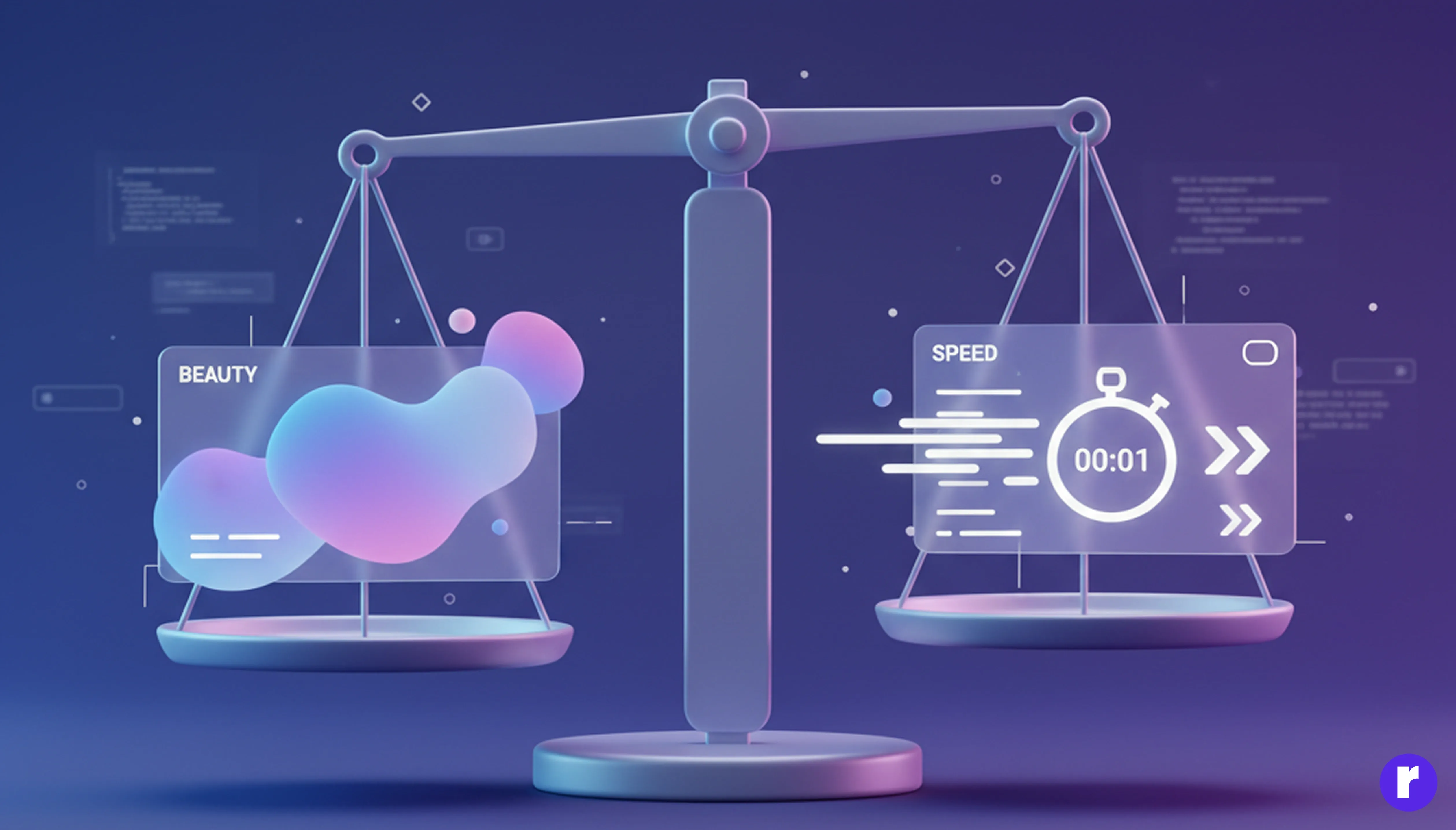
One of the biggest misconceptions about transitions is that they must be long or elaborate to look good. In reality, the best ones are barely noticeable. The goal isn’t to impress — it’s to inform.
A transition should never delay the user. The ideal duration typically falls between 150–400 milliseconds. Anything shorter feels abrupt; anything longer starts to feel sluggish. Great UX designers use motion like seasoning — just enough to enhance the experience, not overpower it. For example, a quick fade during page load can hide layout shifts and reduce visual jank, while a fast slide from the right can suggest navigation depth.
When in doubt, prioritize performance. Users forgive simplicity faster than slowness.
For more UX and motion design Click Here
Storytelling Through Motion

Transitions are a subtle but effective storytelling tool. Just like in film, they can define mood, emotion, and narrative flow. A zoom-in transition feels intimate; a fade-out feels calm; a bounce-in suggests playfulness. These micro-emotions shape how users interpret your brand.
Consider how apps like Airbnb or Apple Music use motion. When you tap an image, it smoothly expands into the next page — showing that the new screen is an extension of your previous action. This creates a story arc: I clicked this → it grew → now I’m seeing details. It feels natural and human, not mechanical.
Designers who understand motion as narrative can craft experiences that resonate emotionally, not just functionally.
The Technical Side: Tools and Frameworks

Modern frameworks make implementing smooth transitions easier than ever. If you’re working with React, Framer Motion offers a declarative, physics-based animation system ideal for page changes. Vue developers can rely on Vue Transitions or GSAP (GreenSock Animation Platform) for rich, timeline-based effects. Even CSS alone can create elegant fades or slides with just a few lines.
A simple CSS example:
.page-enter {
  opacity: 0;
  transform: translateY(10px);
}
.page-enter-active {
  opacity: 1;
  transform: translateY(0);
  transition: all 300ms ease;
}
This minimal setup can make page loads feel soft and polished — without extra libraries. The key is not complexity, but consistency. Choose one transition style and apply it uniformly across the interface. Users subconsciously learn the rhythm of your product, creating a sense of familiarity and flow.
Accessibility and Motion Sensitivity
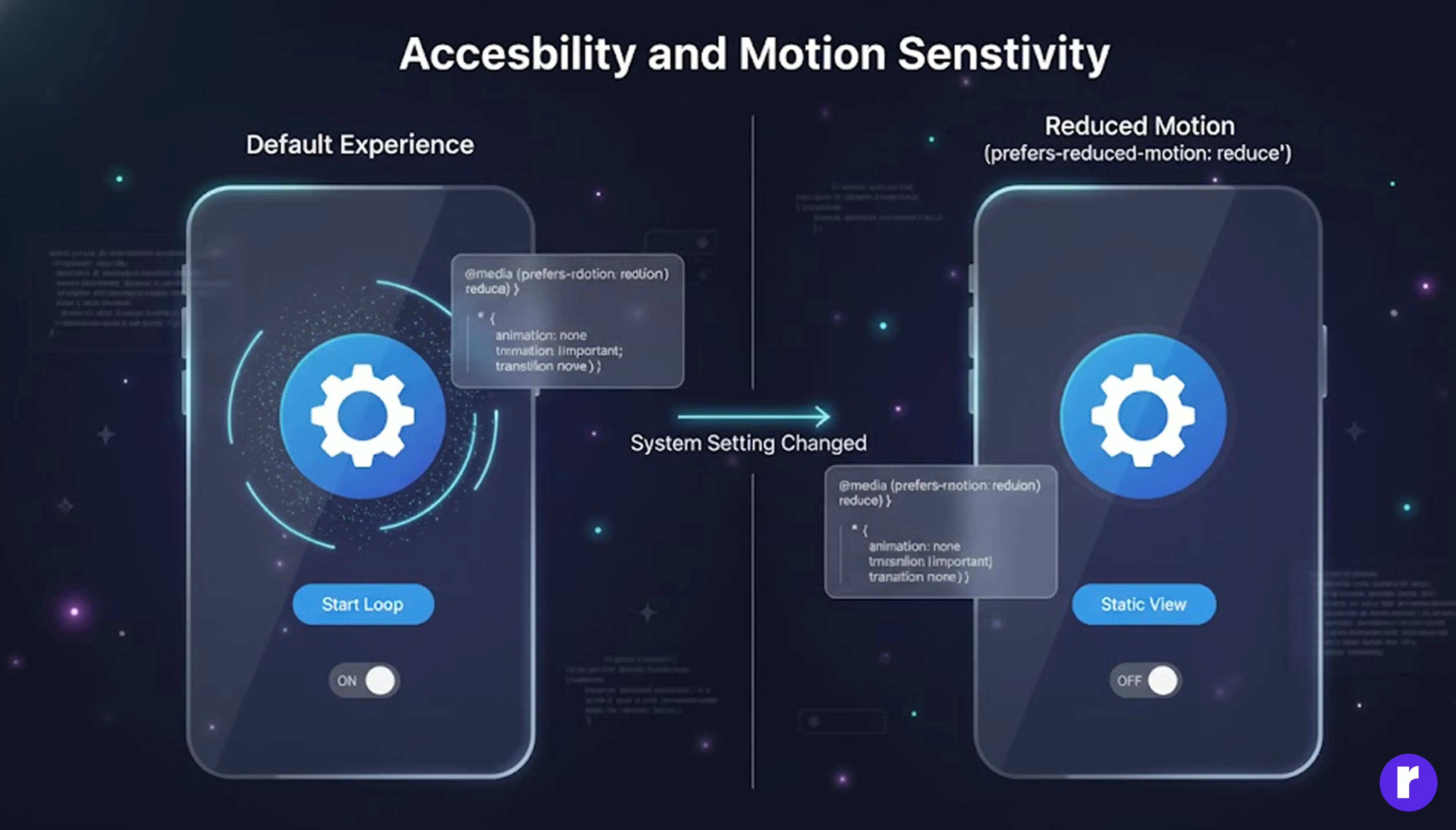
Not all users experience motion the same way. For some, excessive animation can trigger motion sickness or distraction. That’s why accessibility should always guide your transition strategy.
CSS provides a helpful feature called prefers-reduced-motion, which detects if a user has requested less movement in their system settings. By respecting this, you can automatically disable or simplify transitions for sensitive users:
@media (prefers-reduced-motion: reduce) {
  * {
    animation: none !important;
    transition: none !important;
  }
}
Inclusivity doesn’t mean removing personality — it means giving users control over how they experience it. When you design motion with empathy, you create interfaces that feel comfortable for everyone.
Testing and Refinement: The UX Motion Feedback Loop
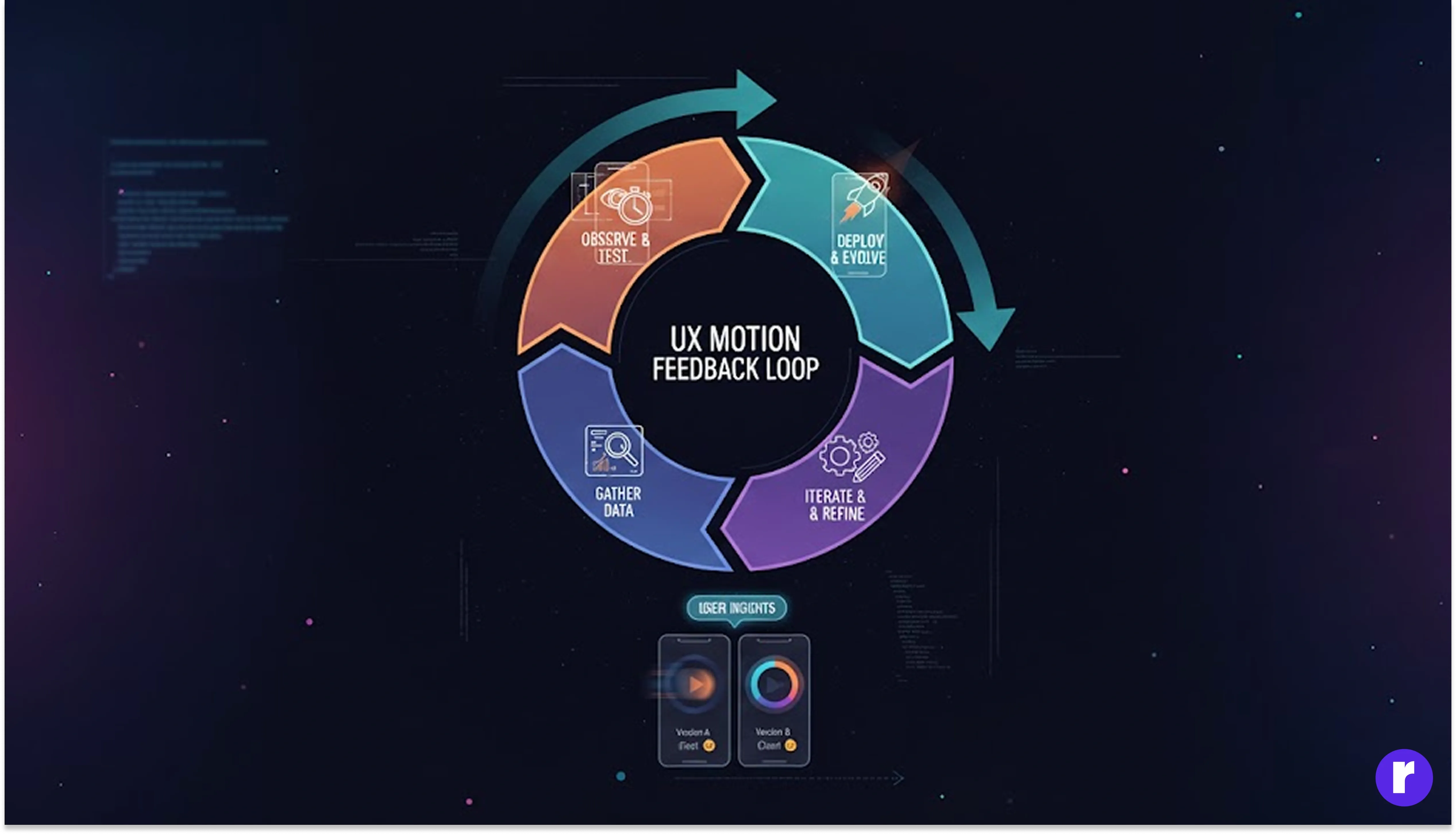
Designing good motion is not a one-time task. Like typography or color, it requires testing and refinement. Observe how real users respond: Do they understand what’s happening on screen? Do transitions feel helpful or distracting? Does the product feel faster or slower?.
A/B testing and usability sessions can reveal surprising insights. Sometimes a slight delay improves clarity; sometimes removing a transition entirely increases flow. Gather data, iterate, and treat motion as a living component of your design system. The best experiences evolve over time — just like the users themselves.
Conclusion
Page transitions are the invisible glue that holds digital experiences together. They bridge gaps, tell stories, and shape emotion — often without users realizing it. By combining psychology, design principles, and technical skill, you can turn simple page changes into moments of delight and clarity.
In a world obsessed with features and speed, remember that feeling matters too. A smooth transition can make your app feel more professional, more human, and more trustworthy. So the next time you design a website or product, don’t treat motion as decoration. Treat it as language — one that speaks directly to the heart of the user.