The Art of Focused UX: Reducing Distractions to Maximize Action

Written by
Sumit Verma
UI/UX Designer

Ashu Sirswa
UI/UX Designer

Table of contents
Build with Radial Code
Share this
In today’s world of endless pings, popups, and pull-down menus, focus has become a rare luxury. For designers, this means one thing: if your user interface doesn’t guide attention with intention, your users will get lost—or worse, leave.
Focused UX is all about stripping away the excess and building digital experiences that are clean, intentional, and action-driven.
Why Focus is the New Competitive Edge
Users don’t want to “figure it out.” They want to land on a page, Instantly understand what’s going on, and move toward their goal. Focused UX supports this by minimizing noise and maximizing clarity. When done right, focused design:
- Reduces cognitive exhaustion
- Improves conversion rates
- Builds trust through simplicity
In short: less confusion, more clicks.
The Core Pillars of Focused UX
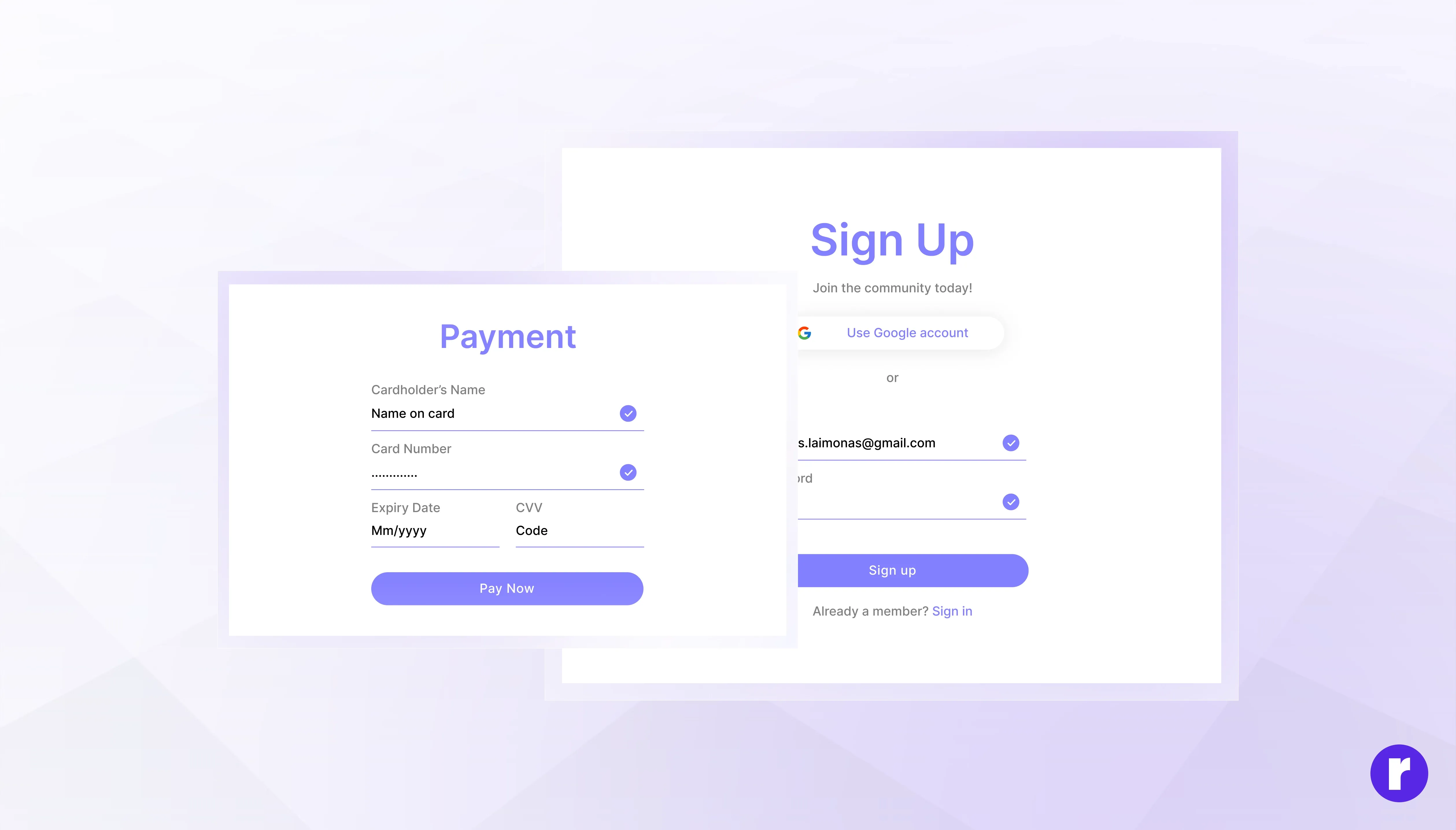
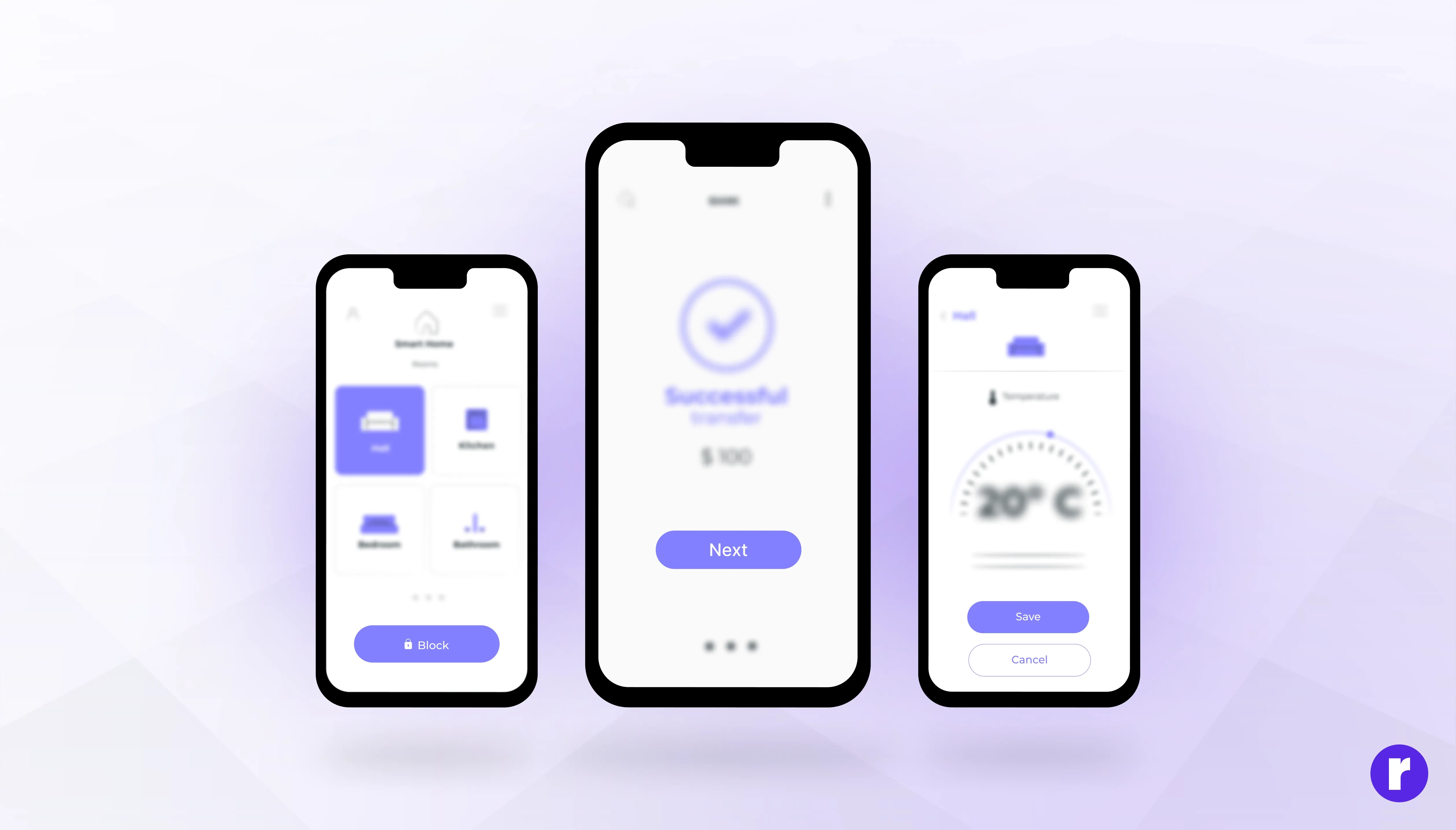
1. Every Screen Should Have a Single Goal
Whether it’s signing up, completing a purchase, or starting a trial—every screen should be designed with one primary action in mind. Secondary elements? Sure. But they should never steal the spotlight.
2. Visual Hierarchy That Leads the Eye
Your design should naturally guide users from headline to call-to-action. Use contrast, size, spacing, and alignment to lead attention exactly where it needs to go—like a silent tour guide. Learn more about Visual Hierarchy.
3. Whitespace Isn’t Empty—It’s Powerful
Negative space brings calm to your interface. It creates room to think, space to focus, and clarity of purpose. It's not what you add, but what you leave out that sharpens a design.
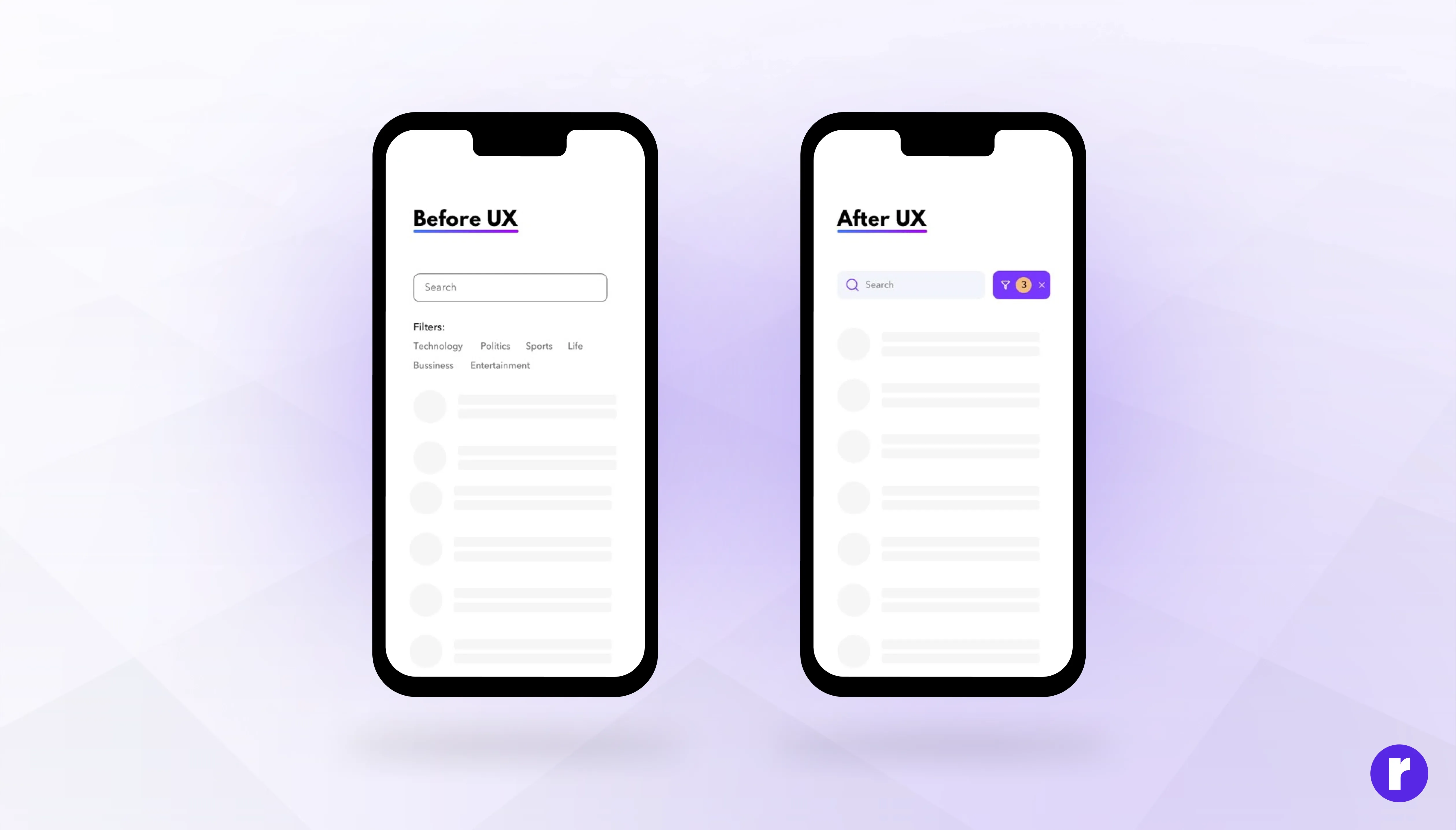
4. Kill the Clutter, Completely
Banners, sidebars, popups, chatbots, ads—if it doesn't serve the main goal, consider removing it or placing it somewhere less intrusive.
✂️ Rule of thumb: If you removed this element, would the core user experience improve?
Design with clarity, not clutter. Discover UX strategies that keep users engaged. Visit Now
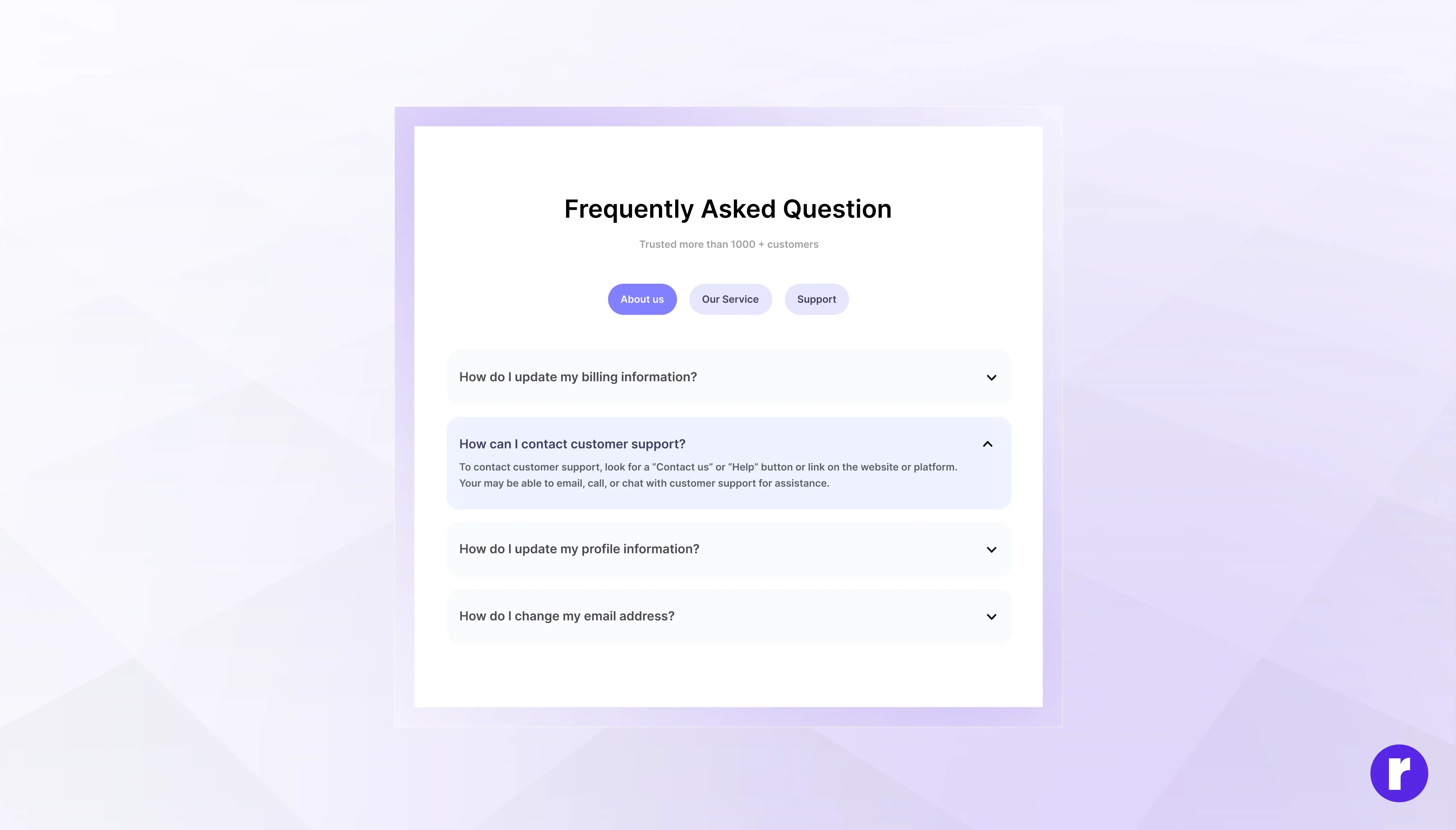
5. Progressive Disclosure: Less Upfront, More as Needed
Don’t hit users with everything all at once. Reveal information gradually, keeping early screens lightweight and focused. Let curious users dive deeper only when they want to.
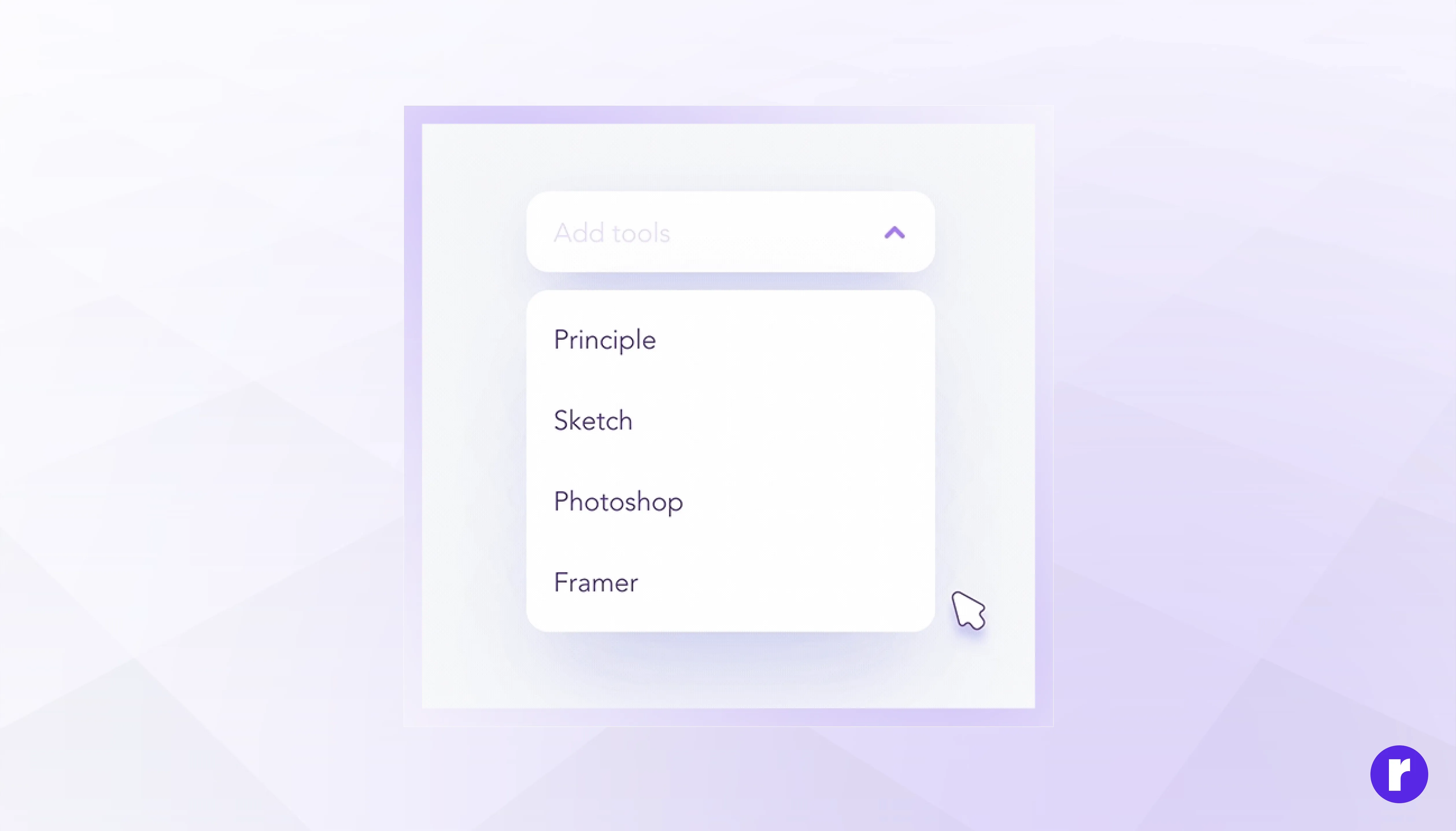
6. Micro interactions That Support Focus
Tiny animations, hover states, or subtle sounds can guide attention without overwhelming the user. When used thoughtfully, micro interactions make the interface feel alive while reinforcing user decisions.
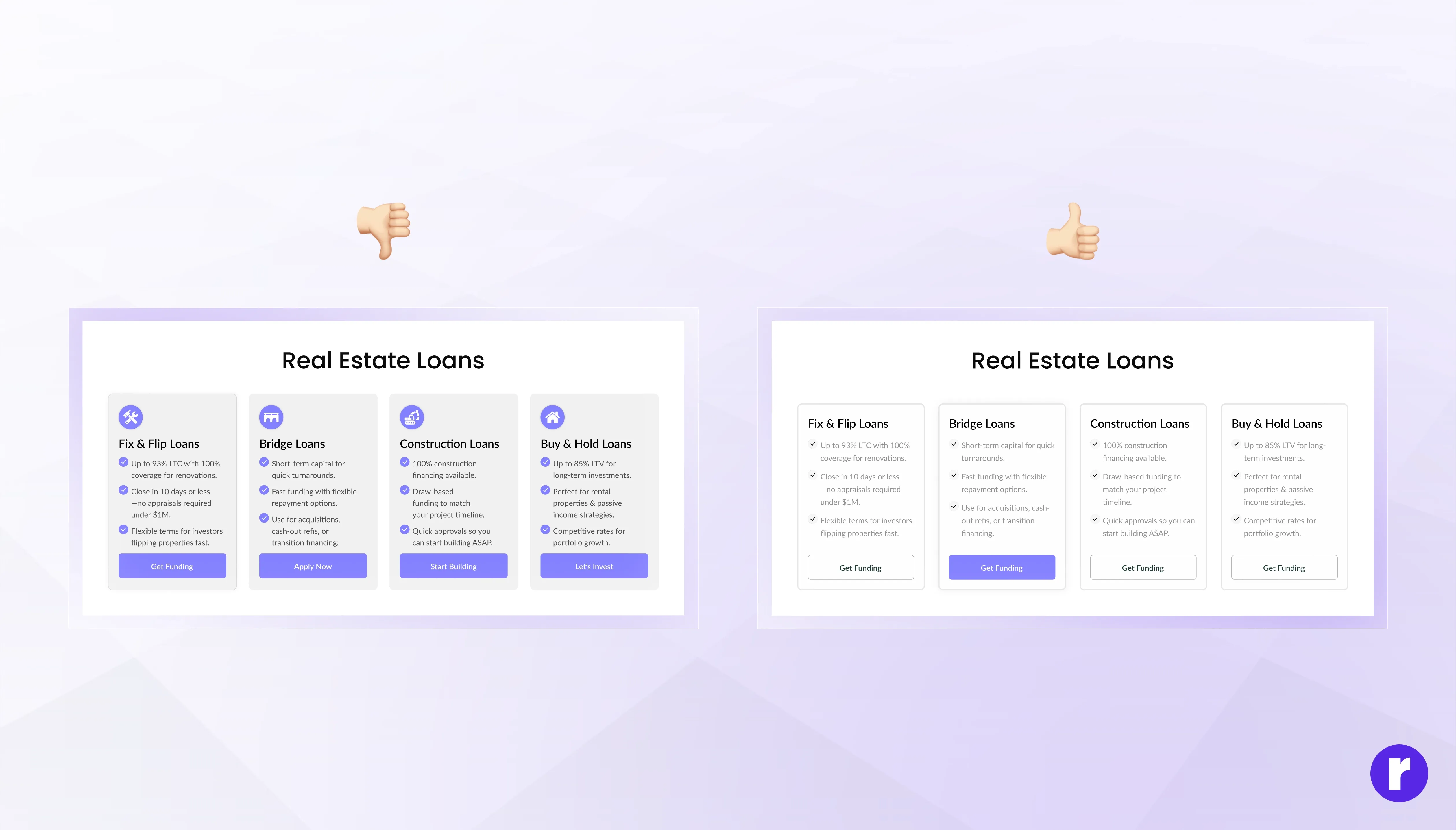
7. Color Psychology in Focused UX
Colors don’t just decorate—they direct. Strategic use of color can spotlight your CTA and reduce visual noise. Stick to a restrained palette and use bold colors in small amounts to emphasize key elements.
🎨 Pro Tip: One accent color for primary actions. The rest of your palette should stay calm and neutral. Here’s a good read on Color psychology in UI.
8. The Cost of Distraction
Every unnecessary element adds friction. Popups, too many links, or conflicting CTAs can drive users away. A Harvard Business Review study showed that reducing cognitive load can directly improve decision-making speed and satisfaction.
📉 Think about it: One extra click = one more chance to lose the user.
Learn more about cognitive load theory and UX.
Real-World Examples of Focused UX
A focused user experience ensures that users can achieve their goals without unnecessary friction. When distractions are minimized, users are more likely to stay engaged, complete tasks, and have a positive perception of your product or service. Here are some key benefits of a focused UX:
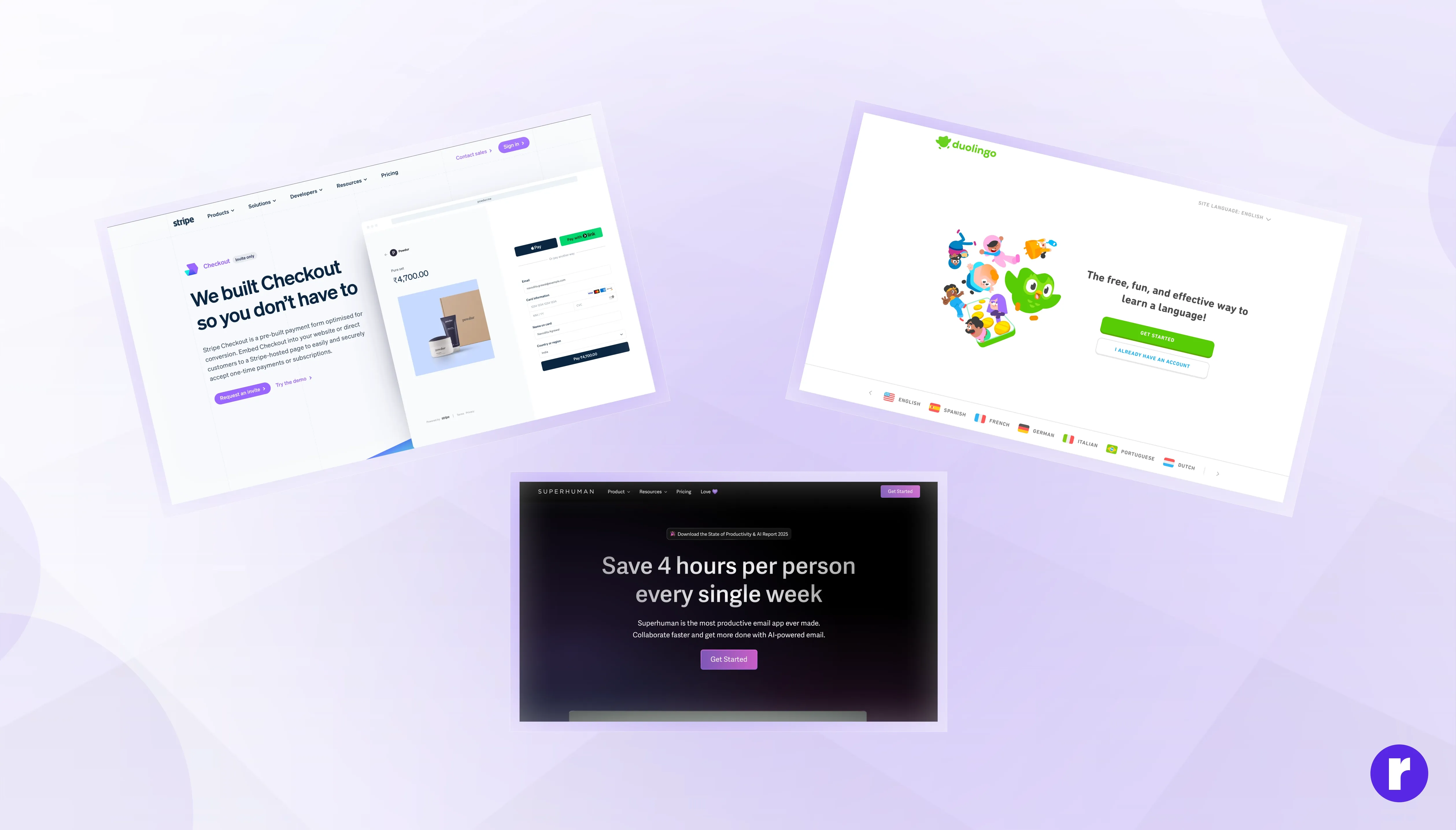
- Stripe’s checkout: Fast, intuitive, and free of distractions.
- Duolingo onboarding: Guides users step-by-step with micro-goals.
- Superhuman: A stripped-down email client optimized for speed and flow.
These aren’t just clean designs. They’re focused designs—with purpose baked into every pixel.
Want to master the art of focus UX? Visit Now
Design With Focus: A Quick Checklist
Before you ship your next design, ask yourself:
- What’s the primary action here?
- Are there distractions stealing attention?
- Is the most important content visually prioritized?
- Would removing any element improve clarity?
- Have we tested this with real users?
Conclusion
The best user experiences don’t just look good—they think clearly. Focused UX is about aligning design with intention, removing what’s unnecessary, and creating pathways that feel effortless. Remember: Users don’t get lost in complexity—they get lost in indecision. Your job is to light the path.