Techniques to create Responsive web design

Written by
Preeti Yadav
Front End Developer

Radial Code
IT Services, Education & Consultancy

Table of contents
Build with Radial Code
Share this
With the exponential growth of mobile devices, having a responsive web design has become essential. A responsive website adapts to different screen sizes and devices, providing an optimal viewing and browsing experience for users. In this blog post, we will explore some techniques that can help you create a responsive web design. Whether you are a developer, a student, or a college enthusiast, these techniques will undoubtedly benefit you.
Responsive web design means making websites that look good on mobiles, tablets, and computers. Websites without responsive design risk alienating a significant number of users.
Before making a responsive design you should know why it is important.
- Improve search engine optimization (SEO).
- It increases user experience.
- It makes websites faster, more accessible, and easy to navigate.
- It increases the amount of time that visitors spend on your website.
- Adapted to future devices.
- Reduce the cost of maintenance.
- Management becomes easier.
Set Appropriate Responsive Breakpoints
In responsive design, a breakpoint is where a website changes its layout to give users the best experience.
- Plan Your Layout: Design your website layout with responsiveness in mind from the beginning. You can use grid systems like Bootstrap or CSS Grid to create a flexible layout. Your layout should adapt to various screen sizes, from mobile phones to large desktop monitors.
- Mobile-First Approach: Design your website for mobile devices before anything else. This approach ensures that the essential content and features are available on small screens. As you scale up, you can add more features and content.
- Select Breakpoints: Common responsive breakpoints are typically defined in terms of screen width, measured in pixels. Bootstrap is a popular front-end framework that provides a responsive grid system with predefined breakpoints. Here are the common responsive breakpoints used in Bootstrap: Bootstrap Reference: Bootstrap Breakpoints
- Extra Small (XS): < 576px (for mobile phones in portrait mode)
- Small (SM): 576px - 768px (for larger mobile devices and small tablets)
- Medium (MD): 768px - 992px (for larger tablets and small laptops)
- Large (LG): 992px - 1200px (for larger laptops and desktops)
- Extra Large (XL): > 1200px (for larger desktop monitors)
Want to Create Stunning Responsive Websites? We Are Here.
Take touchscreens into consideration
When wondering how to make a website responsive, think of touchscreens. Most mobile devices (phones and tablets) are now equipped with touch screens. Some laptops are also catching up, offering touchscreen along with keyboard functions.

- Touch-Friendly Navigation:
- Ensure that your website's navigation menus and buttons are touch-friendly. Buttons and interactive elements should be large enough for users to tap easily with their fingers. A minimum recommended touch target size is around 44x44 pixels.
- Use spacing and padding effectively to prevent accidental taps on adjacent elements.
- Gestures and Interactions:
- Consider how touch gestures will be used on your website. Common gestures include tapping, swiping, pinching, and zooming. Ensure that your site's design accommodates these gestures, especially for features like image galleries and maps.
- Provide visual cues or instructions for users who may not be familiar with specific touch gestures.
- Forms and Input Fields:
- Adjust form fields and input elements for touch input. Input fields should be large enough for users to comfortably tap and type on touchscreen keyboards.
- Disable autocorrect and autocapitalize for specific input fields when it makes sense to do so (e.g., for email or username fields).
- Hover States and Tooltips:
- Keep in mind that touchscreens lack hover states. Ensure that your website's interactive elements work effectively without relying on mouse hover actions.
- Provide tooltips or other ways to offer additional information if needed.
By considering touchscreens in your responsive design strategy, you can create a website that offers an optimal user experience for a wide range of devices, including those with touch-based interfaces.
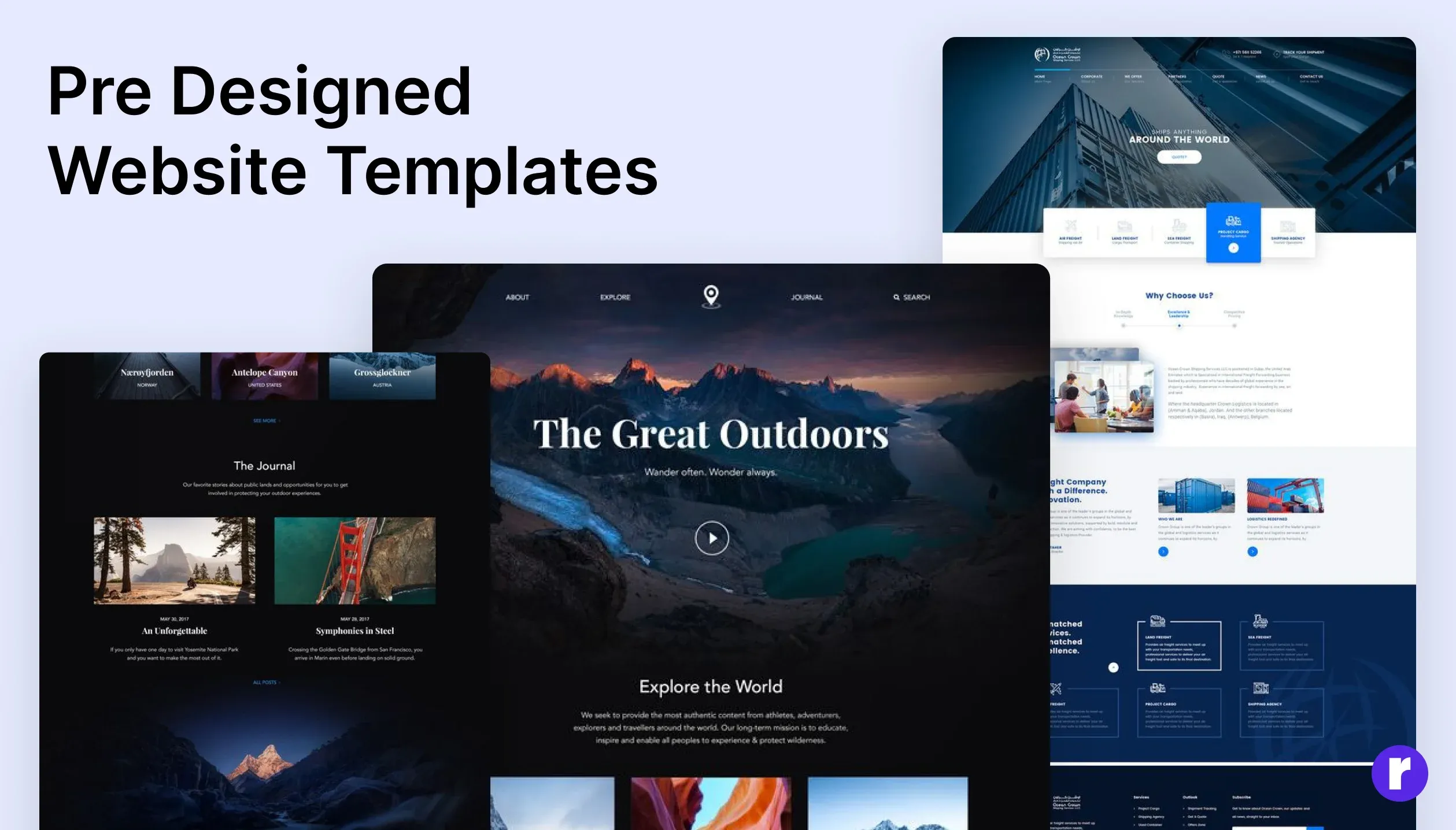
Use a pre-designed theme or layout to save time
Using a pre-designed theme or layout is an excellent way to save time when creating a responsive website. Pre-designed themes or templates offer a foundation for your website's design and functionality, reducing the need to start from scratch. When looking for redesigned themes or templates for websites, you can find various options depending on your specific needs, whether it's for a blog, e-commerce site, portfolio, or any other type of project.
Some popular resources and marketplaces where you can discover high-quality themes and templates are:
- ThemeForest: A part of Envato Market, ThemeForest offers a vast collection of premium website themes and templates for various content management systems (CMS) like WordPress, Joomla, and Drupal. You can find a wide range of options here.
- TemplateMonster: TemplateMonster offers a wide selection of templates and themes for different platforms, including WordPress, Magento, and Joomla. They also provide templates for specific niches and industries.
- Creative Market: Creative Market is a platform for various digital assets, including website themes and templates. It's a great place to discover creative and unique designs for your projects.
- Elegant Themes: Known for their premium WordPress themes and plugins, Elegant Themes provides beautifully designed templates, including the popular Divi theme and page builder.
Here's how you can make the most of pre-designed themes:
- Choose the Right Theme:
- Start by selecting a theme or template that aligns with your website's goals and content. Consider factors like the type of website you're building (blog, portfolio, e-commerce, etc.), the visual style, and the features you need.
- Customize the Theme:
- Most pre-designed themes are highly customizable. Use the theme's built-in customization options or a website builder tool to tailor the design to your brand and preferences.
- Customize colors, fonts, layout, and other design elements to make the theme unique and fit your content.
- Responsive Design:
- Ensure that the chosen theme is responsive or mobile-friendly. It should adapt to various screen sizes and devices, which is a fundamental aspect of modern web design.
- SEO and Performance Optimization:
- Optimize your website for search engines (SEO) by adding relevant meta tags, optimizing images, and ensuring that your content is well-structured. To know more about benifits of SEO you can visit SEO Optimization
- Also, optimize your website's performance by minimizing HTTP requests, leveraging browser caching, and reducing server response times.
By using a pre-designed theme as your starting point, you can save a significant amount of time and still create a professional and responsive website. It's important to strike a balance between the convenience of a pre-designed theme and the need for customization to make your website unique and aligned with your brand.
Content Management System (CMS)
Using a Content Management System (CMS) with responsive design capabilities, such as WordPress or Web-flow, plays a crucial role in implementing responsive web design. Here's how CMS platforms like WordPress contribute to responsive web design:

Certainly! Let's delve deeper into the benefits of specific CMS platforms like WordPress, webflow focusing on the availability of plugins that enhance responsiveness, and discuss security considerations when using pre-designed themes or CMS platforms.
- Extensive Plugin Ecosystem:
- Enhanced Responsiveness: WordPress boasts a vast ecosystem of plugins that cater to various functionalities. For responsiveness, plugins like "WPtouch" and "Jetpack" offer mobile-friendly themes and optimization features. These plugins ensure that your website adapts seamlessly to different devices.
- Ease of Use and Customization:
- User-Friendly Interface: WordPress is known for its simple interface. It's great for people with different tech skills. Users can easily install and activate responsive design plugins without extensive coding knowledge.
- Community Support:
- Responsive Themes: The WordPress community actively develops and maintains responsive themes. These themes, such as "Divi" or "OceanWP," are designed to be mobile-friendly and adapt to various screen sizes. Users can choose a responsive theme that aligns with their website goals and customize it as needed.
- Continuous Updates:
- Security Patches: WordPress consistently releases updates, including security patches. By keeping the CMS and plugins up to date, users can benefit from the latest features, improvements, and security enhancements, contributing to a more secure and responsive website.
if you want to learn more about benifits of webflow you can also visit benifits of webflow.
User Experience
A responsive website should offer a consistent and enjoyable user experience across different devices. This includes easy navigation, legible text, and accessible interactive elements.

User Experience (UX) refers to the overall quality of an individual's interaction with a product or system, including websites, applications, software, and physical devices. It encompasses every aspect of the user's interaction, from their first encounter with a product to their ongoing use and eventual discontinuation.
Here are some key aspects and principles related to UX:
- Visual Design: Visual design is essential for creating an appealing and engaging user experience. It includes aspects such as color schemes, typography, imagery, and overall aesthetics.
- Responsiveness: In the digital realm, responsive design ensures that websites and applications work seamlessly on various devices and screen sizes, providing a consistent experience across platforms. Test your website for usability and user experience. Ensure that navigation is intuitive, pages load quickly, and all features work as expected.
- Consistency: Consistency in design and interactions across a product or a family of products helps users build mental models and navigate with ease.
- User Feedback and Iteration: Collecting and acting on user feedback is a continuous process in UX design. Iterating and improving the product based on user insights is vital for long-term success.
Test and Refine Your Design
Testing is an integral part of creating a responsive web design. Regularly check your website on various devices and browsers to ensure consistent functionality and appearance. Test its responsiveness by resizing the browser window and verify that the content adjusts appropriately. User feedback is invaluable, so consider conducting usability tests or gathering input from users to identify areas for improvement.
Conclusions
In conclusion, responsive web design is not just a trend but a necessity in the digital age. It ensures that websites are accessible, user-friendly, and visually appealing across a wide range of devices. Employing fluid grids, flexible images, media queries, and other techniques is essential for creating responsive web experiences that meet the demands of today's diverse online audience.
By implementing these techniques, you can create a seamless and engaging experience for your users across all devices. Remember to keep up with the latest trends and technologies in web design to stay ahead in this dynamic field. Happy designing!
If you're planning to build a fully furnished responsive website, you can always seek help from an expert development team. Please feel free to schedule a call with one of our experts to discuss your project.