Brand identity vs. Design system: What's the difference?

Written by

Sumit Verma
UI/UX Designer
Table of contents
Build with Radial Code
Share this


One is the promise you make. The other is the machine that keeps it.
Most teams mix these two up for an honest reason: both live in the same Figma file, both have a page called "Colors," and both get called "the brand guidelines" in Slack. Then six months later the marketing site and the product look like two different companies built them.
So here's the short answer up front. Brand identity is what you promise. A design system is how you keep that promise at scale, without a human re-deciding it every time. Which means your brand can be beautiful and your product can still feel off-brand. Your system can be immaculate and your brand can still be forgettable. Neither one covers for the other.
The interesting part isn't the definitions, though. It's the exact place these two are supposed to connect, and why that connection is usually missing.
Brand identity: The promise
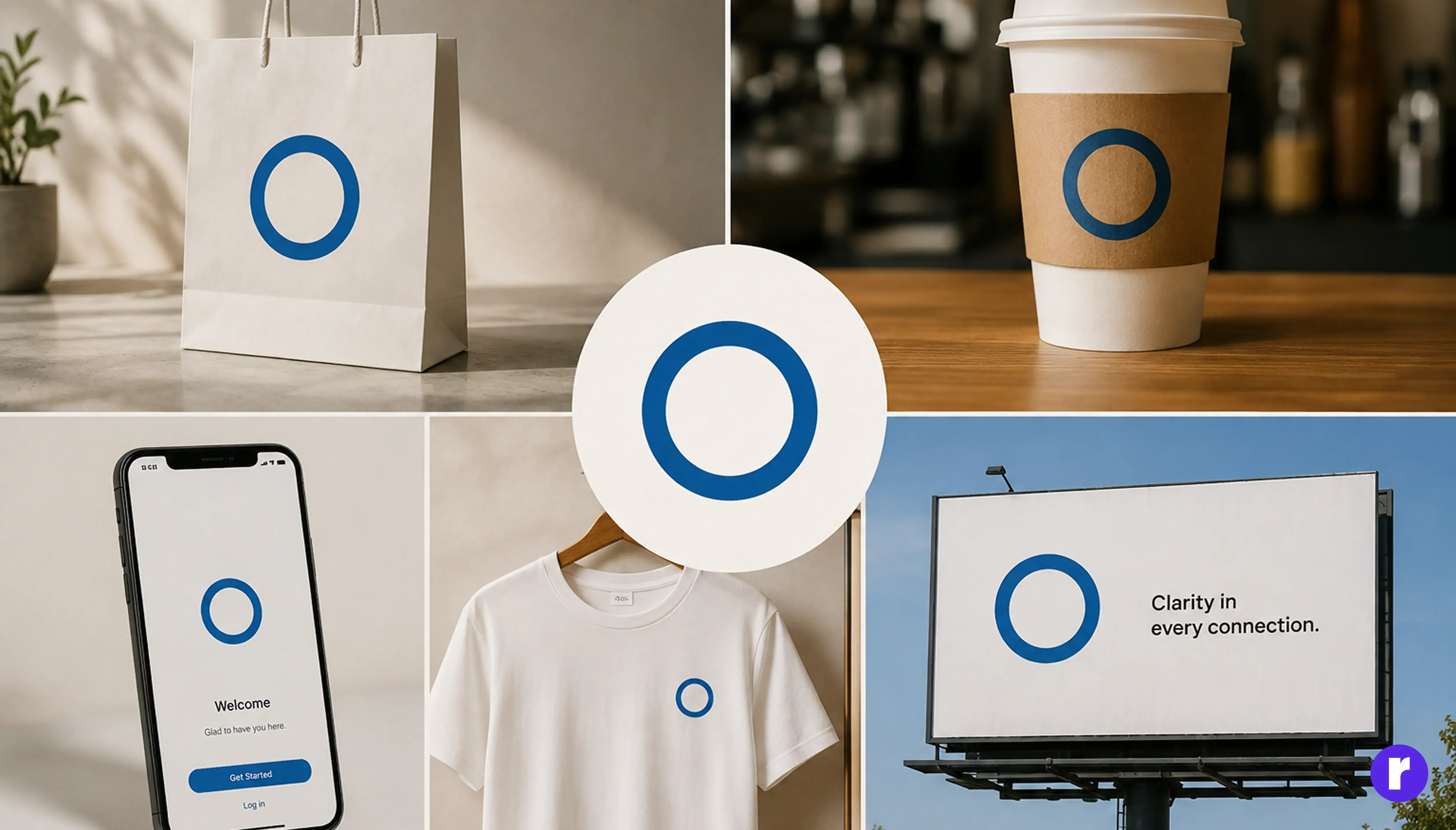
Logo, palette, typography, photography direction, tone of voice, the personality of your motion. Its job is recognition and differentiation: who are we, and why pick us over the near-identical competitor next door?
The part people miss is that brand identity is meant to be interpreted. "Warm, confident, never corporate" will be expressed ten ways by ten designers, and that flexibility is a feature. A billboard and an empty state are not the same canvas.
It usually lives with a brand or marketing lead, and it changes rarely: every few years, with a lot of ceremony. When it fails, it fails by being generic. Technically correct, completely forgettable.
Design system: The delivery machine
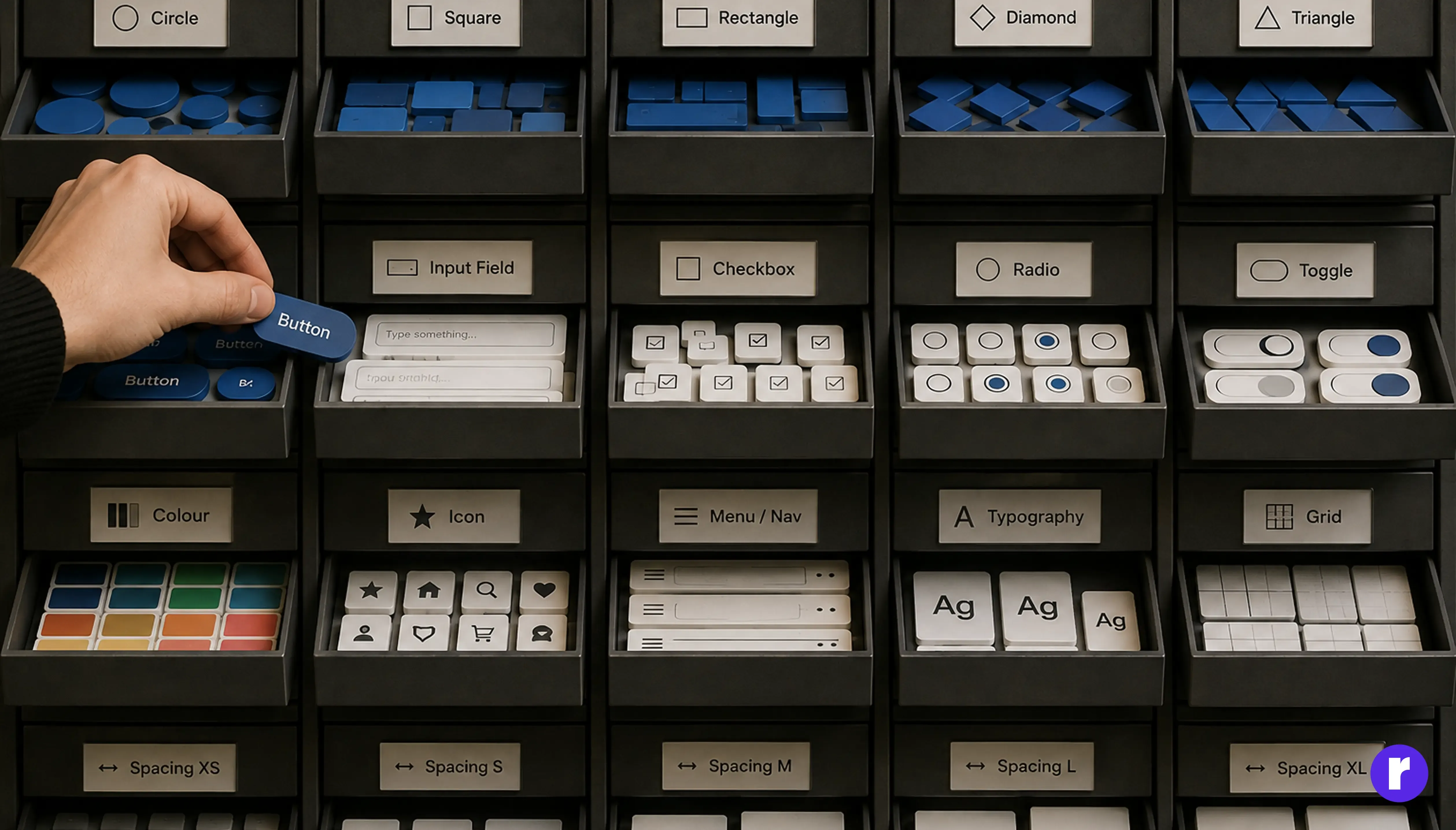
Tokens, components, every interaction state, accessibility rules, versioning, and the code library shipping next to it. Its job is consistency and speed.
It answers what your brand book never will: what does a primary button look like at 320px, disabled, in dark mode, with a 40-character label in Hindi? Where brand invites interpretation, a system removes it. Spacing-4 is 16px, not "around 16." That rigidity is what lets twenty people ship screens that look like one person made them.
Brand identity is a point of view. A design system is a set of constraints. A brand that can't be constrained can't be shipped.
The ownership is different too. Systems belong to product design and frontend engineering, and they change weekly. When they fail, they fail loudly: fourteen button variants, a colour picked by whoever shipped last.
Sit with that difference in pace for a moment, because it's the root of almost everything else here. A brand file that has never been versioned, next to a component library on its fortieth release, isn't a partnership. It's a slow-motion split.
The part nobody talks about: The translation layer
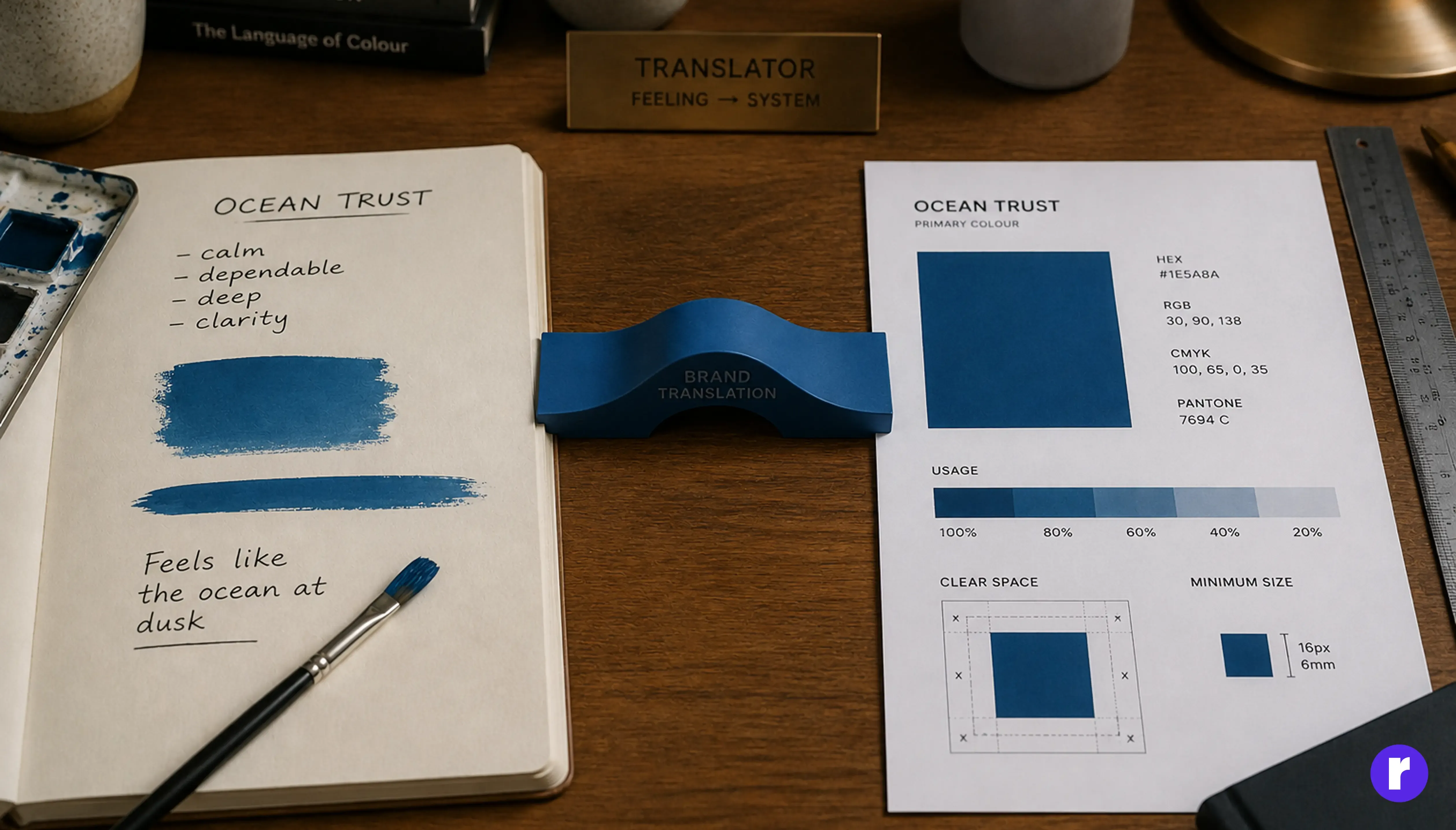
These two don't plug into each other. They connect through the moment a brand decision becomes a machine-readable value, and almost nobody documents it.
That's where "bold and trustworthy" becomes a hex code that also passes contrast on your dark surface. Where "editorial and breathable" becomes a spacing unit and a type scale. Compare:
- Weak documentation: Primary blue is #1B4DFF.
- Stronger documentation: Primary blue is #1B4DFF. It carries the "bold and trustworthy" side of the brand, and it's the darkest tint that still passes 4.5:1 on our light surface. Don't lighten it for aesthetics; use color-primary-400for decorative fills.
The second survives a team change. The first gets overwritten by whoever's working late on a deadline, because nothing tells them a decision was ever made.
Write down the reasoning between your brand decisions and your tokens. Not just the value, the why. That document is the bridge, and in most teams it doesn't exist.
How brand drift actually happens
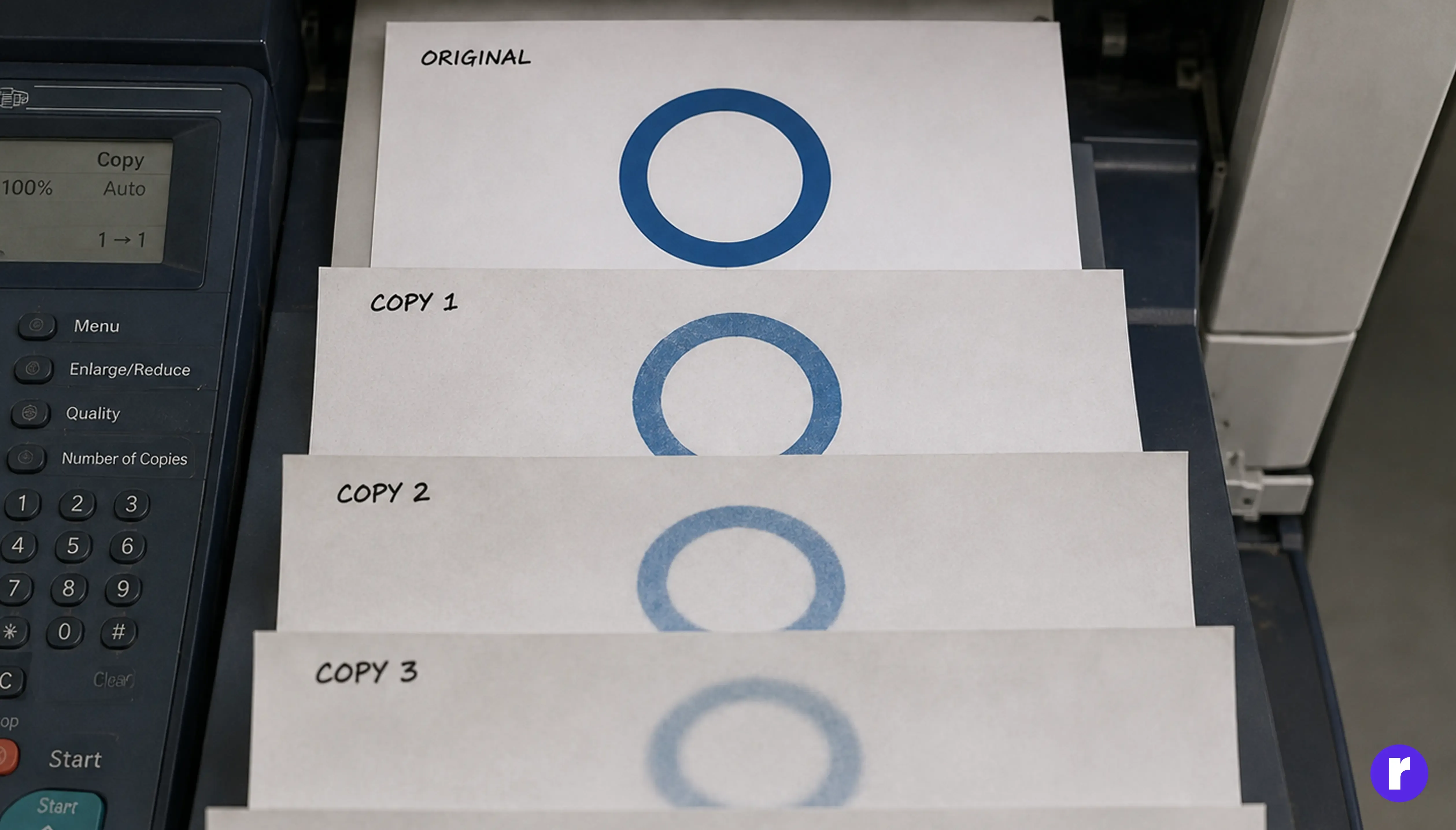
- Brand identity ships as a static artifact: approved, archived.
- The product team hits decisions it never covered. Focus rings, empty states, table density.
- They make reasonable local calls under pressure. Nobody records the rationale.
- Marketing refreshes the site. The product doesn't follow, because its real values now live in code.
- A year later you have two brands and the honest fix is a full audit.
Notice what's missing from that list: bad designers. Drift is what happens when brand identity is treated as a deliverable instead of a living input to the system.
What to build first
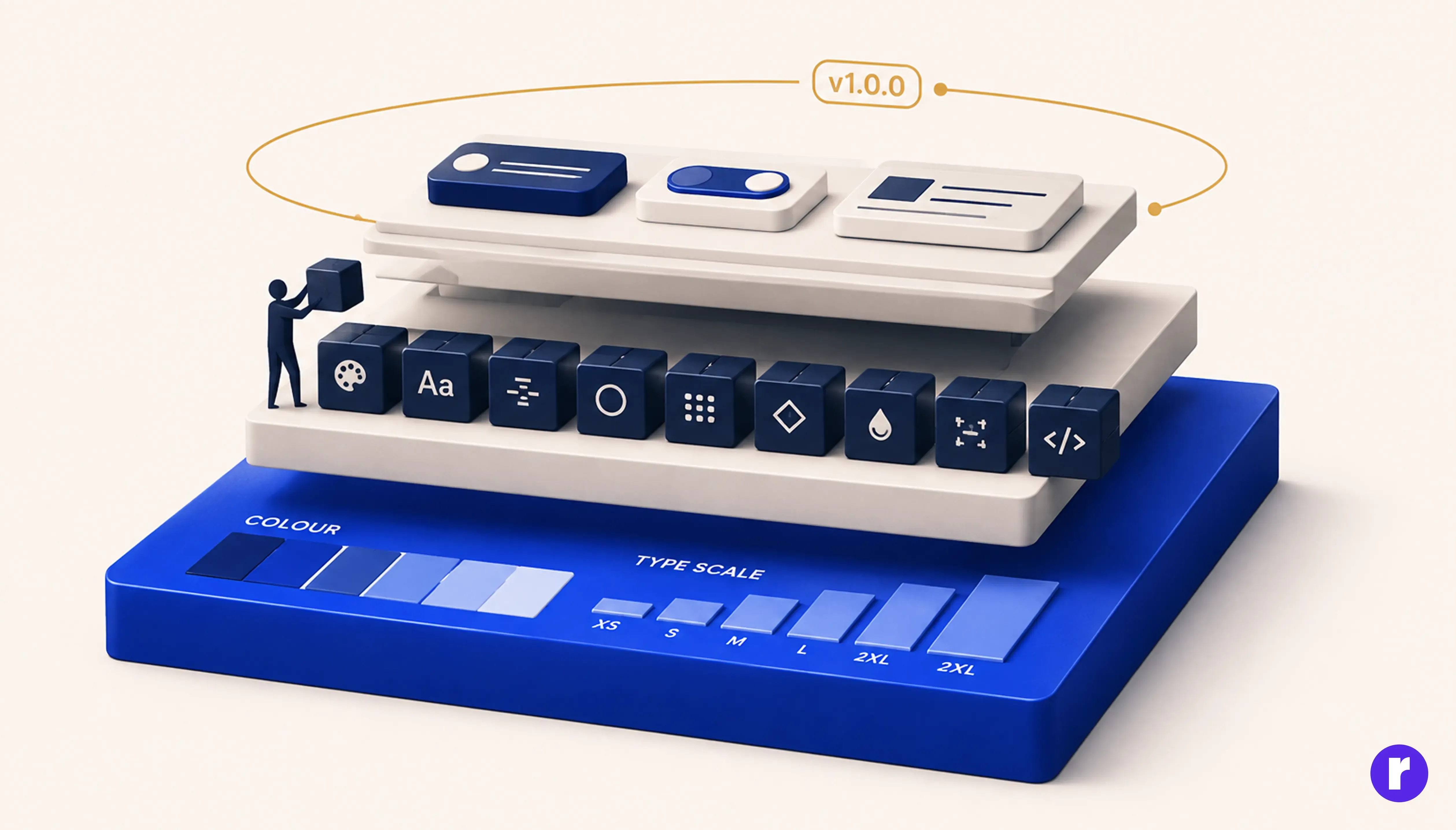
Brand identity, always. A design system is a scaling mechanism, and scaling something undefined just multiplies the confusion.
But don't wait for a "finished" brand either. That's how you end up with a gorgeous brand book and a product held together by one-off values. Instead:
- Lock the fundamentals: accessible palette, type scale, spacing rhythm, voice principles.
- Tokenise them while the reasoning is fresh, and write the reasoning down as you go.
- Build only the components you've already used three times, not a speculative 80-component library.
- Version the brand file like code, so when brand changes, tokens change and the product follows.
Step four is the whole point. A design system isn't a Figma library. It's the mechanism that makes your brand hard to drift away from.
Transform ideas into impactful digital experiences, visit Radial Code
Conclusion
Brand identity is the promise; the design system is how you keep it at scale. One is interpretive and moves slowly, the other is prescriptive and moves weekly. Neither can do the other's job.
The gap between them is where most consistency problems are born: the undocumented space where a designer on a deadline has to guess what the brand would have wanted. Each guess is reasonable. A year of them is a second brand nobody chose.
The good news is that it’s a documentation problem, not a creative one. So if your product and your marketing site feel like distant cousins, you don't need a rebrand. You need the bridge, written down.