How to build a strong brand identity for a digital product

Written by

Sumit Verma
UI/UX Designer
Table of contents
Build with Radial Code
Share this


Your logo is the smallest part of your brand. The other 95% is everything users touch after they stop looking at it.
Most digital products get their identity backwards. A logo gets approved, a palette gets picked, a font gets bought, and everyone calls it a brand. Then the product ships and it feels like nothing in particular: clean, competent, completely forgettable next to four competitors doing the same thing.
A strong brand identity for a digital product isn't a visual layer applied at the end. It's a set of decisions that show up in the empty states, the error messages, the onboarding copy, the loading spinner, and the pricing page. Users don't experience your brand in a presentation. They experience it at 11pm on a slow connection when something goes wrong.
Here's how to build one that survives contact with a real product.
Start with positioning, not pixels
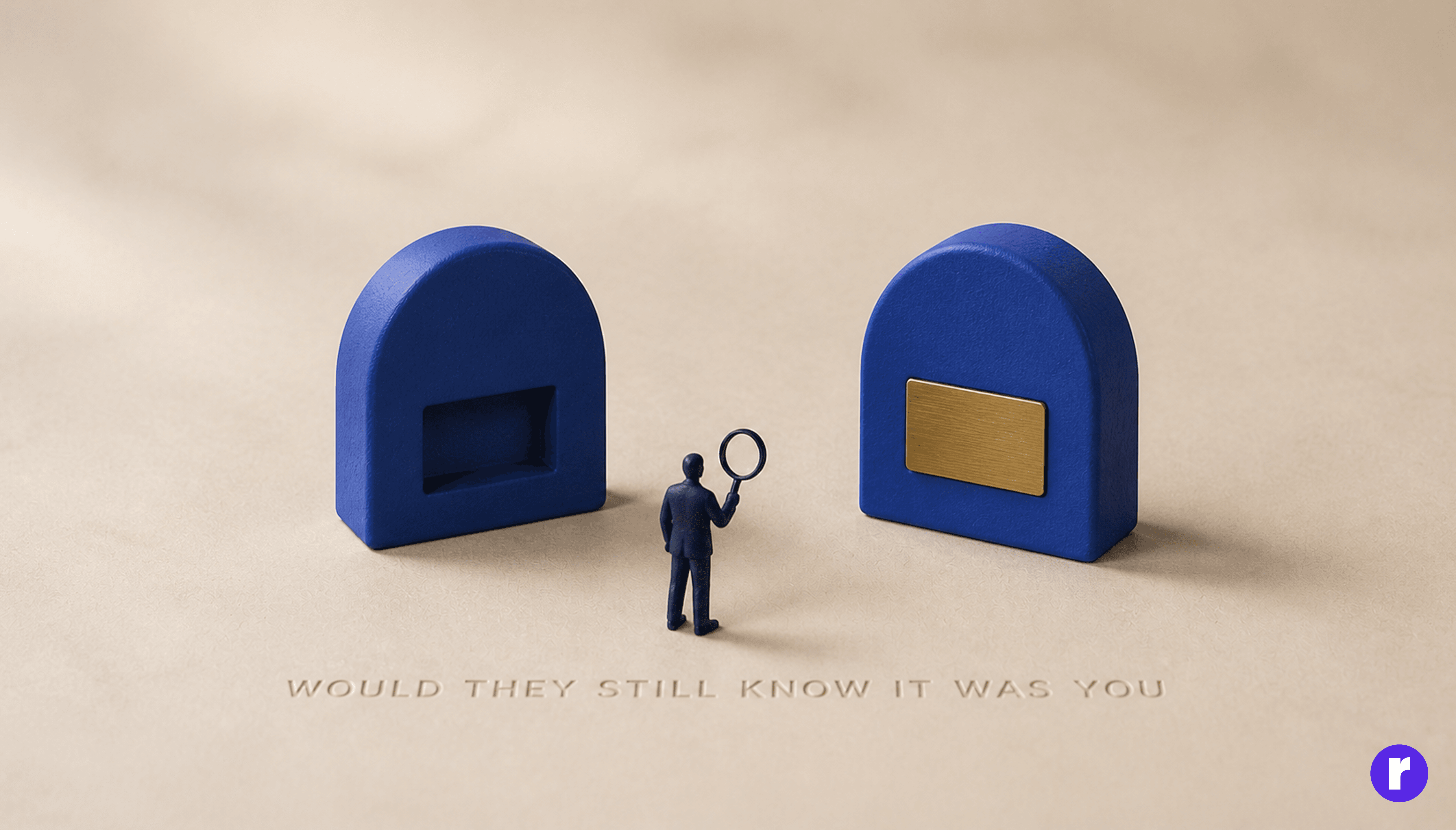
Before anyone opens Figma, you need an answer to one uncomfortable question: if a user removed your name from the interface, would they still know it was you?
That's not a visual question. It's a positioning one. Who is this for, what do they already believe, and what do we do differently from the obvious alternative? A brand identity is a visual argument for a position. No position, no argument, and you end up with a mood board of things that looked nice on Dribbble.
The most common failure here is competitor-shaped design. You look at the category leader, absorb their conventions, and end up as a slightly worse-looking version of them. Look at the category to understand what users expect, then decide deliberately where you're going to break the pattern.
Define the three sentences that drive every decision
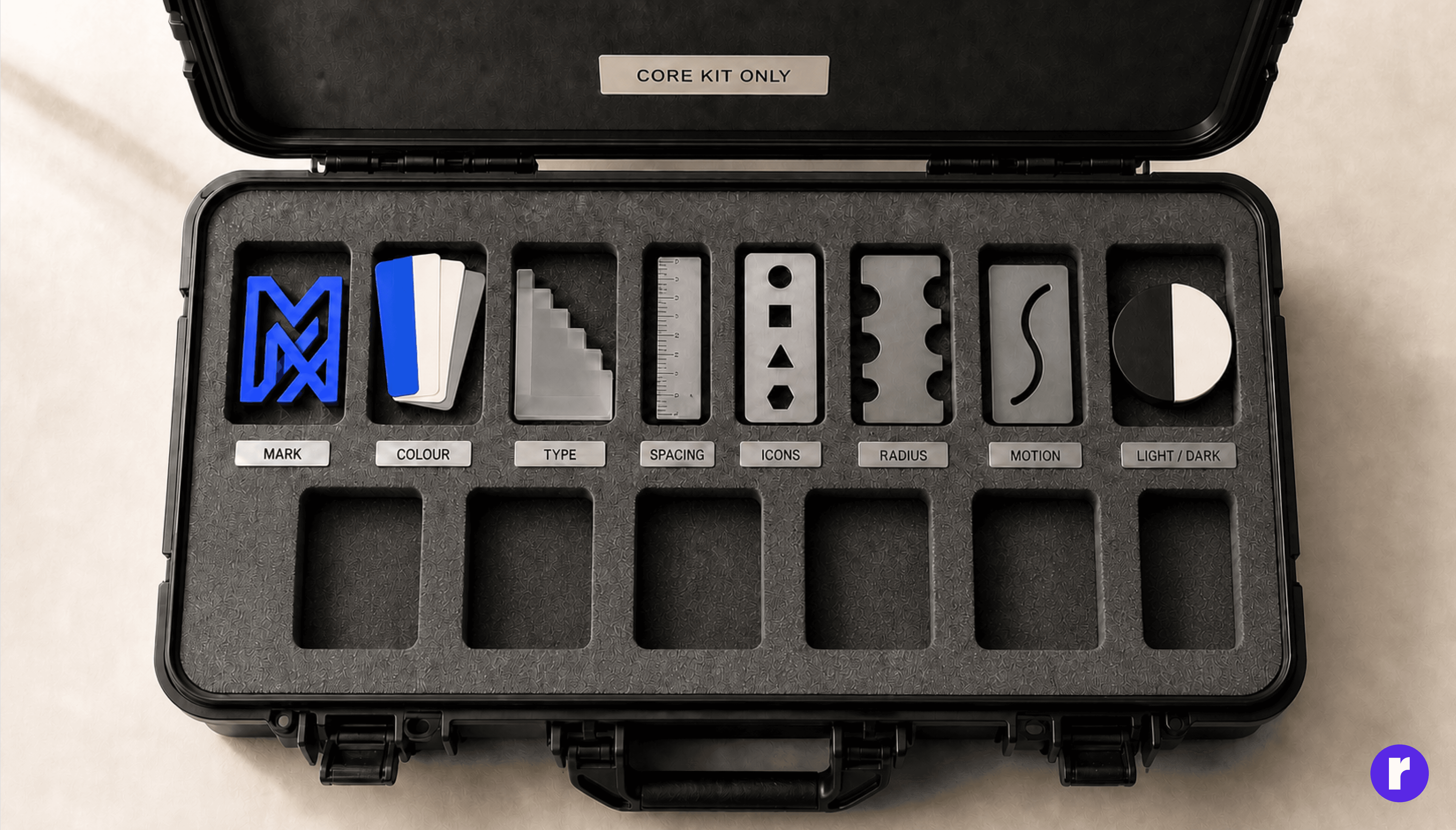
Write these down before you design anything. They should fit on a sticky note.
- Who we're for: One specific audience, not "everyone who needs X".
- What we stand for: Three adjectives you'd defend in a meeting. "Fast, plainspoken, never precious" beats "innovative, modern, user-friendly".
- What we refuse to be: The most useful sentence of the three, because it's the only one that kills a bad idea quickly.
That third line does more work than most brand books. "Never playful" instantly rules out the illustration style, the confetti animation, and the joke in the 404 page. Constraints are what make an identity recognisable; without them, every designer's taste gets a vote.
Your brand looks different everywhere. Let's fix that. Talk to us
Build the core kit (and only the core kit)
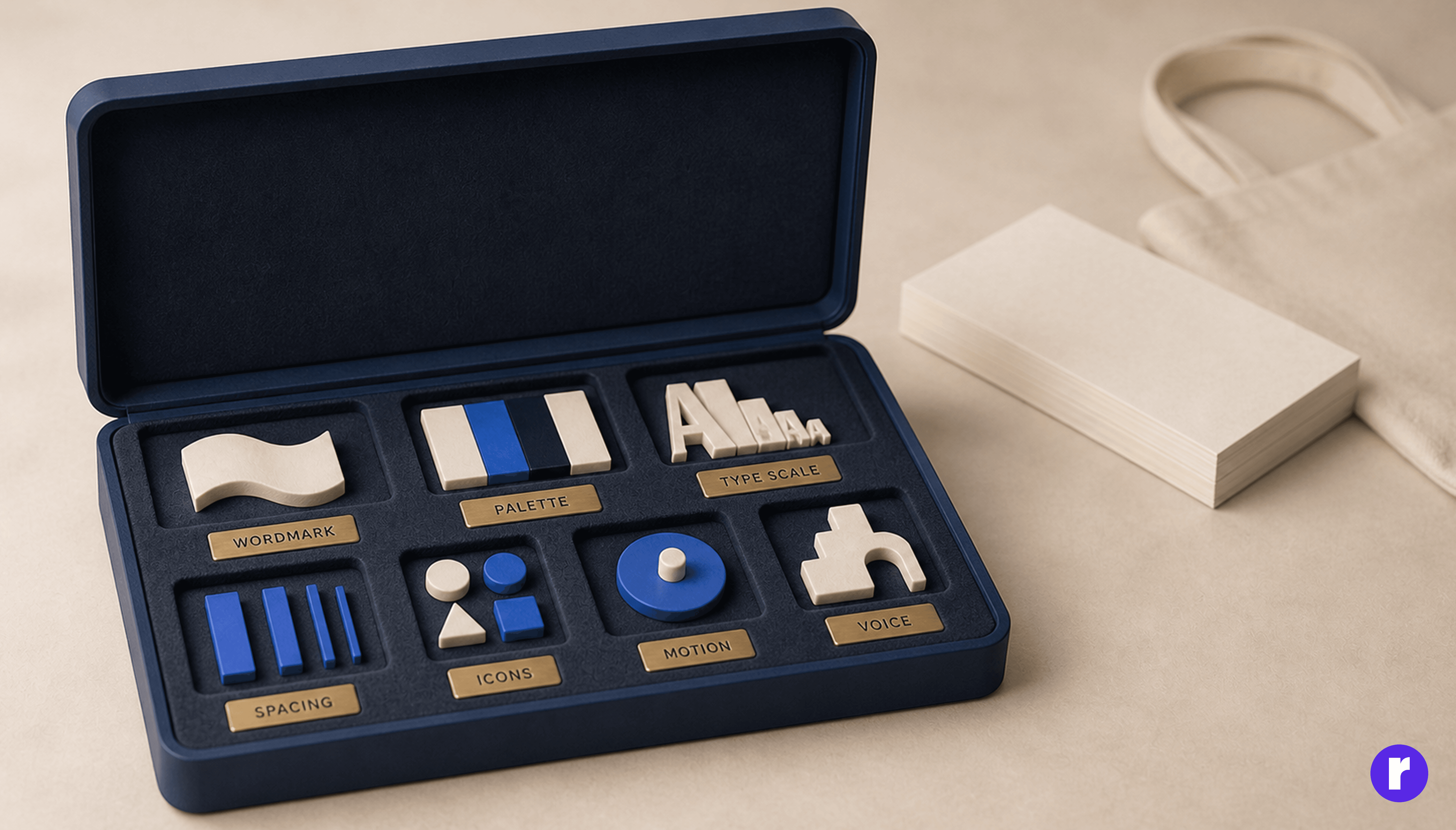
For a digital product, the kit that actually gets used is smaller than most brand decks suggest:
- Wordmark and app mark that survive 24px, dark mode, and a favicon.
- A palette built for interfaces brand colours, plus neutrals, plus real semantic states (success, warning, error, info). Interfaces need many more greys than billboards do.
- A type scale, not a font list. Two families maximum, with defined sizes, weights, and line heights.
- Spacing rhythm one base unit and a scale off it.
- Iconography and illustration direction with a stated stroke weight and corner radius, so twenty icons look related.
- Motion principles duration, easing, and what motion is allowed to mean.
- Voice and tone rules with real before-and-after examples.
Skip the 60-page deck of speculative applications. The tote bag mockup has never once stopped a designer from inventing a fourteenth shade of blue at 6pm.
Design for product surfaces, not billboards
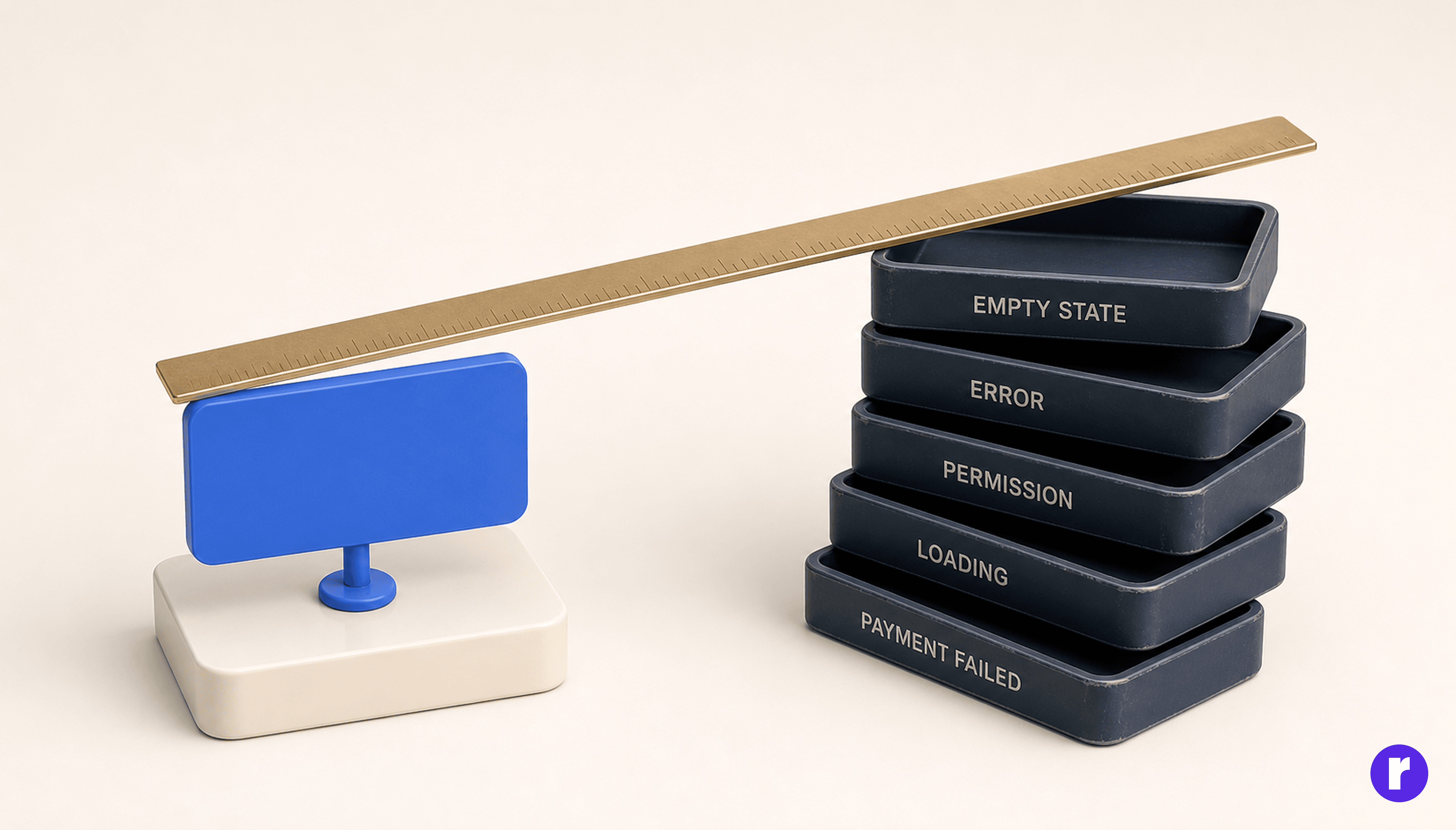
This is where digital brand identity genuinely differs from traditional branding, and where most identities quietly fall apart.
Your brand lives on the surfaces nobody puts in a case study: empty states, error messages, permission prompts, loading states, confirmation dialogs, notification emails, the moment a payment fails. These are high-emotion moments. They're also usually written by whoever built the feature, in whatever voice they had that afternoon.
An identity that covers the marketing site but not the failure states isn't finished, it's decorated. Pick your five most-seen product moments and design each one deliberately, in voice. That's where recognition is actually built.
Your voice is half your identity
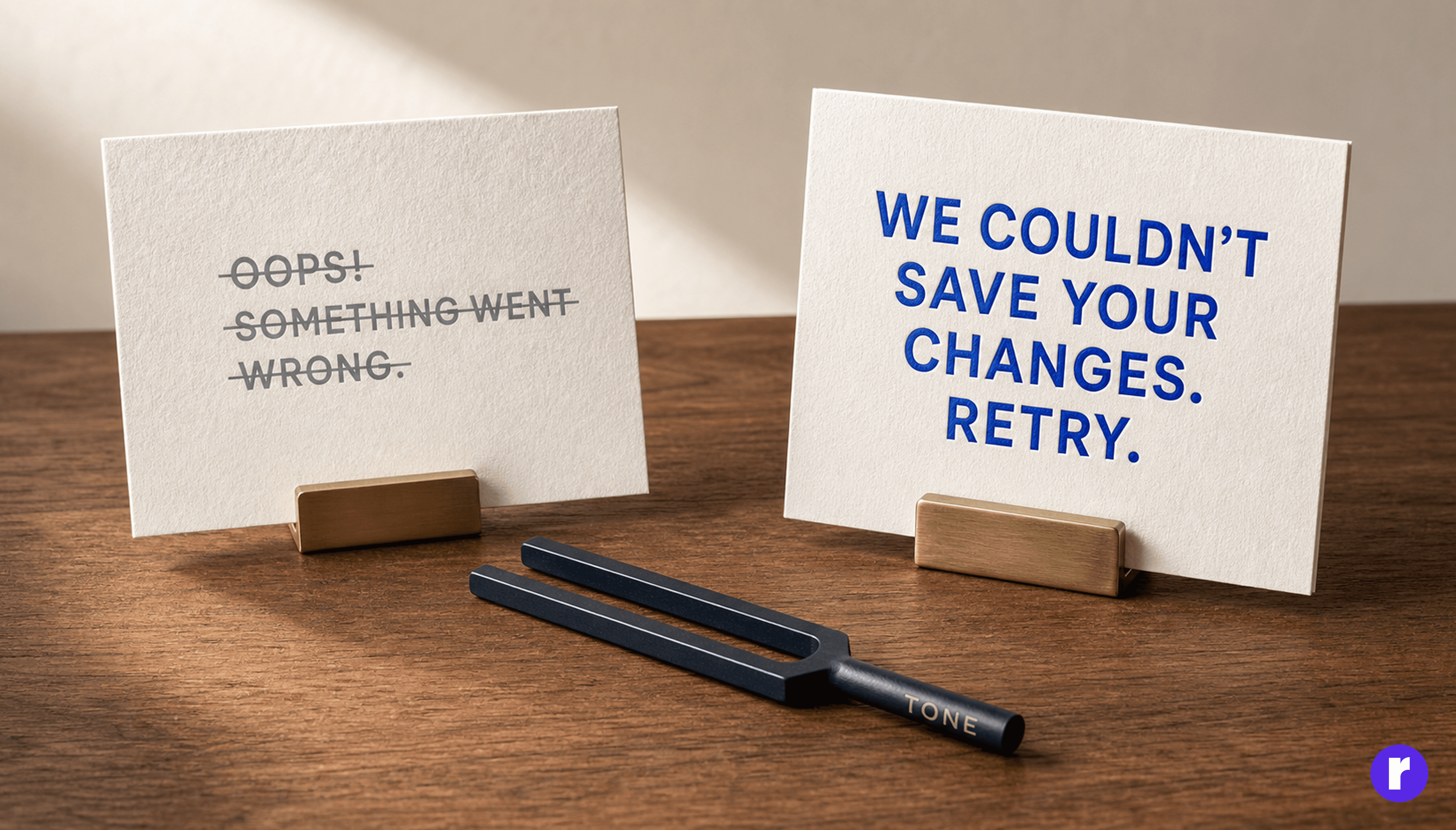
Users read your product far more than they look at it. Copy is the fastest-acting part of a brand identity and the cheapest to get right.
Give your voice rules concrete enough to enforce. Not "friendly and professional," which means nothing, but: we use contractions, we never say "oops," we name the problem before the fix, we don't apologise twice. Then show the pairs.
- Weak: "Oops! Something went wrong. Please try again later."
- Stronger: "We couldn't save your changes. Your connection dropped. Retry, and we'll keep what you wrote."
Accessible or it isn't finished
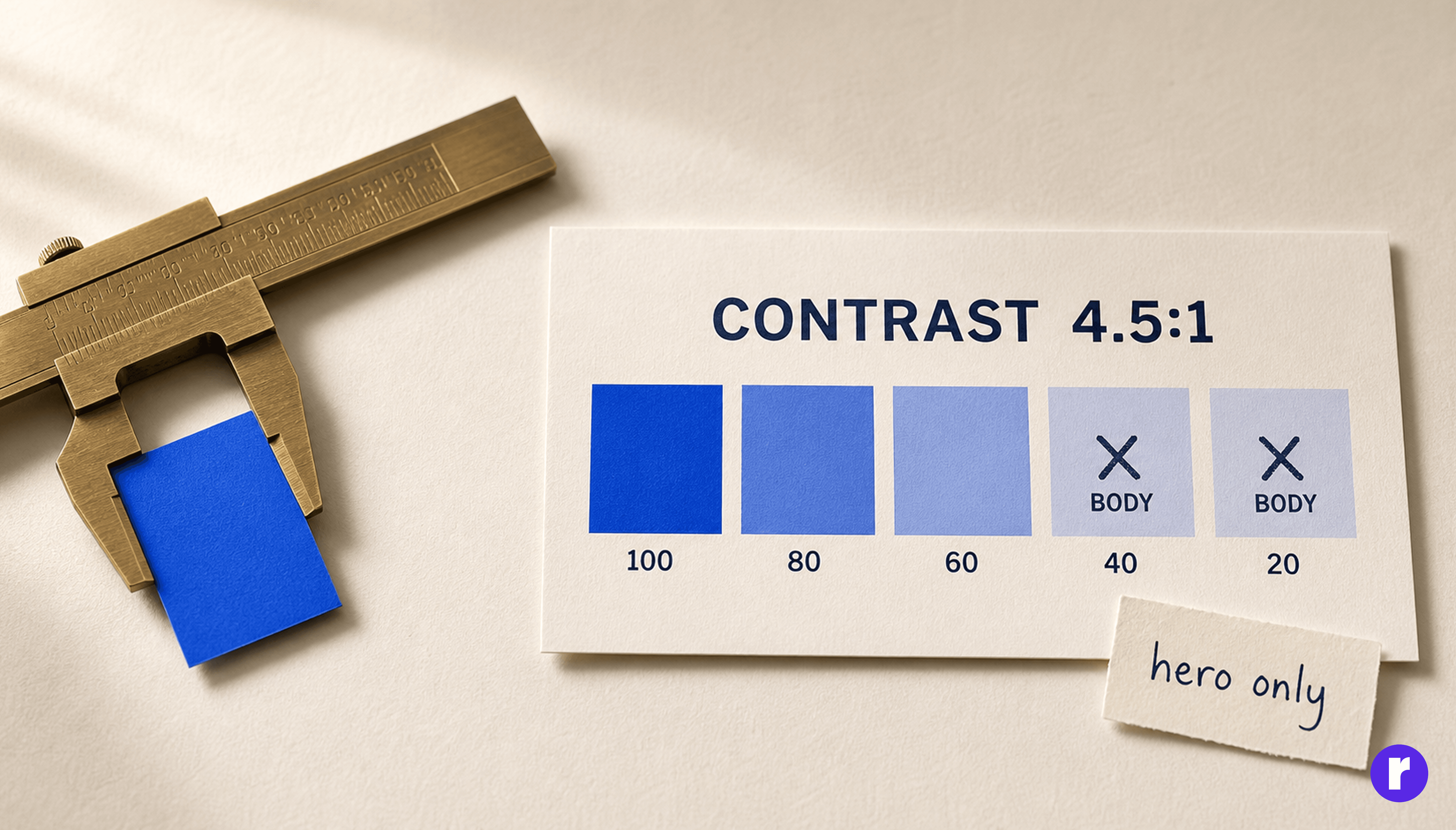
A palette that fails contrast isn't a brand decision, it's a bug you'll be patching for years. Test contrast at the point you choose colours, not after.
The practical move: pick your brand colour for what it means, then generate a tint scale from it and mark which steps are legal on which surfaces. Your bright brand accent may look excellent in a hero and be unusable as body text. Decide that once, write it down, and nobody has to relitigate it under deadline pressure.
Document the reasoning behind each decision, not just the value. "Primary is #1B4DFF because it carries the confident side of the brand and it's the darkest tint that still passes 4.5:1 on our light surface" survives a team change. "#1B4DFF" gets overwritten by whoever's shipping late on a Friday.
Turn decisions into tokens while the reasoning is fresh
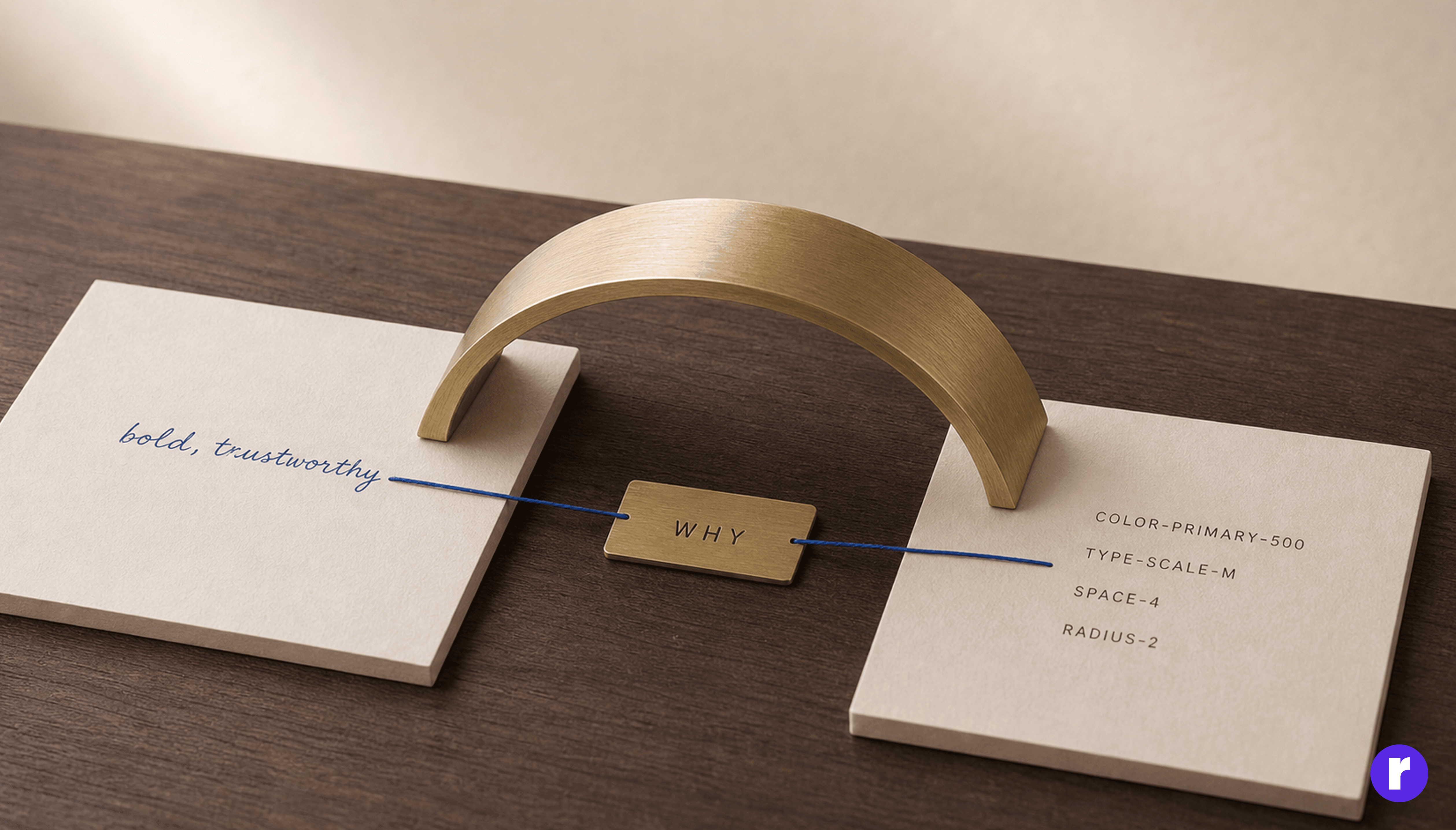
A brand identity that lives only in a Figma file will drift, guaranteed. The moment product decisions outpace the brand file, the real identity moves into code and nobody's watching it.
So convert as you go: colours, type, spacing, radii, and motion become named tokens shared by design and engineering. Version the brand file like code. When the brand changes, tokens change, and the product follows without an audit. If you want the full picture of how these two layers relate, we broke it down in Brand Identity vs. Design System: What's the Difference?.
How to test whether your identity is actually strong
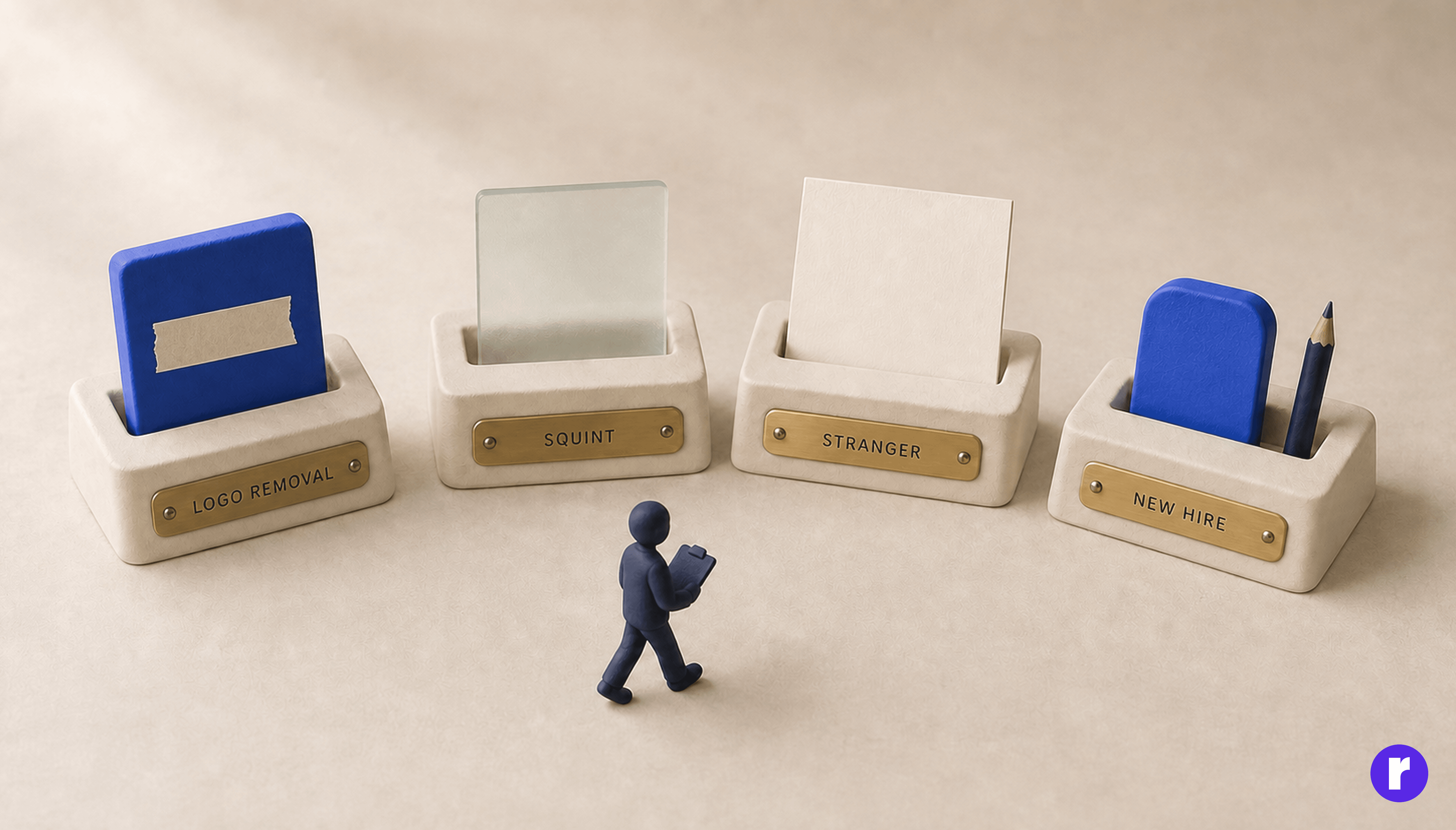
Four fast tests, none of which need a research budget:
- The logo-removal test: Cover the wordmark on a screenshot. Is it still recognisably yours?
- The squint test: Blur the screen. Does the hierarchy still read, and does the colour balance still feel like you?
- The stranger test: Show three screens to someone outside the team and ask what kind of company made this. If the adjectives they give don't match your three, the identity isn't landing.
- The new-hire test: Hand a designer who joined last week your documentation and one unbuilt screen. What they produce shows you exactly how strong your identity really is.
Conclusion
A strong brand identity for a digital product is a position, expressed consistently on every surface a user touches, and documented well enough that a stranger can extend it correctly.
Start with what you stand for and what you refuse to be. Build the small kit you'll actually use. Design the ugly moments in voice. Tokenise the decisions and write down why they were made. Do that and consistency stops being a policing problem, because the right choice becomes the easy one.
Most products don't need a rebrand. They need the decisions they've already made to be written down and applied everywhere.