Why “more features” can make a product worse

Written by

Sumit Verma
UI/UX Designer
Table of contents
Build with Radial Code
Share this


There's a quiet assumption baked into most product roadmaps: that adding is always safer than subtracting. A new button doesn't feel like it costs anything. A new setting seems like pure upside the people who want it get it, and everyone else can just ignore it. This logic feels so obviously true that most teams never question it. It's also wrong, and the way it's wrong explains a lot about why so many once-beloved products slowly become exhausting to use.
The feature is Never actually free
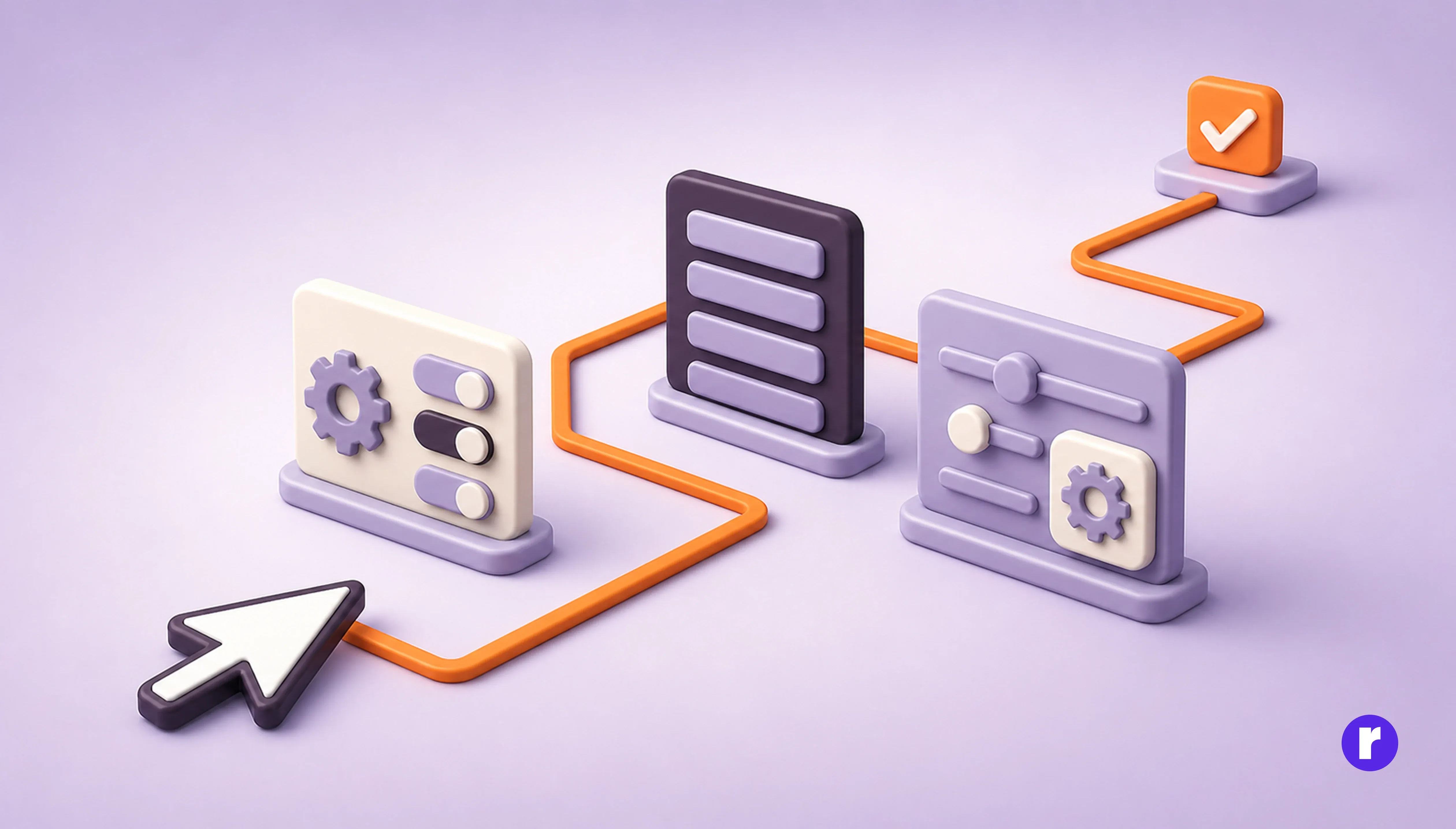
The cost of a feature isn't paid once, at launch. It's paid every single day, by every single user, in small increments that never show up on a roadmap.
Every feature you add has to live somewhere. It takes up a slot in a menu, a line in a settings page, a decision point in someone's workflow. Even if a person never touches it, they still have to see it, mentally file it as "not relevant to me," and move past it. Do that enough times across enough features, and using the product starts to feel like wading through underbrush instead of walking down a path.
This is sometimes called the "paradox of choice" in psychology, but in software it's more specific than that — it's not just choice overload, it's navigation overload. The user isn't just choosing between options; they're first trying to figure out where the option even is, and whether it applies to them.
Learn more about building better products at Radial Code Learn.
Complexity compounds, it doesn't add
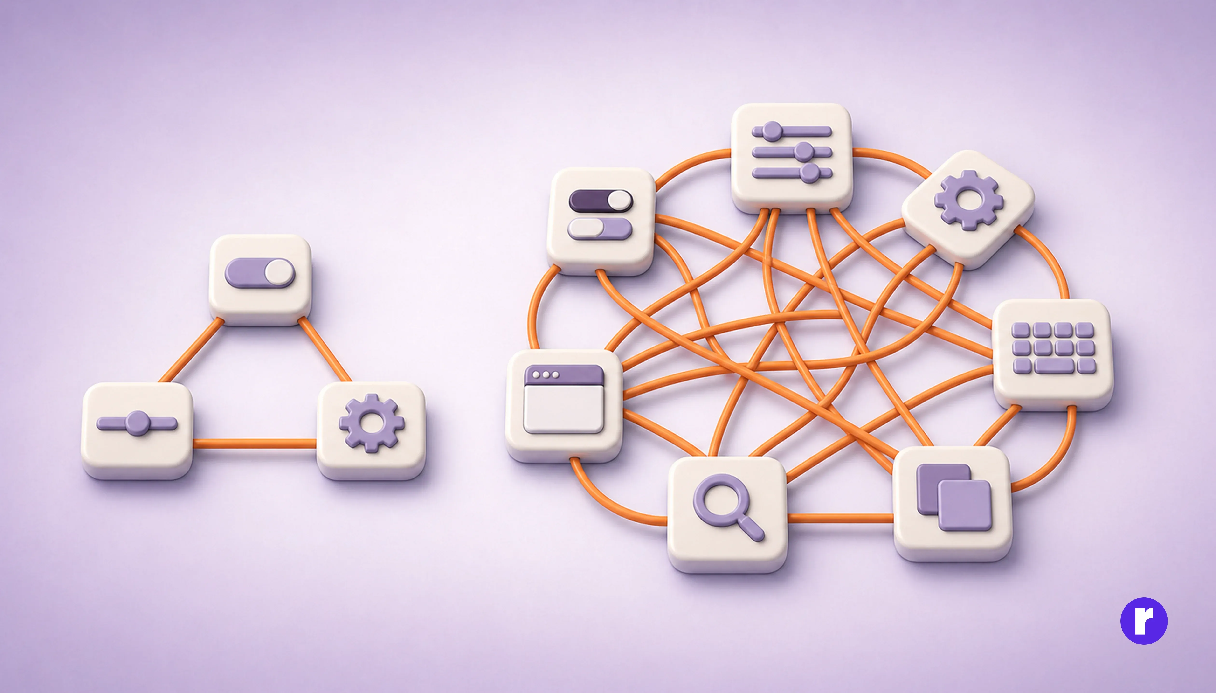
The mistake most teams make is thinking of feature cost as additive: feature A costs a little, feature B costs a little, so ten features cost ten littles. In practice, complexity multiplies, because features interact.
A setting that changes how another setting behaves. A power-user feature that alters the default keyboard shortcuts for everyone. A new panel that pushes the "important" panel one scroll further down. None of these show up in isolation — they show up in combination, and combinations grow far faster than the feature count does. Ten features don't create ten possible states; they create up to a thousand.
This is why products that were once famous for simplicity — a search box, a text field, a single clear action — often become the products people complain about most once they've been around long enough to accumulate five years of "just one more thing." Nobody added the tenth feature thinking it would break the product. But nobody was accounting for how it would interact with the other nine.
Features compete for the same scarce resource: attention
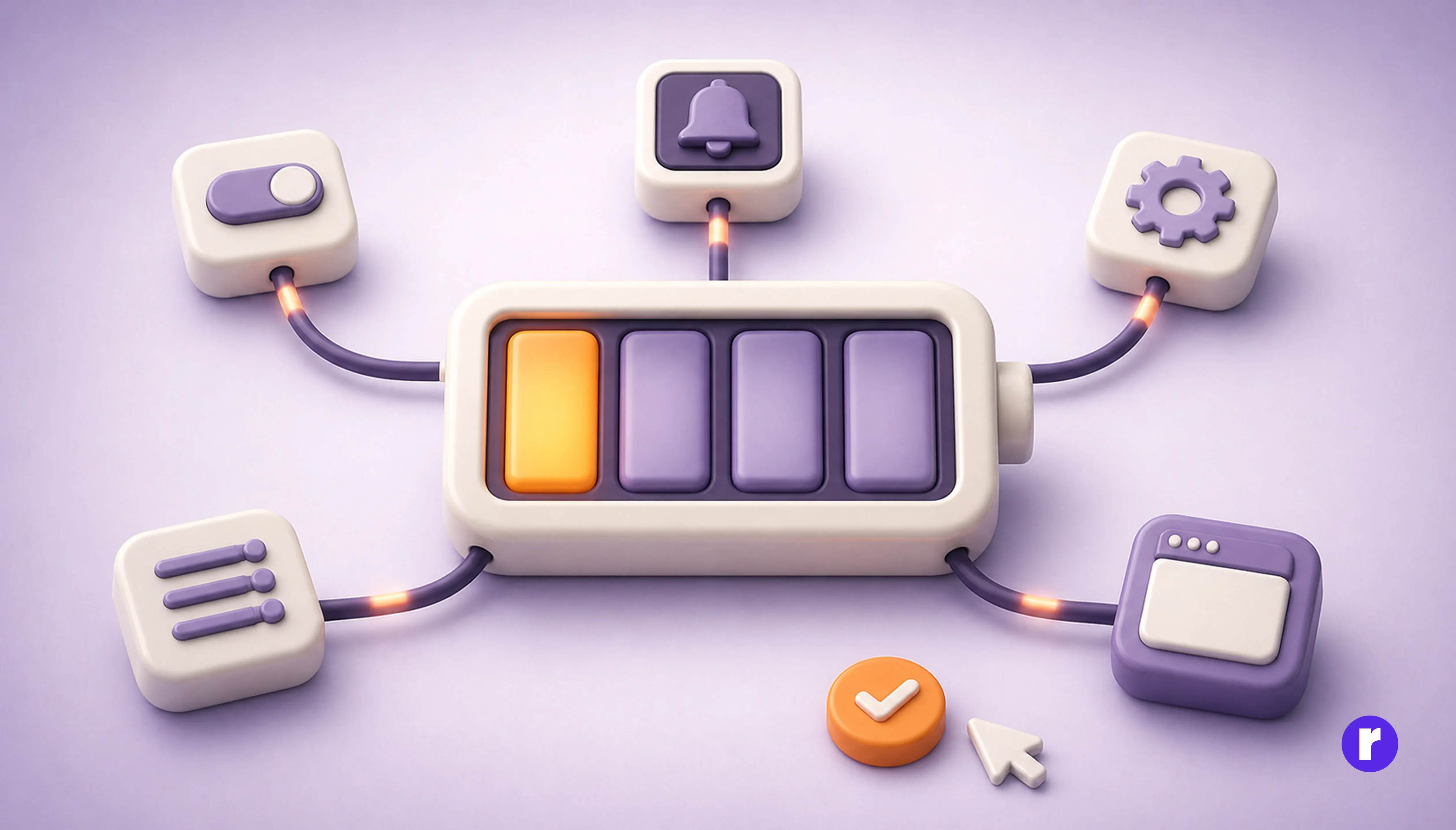
Here's the part that's easy to miss: features don't just compete with each other for screen space. They compete for the user's cognitive budget — the small, finite amount of mental energy someone is willing to spend figuring out how to do something before they give up or get annoyed.
A product with one clear job spends that budget efficiently. A product with twenty jobs, all visible at once, spends the user's attention on orientation instead of on the task they actually came to do. The user has to work just to find the part of the product that matters to them right now — and that work is invisible to the team that built it , because the team already knows where everything is.
This is the trap: the people best equipped to judge whether a product feels overwhelming — the people who built it — are precisely the people who can no longer perceive the overwhelm. Familiarity erases friction from view.
The feature adds value, but subtracts trust
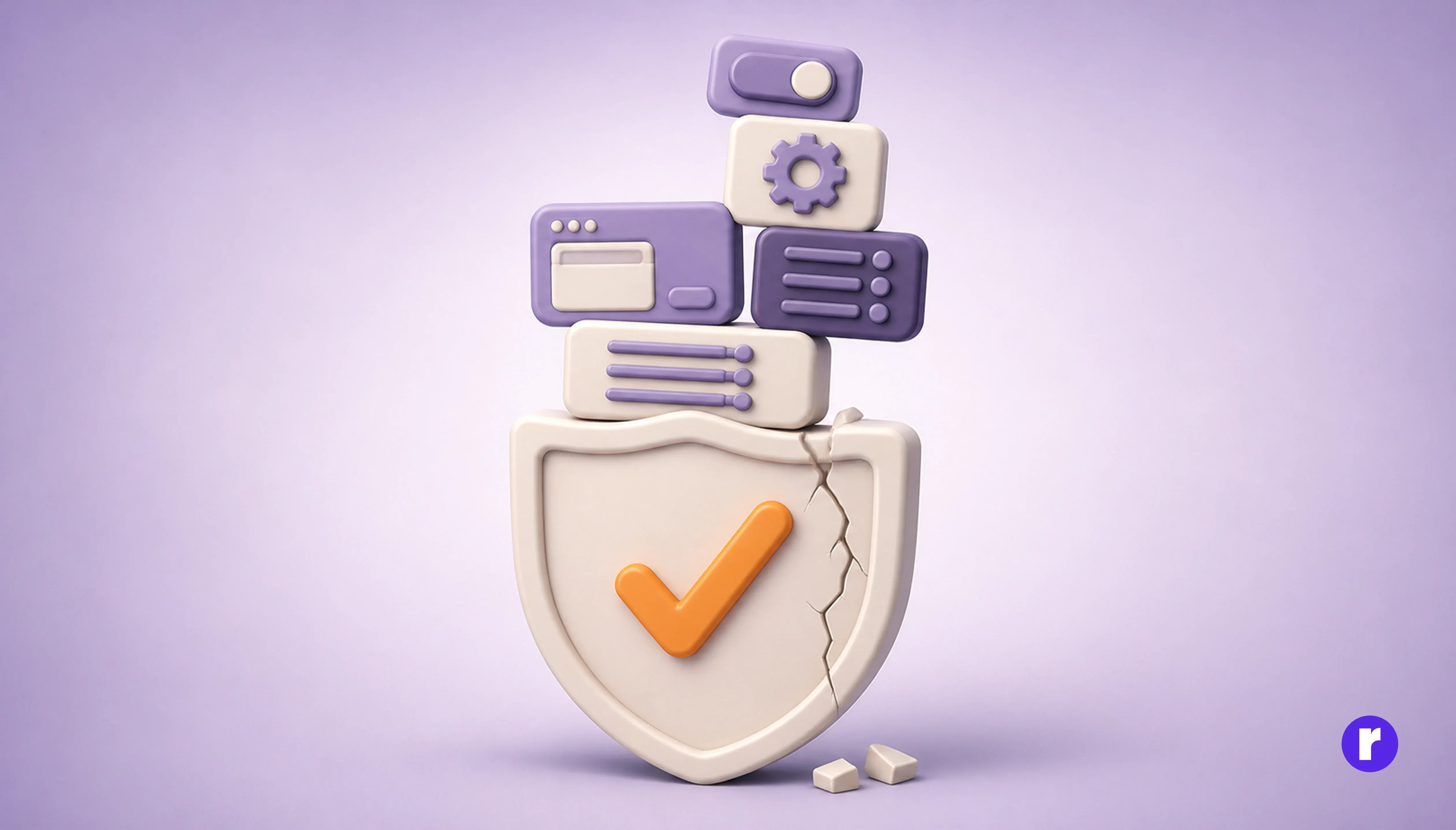
There's a subtler cost: every feature that doesn't quite work, or seems to duplicate something else, chips away at the user's trust in the product's judgment.
Compare a product with three sharp tools to one with thirty tools where a third feel half-finished. The thirty-tool product might be more capable on paper. But it starts to feel like something the team itself doesn't fully understand — and if they can't hold it in their head, why should the user trust that any corner of it was thought through?
Simplicity isn't just about ease of use. It's a signal. A product that does a few things extremely well tells the user that someone cared enough to say no. A product that tries to do everything tells the user nobody was willing to make that call.
Why this happens anyway
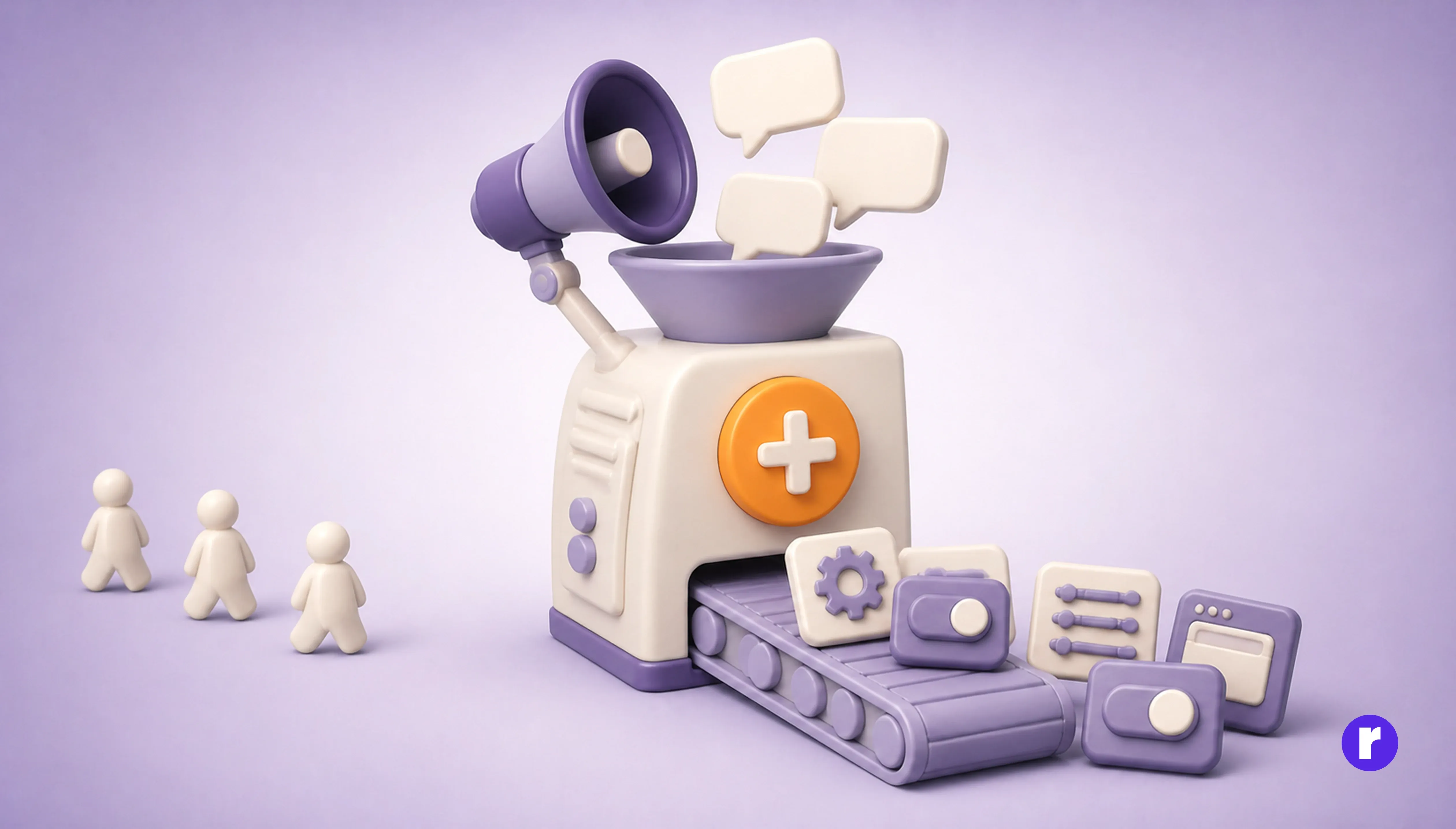
If the costs are real, why do teams keep adding? A few reasons, and they're mostly organizational rather than technical:
- Saying yes is easier than saying no: Rejecting a feature request means having an uncomfortable conversation, possibly with a customer, a salesperson, or an executive. Approving it just requires putting it in a sprint.
- Features are countable; simplicity isn't: It's easy to put "12 new features shipped this quarter" in a report. It's much harder to put "we made the product feel calmer" in a report, even though the second thing might matter more.
- Loss aversion runs backwards for builders: Removing a feature that ten people use feels like an obvious loss — you can picture the complaints. The diffuse cost of that feature slowing down the other ten thousand users is invisible by comparison, because no single one of them will ever write in to complain about a paper cut they don't consciously notice.
- Feature requests are loud; the absence of confusion is silent: The users who are frustrated by clutter rarely file a ticket that says "please remove things." They just quietly find your product a bit more tiring to use, and some fraction of them eventually leave without explanation.
What restraint actually looks like
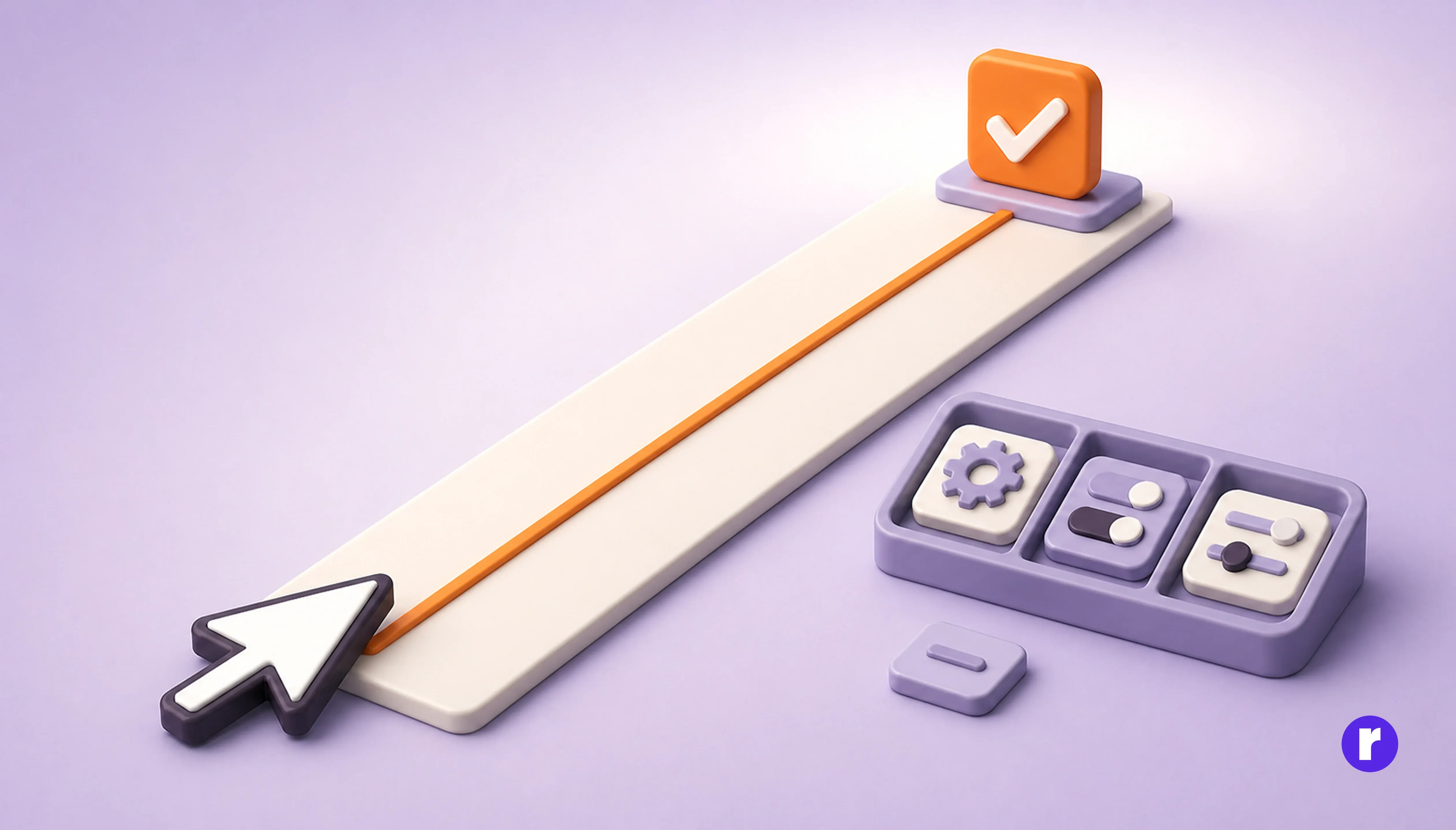
None of this is an argument that products should never grow. It's an argument that growth has to be judged against removal, not treated as automatically free.
Some things that separate teams who manage this well:
- They ask what a feature costs everyone, not just what it gives to the people who requested it.
- They treat "no" as a legitimate answer, not a failure to be helpful.
- They periodically audit and remove features that stopped earning their keep, the same way they'd refactor code that stopped earning its keep.
- They protect a small number of core flows fiercely, and are willing to push new ideas into optional, out-of-the-way corners rather than the main path.
The products people describe as "just working" are almost never the ones with the most capabilities. They're the ones where someone was disciplined enough to keep saying no, long after it stopped being the easy answer. More features can make a product more powerful. But power and quality are not the same thing — and mistaking one for the other is exactly how good products quietly become worse.
Conclusion
The instinct to keep adding comes from a good place — wanting to serve more people, solve more problems, say yes more often. But a product isn't just the sum of what it can do; it's also the experience of finding your way through it. Every feature added without subtraction makes that experience a little heavier, even when each individual addition looks harmless in isolation.
The teams that build products people love for years, not just months, tend to share one trait: they treat simplicity as a feature in its own right, one that has to be actively defended rather than something that survives on its own. Growth is not the enemy. Growth without discipline is. If there's one habit worth adopting from this, it's simple to state and hard to practice: before asking what a new feature will add, ask what it will cost everyone who never asked for it.
Want to go deeper? Check out View Here