Colors That Speak Without Words

Written by

Sumit Verma
UI/UX Designer
Table of contents
Build with Radial Code
Share this
Have you ever noticed how colors can make you feel something even before you say or read a single word? That’s because colors have their own language — a silent one that speaks directly to our hearts and minds. From the clothes we wear to the websites we design, colors tell stories, express emotions, and influence how people react. Let’s explore how colors communicate without using a single word.
Yellow – The Color of Happiness
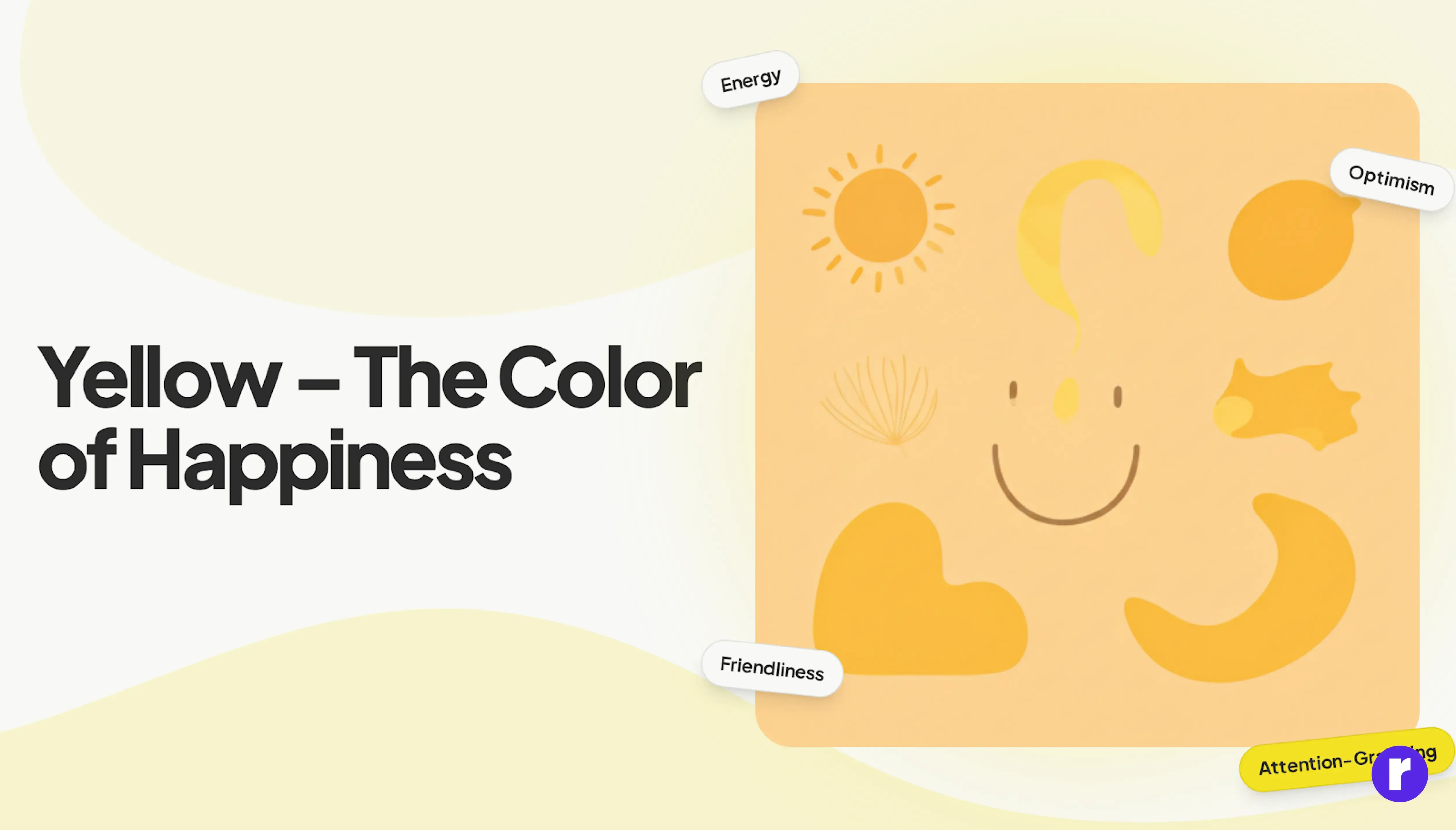
Yellow is often called the color of sunshine. It brings warmth, happiness, and positivity wherever it appears. It’s bright, energetic, and full of life — which makes people feel cheerful and motivated. When used in design, yellow catches attention quickly and adds friendliness to the overall look. But too much yellow can feel overwhelming or harsh on the eyes, so it’s best used in highlights or accents.
Best for: Creative, playful, and optimistic brands that want to spread happiness and warmth.
Red – The Color of Passion, Power, and Excitement
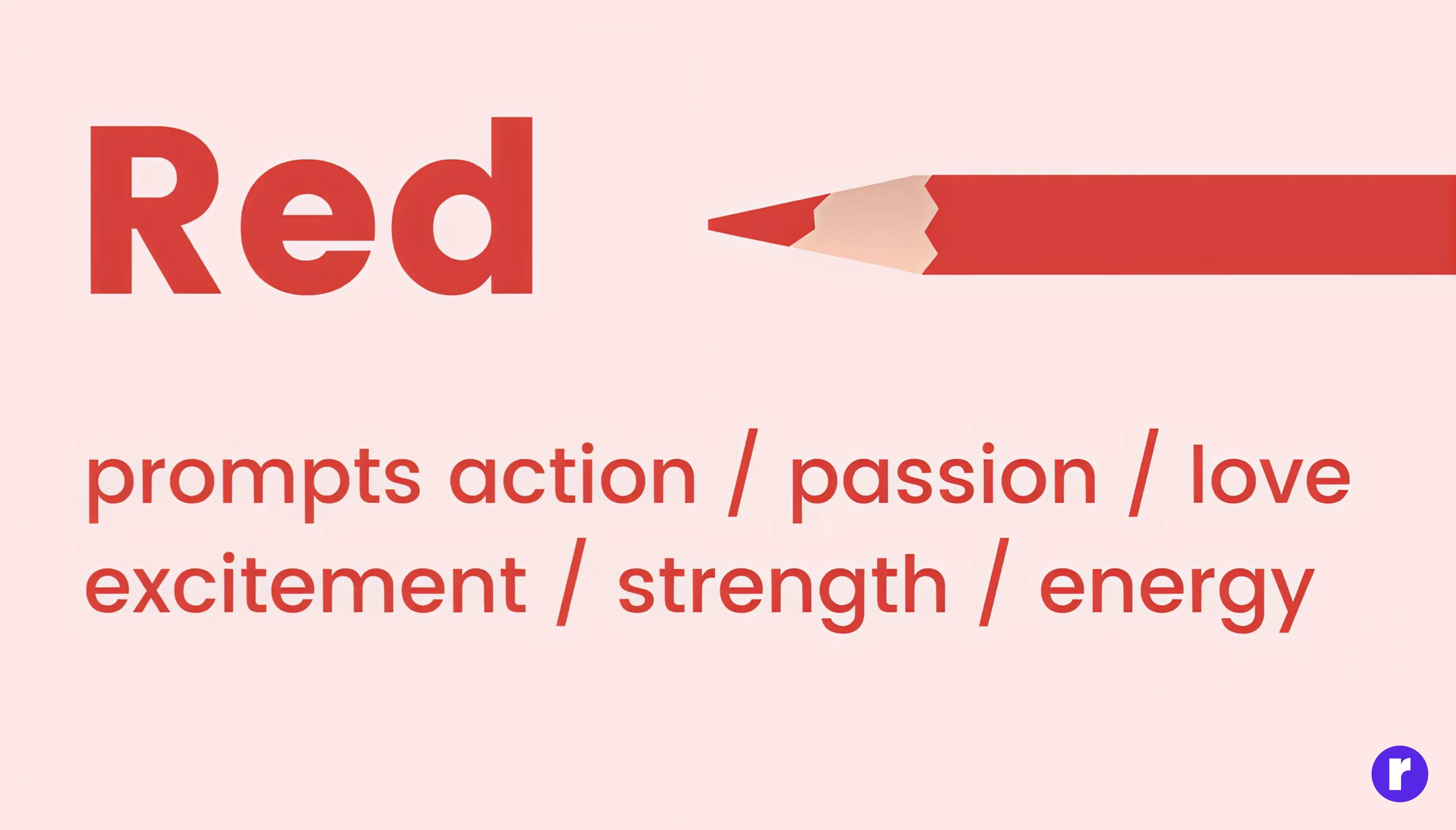
Red is the color that speaks the loudest. It’s full of passion, love, and energy. It makes your heart beat faster and instantly grabs attention. That’s why it’s used in places where quick decisions are made — like
Buy Now buttons or sale signs.Red also shows confidence, power, and importance. It can make a design feel strong and emotional, but too much red can also feel aggressive or stressful.
Best for: Brands that want to look bold, exciting, or energetic — like entertainment, food, or sports companies.
Blue – The Color of Trust, Calmness, and Stability
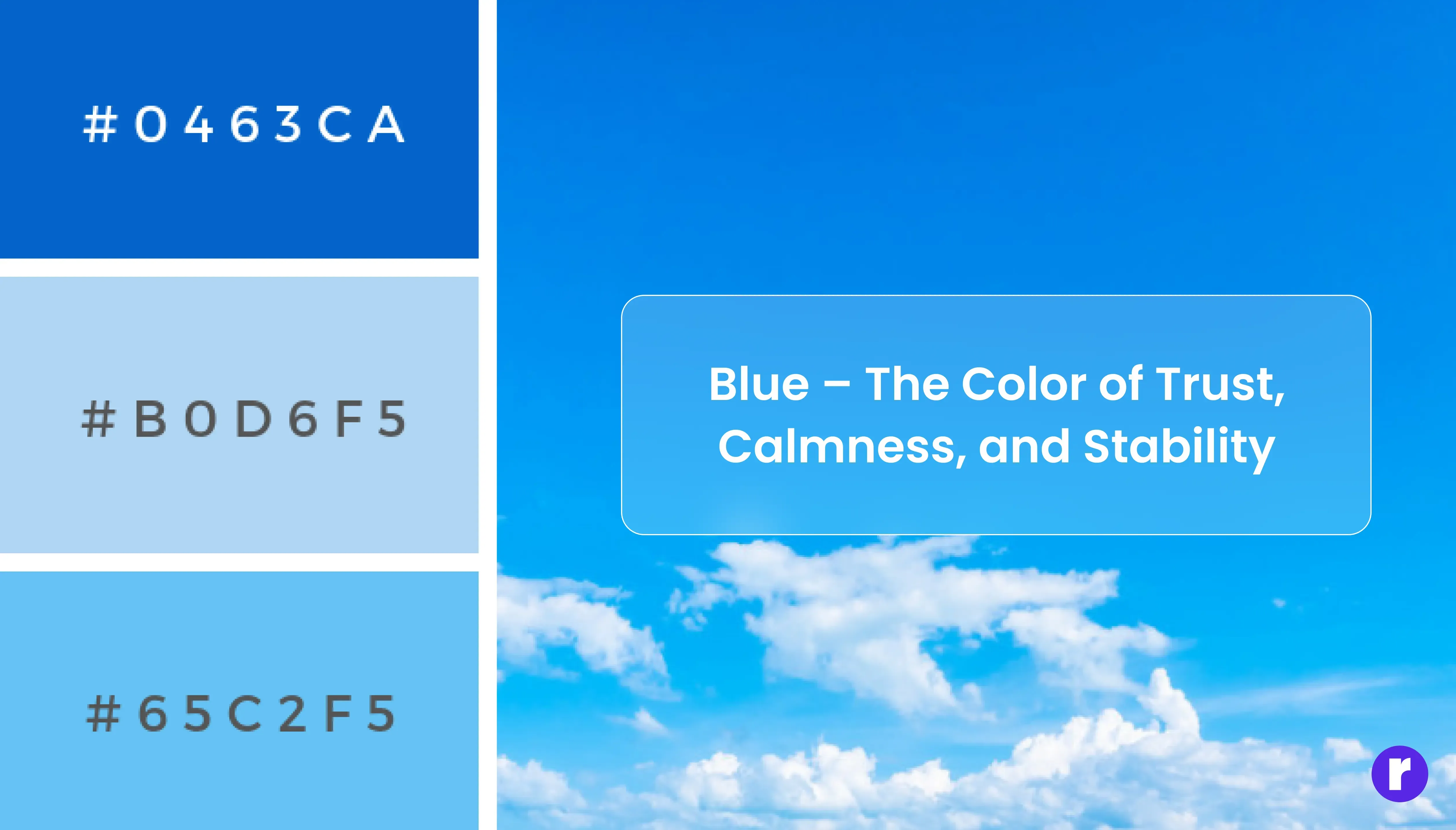
Blue reminds us of the sky and the ocean — calm, peaceful, and trustworthy. It helps people feel safe and relaxed, which is why it’s one of the most popular colors in design. Lighter shades of blue feel refreshing and friendly, while darker shades feel more serious and professional. Blue is often used by banks, tech companies, and healthcare brands to build trust and show reliability.
Best for: Businesses that want to create a sense of trust, honesty, and professionalism.
Green – The Color of Nature, Growth, and Balance
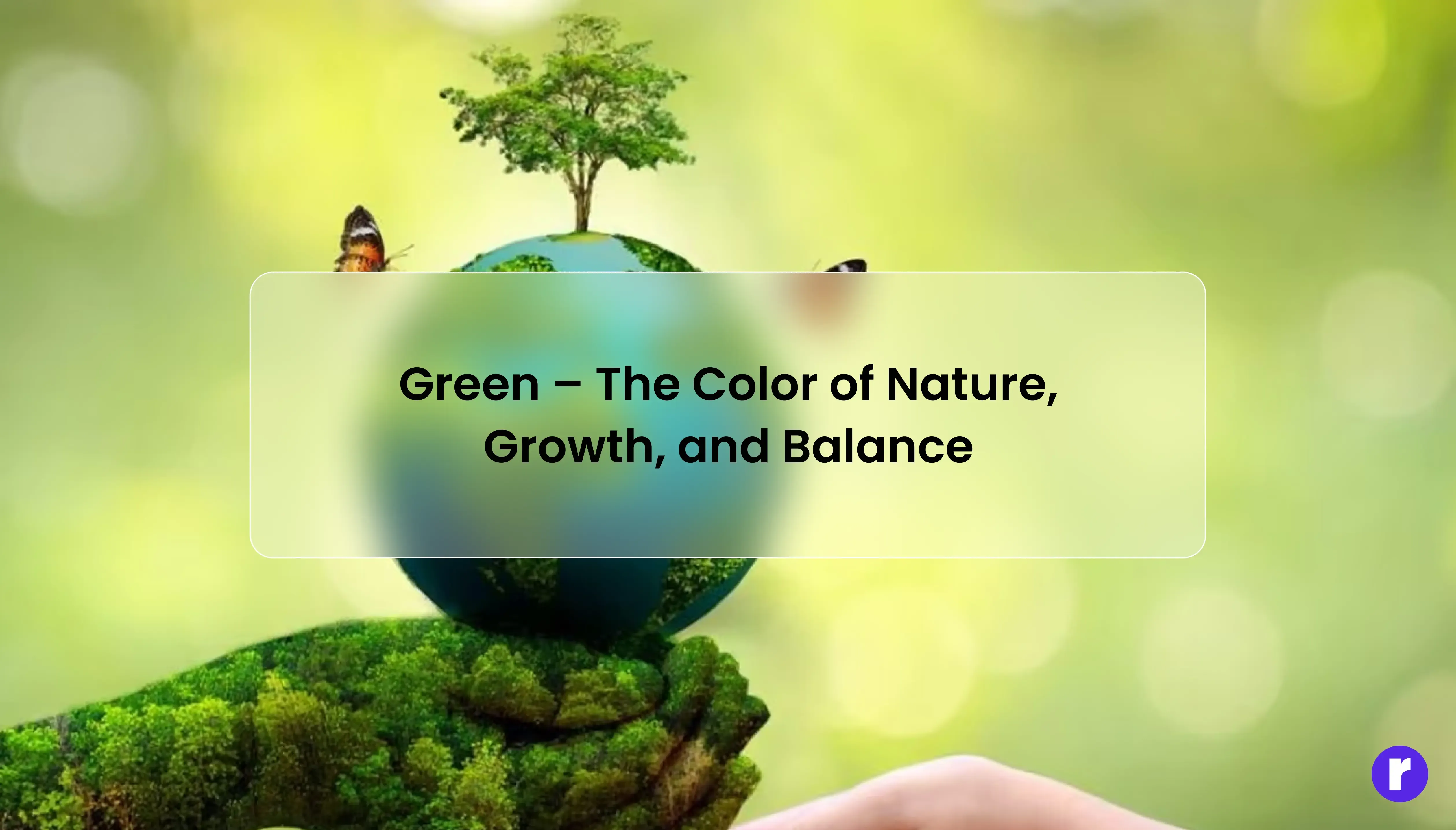
Green is the color of life. It represents nature, health, and growth. When people see green, they think of freshness, renewal, and balance. It has a calming effect and is often used to show that something is eco-friendly, organic, or healthy. Light green feels refreshing and natural, while dark green feels stable and strong.
Best for: Eco-friendly, health-related, or nature-inspired brands.
"Continue exploring design decisions that shape behavior at Radial code
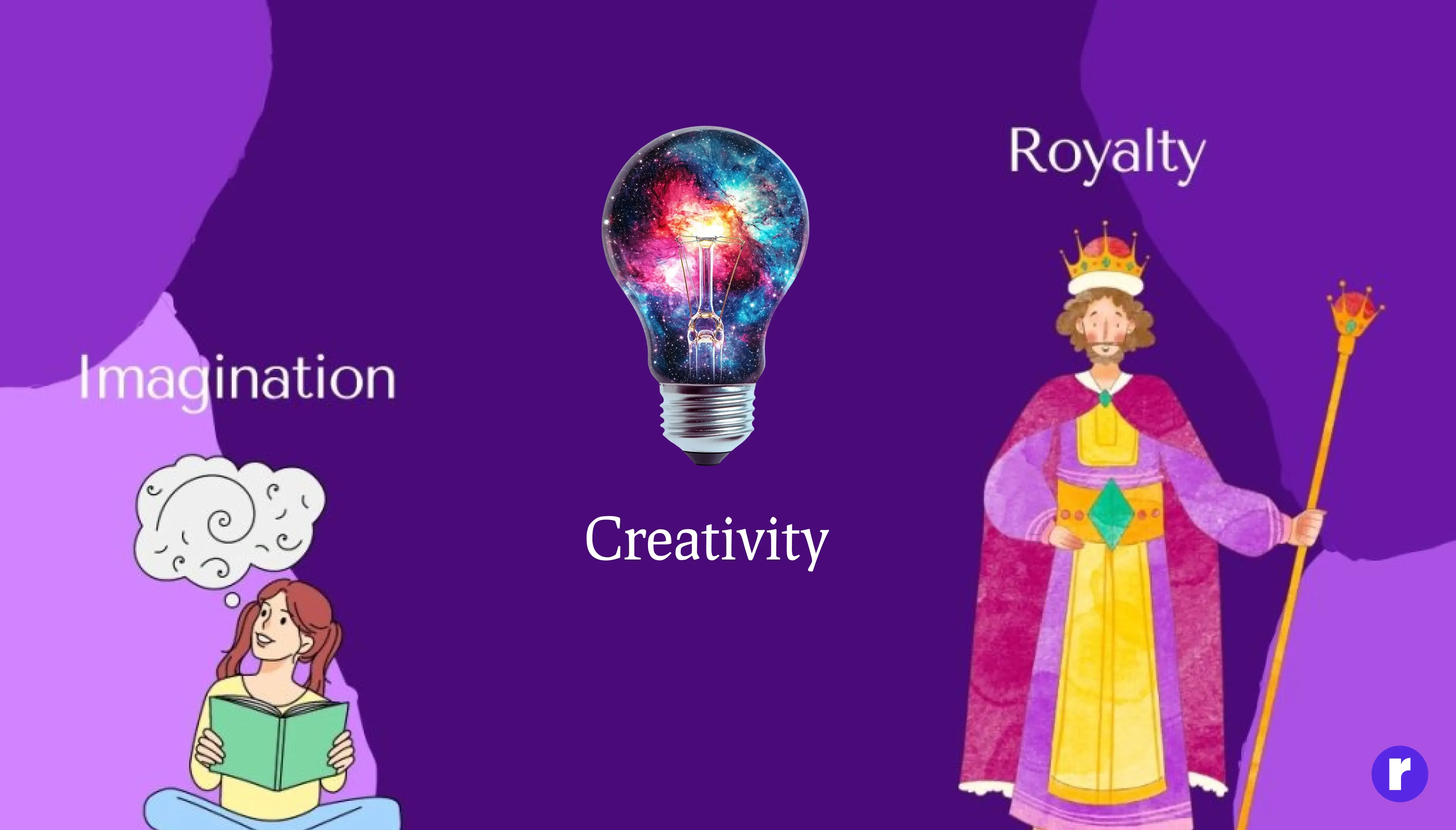
Purple – The Color of Creativity, Royalty, and Imagination
Purple is made by mixing blue and red, so it carries both calmness and energy. In ''UI design, understanding colors psychology'' is important because every color communicates a feeling, and purple is a great example of that. It’s often linked with luxury, magic, and wisdom. In history, purple dye was very rare — so only kings and queens could afford it, which is why it still represents royalty and quality today. Purple can also show creativity and imagination, making it perfect for artistic or unique brands, especially when a design needs to feel premium yet expressive.
Best for: Luxury brands, artistic companies, or creative projects that want to stand out.
Black – The Color of Elegance, Power, and Mystery
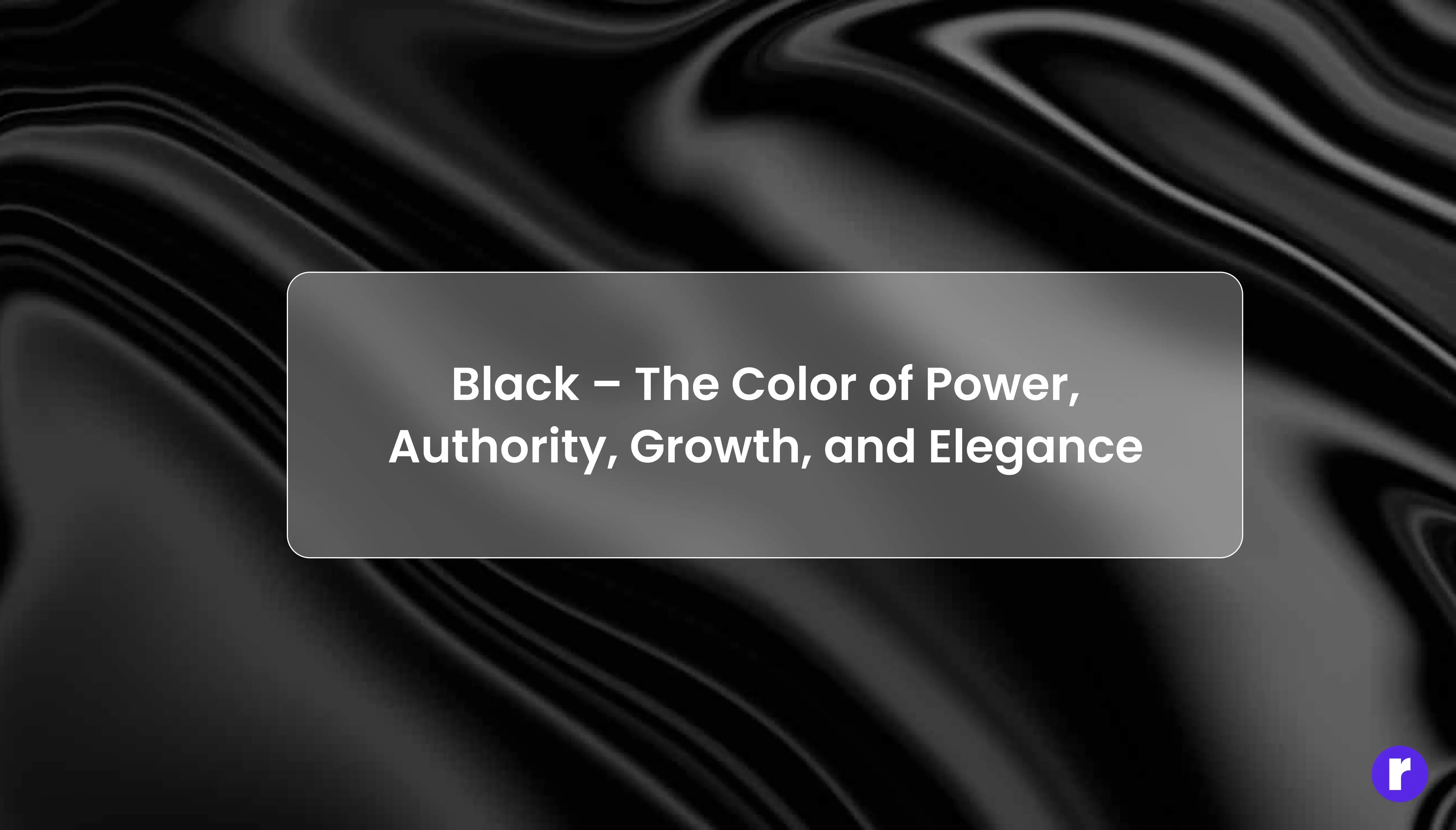
Black is powerful, classy, and timeless. It adds a sense of depth, mystery, and confidence. It can represent strength and authority, but also elegance and simplicity — depending on how it’s used. Many luxury brands choose black because it looks premium and modern. In web design, black backgrounds can make colors and visuals pop beautifully.
Best for: Luxury, technology, or fashion brands that want a strong and bold image.
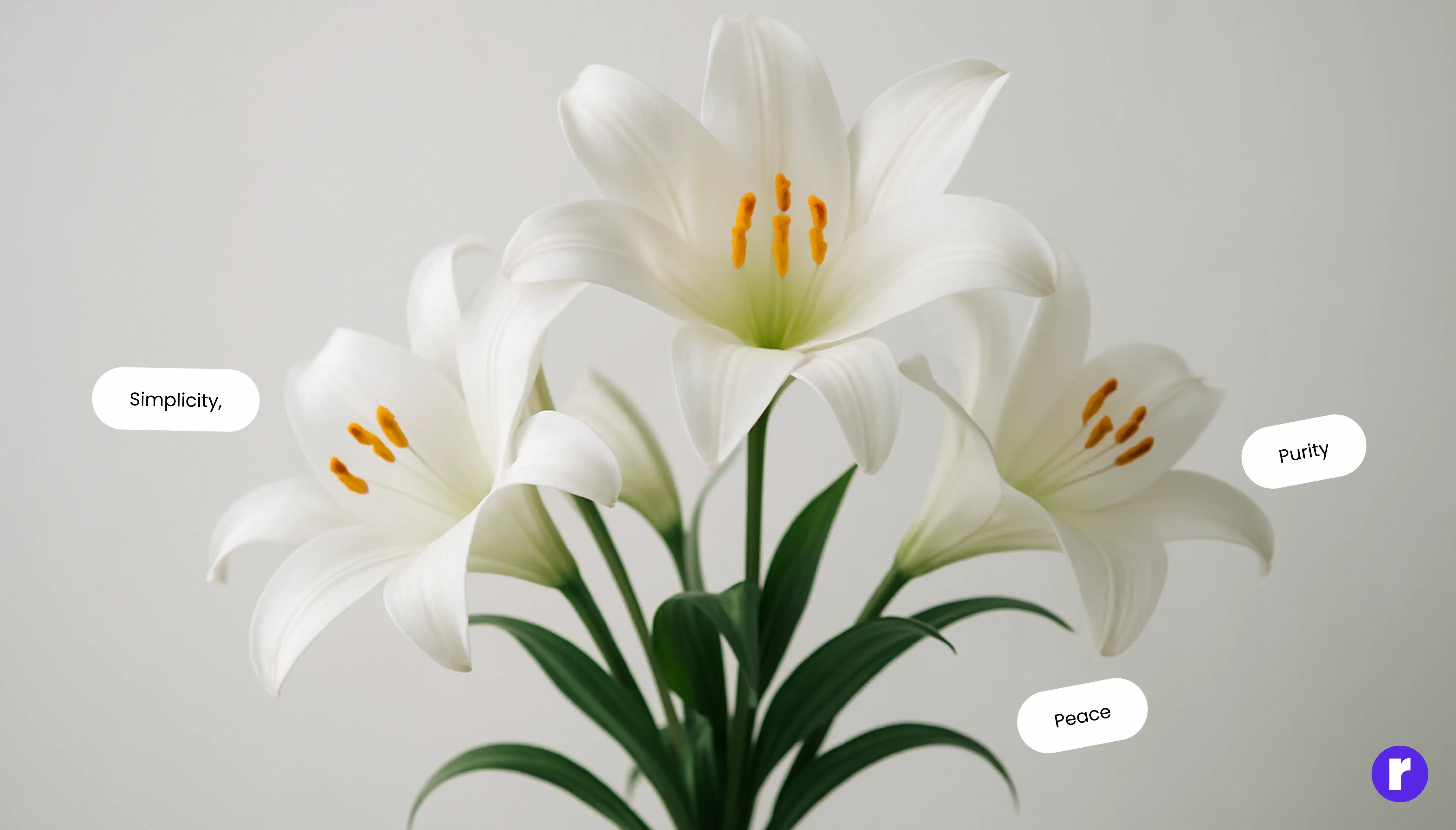
White – The Color of Simplicity, Purity, and Peace
Orange combines the power of red and the happiness of yellow. It’s lively, adventurous, and full of confidence. It makes people feel energetic and excited — without being too aggressive. It’s perfect for brands that want to look friendly, modern, and creative.
Best for: Creative companies, food brands, and entertainment businesses that want a cheerful, energetic look.
Want to Explore other Blogs ? Radial code blog
How Colors Affect Us Every Day
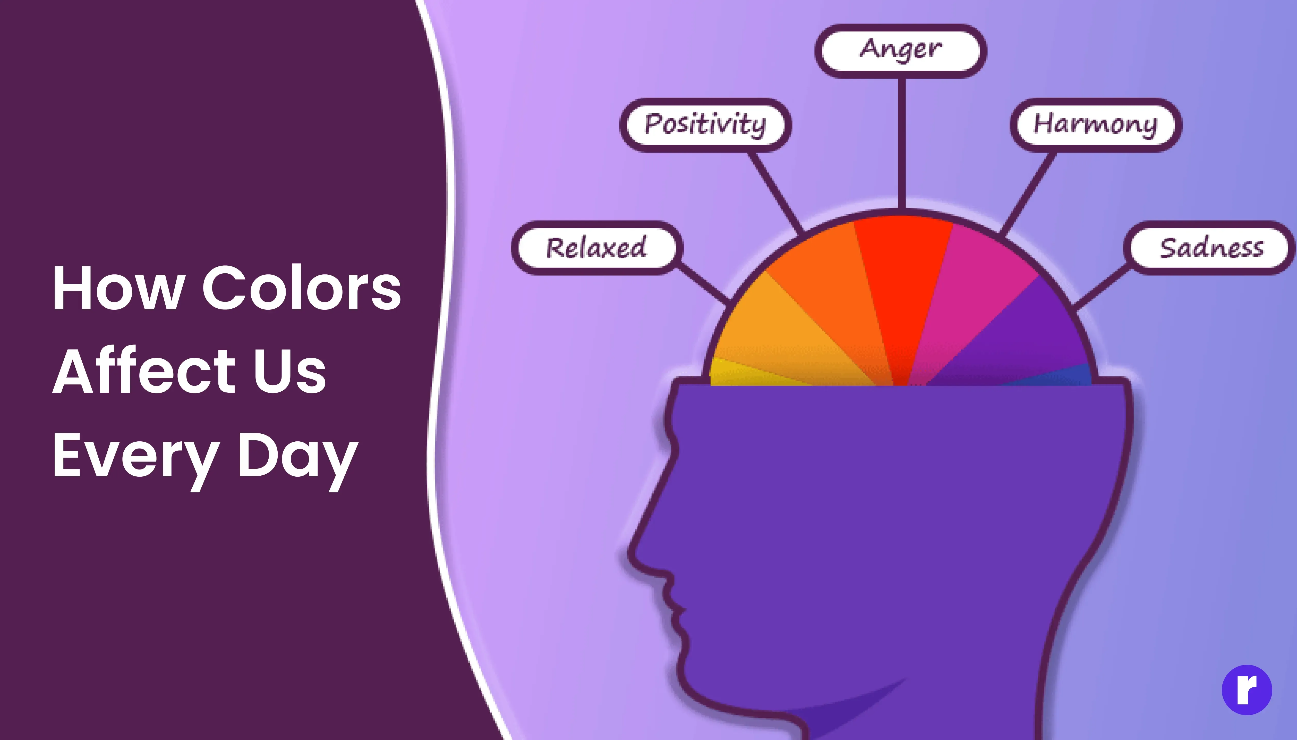
Colors influence us all the time — in what we wear, where we shop, and even how we feel in a room. That’s why understanding color psychology is so powerful for designers. Warm colors like red, orange, and yellow feel welcoming and energetic. Cool colors like blue, green, and purple feel relaxing and calming. Neutral colors like black, white, and gray bring balance and focus. When you use the right combination, your design speaks directly to people’s emotions — even before they read a word.
Final Conclusion
Colors truly are a powerful way of communication — they speak to our emotions, guide our decisions, and shape how we see the world. Whether it’s the calm of blue, the energy of red, or the warmth of yellow, each color carries its own message without needing a single word. From brands using colors to express trust or excitement, to designers choosing palettes that tell a story, colors connect with people on a deeper, emotional level. They help us feel before we even think — and that’s what makes them magical.