UI Color Schemes That Work: Simple Rules for 2026

Written by

Vishal Baloda
UI/UX Designer
Table of contents
Build with Radial Code
Share this
In 2026, color is no longer a decorative choice — it is a functional layer of the user experience. It helps users understand hierarchy, make decisions faster, and navigate interfaces with less effort. When used well, color reduces thinking, not adds to it. As interfaces become cleaner and more minimal, color does more of the heavy lifting. It guides attention, signals meaning, and supports usability across devices, modes, and environments. The best color systems don’t demand attention — they quietly make everything feel easier.
A strong color system often goes unnoticed. Until it’s missing.
Build a Balanced System, Not a Bigger Palette
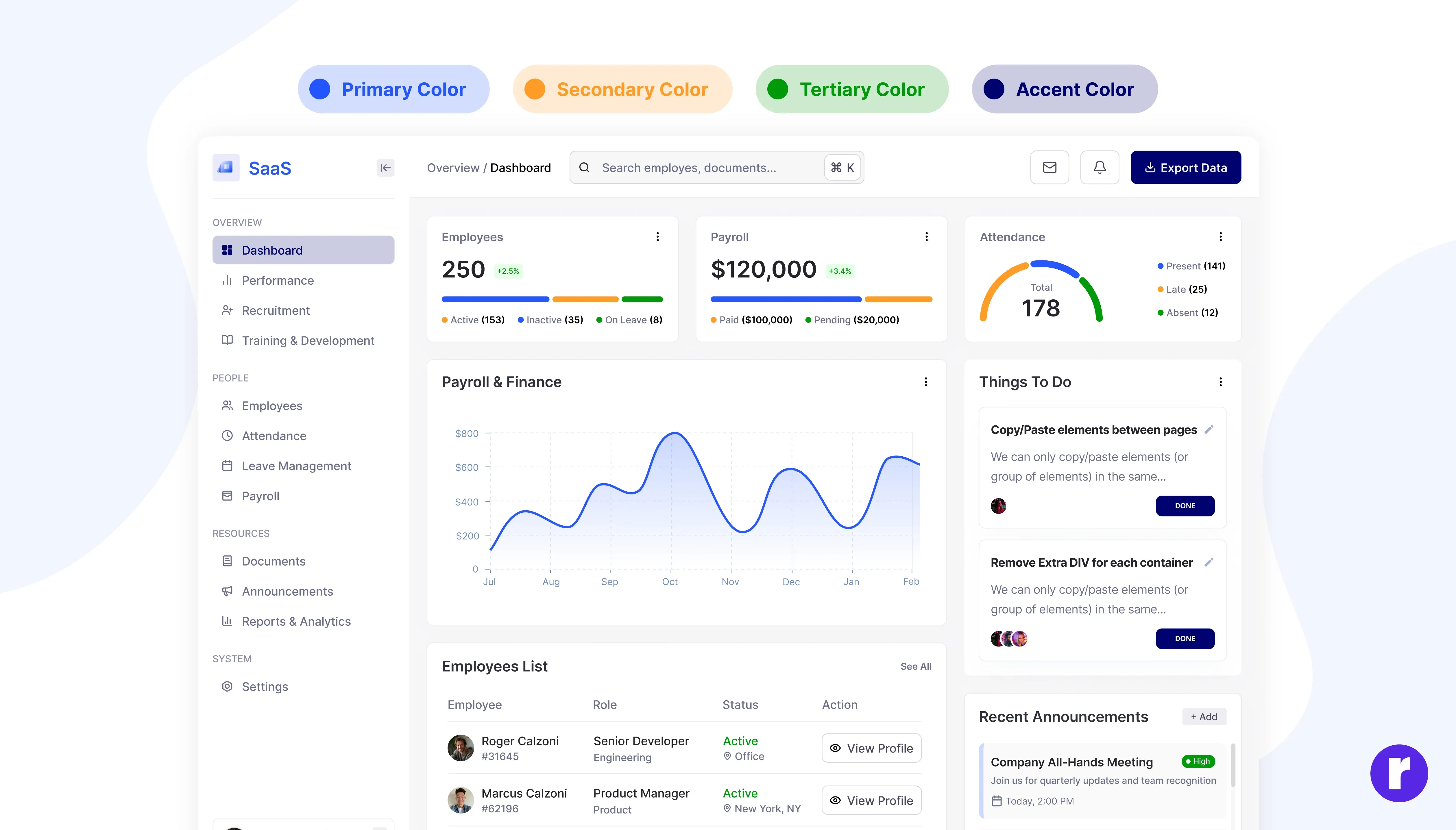
Most UI issues don’t come from too few colors — they come from too many without a system. In 2026, effective interfaces rely on limited, repeatable color logic that scales across screens and use cases.
A practical structure many product teams follow today looks like this:
- Primary brand colors for identity and consistency
- One action-focused accent for key interactions
- Neutral tones for backgrounds, surfaces, and text
- Highlight colors for secondary emphasis
- Muted shades for dividers, borders, and subtle states
Example: Modern SaaS dashboards like project management or CRM tools use one dominant brand color, a single accent for “Create” or “Save” actions, and neutral greys for layouts. This keeps interfaces predictable even as features scale.
Choose Soft Contrast Over Loud Saturation
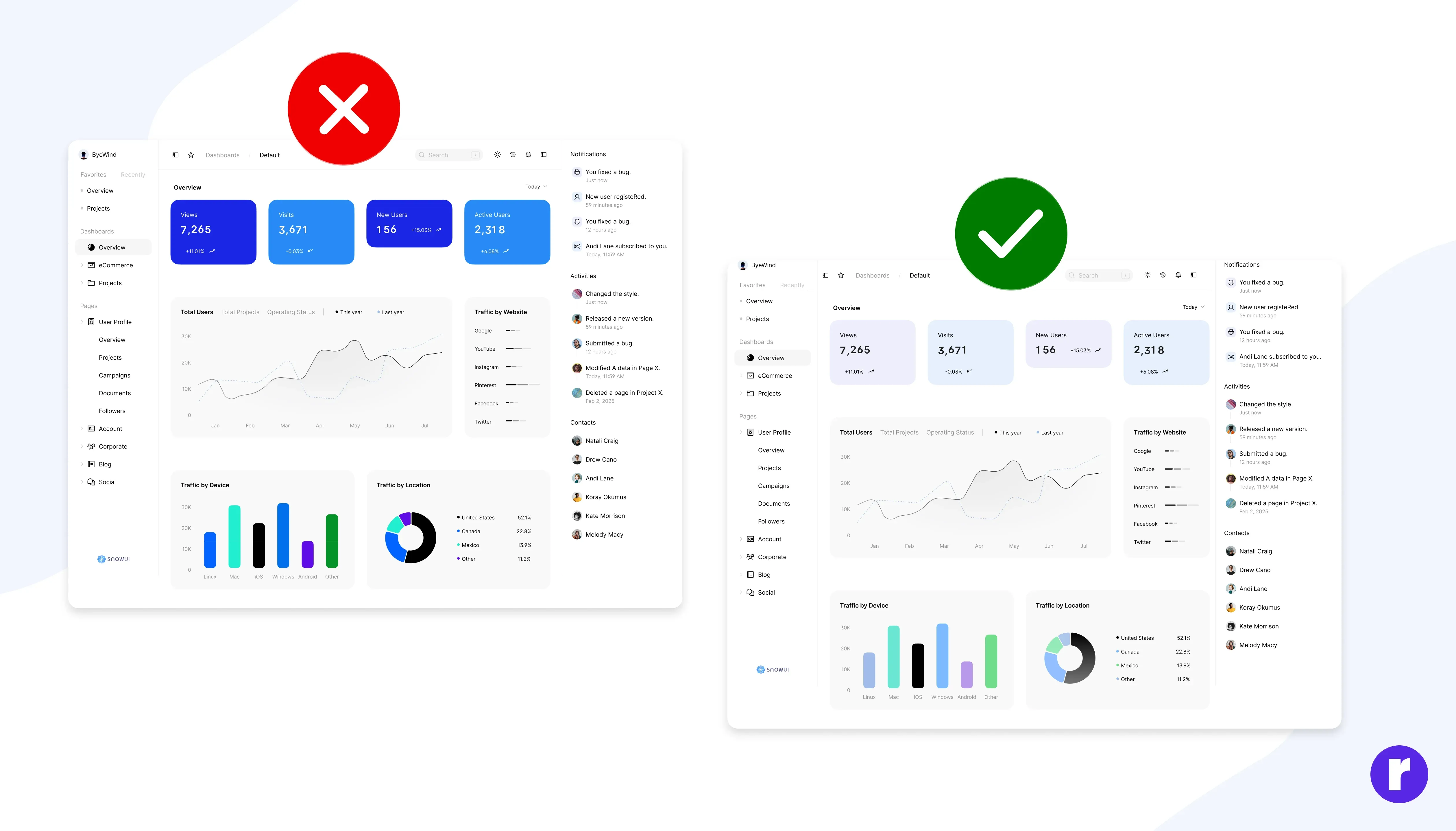
Visual trends in 2026 clearly favor calm, breathable interfaces over loud, high-saturation designs. This shift isn’t aesthetic alone — it’s driven by how long users now spend inside digital products. Softer hues and controlled contrast reduce eye strain during extended usage. They allow content and data to stand out without competing visual noise.
Example: Financial tracking and productivity apps now avoid bright reds and neon greens for charts. Instead, they use softened tones that remain readable during long review sessions without causing fatigue.
Design Light Mode and Dark Mode as Equals
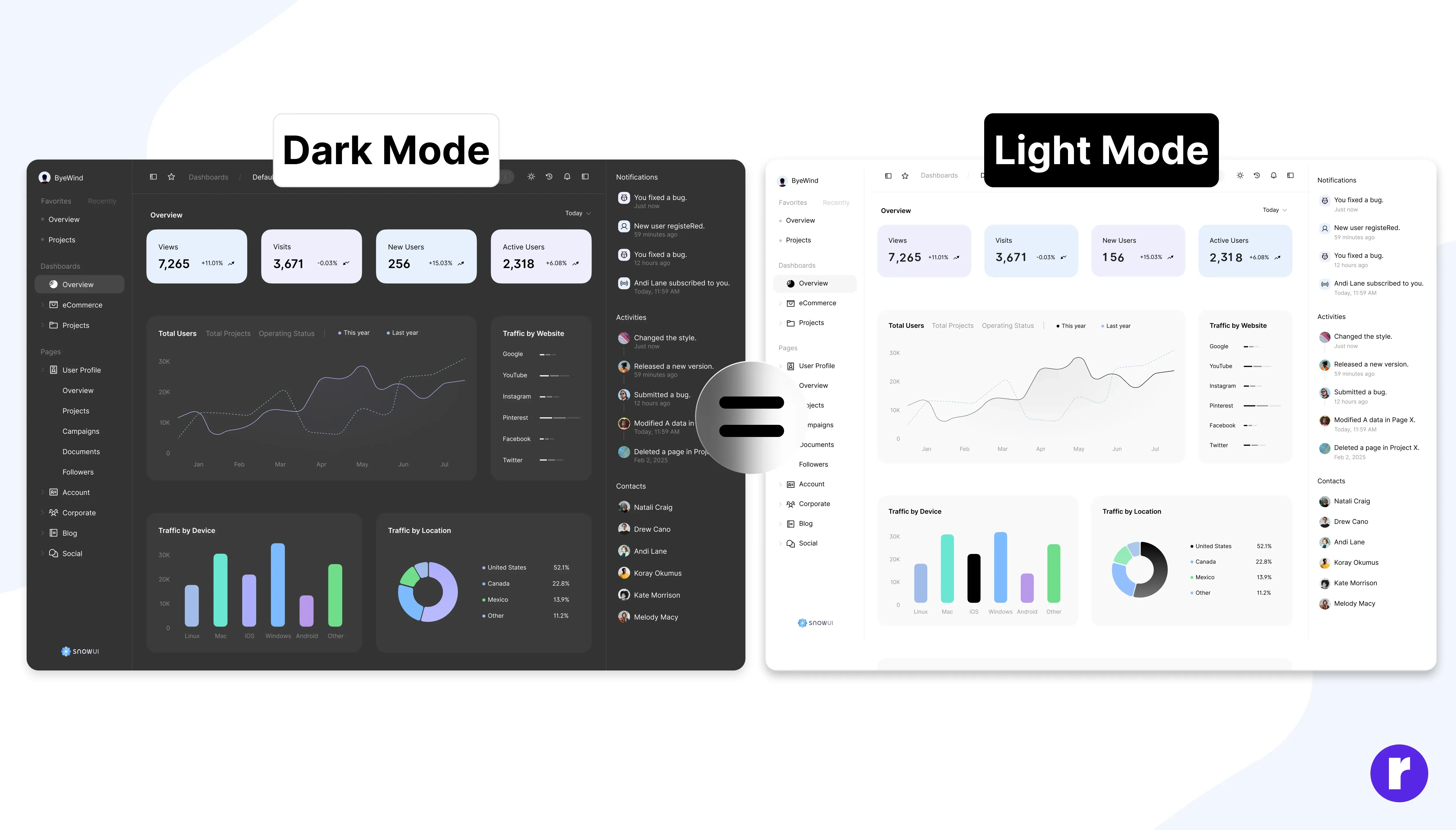
Dark mode is no longer a secondary feature — users actively choose modes based on environment, comfort, and battery use. In 2026, successful products treat light and dark modes as parallel experiences, not adaptations. Instead of pure black or white, modern interfaces use refined neutrals such as graphite, ink, mist, or warm ivory.
Example: Reading, finance, and analytics platforms now use dark charcoal backgrounds instead of black, paired with muted accent colors to maintain contrast without glare during night usage.
Let Meaning, Not Preference, Drive Color Choices
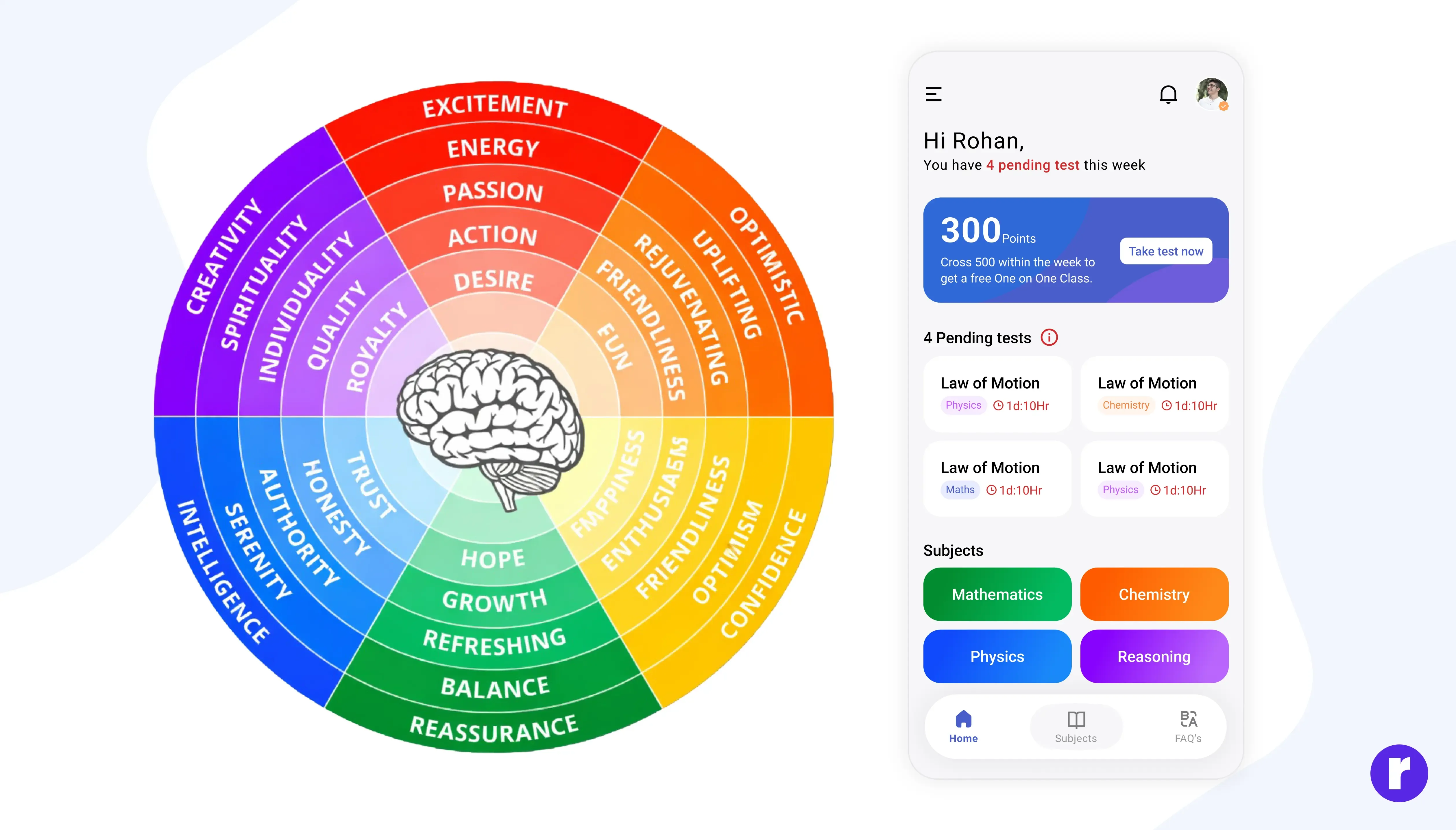
Experienced designers don’t choose colors arbitrarily. They rely on semantic patterns users already understand, reducing the need for explanation.
- Blue supports trust and calm decision-making
- Green communicates success and progress
- Orange draws attention without urgency
- Red signals errors and critical states
- Purple highlights premium or exclusive features
Example: In a budgeting app, green confirms savings goals, red flags overspending, blue anchors primary navigation, orange highlights warnings, and purple marks paid features — allowing users to understand status instantly. Read More
Test Color in Reality, Not Just Design Tools
Test Color in Reality, Not Just Design Tools. Screens differ in brightness, saturation, and temperature. Testing across real devices reveals issues that mockups hide.
Example: A pastel UI may look balanced on a MacBook but appear washed out on mid-range Android devices. Teams that test across devices adjust contrast early, avoiding accessibility issues post-launch.
Conclusion
In 2026, effective UI color is subtle, intentional, and grounded in real usage. Designers use color to guide attention, reduce cognitive load, and support accessibility — not to decorate screens. When color systems are structured, tested in real conditions, and supported by real examples, interfaces feel calm, modern, and trustworthy. Users don’t notice the colors — they notice how easy everything feels. That’s when color is working.
Remember: Color is not just seen; it is felt — that’s why it matters.
Discover who we are and what we do — explore us. Visit Here