Understanding Flat and Bento-Box Layouts

Written by

Vishal Baloda
UI/UX Designer
Table of contents
Build with Radial Code
Share this
Website layout is important because it decides how users see and understand content. A good layout helps users move easily through a website and find information without confusion. Earlier, designers mostly used flat layouts because they were simple and easy to use. But as websites started having more content and features, designers needed better ways to organize information. This is where bento-box layouts became useful. Flat and bento-box layouts are now widely used, and each one works best for different needs. Understanding these layouts helps designers choose the right structure and create clear, user-friendly designs.
What Is Flat and Bento layout
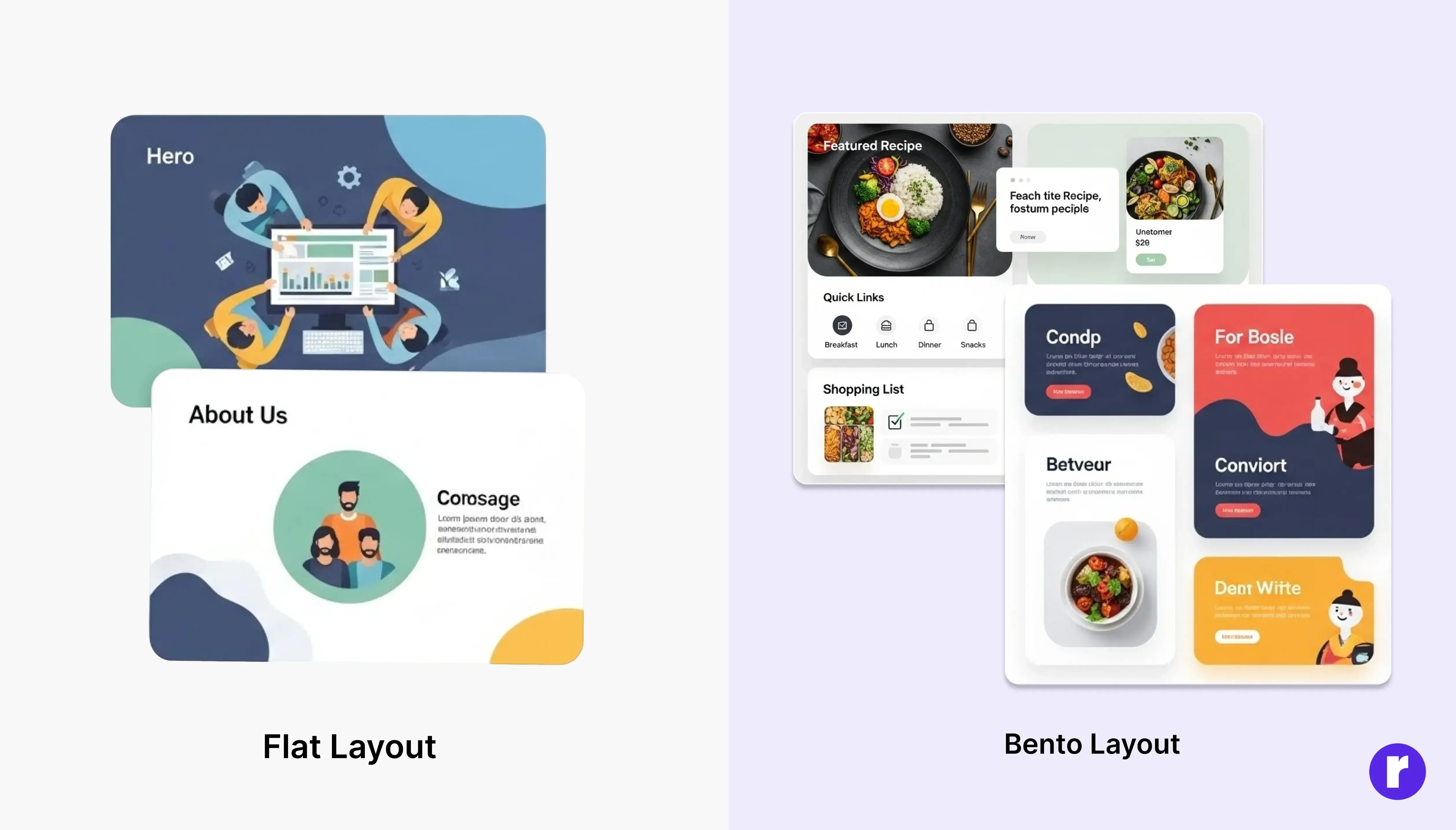
Flat Layout
A Flat Layout is a simple design style where content is arranged in a straight, clean flow — usually one section after another. It does not use shadows, gradients, or 3D effects. The goal is to keep everything clear, easy to read, and beginner-friendly. Flat layouts work well when the website has less content and the main focus is on simplicity and quick understanding.
Bento Layout
A bento-box layout is a design style where content is divided into separate boxes or cards, similar to food sections in a Japanese bento lunch box. Each box shows different information, and important content is usually made larger. This layout helps users quickly scan the page, find what they need faster, and view multiple types of content in an organized and modern way.
About Bento-Box Layout?
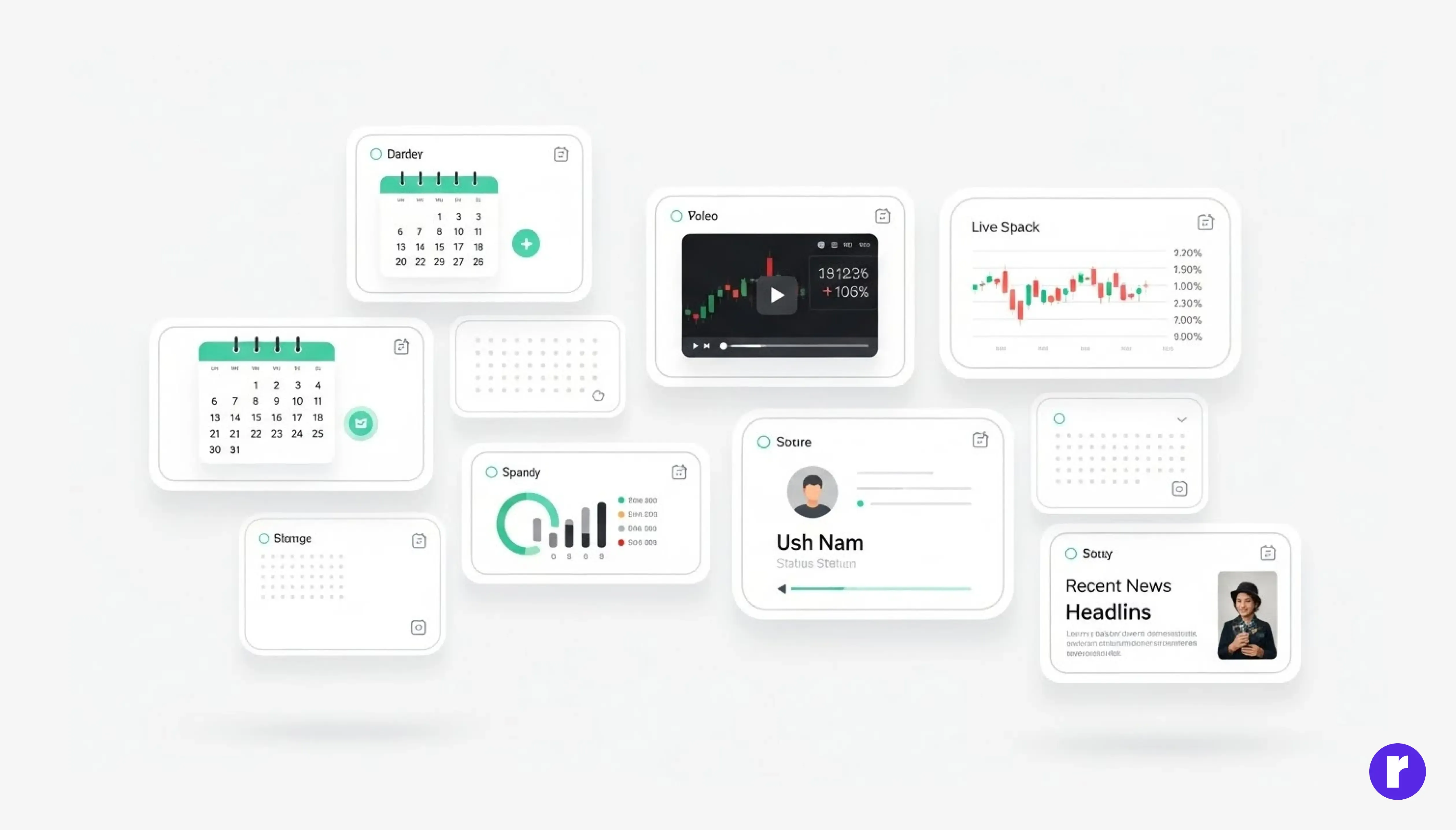
The bento-box layout in UI/UX design is inspired by the traditional Japanese bento lunch box, which has been used for centuries to neatly organize different foods into small compartments. While the bento box itself originated in Japan around the 12th–13th century, the bento-style layout in digital design became popular much later, especially in the 2010s, when companies began searching for clean ways to display multiple types of information on one screen. There is no single “founder” of the bento-box layout in design, because it evolved naturally as designers borrowed the organized compartment idea from Japanese culture. The layout gained widespread attention when Apple used a bento-style grid in their iOS design, and later when platforms like Notion, Gumroad, and modern portfolios started using card-based blocks to show content clearly. Today, the bento-box layout is valued for its visual clarity, modern look, and ability to highlight important content, making it popular for dashboards, landing pages, personal websites, and product showcases.
Benefits of Bento Grid
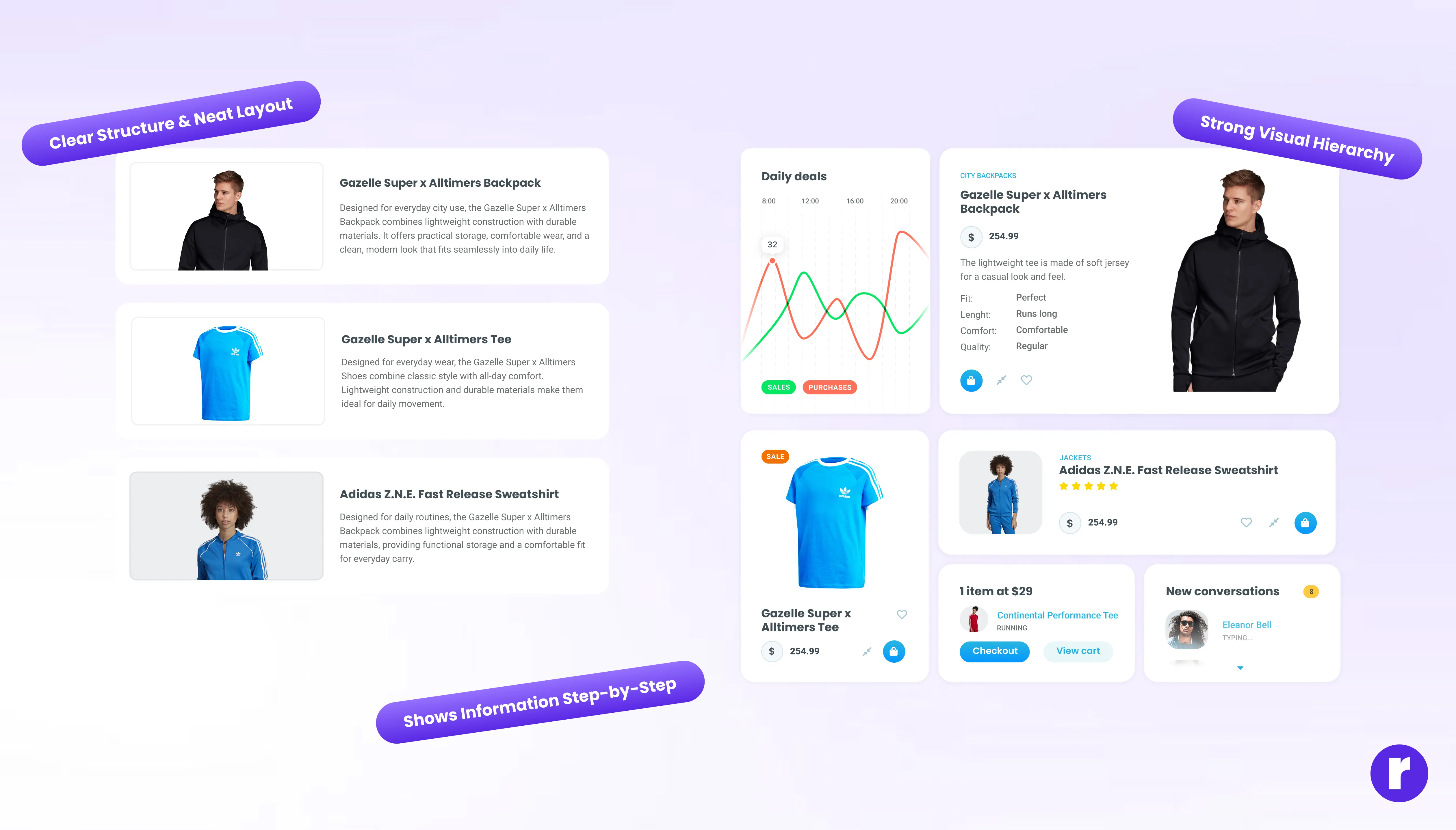
- Clear Structure & Neat Layout: Bento Grid breaks the interface into separate, well-defined blocks. Each block has its own role — like showing text, images, navigation, or actions. Because everything is placed in its own space, the layout feels tidy and easy to scan, helping users quickly understand where to find what they need.
- Strong Visual Hierarchy: Since each section is separated into different blocks, designers can highlight important areas more easily — for example, by giving a key feature a bigger block or a different style. This naturally guides a user’s attention and makes the interface feel more intuitive.
- Shows Information Step-by-Step: Bento Grid breaks the interface into separate, well-defined blocks. Each block has its own role — like showing text, images, navigation, or actions. Because everything is placed in its own space, the layout feels tidy and easy to scan, helping users quickly understand where to find what they need.
"Continue exploring design decisions that shape behavior at Radial code.
Flat Layout vs Bento-Box Layout
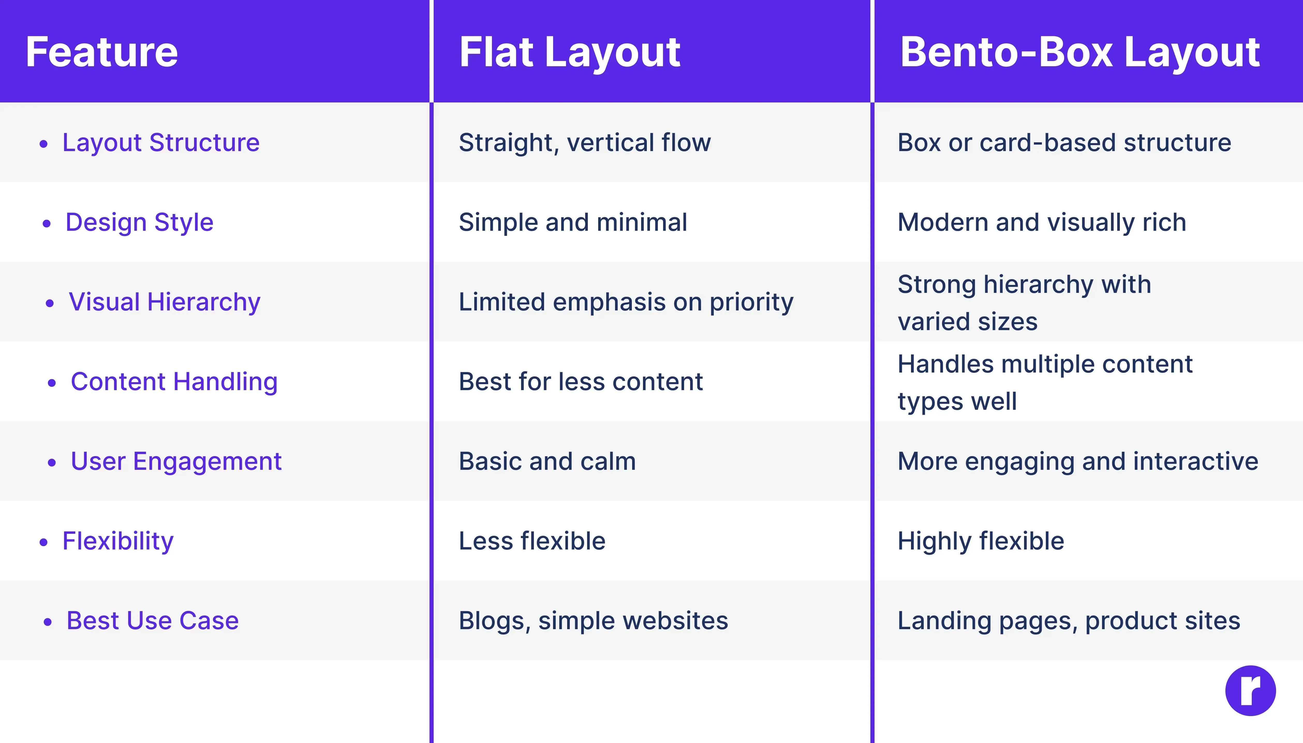
Flat layout and bento-box layout are two different approaches to organizing content in digital design. A flat layout focuses on simplicity, where content flows in a straight line with minimal visual elements, making it easy to read and understand. It works best for simple websites with limited content. On the other hand, a bento-box layout divides content into multiple boxes or cards, allowing designers to show different types of information clearly on a single screen. Bento-box layouts feel more modern, help guide user attention, and are better suited for websites with multiple features or sections. Choosing between them depends on how much content you have and how you want users to interact with it.
Want to explore more design patterns like this? Don’t miss our related blog.
Conclusion
Flat and bento-box layouts have their strengths and are suited to different design needs. Flat layouts prioritize simplicity, clarity, and smooth navigation, making them ideal for content-focused or straightforward websites. Bento-box layouts, on the other hand, provide structure, visual interest, and better content prioritization, which works well for complex sites with multiple features or sections. By understanding the differences between these layouts, designers can choose the most appropriate approach to create websites that are not only visually appealing but also user-friendly and easy to navigate.