Design that Speaks Louder than Words

Written by

Chandani Sahani
UI/UX Designer
Table of contents
Build with Radial Code
Share this
Great design doesn’t just look good — it communicates, persuades, and makes things effortless. It’s not about adding more elements but about making every element matter. Good design guides the eye, builds trust, and tells a story without needing to say a word.
Whether you’re designing a logo, a website, or a poster, clarity should always come before decoration. When people instantly understand your message, they connect emotionally and remember it. That’s the real power of design — to simplify complexity and make people feel something genuine.
Think before you design
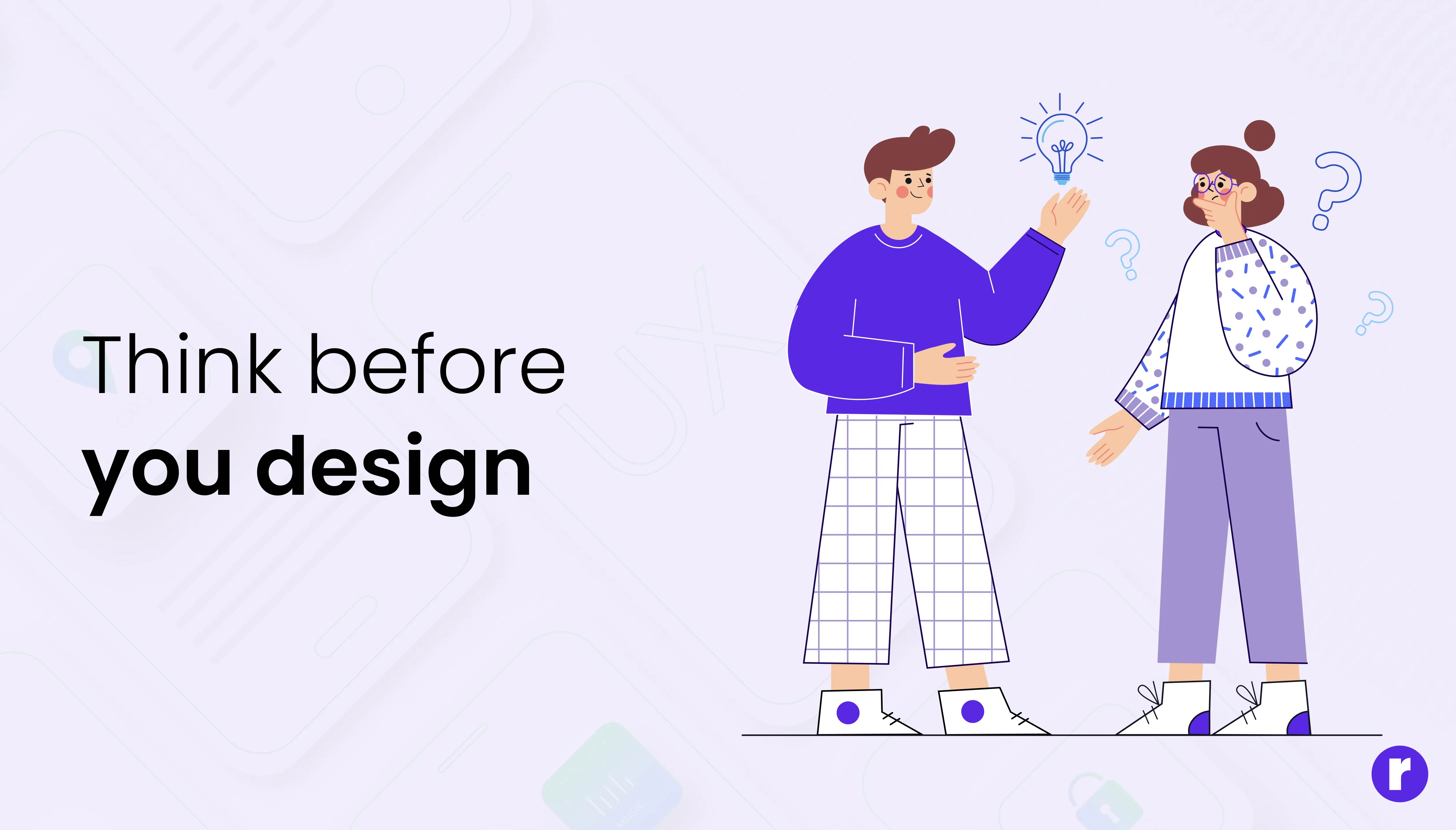
Before choosing colors or fonts, ask: What should this design make someone do, feel, or understand? A clear purpose keeps every visual choice aligned.
When you design with intention, every detail has a job. The colors set the mood, the fonts express personality, and the spacing gives breathing room to your message. Without a clear goal, design becomes decoration — pretty but powerless.
- Build trust with your audience
- Explain a process clearly
- Speed up sign-ups or sales
- Make information easy to scan
- Help users find what they need quickly
Make It easy to understand
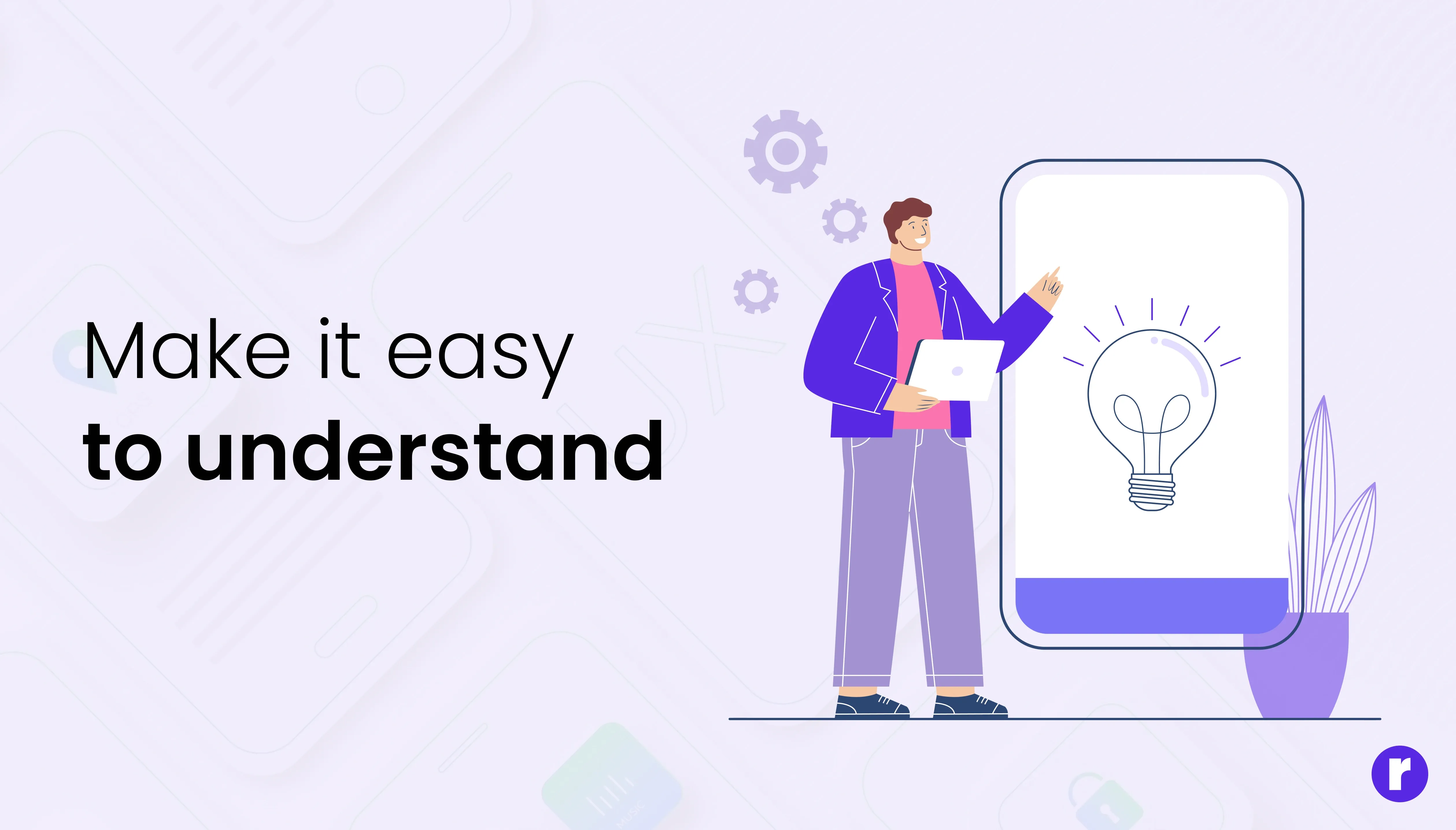
A design that follows the same rules everywhere reduces the amount of mental effort required from users. This is known as lowering cognitive load. When users don’t have to re-learn patterns on every page, they can focus more on achieving their goals instead of figuring out how the interface works. This makes the overall experience smoother, faster, and more enjoyable.
- Users don’t waste time re-learning controls on every screen
- Predictable layouts make the journey faster
- Repeated patterns allow the brain to recognize actions instantly
- Mental energy is spent on achieving goals, not on decoding design
Keep your design style consistent
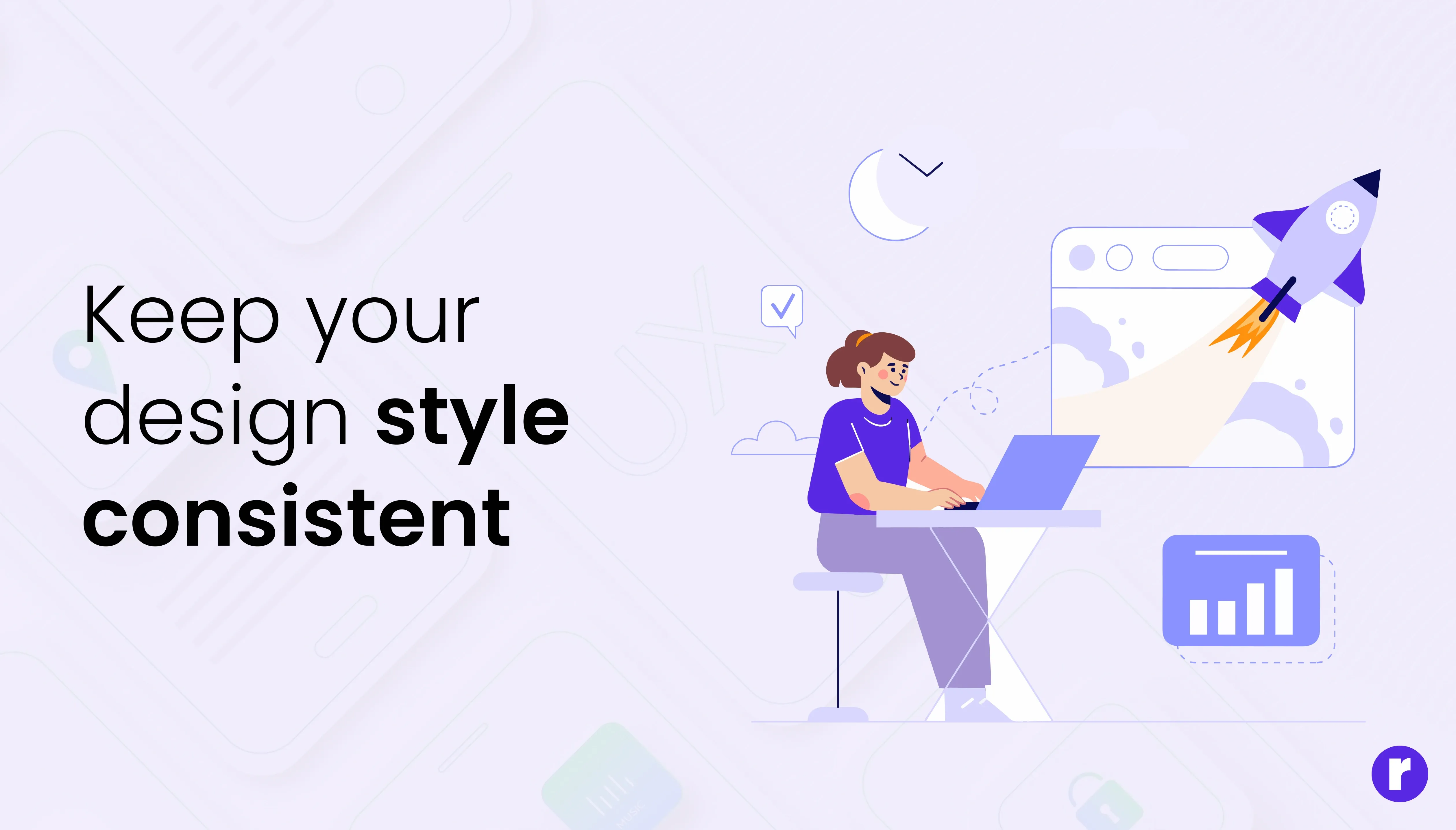
Pick 2–3 core colors and a few neutrals. Use color with purpose — to highlight calls to action, show status, or create focus. Avoid using too many colors; it can distract instead of guide. A consistent palette builds recognition and keeps your design calm and confident.
- Color: Pick 2–3 core colors + neutrals. Use color intentionally (CTA, status, background).
- Typography: One readable headline font + one body font. Keep sizes predictable.
- Spacing & grids: Define consistent spacing to make content scannable.
🎨 Pro Tip: Let one color lead, and use others to support it. Too many strong colors fight for attention. Connect Us
Make it easy to use

Design isn’t static — it’s an experience. Every click, hover, or scroll should feel natural and predictable. When people know what to do next, they stay engaged and confident.
- Make actions clear: Buttons should look like buttons. Links should look clickable. Don’t make users guess what’s interactive — clarity builds trust and ease.
- Give instant feedback: When someone clicks a button, hovers over a link, or submits a form, show a quick response. A hover effect, loading bar, or success message tells users the design is working. Little details like these make your interface feel alive and responsive.
- Simplify decisions: Too many choices can confuse or slow people down. Guide them toward one clear action at a time — it improves focus and boosts conversions.
- Think like a user: Ask yourself, “If I were using this for the first time, would I know what to do?” Good design removes doubt and replaces it with flow.
Tell micro-stories with imagery

A single image should answer three simple questions: Who is this for? What is it about? Why does it matter? The right image can tell your story faster than a paragraph of text.
- Use authentic visuals: Choose images that feel real and relatable. Show real people in real situations — ones your audience can see themselves in. Authentic visuals build trust and make your message more human.
- Avoid generic stock photos: Overly polished or fake-looking images can make your design feel distant or insincere. If a photo doesn’t match your tone or story, skip it. Every image should have a reason to be there.
- Show the benefit, not just the thing: Especially in product design, focus on the outcome. Don’t just display a gadget — show how it makes life easier, happier, or better. People connect more with results than with features.
- Keep visuals consistent: Use a similar style, lighting, and color tone across your images. Consistency ties your message together and makes your design feel polished and professional.
Conclusion
Great design doesn’t shout — it speaks clearly and confidently through purpose, consistency, and empathy. When every element has meaning, users don’t just see your design — they feel it. They understand what to do, trust what they see, and remember how it made them feel. Visit here