Designing Trust: How Layout Choices Affect User Confidence

Written by
Shweta Kumari
UI/UX Designer

Chandani Sahani
UI/UX Designer

Table of contents
Build with Radial Code
Share this
How Layout Choices Affect User Confidence
In a world where users decide in seconds whether to stay on your website or leave, trust becomes a silent force behind every interaction. And while flashy colors or powerful headlines may grab attention, it’s the layout — the invisible framework of design — that often builds or breaks that trust.
Let’s explore how the way you structure your site directly affects how confident users feel when interacting with your brand. A thoughtful layout does more than just place elements on a screen — it communicates intent. It shows visitors that you've considered their journey, that you value their time, and that every interaction has been carefully shaped for clarity and ease. When users arrive on a page that feels chaotic or unbalanced, their instinct is to leave. But when everything flows naturally — with readable text, intuitive buttons, and clean structure — it quietly builds a sense of confidence and control.
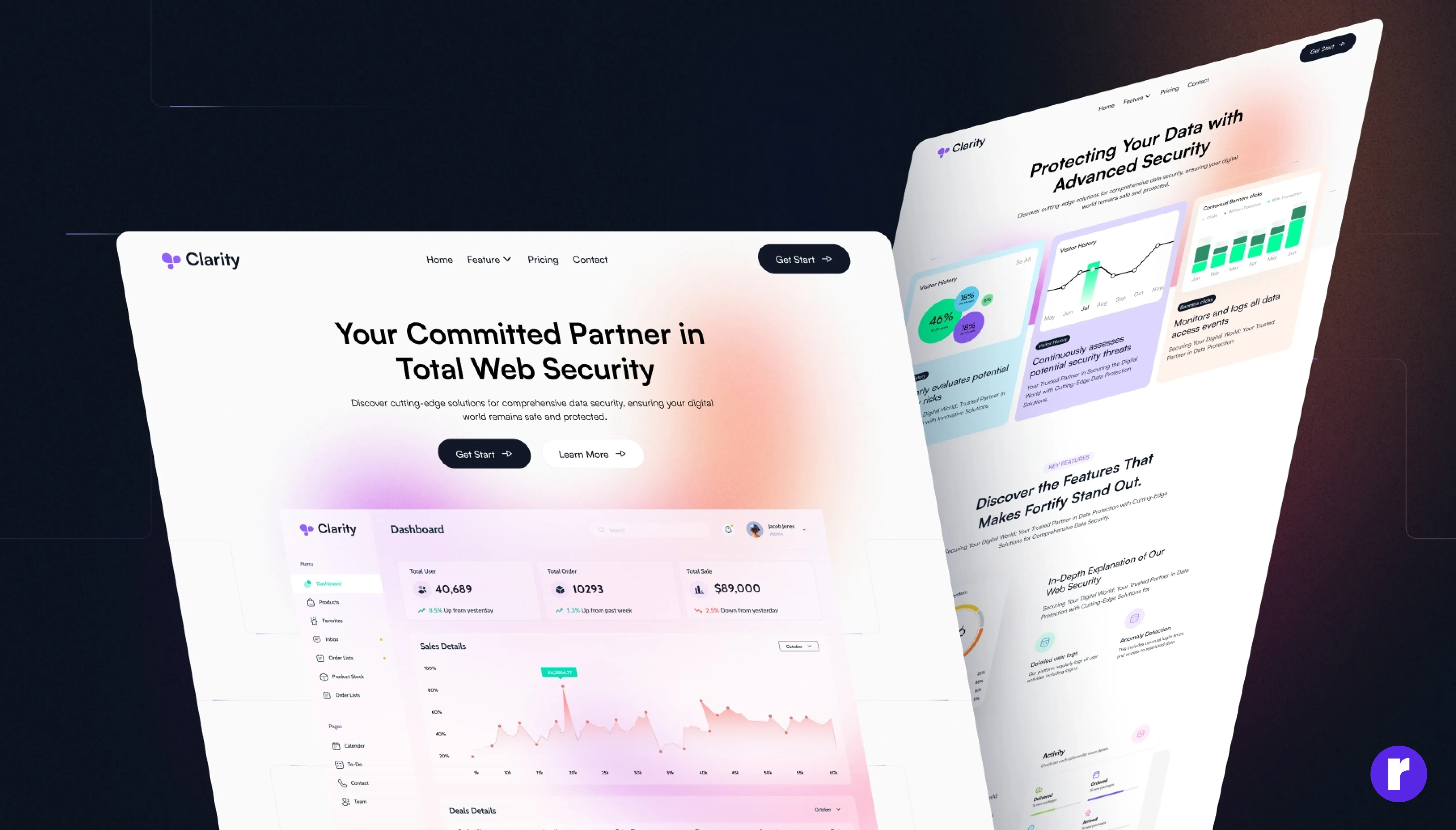
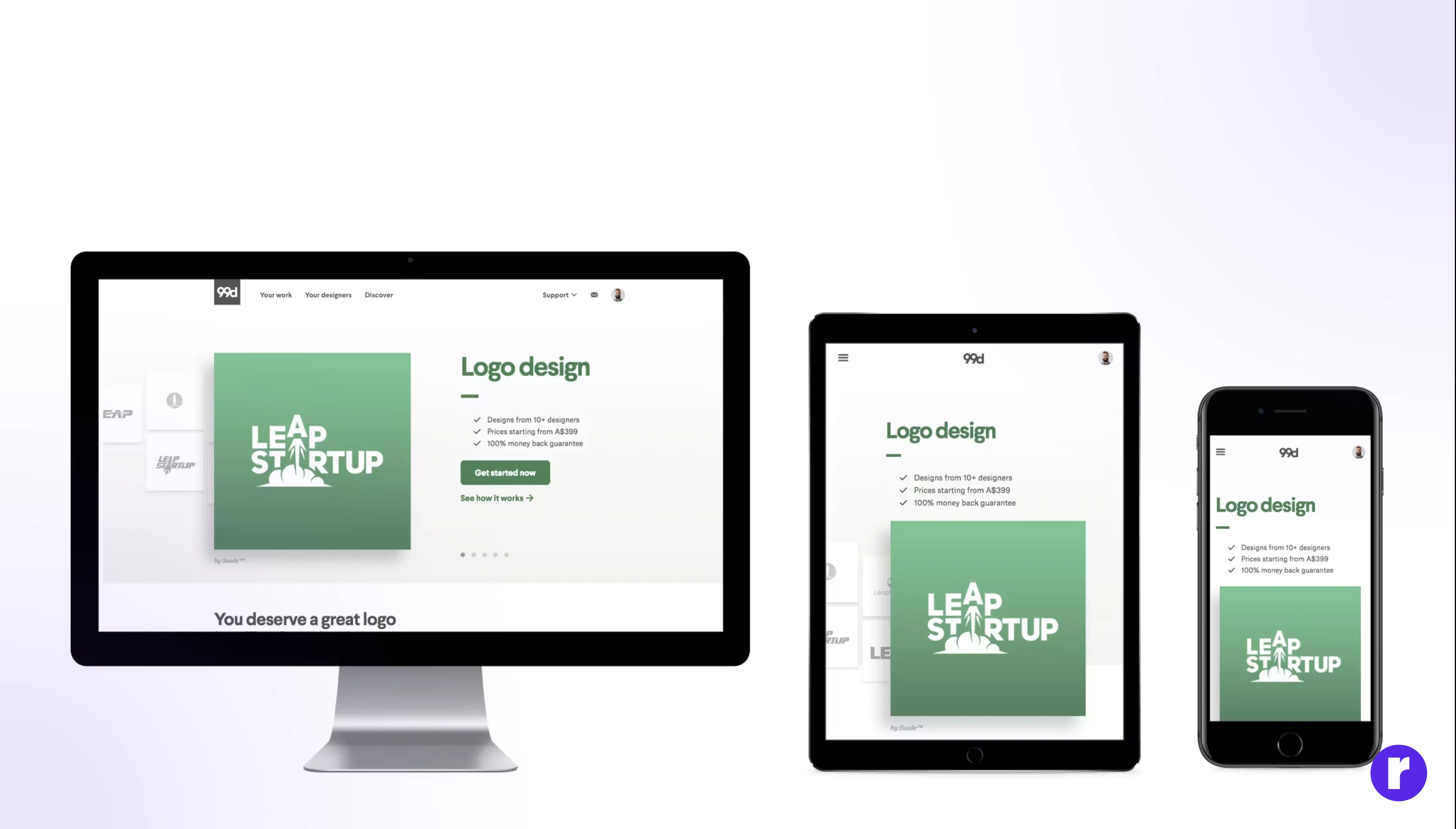
For example: A messy layout with hidden buttons and cramped content can make users feel lost. But a clean, well-structured page instantly feels more trustworthy — even before reading a single word. See exampleFirst Impressions Come from Layout
Before users read even a single word, their eyes are already forming an opinion. The layout becomes their first handshake with your brand — and just like in real life, that first impression happens fast. When a user lands on your site, their brain quickly scans the visual structure: Are things spaced out clearly? Does the content feel breathable or crammed? Is there balance between images and text, or does it feel chaotic? A clean, thoughtfully spaced layout immediately gives off a sense of control and professionalism. It silently says, "We know what we’re doing." On the other hand, if elements are misaligned, buttons are floating awkwardly, or everything feels squeezed, users subconsciously feel anxious — and that discomfort often pushes them away. Even subtle details like margin consistency, grid balance, or symmetry can make a big difference. That initial visual scan sets the tone for trust, and users will judge the quality of your product or service based on it — even if they haven't read a single headline yet. A polished layout doesn’t just look good — it feels good. And when things feel right from the very start, users are far more likely to stick around.
Clarity Builds Confidence
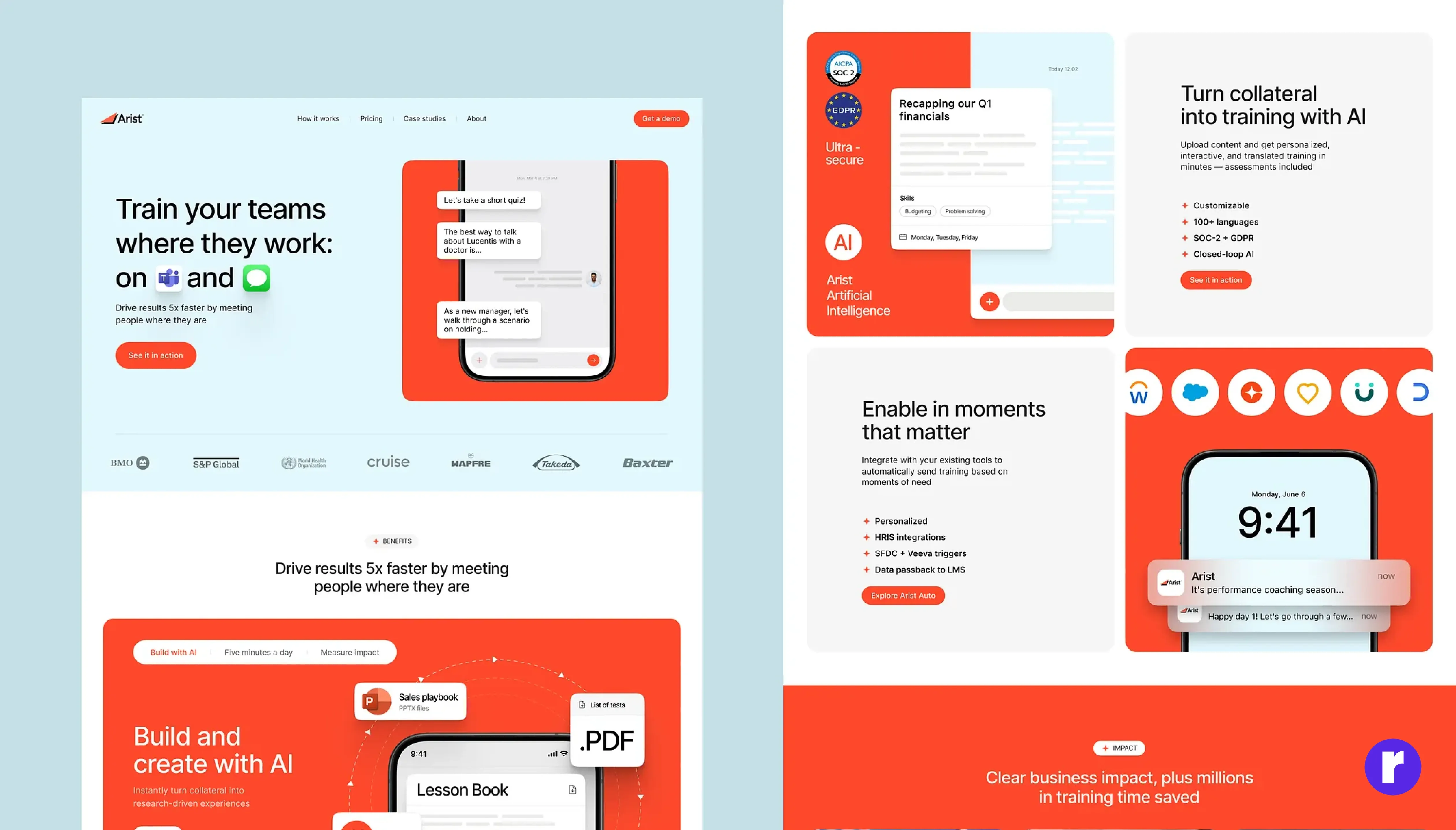
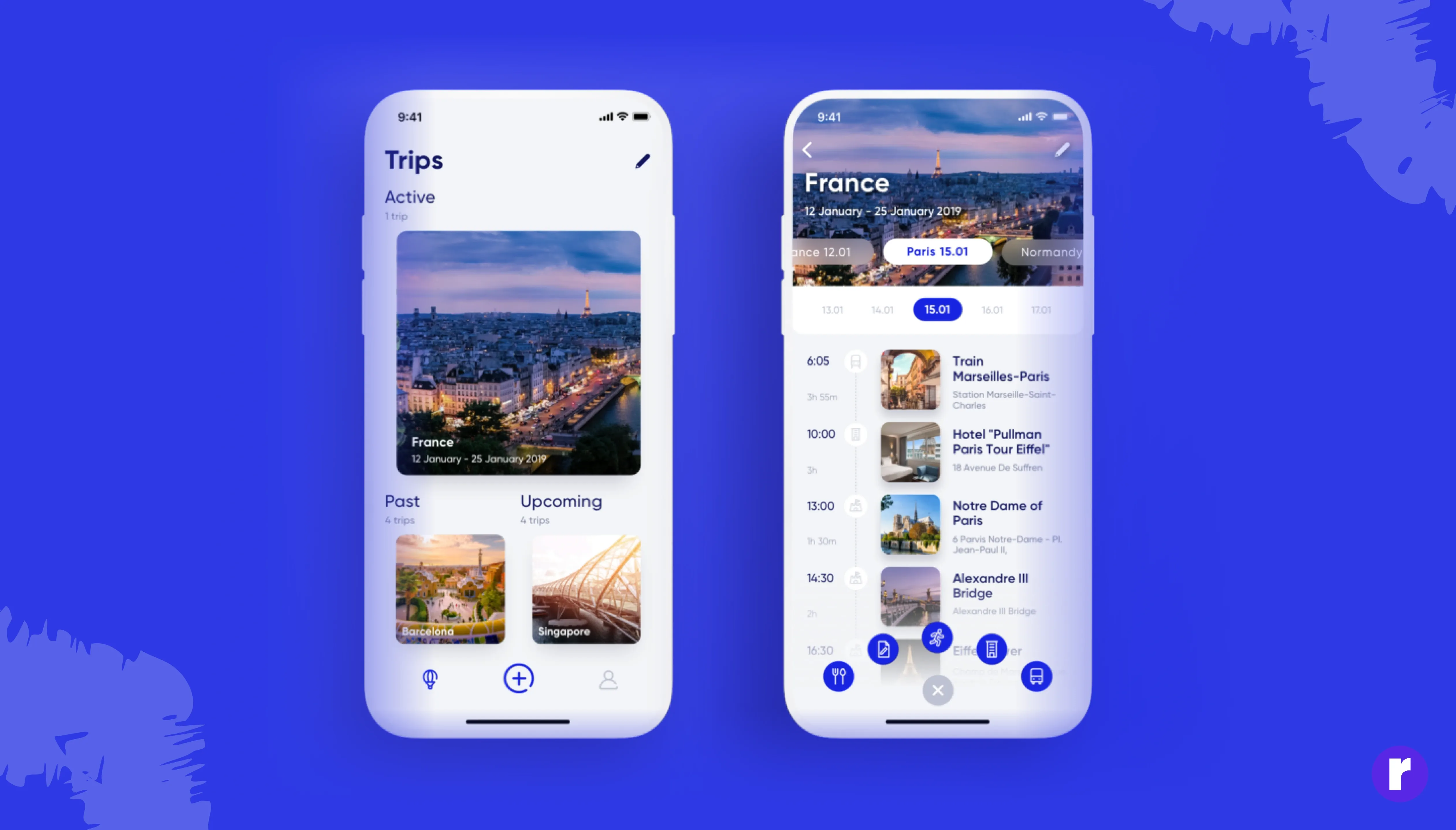
A well-planned layout doesn’t just organize content — it guides the user journey. Each section should naturally lead into the next, creating a feeling of direction and ease. When users can predict what comes next, it creates a sense of control and clarity. This rhythm builds confidence and encourages deeper engagement, because users feel the site is built with their experience in mind. For example: A homepage that introduces your product, then showcases benefits, followed by social proof, and finally a CTA builds trust gradually. See example
Smooth Layout Builds Flow
Layout choices that maintain consistency across all pages — like using the same header structure, grid spacing, and content alignment — reinforce brand reliability. Inconsistency feels sloppy and amateurish, while a predictable layout pattern feels safe, familiar, and professional. This visual consistency builds momentum as users move through your site — they don’t need to pause and reorient themselves on every new page. It reduces friction, making the browsing experience feel effortless. Users begin to trust your site because it feels designed with intention and care. Even subtle things like repeating section rhythms or consistent placement of buttons help users feel more in control. Over time, this familiarity turns into brand recall — they remember your site not just for what it said, but how naturally it flowed. A smooth layout isn’t loud or flashy, but it’s quietly powerful — it holds everything together and makes the experience feel whole.
Responsive Layouts Show Reliability
A layout that adapts smoothly across devices shows users that you care about their experience. If your site looks clean on desktop but breaks on mobile, trust instantly drops. Users expect everything — text, buttons, images — to work flawlessly no matter the screen size. Responsive design isn’t just resizing; it’s rethinking. Can users read comfortably? Are CTAs tappable? Does the layout adjust without glitches? When your design feels natural and consistent across all devices, users feel reassured. It sends a quiet but strong message: "You’re in good hands.
- Consistent navigation flow on all major devices
- Legible, clean typography across all screen types
- Tappable, visible buttons and key CTAs everywhere
- Clean, stable visuals without layout glitches
- Legible, clean typography across all screen types
Visual Hierarchy Guides Attention
The way you visually arrange content tells users what to focus on first. By using different font sizes, colors, spacing, and positioning, you create a natural flow of attention. Users don’t read everything — they scan. So if your layout highlights the right elements, users instantly know what’s important, where to click, and how to move forward confidently.
When everything looks the same, it creates confusion. But when hierarchy is used right, it makes the interface feel organized and trustworthy.
🎨 Pro Tip: Use visual hierarchy to highlight elements that feel reliable — like testimonials, guarantees, or secure checkout icons — so users feel safe as they scroll.>
Whitespace Creates Comfort
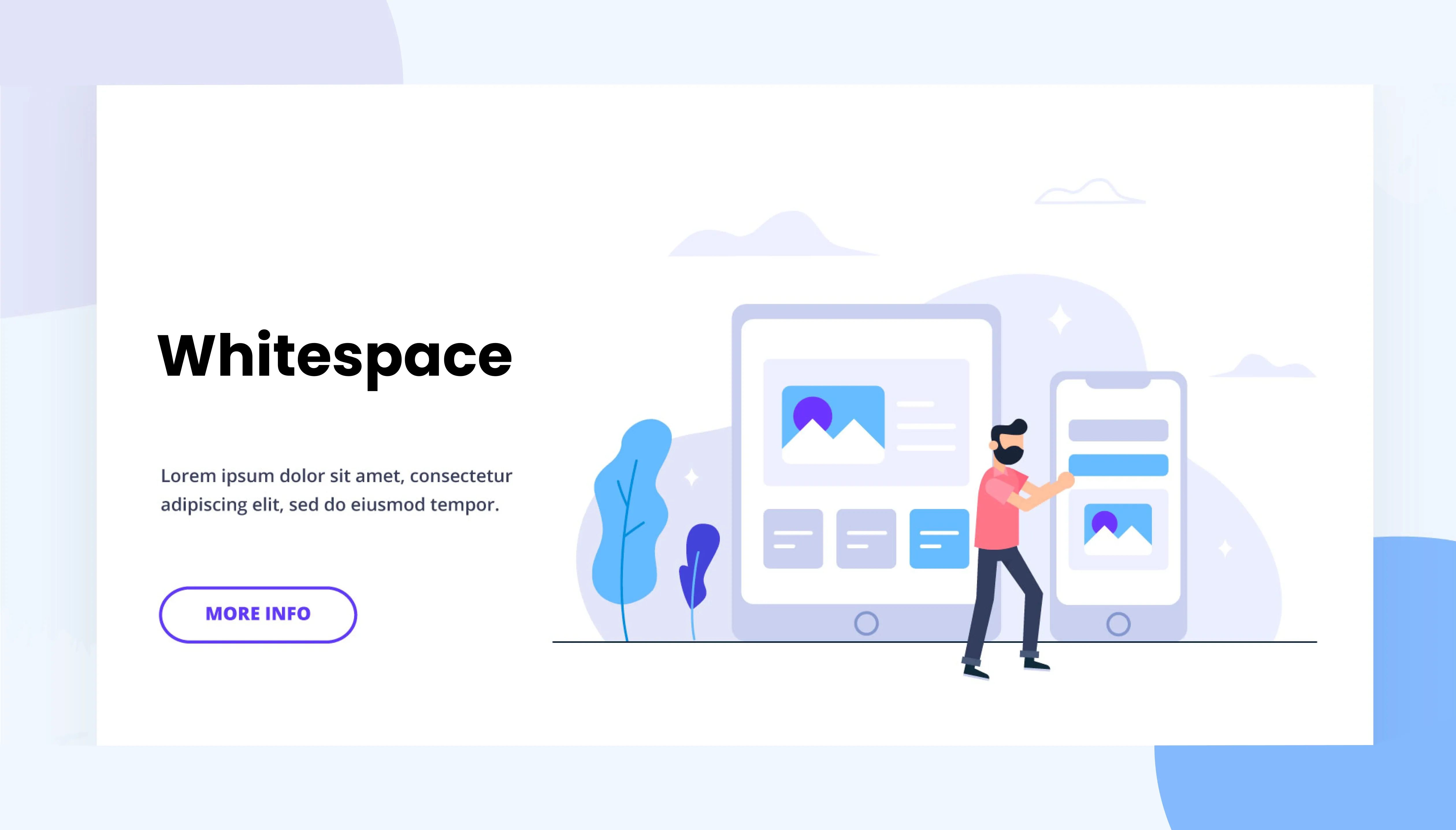
Whitespace — the empty space between elements — isn’t wasted space. It’s what makes a design feel clean, breathable, and easy to navigate. When content is too close together, users feel overwhelmed. But when spacing is used intentionally, it draws attention to what matters and creates a sense of calm.
- Draws focus to CTAs or important content
- Improves reading flow by reducing visual clutter
- Separates content into simple, readable parts
- Refines the layout, making it feel premium and clean
- Improves reading flow by reducing visual clutter
Conclusion
Trust isn’t earned through fancy visuals — it’s built through a layout that feels reliable. From clean spacing to consistent alignment, every part of your design speaks to the user without words. When the layout is intentional and well-structured, users naturally feel a sense of clarity, ease, and confidence. In the end, it’s not just how your site looks — it’s how it feels. And a well-designed layout feels like trust.