Dos and don’ts of professional logo design

Written by

Chandani Sahani
UI/UX Designer
Table of contents
Build with Radial Code
Share this


A logo is not just a graphic—it's often the first impression of a brand. A professional logo communicates identity, supports recognition, and stays memorable over time. However, trust is built through the complete brand experience, including the product, service, communication, and every interaction people have with the brand.
To design logos that truly perform, you need to understand both what to do and what to avoid. Let’s break it down.
Simplicity over complexity

Do: Focus on clarity and minimal design elements that are easy to recognize
Don’t: Overload the logo with gradients, shadows, or too many shapes
A clean logo is often more memorable and versatile, making it easier for users to recall and recognize instantly. However, complexity isn't inherently wrong: some brands benefit from detailed or intricate marks. The real test is whether the design stays clear, distinctive, and functional across different platforms, regardless of how simple or complex it is.
Design for all platforms, not just one
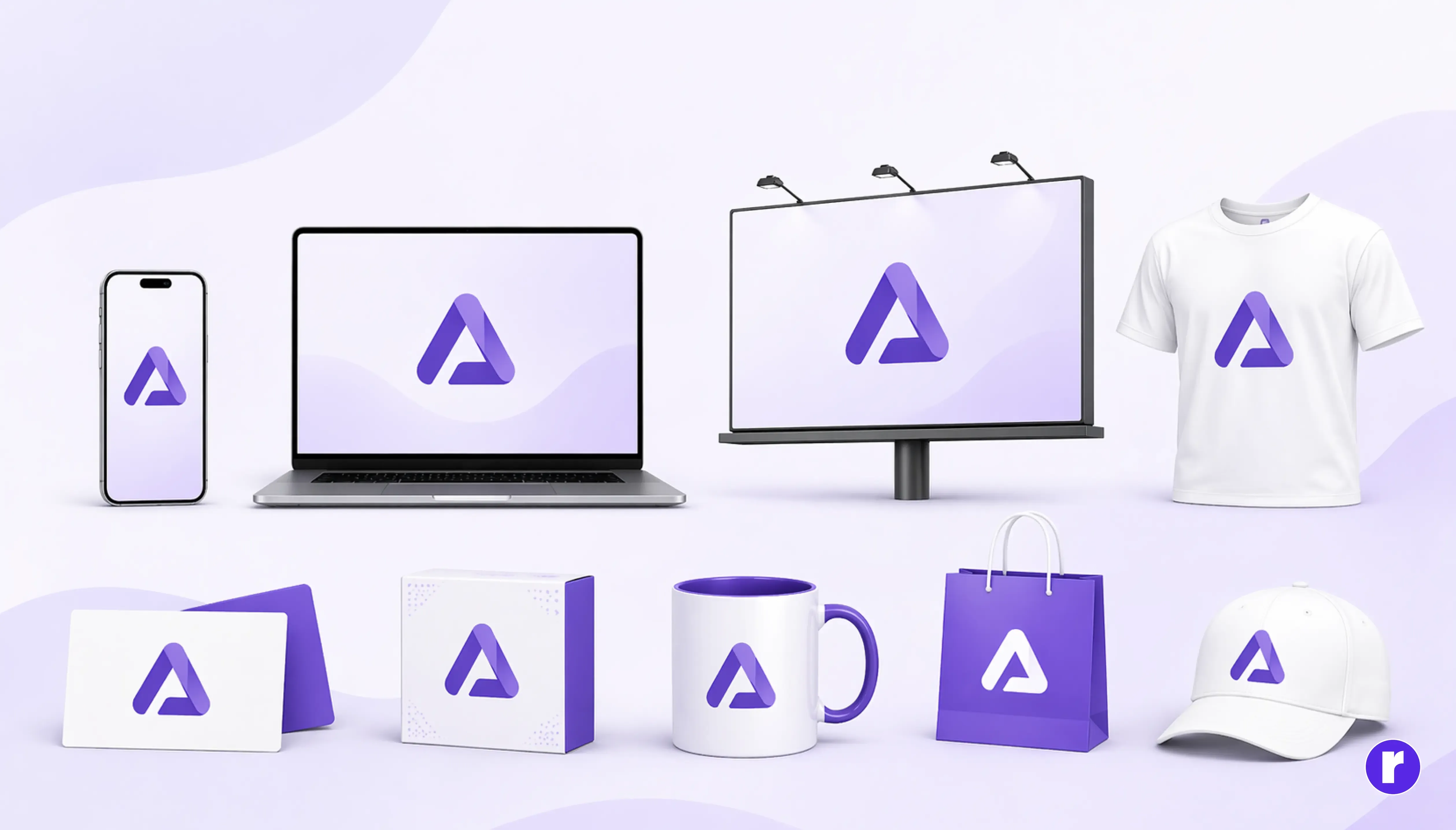
Do: Ensure your logo works on websites, mobile apps, print materials, and merchandise
Don’t: Design only for a specific use case like social media
A professional logo should adapt seamlessly across various environments. Whether it’s on a small app icon or a large billboard, the design should remain consistent and effective without losing its identity.
Use colors strategically, not randomly
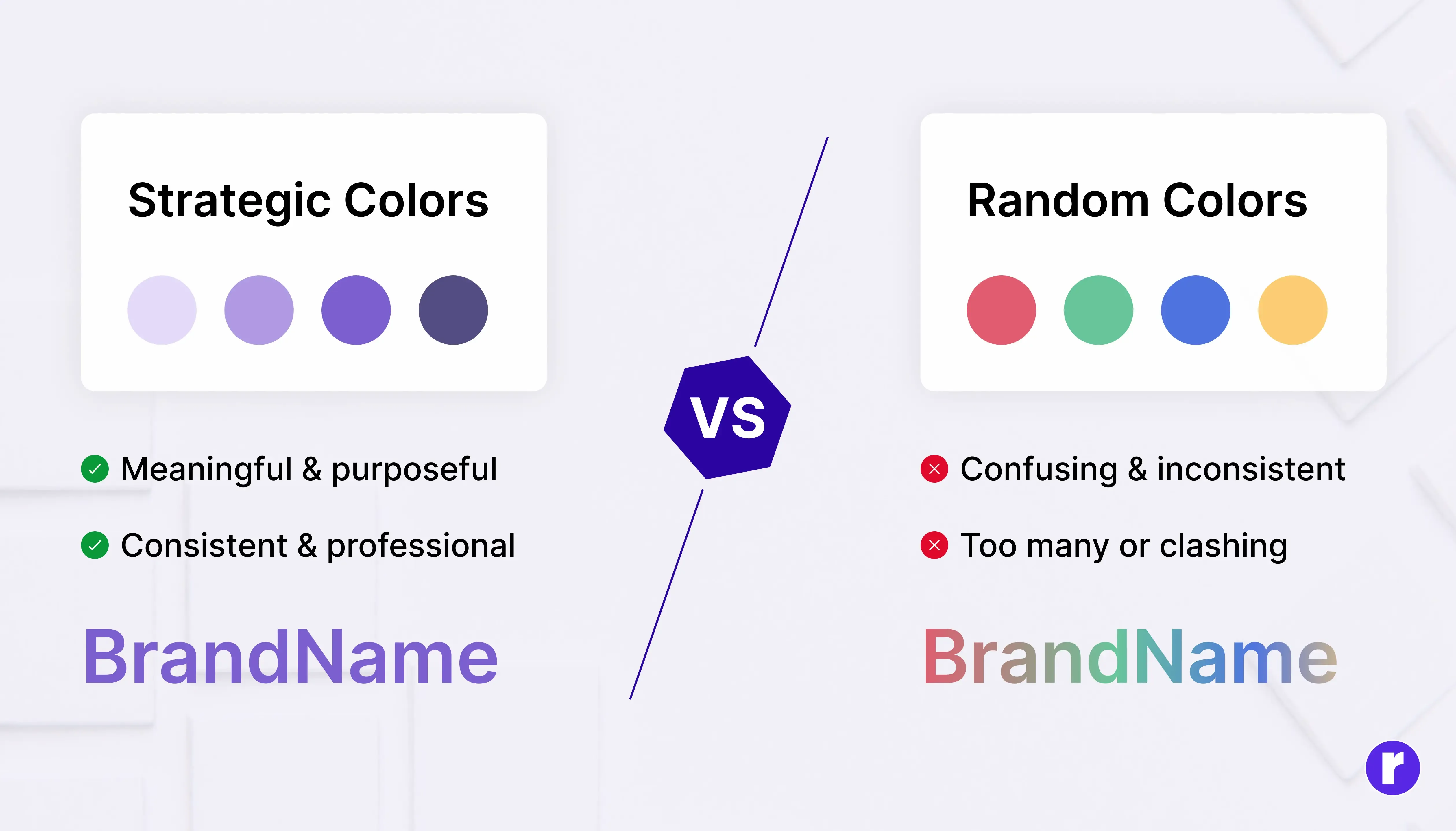
Do: Choose colors that align with the brand’s personality and message
Don’t: Use too many colors or pick them without purpose
Colors play a psychological role in branding. The right color palette can evoke trust, excitement, or sophistication. Random color choices, on the other hand, can make the logo feel inconsistent and unprofessional.
To learn more about the logo design process, visit Radial Code
Prioritize scalability, avoid fine details
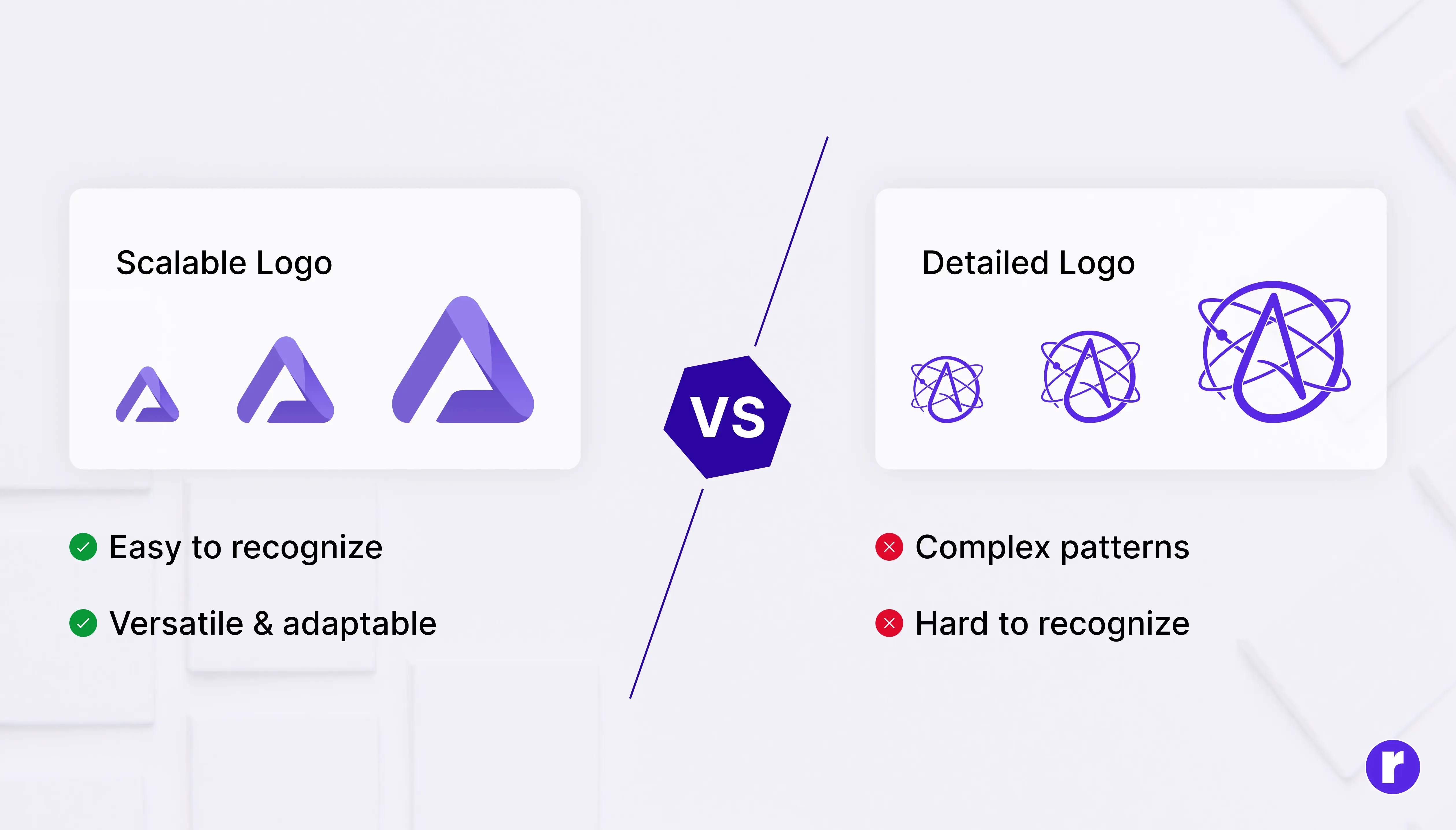
Do: Test your logo at multiple sizes to ensure readability
Don’t: Use thin lines or intricate details that disappear when resized
Logos are used in many formats, from tiny favicons to large banners. If your design loses clarity when scaled down, it fails one of the most important tests of professional design.
Choose typography carefully, avoid overuse
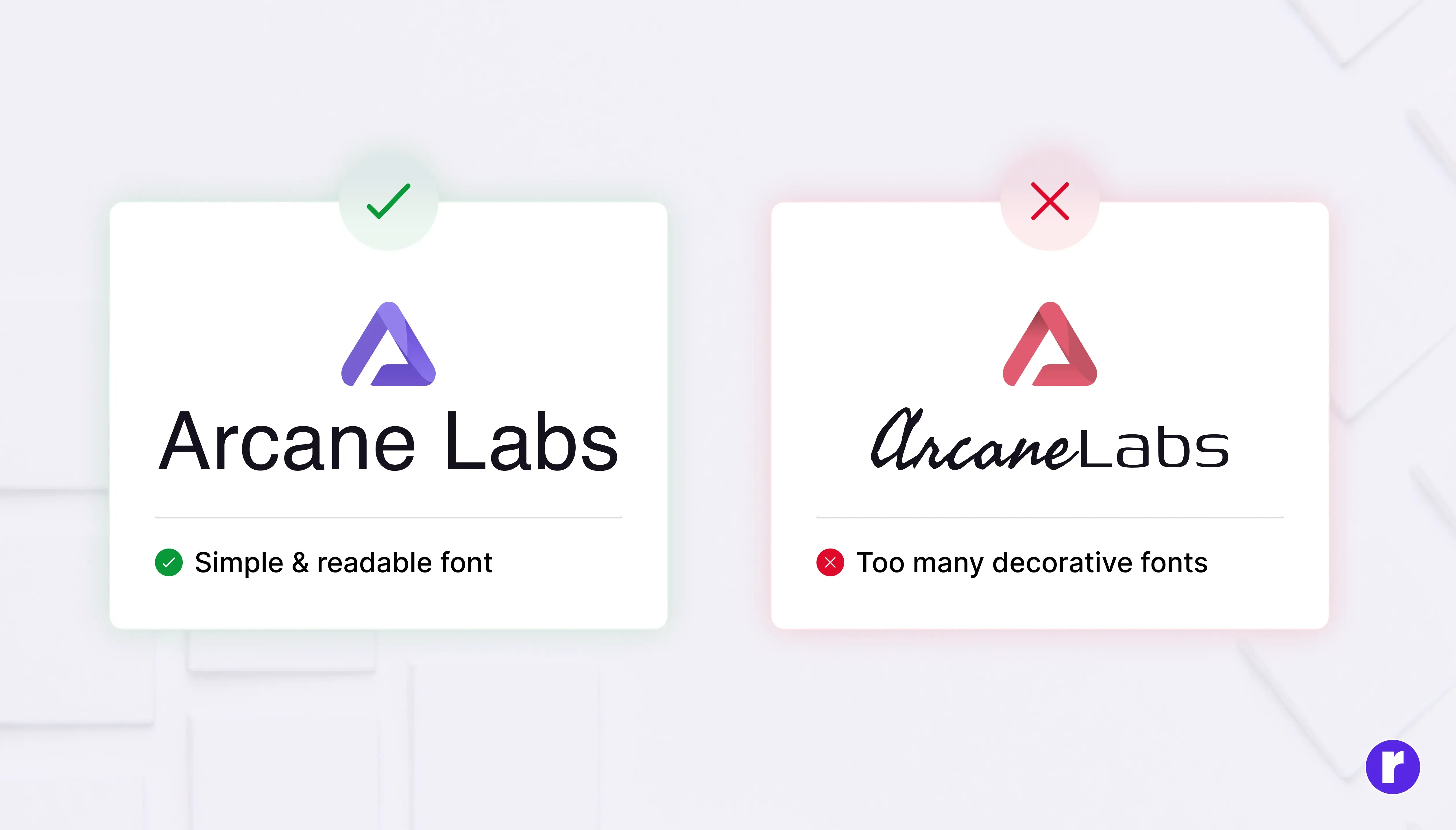
Do: Use clean, readable fonts and maintain consistency
Don’t: Mix multiple fonts or use overly decorative typefaces
Typography is a crucial part of logo design. A well-chosen font enhances the brand identity, while poor typography can completely ruin even a good concept. Keeping it simple ensures better readability and a stronger visual impact.
To learn more about typography selection, visit Radial Code
Run essential professional checks

Before finalizing a logo, take a moment to test the details that determine whether it will truly work in the real world.
- Check how it performs in black and white
- Ensure it is available in vector formats for scalability
- Consider accessibility so it remains clear and usable for different audiences
- Verify that the design is original and does not conflict with existing trademarks
These final checks may seem small, but they help transform a good-looking concept into a professional, practical, and reliable brand mark.
Conclusion
Professional logo design is not just about creativity; it’s about making the right decisions with purpose. A well designed logo should be simple, adaptable, and aligned with the brand it represents. By focusing on clarity, scalability, and timelessness while avoiding common mistakes like overcomplication and trend dependency, designers can create logos that truly stand out.
Ultimately, the goal is to design something that not only looks good but also works effectively in real world situations. When every element has a reason behind it, the logo becomes more than just a design; it becomes a strong and lasting brand identity. Want to learn more about design best practices? Visit here