Figma mistakes every beginner designer should avoid

Written by

Chandani Sahani
UI/UX Designer
Table of contents
Build with Radial Code
Share this


Figma is one of the best tools for UI/UX design. It is simple, powerful, and great for beginners. But when you start learning Figma, it is normal to make mistakes. These mistakes can slow down your work and make your designs look messy.
In this blog, we will talk about common mistakes beginners make in Figma and how you can avoid them. If you are new to design, this will help you work faster and design better.
Ignoring auto layout
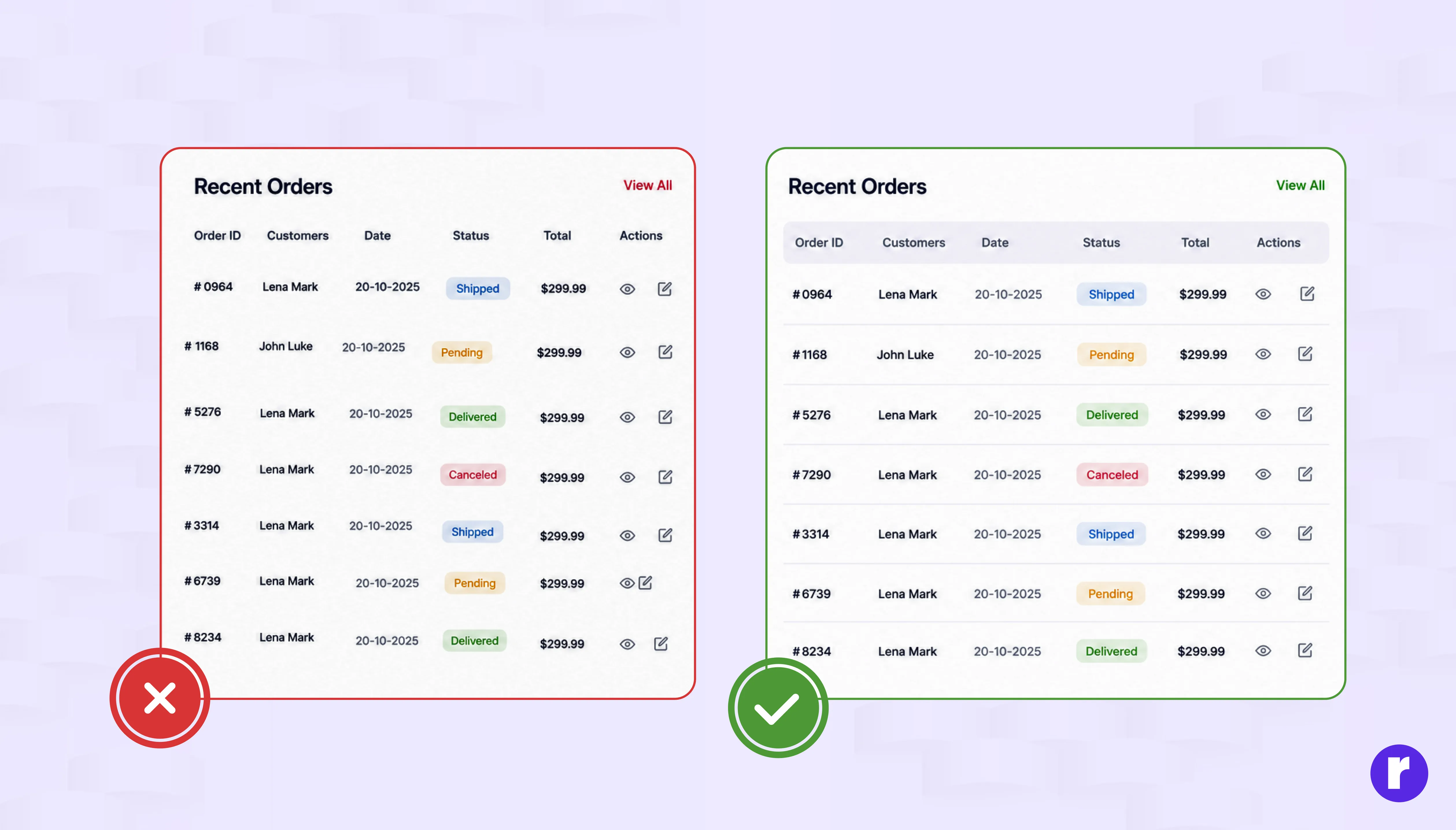
Auto Layout is one of the most useful features in Figma, but many beginners avoid using it because it looks a little confusing at the start. Because of this, they end up adjusting spacing and alignment manually again and again.
Auto Layout automatically manages the spacing, positioning, and sizing of elements within a frame as your content changes. It keeps spacing consistent and makes your layout more flexible, which is very helpful for responsive design.
Unlock expert tech insights from Radial Code — tap the badge to dive in. Radial Code
Why it matters:
- Elements stay properly aligned and spaced
- Saves time when you edit text or content
- Makes your design more responsive and clean
Using too many fonts
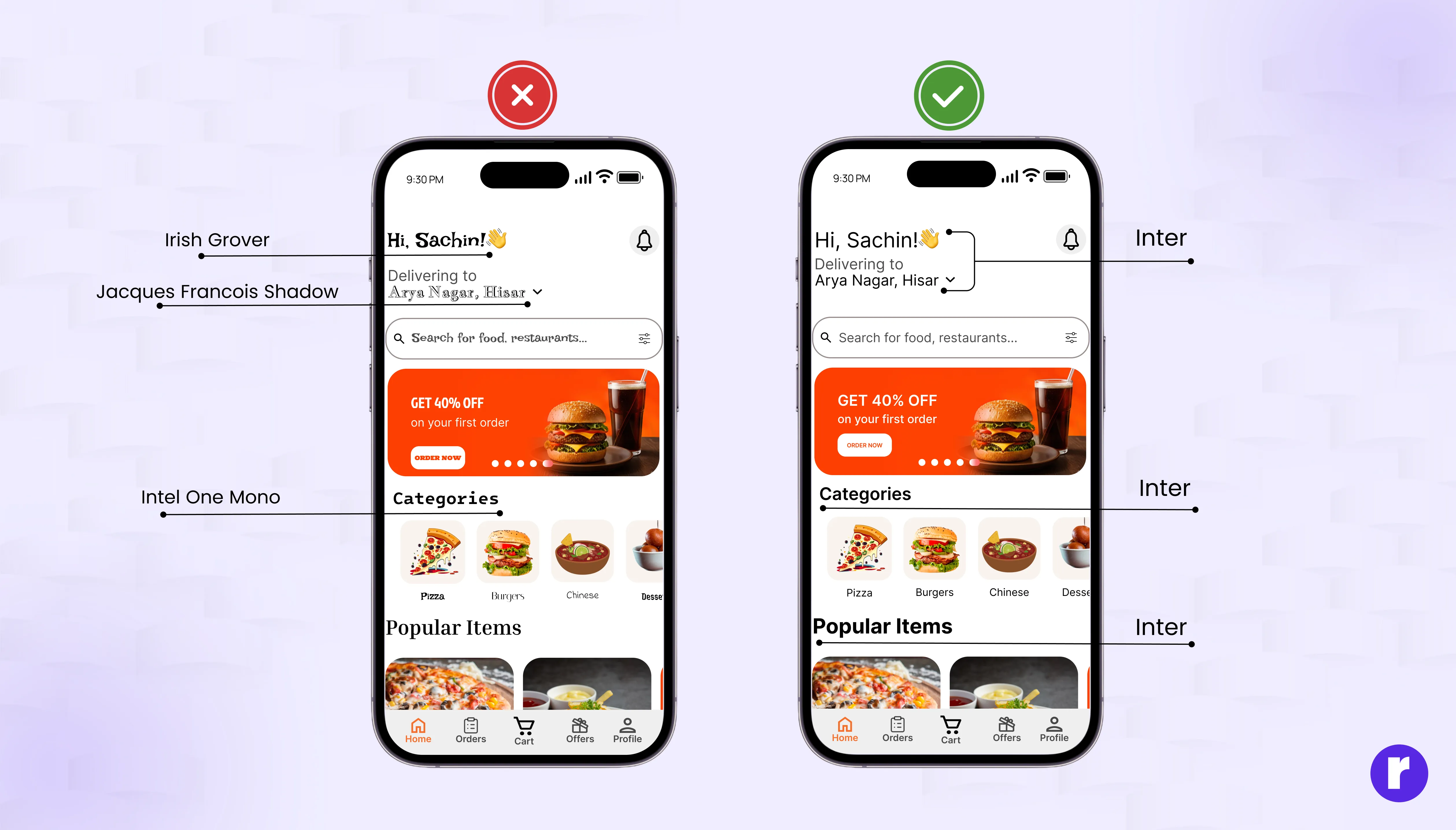
Many beginners use different fonts for headings, buttons, and text just to make the design look creative. But using too many fonts makes the design look messy, unprofessional, and difficult to read. It also breaks visual consistency.
A clean design usually works best with simple and consistent typography. When you use fewer fonts, your layout looks more professional and is easier for users to understand.
Best practice:
- Use only 1–2 fonts in your design
- Keep heading styles and body text consistent
- Create a simple typography system with clear sizes and weights
Have questions about UI/UX design? Explore more resources from Radial Code.
Poor spacing & alignment

Many beginners place elements without thinking about spacing or alignment. This makes the layout look unbalanced and messy, even if the design idea is good. Proper spacing helps users understand the content easily and makes the design look more professional.
Good alignment creates a clean structure and improves the overall visual flow of your design.
How to fix it:
- Use grids and layout guides to keep everything structured
- Maintain equal spacing between sections and elements
- Use Figma’s alignment and distribution tools for consistency
Not using components
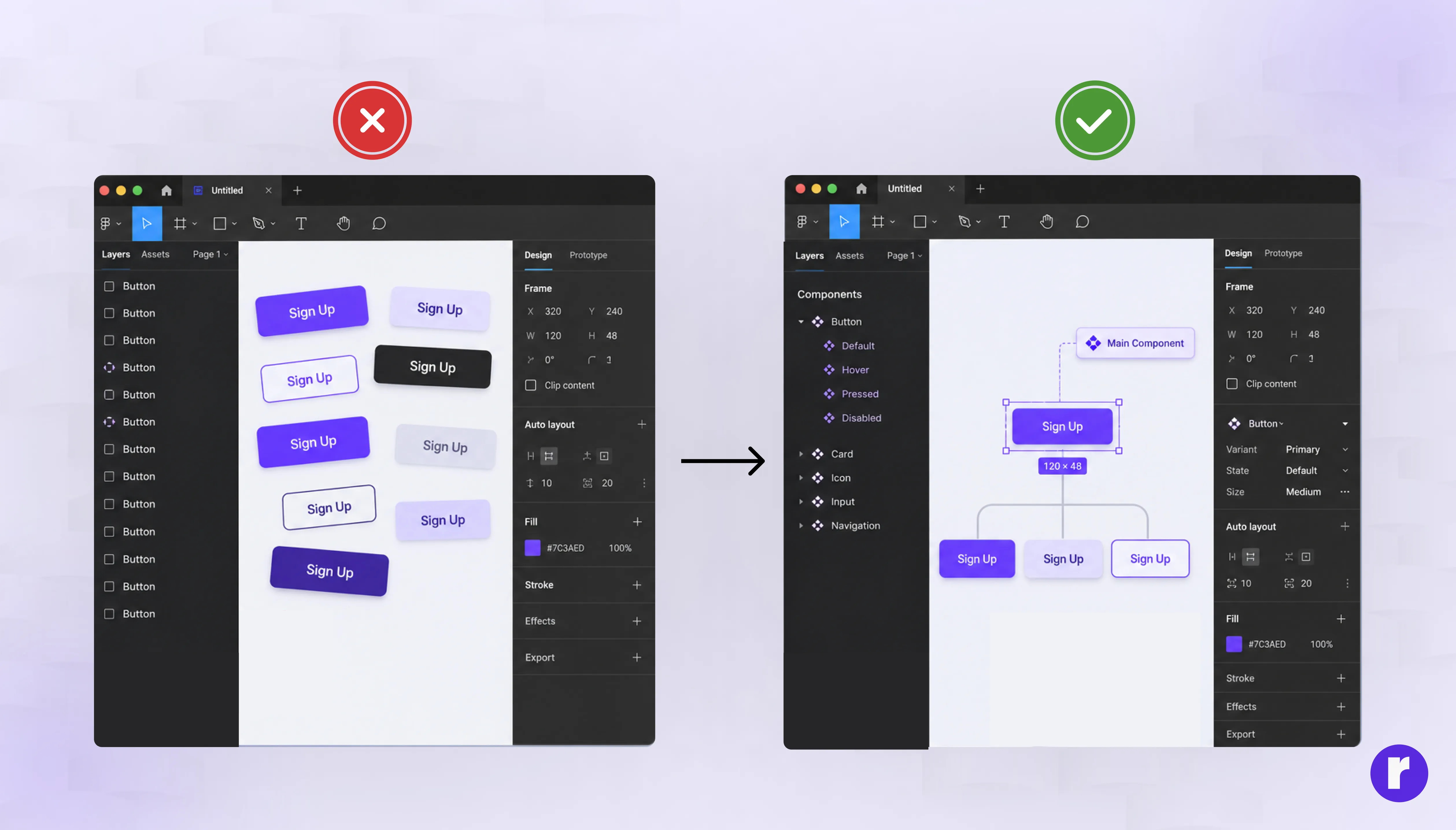
Many beginners design the same buttons, cards, or icons again and again instead of creating components. This takes more time and can make the design inconsistent, especially when you need to make changes later.
Components help you create reusable design elements. When you update the main component, all its instances update automatically — unless an instance property has been overridden. Overridden properties (like changed text, swapped icons, or modified colors) stay as-is, while everything else syncs with the main component. This gives you both consistency and flexibility.
Why components are important:
- You can edit one main component and update all instances
- Saves time and reduces repeated work
- Keeps your design consistent and professional
Start by creating simple components like buttons, icons, cards, and navigation items to make your design process smoother.
Forgetting about color styles and variables
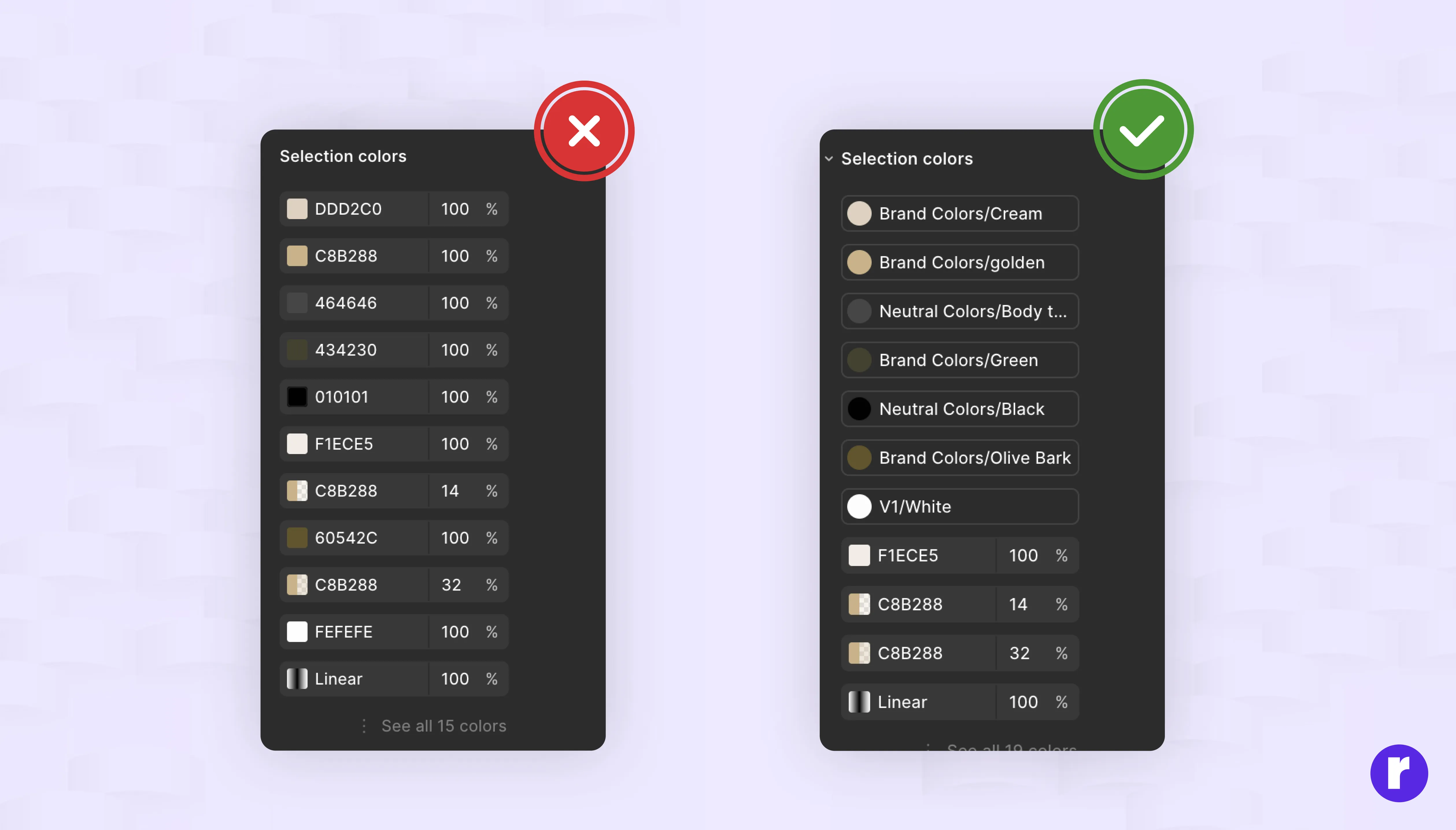
Many beginners choose colors manually every time they design a new element. This often leads to small color differences and makes the design look inconsistent. It also becomes difficult to update colors later.
Figma supports both color styles and variables for managing colors. Styles let you define reusable colors you can apply across your design. Variables take this further by letting you create color tokens that support modes such as light and dark themes. With variables, switching your entire design between themes becomes a single click instead of hours of manual work.
Better approach:
- Create color styles for your main brand colors
- Use variables for reusable color tokens (e.g., color/primary, color/background)
- Set up modes in your variables to support light/dark themes
- Keep your color palette simple and limited
Want to learn more about colours? View here.
Designing without a plan

Many beginners start designing immediately without thinking about the goal or purpose of the project. This often leads to confusing layouts and designs that do not solve the real problem. A clear plan helps you stay focused and create more meaningful designs.
Before you open Figma, take a little time to understand what you are building and who it is for. Even a simple plan can save a lot of time later.
Before designing:
- Understand the main goal of the project
- Know who your target users are
- Create a simple wireframe to plan the layout
Ignoring constraints and resizing behavior
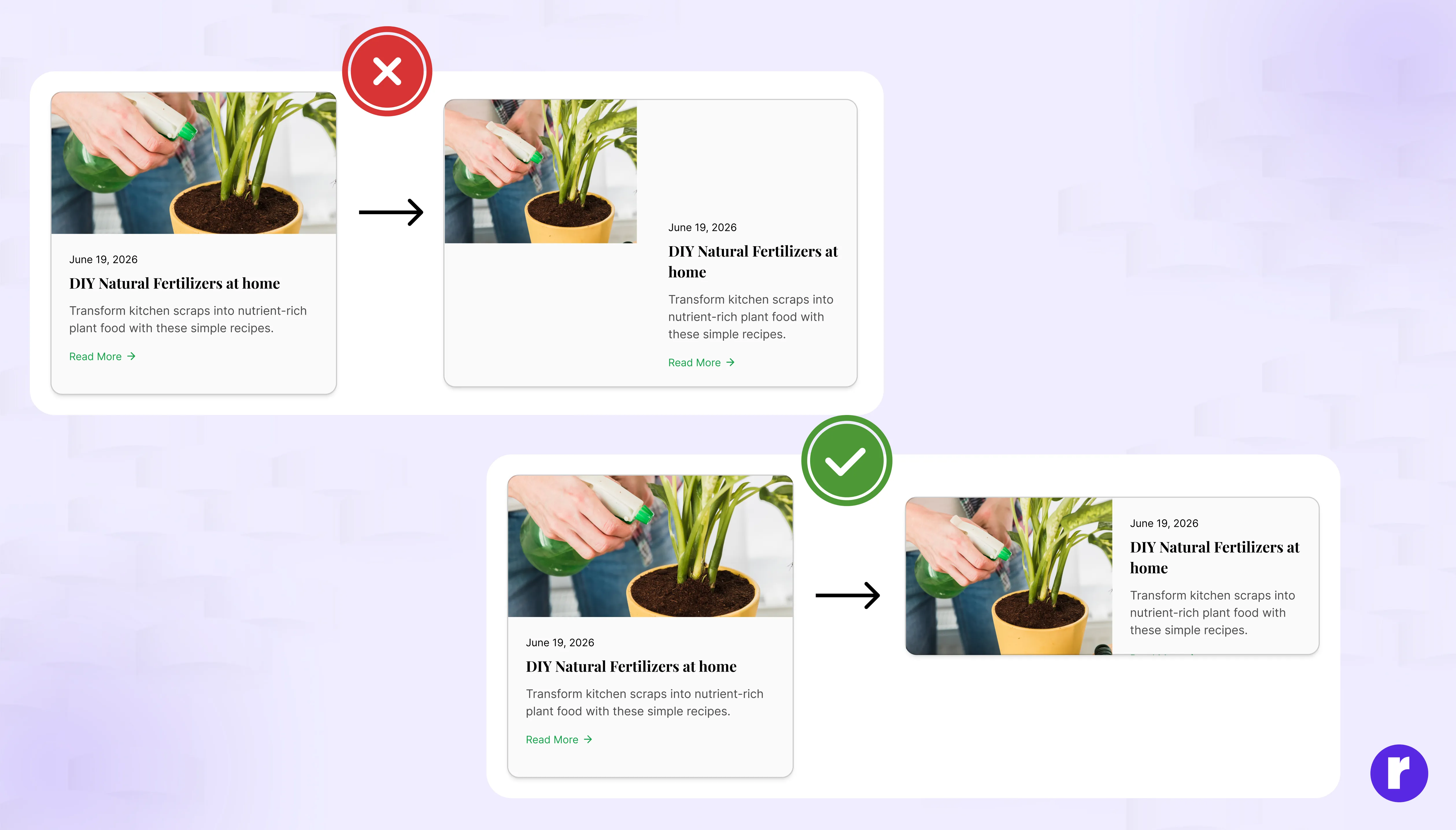
Many beginners skip setting constraints on elements inside frames. This means when a frame is resized, elements jump to unexpected positions or stay fixed in one corner instead of scaling properly.
Constraints tell Figma how an element should behave when its parent frame changes size. Setting them correctly is essential for building designs that adapt to different screen sizes.
How to fix it:
- Set left/right or top/bottom constraints to pin elements where they should stay
- Use "Scale" constraint for elements that should resize proportionally
- Use Auto Layout for flexible layouts and constraints when you need specific positioning behavior as a frame resizes.
Skipping accessibility checks
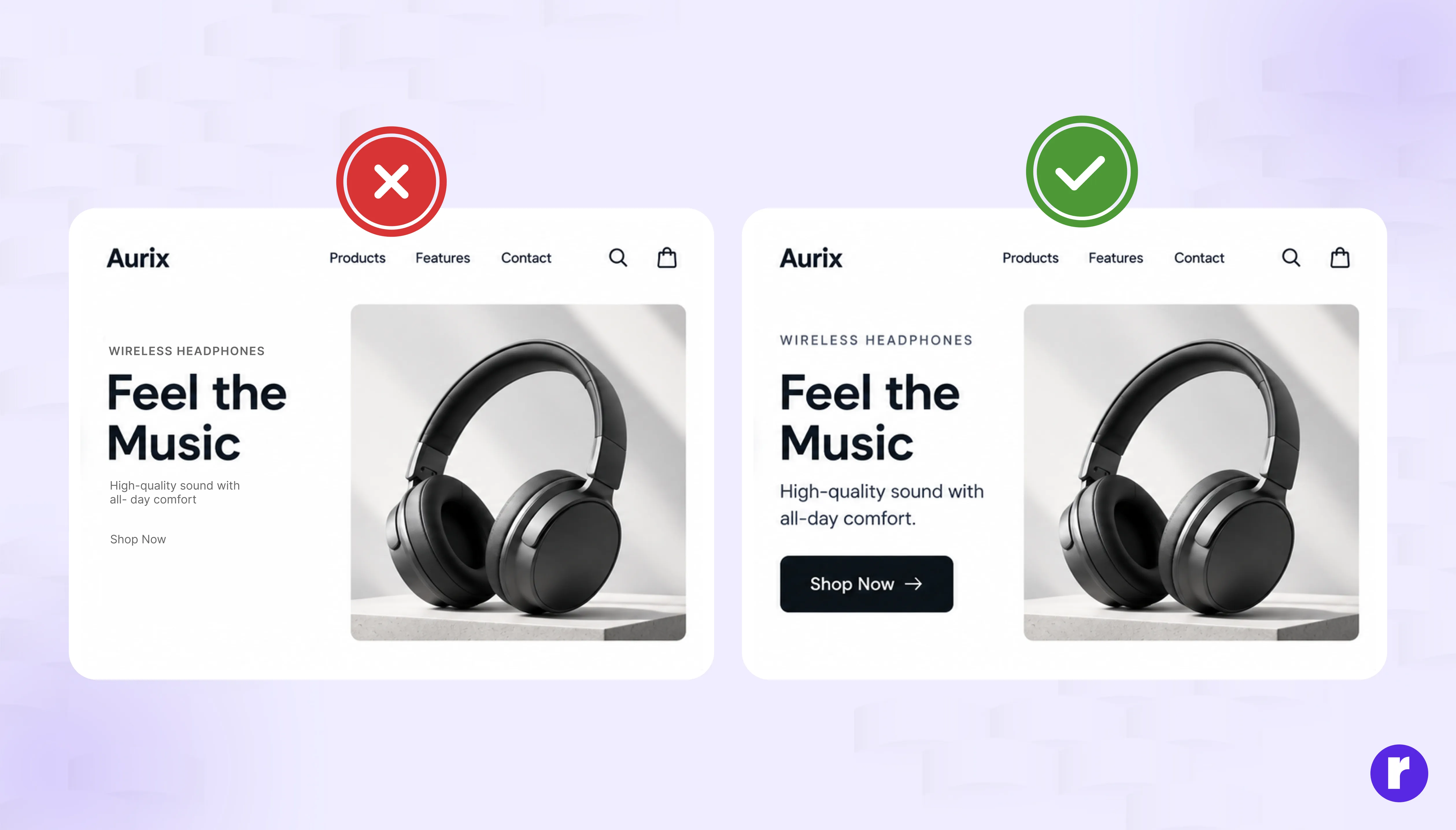
Many beginners focus only on making designs look good without checking if they are accessible to all users. Poor contrast, small text, and missing visual hierarchy can make your design unusable for people with visual impairments.
Designing for accessibility is not optional — it ensures your product works for everyone and meets modern design standards.
What to check:
- Maintain a minimum contrast ratio of 4.5:1 for body text and 3:1 for large text (use plugins like "Contrast" or "A11y" to verify)
- Don't rely only on color to communicate information (use icons, labels, or patterns as well)
- Test your designs with accessibility plugins before handoff
Not naming layers properly
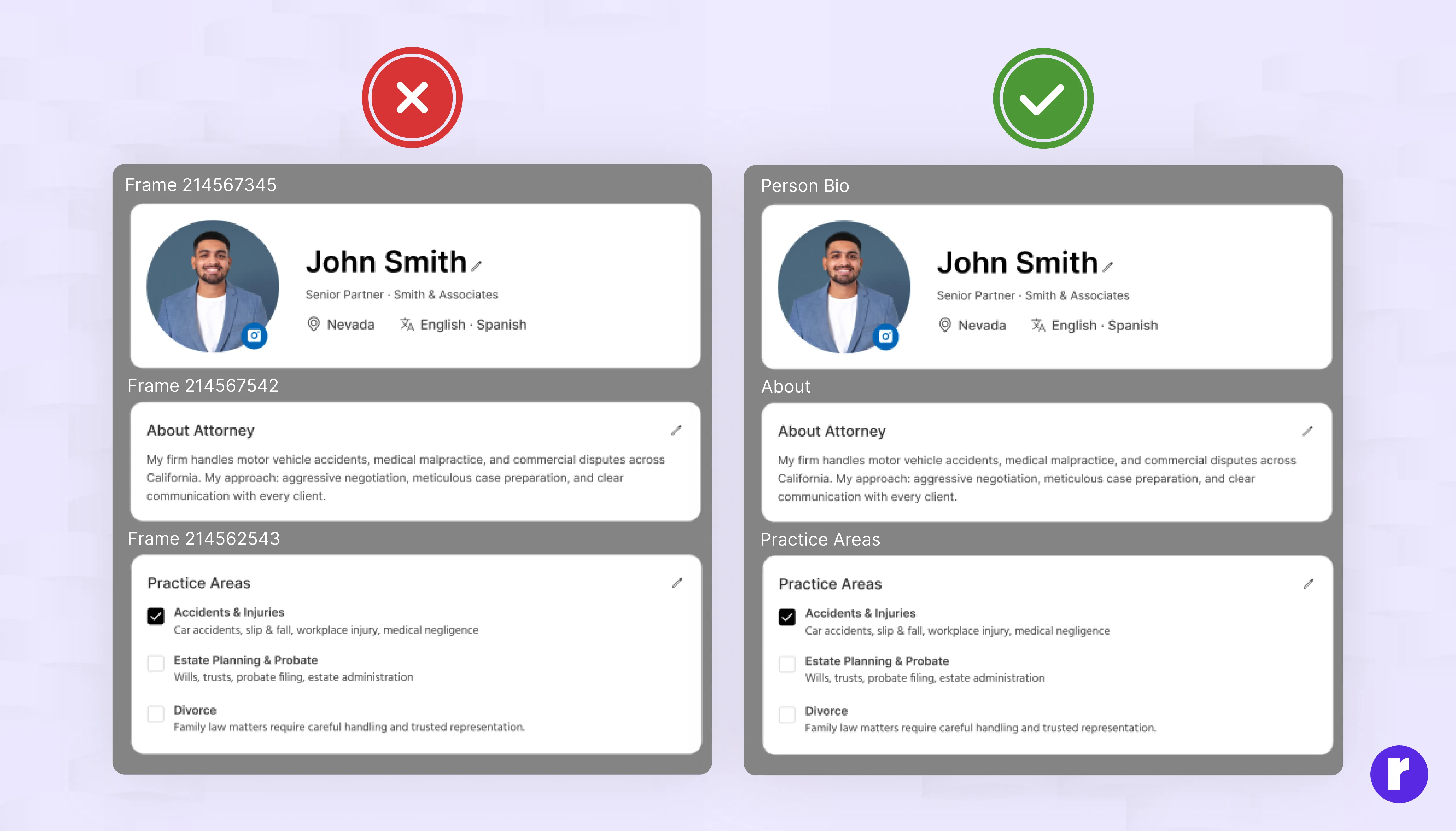
Many beginners leave default names like "Rectangle 1" or "Frame 45." This may feel okay at the start, but later it becomes very confusing when your file gets bigger. Poor naming makes it hard to find elements and slows down your workflow.
Simple solution:
- Rename layers with clear and meaningful names
- Use labels like "Navbar," "Hero Section," or "CTA Button."
- Keep your layers organized in groups and sections
Learn more about this topic View Here
Not learning shortcuts
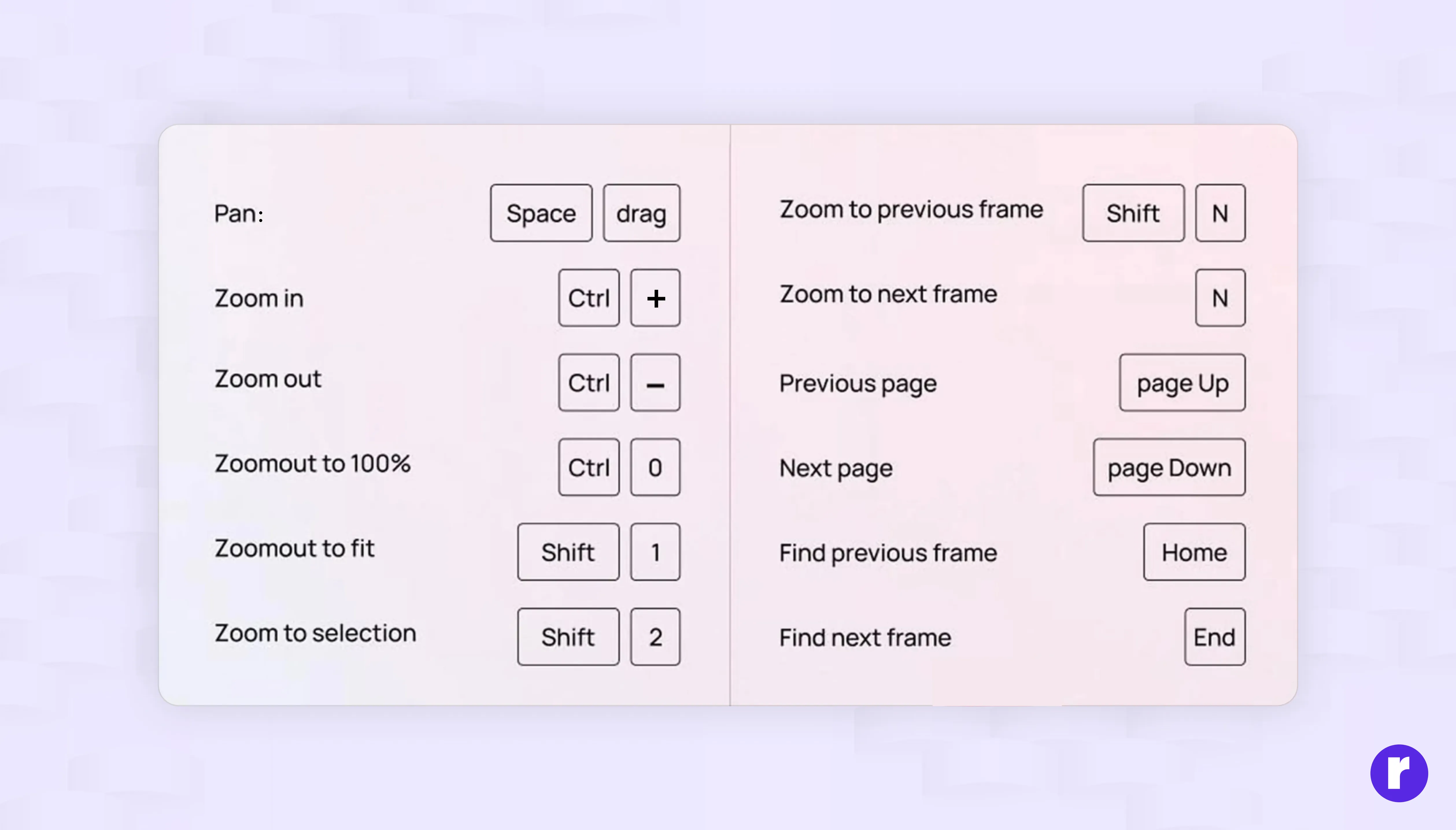
Many beginners rely only on the mouse and ignore keyboard shortcuts. This makes the design process slower than it needs to be.
Learning a few basic shortcuts can improve your speed and make your workflow smoother.
Start with basic shortcuts like:
- F for Frame
- T for Text
- R for Rectangle
Final thoughts
Now that you know the most common Figma mistakes, you have a clear checklist to follow in every project. Focus on building clean, consistent, and accessible designs from the start. Small habits like using components, naming layers, setting constraints, and checking contrast will compound over time and set you apart as a designer.
Keep practicing, stay curious, and revisit these tips whenever you start a new project.