Good vs. Bad Navigation: What Makes a Website Easy to Use

Written by

Chandani Sahani
UI/UX Designer
Table of contents
Build with Radial Code
Share this
Website navigation is more than just a menu at the top of your page—it’s the backbone of your user experience. When done right, it guides visitors effortlessly through your content, helping them find what they need and encouraging them to take action. When done poorly, it can frustrate users, drive them away, and hurt your brand’s credibility.
Why Navigation Is Crucial
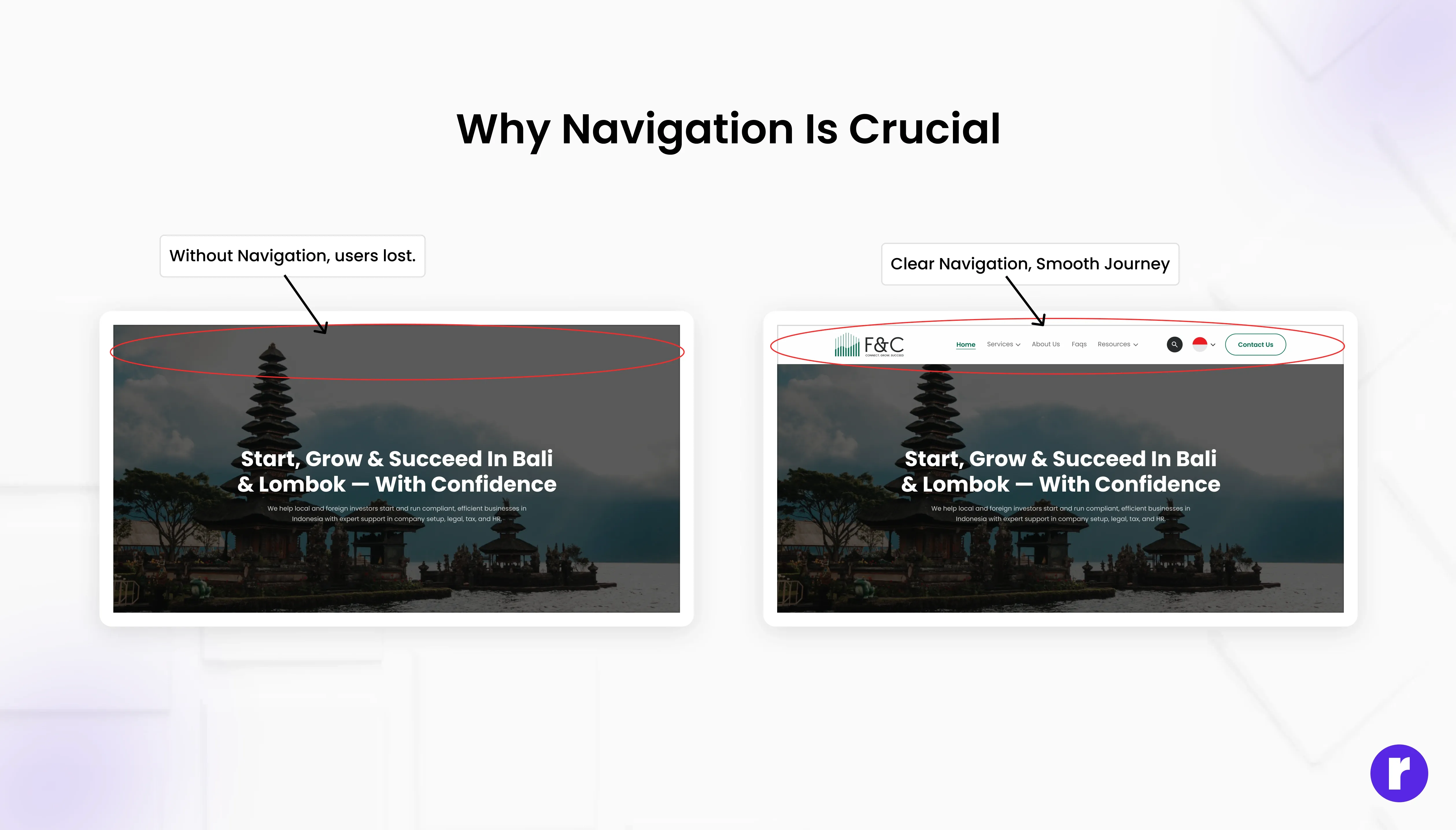
Picture stepping into a store where shelves have no labels, items are haphazardly placed, and no staff are around to assist you. You’d likely leave quickly. The same applies to websites. Navigation is your digital signpost, helping users:
- Find information quickly
- Understand your site’s structure
- Complete tasks (like making a purchase or contacting you)
- Feel confident and in control
What Makes Navigation “Good”?
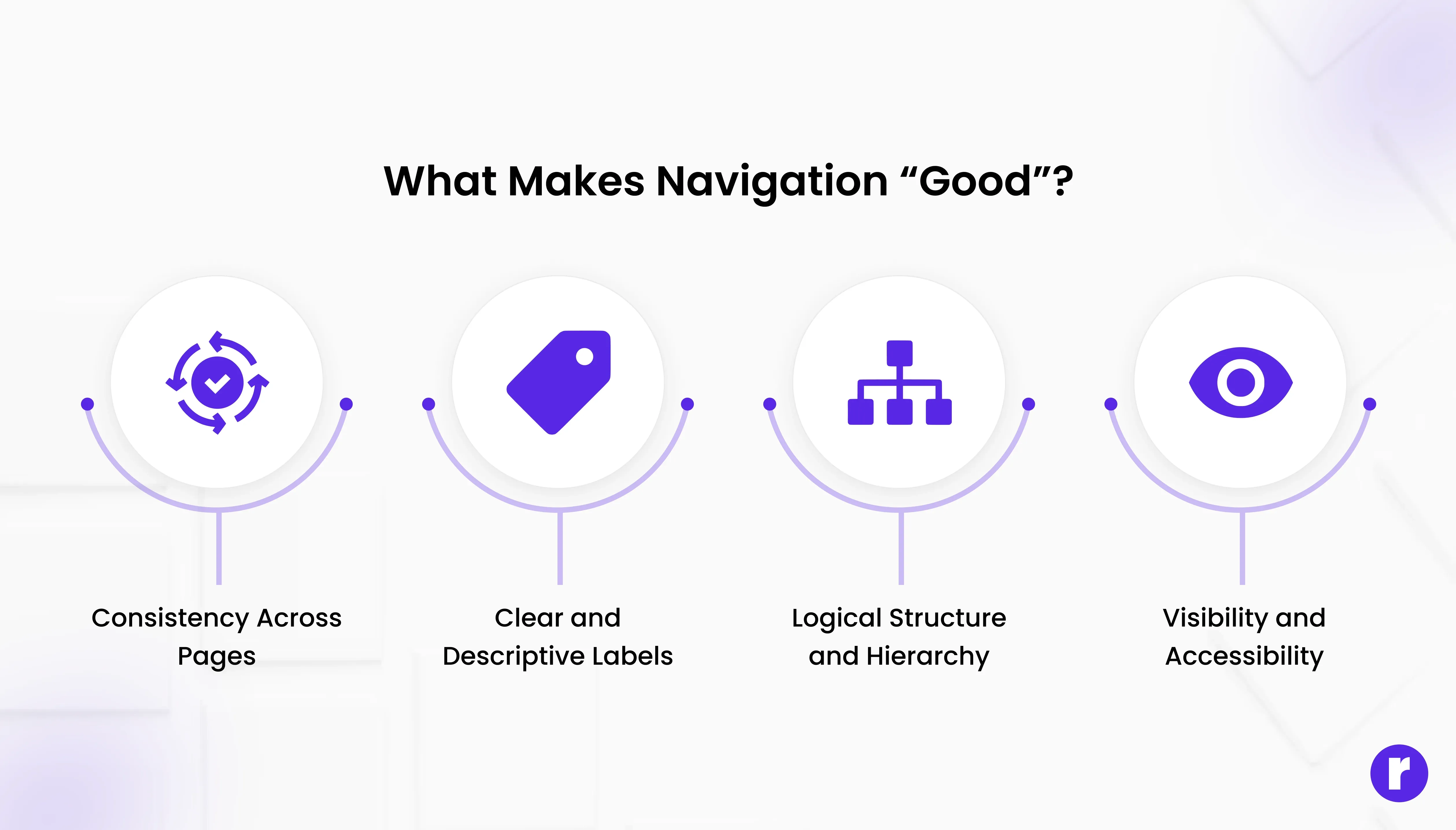
- Consistency Across Pages: Consistency means keeping your navigation elements—like menus, buttons, and links—in the same place and style on every page. This predictability helps users feel comfortable and increases the learning curve.
Example: If your main menu is at the top of your homepage, it should also be at the top of your blog, contact, and product pages. - Clear and Descriptive Labels: Labels should tell users exactly what to expect. Avoid vague terms like “stuff” or “things.” Instead, use specific labels like “Services,” “Pricing,” or “About Us.”
Example: Instead of “Resources,” use “E-books,” “Tutorials,” or “Case Studies” if those are the actual resources you offer. - Logical Structure and Hierarchy: Organize your navigation so that related items are grouped together. Use categories and subcategories to help users drill down to specific topics.
Example: A clothing store might have a main menu with “Men,” “Women,” and “Kids,” each with submenus for “Tops,” “Bottoms,” “Shoes,” etc. - Visibility and Accessibility: Navigation should be easy to spot and use, regardless of device. On mobile, use a clear hamburger menu or bottom navigation bar. Make sure your navigation is accessible to people with disabilities by using proper HTML tags and ARIA labels.
Example: A sticky navigation bar that stays at the top as users scroll keeps options always within reach. - Feedback and Orientation: Users should always know where they are on your site. Highlight the current page in the menu, use breadcrumbs, and provide visual cues like hover effects.
Example: If a user is on the “Blog” page, the “Blog” menu item should be highlighted or underlined. - Minimal Clicks to Destination: The fewer clicks it takes to reach important content, the better. Avoid burying pages deep within multiple submenus.
Example: A user should be able to reach your “Contact Us” page from anywhere on your site in one or two clicks.
Pro Resource: For more real-world navigation examples and expert tips, explore Flux Academy’s guide: 7 Website Navigation Best Practices (With Examples)
What Makes Navigation “Bad”?
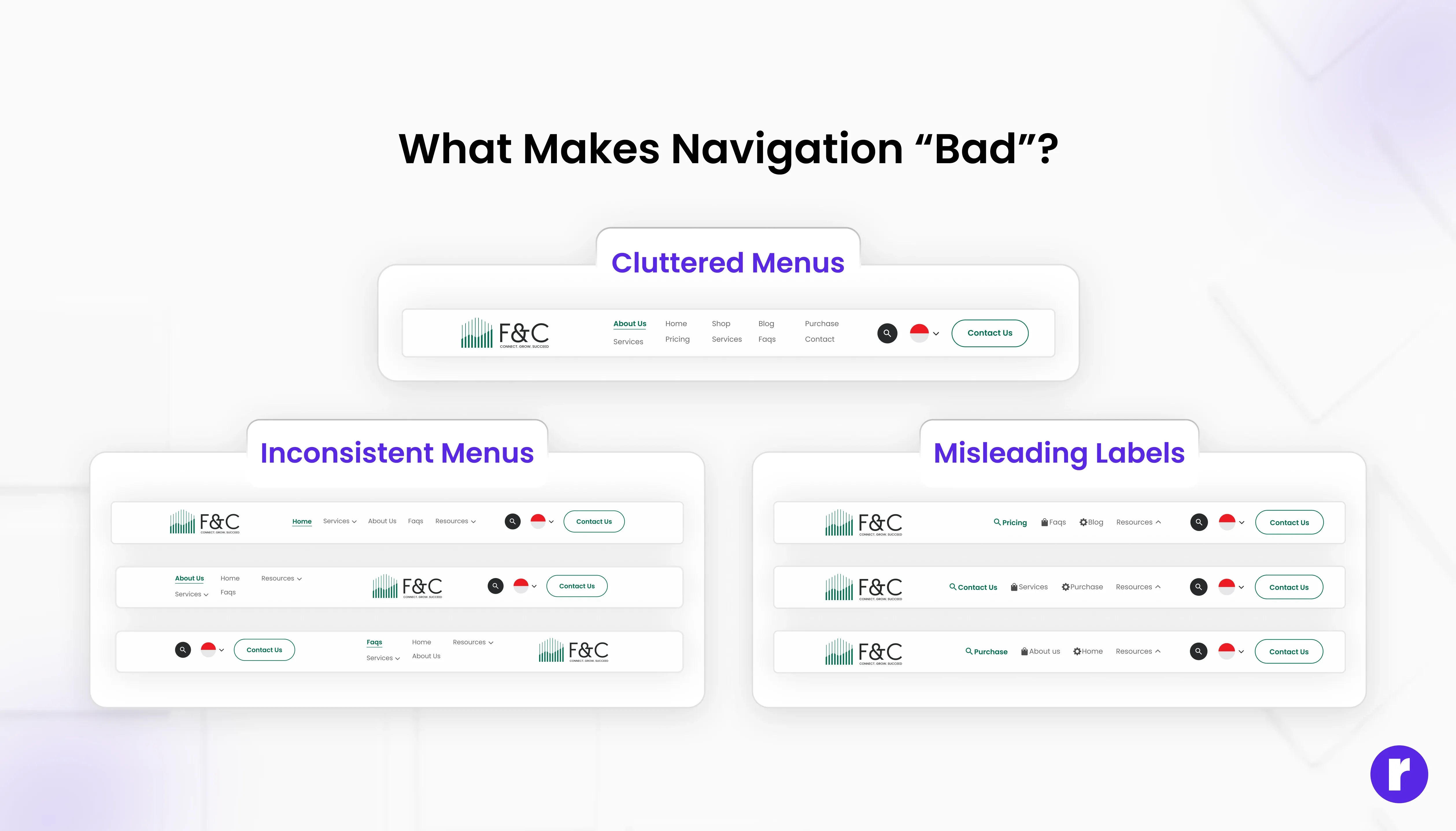
- Inconsistent Menus: Menus that change position, style, or content from page to page confuse users and make your site feel unprofessional.
- Vague or Misleading Labels: If users can’t predict what they’ll find when they click a link, they may hesitate or get frustrated.
- Overcrowded or Cluttered Menus: Too many options can overwhelm users. Prioritize the most important links and use dropdowns or “More” menus for secondary items.
- Hidden or Hard-to-Find Navigation: Navigation that’s hidden behind icons, pop-ups, or only appears on hover can be missed, especially on mobile devices.
- Broken Links and Dead Ends: Links that lead to 404 errors or irrelevant pages break trust and disrupt the user journey.
Best Practices for Effective Navigation
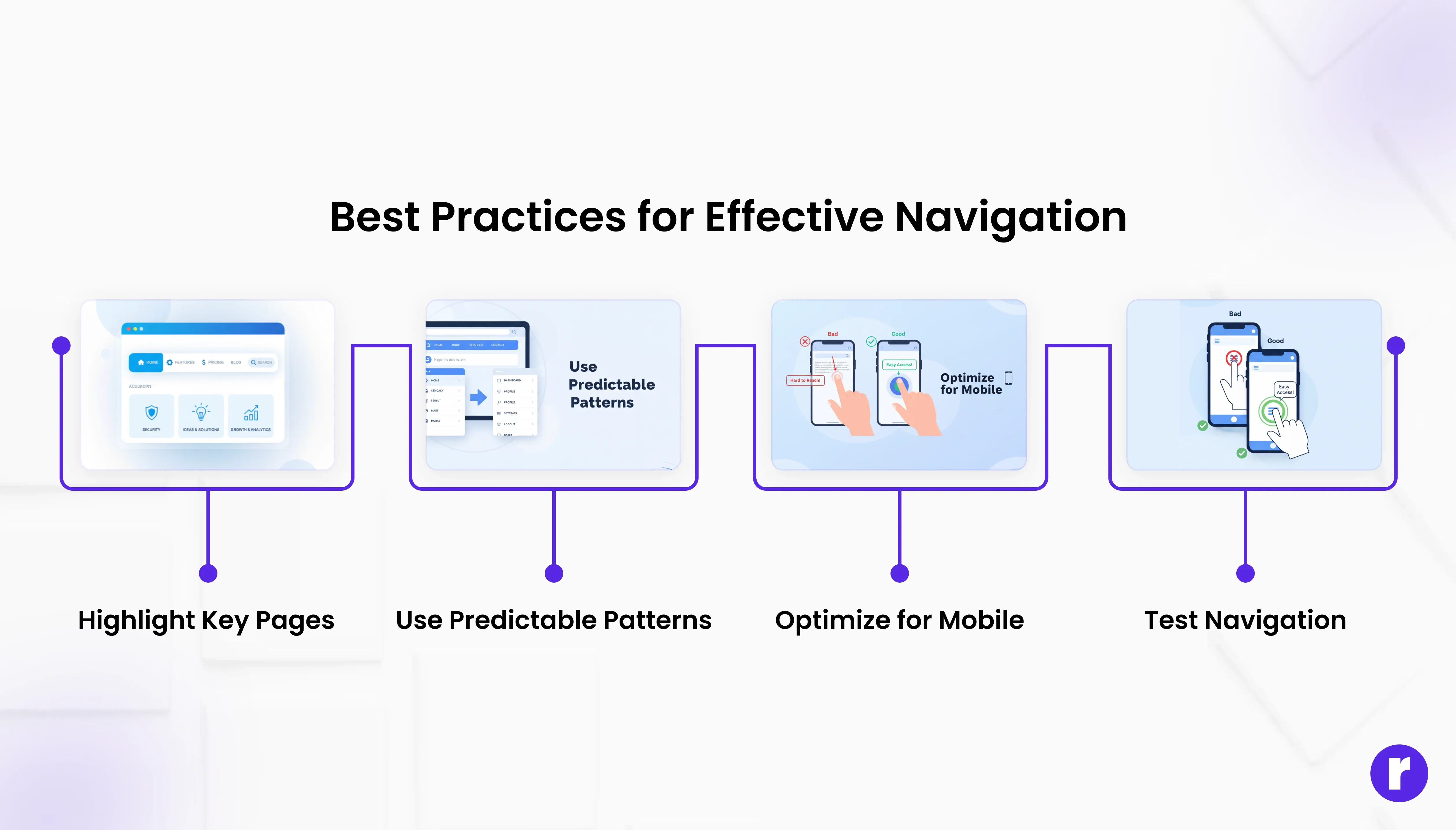
- Highlight Key Pages: Make important sections easily accessible.
- Use Predictable Patterns: Stick to familiar layouts like top menus or sidebars.
- Optimize for Mobile: Menus must be responsive, easy to tap, and functional on all devices.
- Test Navigation: Ensure menus are easy to tap and navigate on small screens.
- Add Search & Filters: For larger websites, robust search and filtering options improve user experience.
Conclusion
Navigation is the silent guide that shapes every user’s journey on your website. By focusing on clarity, consistency, and user needs, you can create a navigation system that delights visitors and drives results. Regularly test your navigation, gather feedback, and keep refining—because a website that’s easy to use is a website people love to visit.