How to Design Forms People Actually Want to Fill

Written by

Chandani Sahani
UI/UX Designer
Table of contents
Build with Radial Code
Share this
Forms are everywhere—sign-ups, checkouts, bookings, surveys. Yet most people dread them. Why? Because too often they feel like a chore: long, confusing, and designed for businesses rather than for the humans filling them out.
But here’s the truth a well-designed form can actually improve trust, reduce friction, and create a smoother experience that users want to complete. Here’s how to design forms people actually enjoy filling out.
Start With Purpose, Not Fields
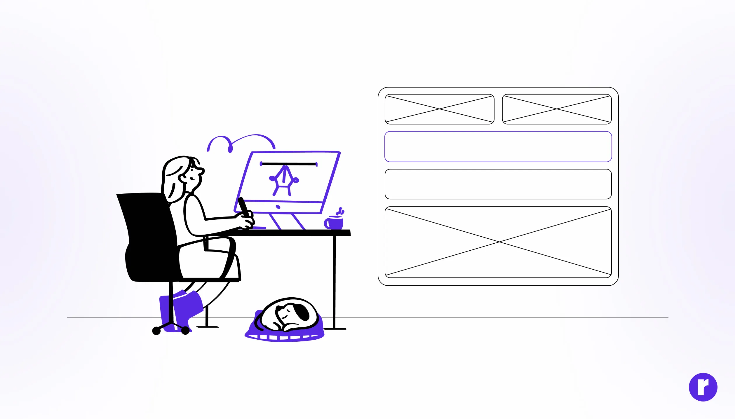
The first step to designing a form isn’t deciding which fields to add—it’s deciding why the form exists in the first place. Every field should serve a clear purpose. If you can’t explain why you need a particular piece of information, it doesn’t belong.
Here’s a simple framework you can use:
- Must-have fields: Absolutely essential to the form’s function (e.g., email for login).
- Nice-to-have fields: Useful but not critical—move these to later steps or make them optional.
- Unnecessary fields: Remove them completely.
This is where principles like reducing cognitive load come into play, making it easier for people to get through your form without mental fatigue.
Keep It Short and Scannable
Instead of dumping everything on one screen, break your form into small, digestible steps. Multi-step layouts feel lighter, even if the total number of fields stays the same.
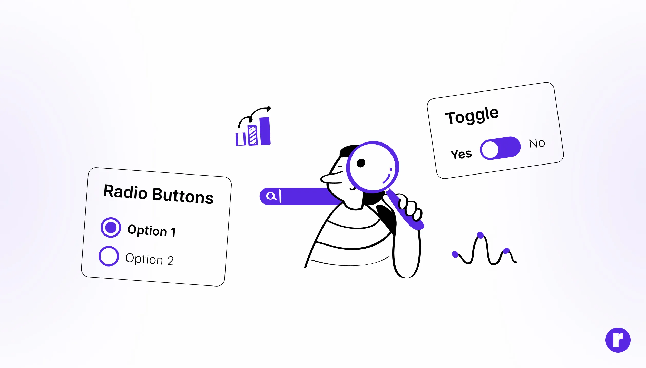
And wherever possible, replace text input with faster options:
- Dropdowns for fixed lists (like country selection).
- Toggles for yes/no answers.
- Auto-complete for addresses.
These small design choices save seconds at every step—and those seconds add up. Research on form UX best practices shows how these small tweaks dramatically improve completion rates.
Make It Feel Human
Start with low-effort details like name or email, and build toward sensitive questions such as payment details. This mirrors how people interact in real life—no one asks for your credit card number in the first five seconds of a conversation
- Also, don’t underestimate the power of microcopy. Small, supportive text can make or break trust:“We’ll only use this number to send delivery updates.”
- “Passwords must include at least 8 characters.”
Case studies on human-centric form design prove that conversational tone and clear guidance boost both trust and completion.
Fix Errors Before They Frustrate

Anticipate issues before they happen. Real-time validation gives instant feedback, showing users when something’s wrong while they’re still filling it out. And when you do show an error, make it:
- Clear: Say “Please enter a valid email address” instead of “Invalid input.”
- Helpful: Highlight the exact field that needs fixing.
- Supportive: Avoid harsh red text everywhere—use calm, instructional tone instead.
Build Trust and Accessibility
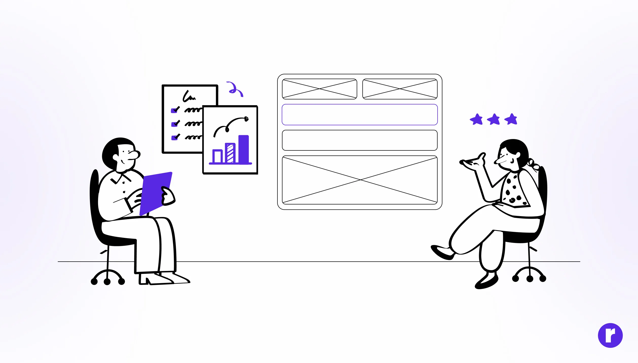
Great form design goes beyond efficiency—it’s about making users feel safe and included. Accessibility ensures everyone can complete the form, regardless of ability. That means:
Here’s a simple framework you can use:
- Proper label associations for screen readers. (e.g., email for login).
- High contrast text for readability.
- Smooth keyboard navigation.
That’s why many e-commerce leaders follow Baymard’s form design principles to build checkout flows that feel honest, efficient, and user-first.
Conclusion
Forms don’t have to be a necessary evil. With the right design approach, they can feel like natural, seamless parts of the user journey rather than frustrating obstacles.
By making them purposeful, scannable, conversational, error-friendly, and trustworthy, you transform a dreaded task into an interaction users actually appreciate.
Remember: every form is a conversation. And the best conversations leave people feeling heard, respected, and understood.