The Psychology of tap targets

Written by

Chandani Sahani
UI/UX Designer
Table of contents
Build with Radial Code
Share this
In the digital world, small details make big differences. One of the most overlooked aspects of web and app design is the size of tap targets — the buttons, links, and icons users interact with. While it may seem minor, the psychology of tap targets directly impacts usability, user satisfaction, and conversion rates.
A button that feels too small can instantly create friction, forcing users to zoom in, adjust their grip, or even abandon the action altogether. On the other hand, a well-sized, easy-to-tap button feels natural and effortless, reinforcing a sense of control and building trust with the interface.
The Human Factor: Fitts’s Law
Psychologists and UX researchers often cite Fitts’s Law, which explains the time it takes to reach a target depends on its size and distance. In simple terms:
- Bigger buttons = easier to tap
- Smaller buttons = higher chance of mistakes
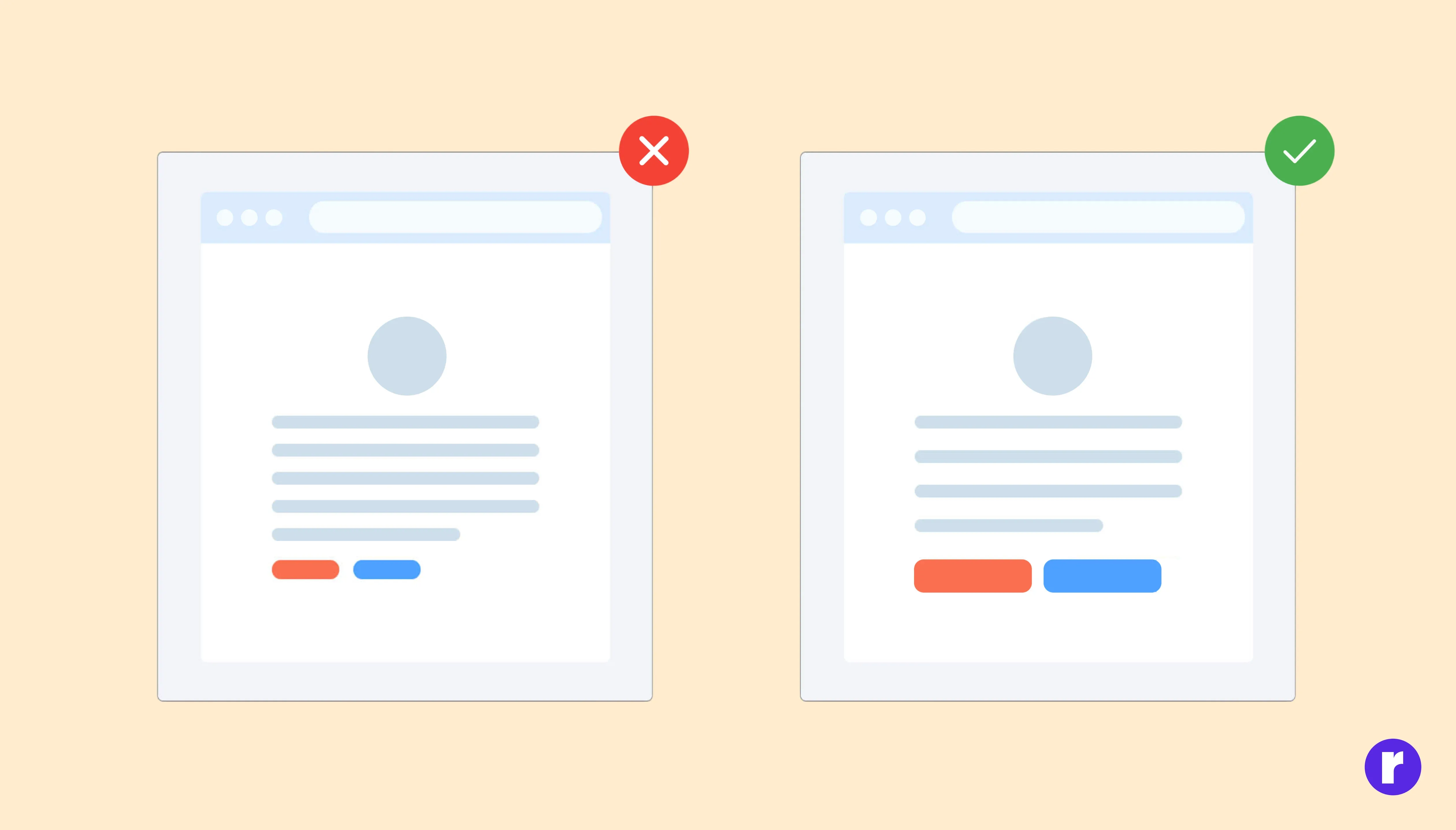
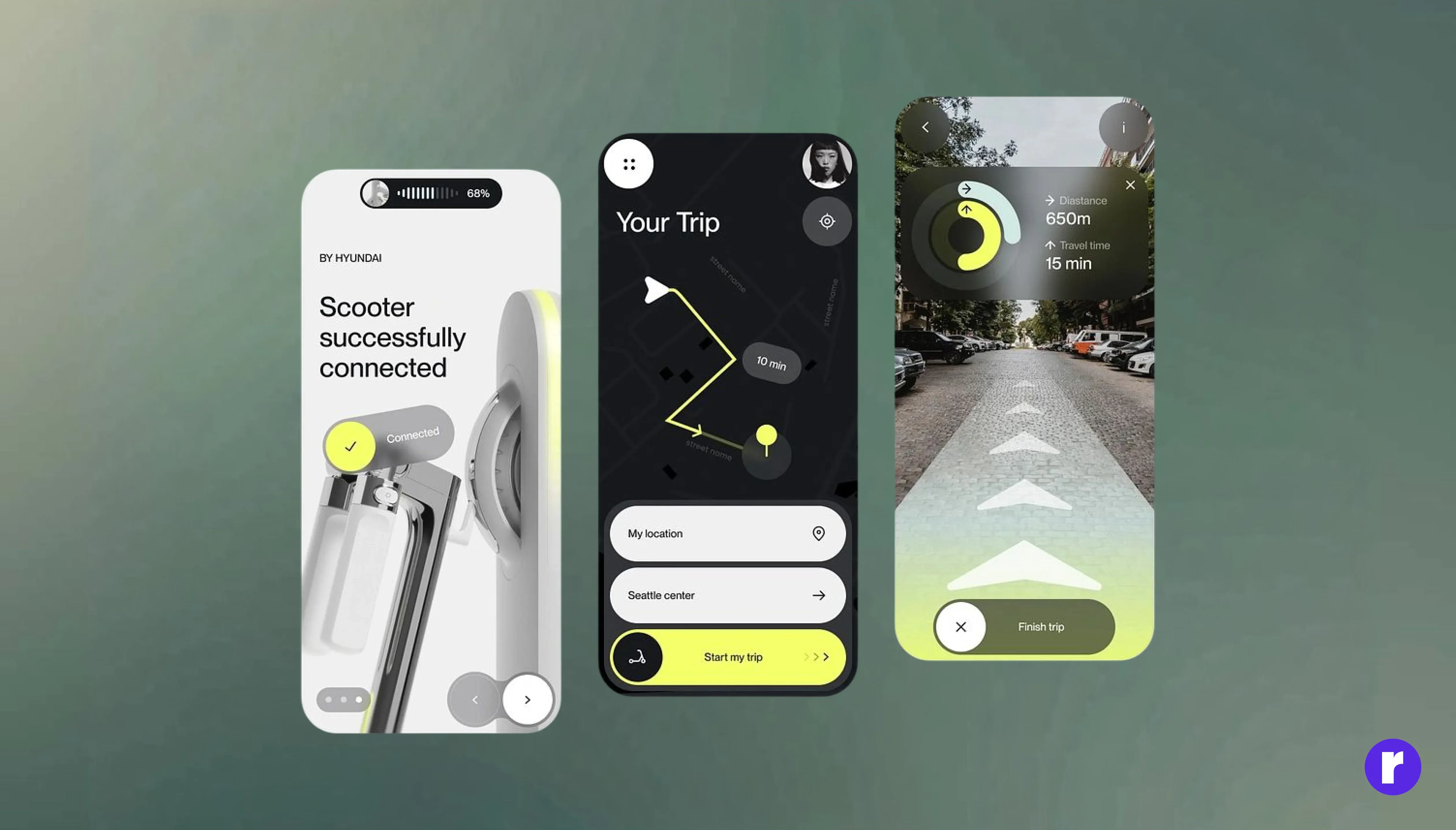
Bigger buttons improve touch interaction and reduce frustration. See Example
When users struggle to tap a button, it creates friction — and even small moments of frustration can lead to drop-offs.
Make Buttons Easy to Tap
Every extra effort a user makes adds to their cognitive load. If buttons are too small or too close together, users feel tense and anxious about making errors. Clear, generously sized buttons reduce that mental strain, making interactions feel smooth and intuitive. smooth and intuitive.
💡 Pro Tip: Always design buttons with at least 44x44px (Apple) or 48x48px (Google) touch targets to minimize errors and create stress-free interactions.
Design Buttons for Everyone
Not all users have the same motor skills or devices. People with larger fingers, limited dexterity, or those using a phone with one hand often struggle with tiny tap targets. Larger, well-spaced buttons promote inclusive design, ensuring everyone can interact with your app or site comfortably.
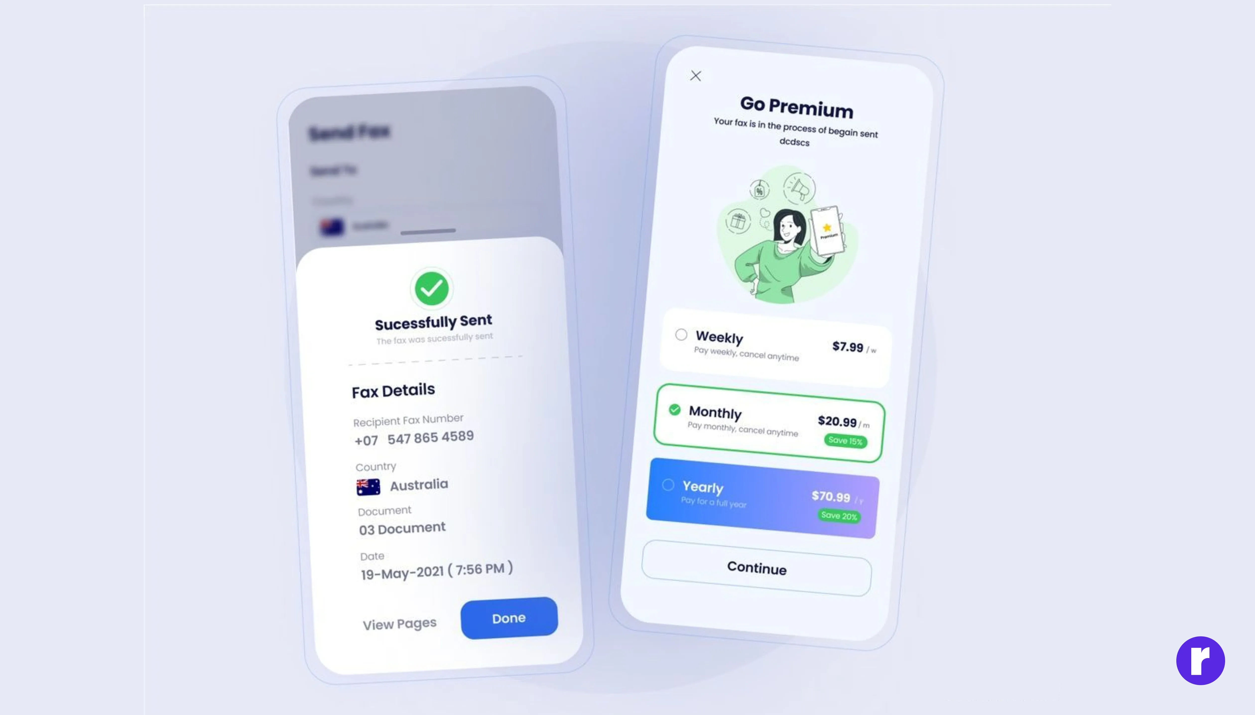
The Power of a Well-Sized CTA
A poorly sized call-to-action (CTA) button can cost you conversions. Users hesitate when a button feels hard to tap — but they act quickly when the button feels easy, confident, and obvious. That’s why high-performing CTAs often use:
- Large, thumb-friendly dimensions
- Adequate spacing from other elements
- Strong visual contrast.
Best Practices for Tap Targets
Both Apple and Google give clear recommendations for button sizes. Apple suggests a minimum of 44x44px, while Google recommends 48x48px. Sticking to these standards ensures your buttons feel natural on most devices.
- Follow platform guidelines (e.g., Apple recommends at least 44x44px, Google recommends 48x48px).
- Leave breathing space between clickable elements.
- Design for thumbs, since most people use one hand on mobile.
- Test with real users, not just design assumptions.
Conclusion
Button size isn’t just a design choice — it affects ease, trust, and results. A button that’s big enough feels better, works better, and leads to more clicks.