How brands stay recognizable across apps, websites & social media

Written by

Sumit Verma
UI/UX Designer
Table of contents
Build with Radial Code
Share this


Think about the last time you spotted a brand before you even read its name. Maybe it was a color on a delivery box, a shape in the corner of an app icon, or a certain kind of photo on someone's Instagram feed. You knew who it was almost instantly, even though you saw it on a completely different screen than usual.
That is not an accident. Brands that feel familiar everywhere put real thought into staying consistent, even while showing up on apps, websites, and social platforms that all work differently. This blog looks at how they pull that off, and what actually makes a brand stick in someone's memory across so many different places.
A visual system holds everything together
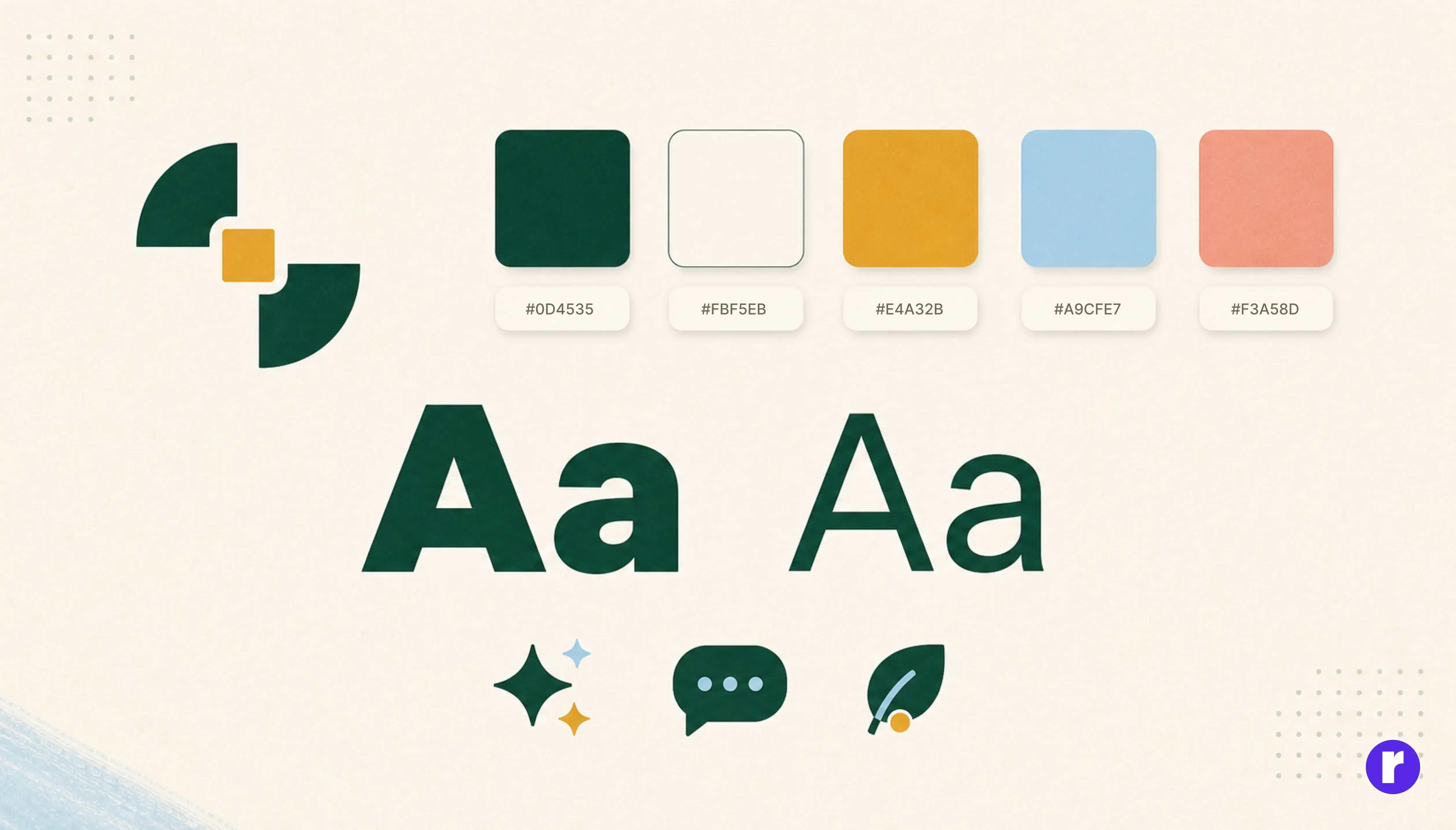
Every recognizable brand is built on a small set of visual pieces that repeat everywhere. It is not about using the exact same layout on every screen. It is about reusing the same building blocks so people recognize the brand no matter where they see it. This idea is often called brand identity, and it is the foundation everything else in this blog builds on.
The core pieces usually include:
- A logo that stays the same, even if its size or spacing changes
- A small, fixed color palette used the same way every time
- One or two consistent fonts across all platforms
- A recognizable style for icons and illustrations
- A consistent type of photography or imagery
When these pieces stay fixed, a brand can look different in small ways from app to website to social post, while still feeling like the same brand underneath.
Every platform has its own rules

Here is where it gets tricky. Apps, websites, and social platforms do not all work the same way, and they do not all let a brand do whatever it wants. Apple has its own design guidelines for how iPhone apps should look and behave. Google has a similar system called Material Design for Android and the web. Social platforms have their own limits too, like fixed image sizes and profile shapes.
A brand that ignores these rules ends up feeling broken or out of place on that platform. A brand that follows the rules too rigidly, without keeping any of its own personality, ends up looking like every other app around it. The brands that stay recognizable manage to do both. They follow each platform's rules, but they still bring their own color, shape, and voice into that structure.
Voice and tone matter just as much as visuals

Recognition is not only about how something looks. It is also about how it sounds. A brand that is playful and casual on social media but sounds like a legal document on its website starts to feel like two different companies, even if the colors and logo match perfectly.
Brands that get this right usually pick a small set of tone traits and repeat them everywhere their words show up:
- A consistent level of formality, whether that is casual or professional
- The same kind of humor, or none at all, used the same way each time
- Similar sentence length and rhythm across emails, app notifications, and posts
- The same words used for the same actions, instead of switching terms randomly
Getting the visuals right gets a brand noticed. Getting the tone right is what makes it feel like a real, consistent personality instead of just a logo.
Small inconsistencies add up fast

No single mismatched icon or slightly off color is going to ruin a brand on its own. The real damage happens slowly, from a long list of small differences that build up over time. A slightly different shade of blue on the app. A logo that is stretched a little too wide on the website. A font swap in an email because someone did not have access to the original file.
None of these mistakes look serious by themselves. But when people move between an app, a website, and a social page in the same day, these small gaps start to register, even if they cannot say exactly why something feels a little off. Over time, this quietly chips away at how easily people recognize and trust the brand.
Your brand looks different everywhere. Let's fix that. Talk to us
Why this actually matters for the business

Staying recognizable is not just a design preference. It has a real effect on how a business grows and how much people trust it. Consistency is one of the cheapest ways a brand can build trust, because it does not require a new campaign, just discipline in how existing pieces get used.
Some of the direct benefits include:
- Faster recognition, so people notice the brand in a crowded feed or app store
- More trust, since a consistent look feels more professional and reliable
- Easier scaling, since new pages, apps, or campaigns can reuse the same system instead of starting from scratch
- Less confusion for customers moving between the website, app, and social channels
Conclusion
Staying recognizable across apps, websites, and social media is not about using the exact same design everywhere. It is about repeating the same small set of visual and language choices so consistently that people recognize the brand without even reading its name. The brands that manage this treat their logo, colors, fonts, and tone as fixed rules, not flexible suggestions, and they respect each platform's own limits without losing their own personality inside them. Get that balance right, and a brand starts to feel familiar everywhere it shows up, which is exactly the kind of trust that is hard to build any other way.