How Icons and Buttons Guide Your Experience

Written by

Priyanka Jangra
UI/UX Designer
Table of contents
Build with Radial Code
Share this
When you open an app or visit a website, what helps you move around smoothly? It’s not just the words you read—it’s also the icons and buttons you click. These small elements play a big role in shaping your digital journey.
Good icons and buttons make an interface clear, easy, and enjoyable. Bad ones can confuse you, slow you down, and even make you leave. In this blog, we’ll explore why icons and buttons matter in UX/UI design, how they influence user behavior, some good examples, and tips for designing them effectively.
Why Icons and Buttons Matter
They are the building blocks that enable users to interact with a digital product, making it functional, intuitive, and visually appealing. Here's a breakdown of why icons and buttons matter:
- Quick Communication: Icons speak faster than words. A trash bin icon instantly tells you “delete.” A magnifying glass says “search.” Users don’t have to think twice.
- Visual Cues for Action: Buttons guide you on what to do next—whether it’s “Sign Up,” “Buy Now,” or “Continue.” Without clear buttons, users feel lost.
- Consistency Builds Trust: When icons and buttons follow common patterns, users feel comfortable. They don’t need to re-learn things every time they use a new app.
- Enhances Accessibility: Well-designed icons and buttons improve accessibility. For example, a clear “play” button helps users with language barriers or low literacy.
Learn how icons and buttons impact usability and improve overall user experience. Read more
How They Influence User Behavior
They are the building blocks that enable users to interact with a digital product, making it functional, intuitive, and visually appealing.
- Encourage Action: A bold “Call Now” button makes users more likely to take action compared to plain text.
- Reduce Effort: Instead of reading a full instruction, users simply follow the icon or press the button.
- Build Confidence: Clear buttons make users feel they are on the right path, which reduces drop-offs.
- Emotional Connection: Fun, colorful icons can make a product feel friendlier and more engaging.
Discover practical tips for designing buttons that are clear, clickable, and guide user behavior. Read more
"Icons and buttons may be small, but they’re the signposts that guide every step of a user’s digital journey.”
Examples of Good Practices
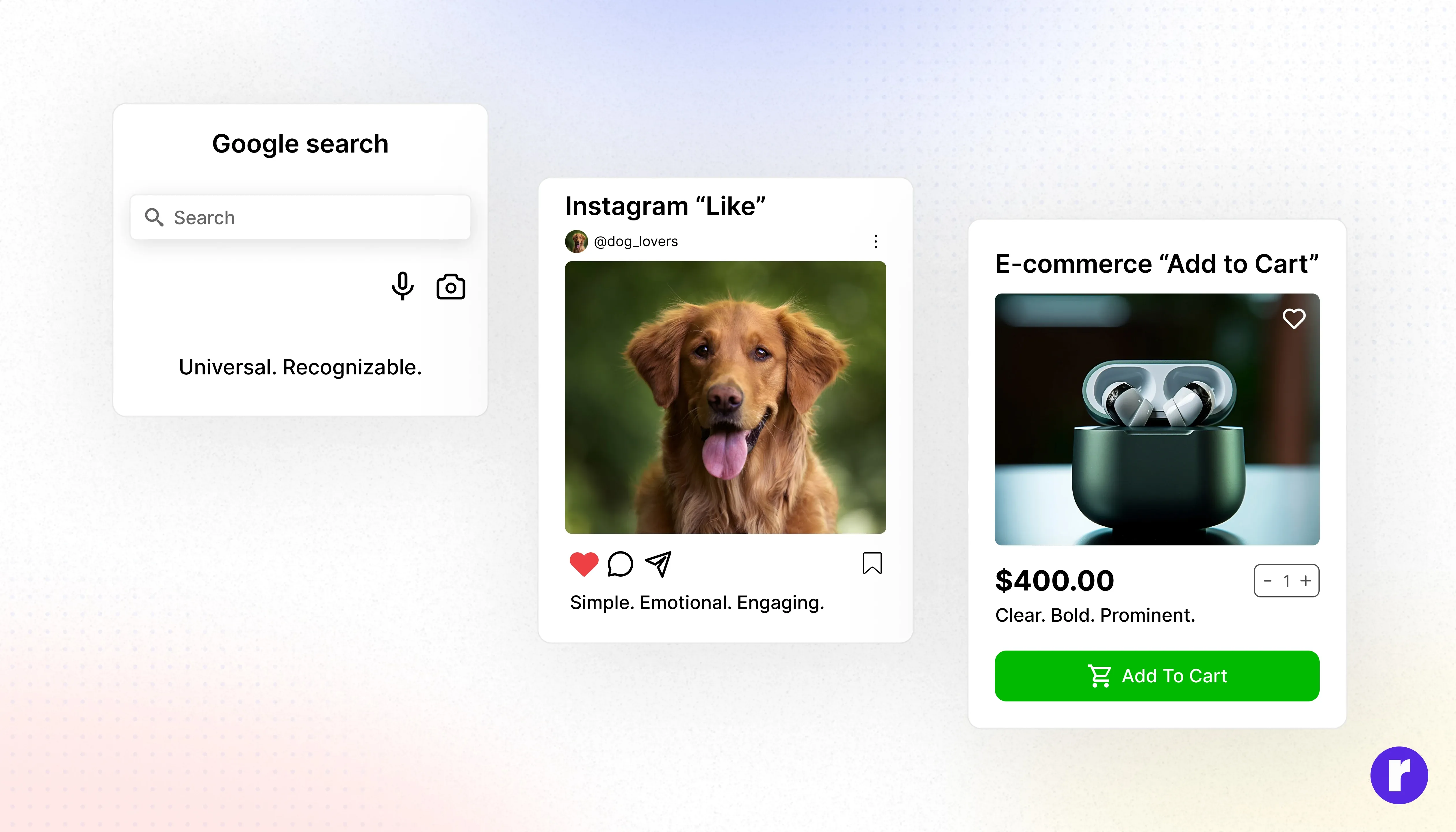
- Google Search: The magnifying glass icon is universal. No matter where you are in the world, you know it means “search.
- Instagram’s Heart Icon: The heart represents “like.” Simple, recognizable, and emotional—it connects with users instantly.
- E-commerce ‘Add to Cart’ Button: Bright, bold, and placed where users expect it, this button makes shopping easy.
Tips for Designing Effective Icons and Buttons
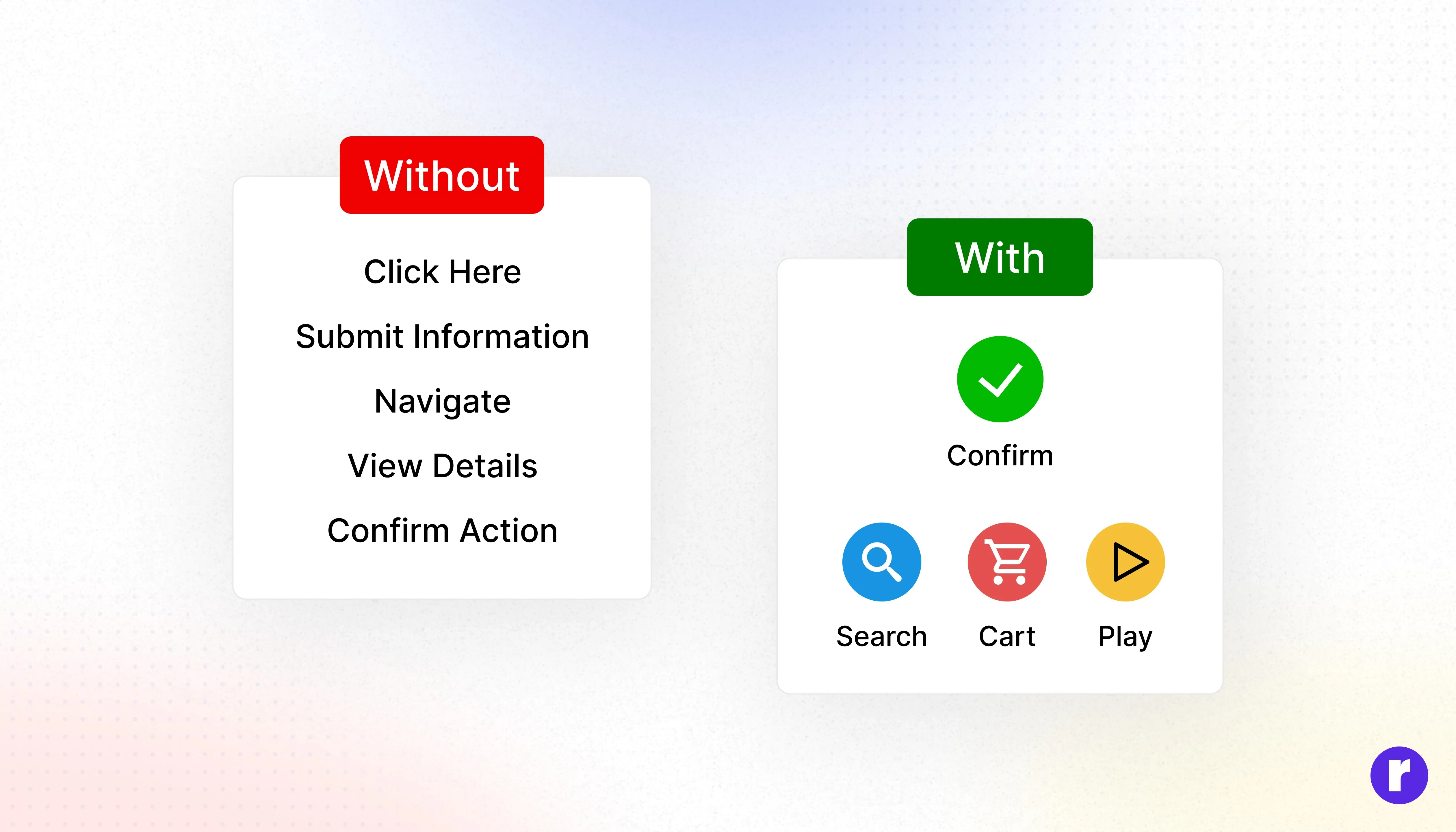
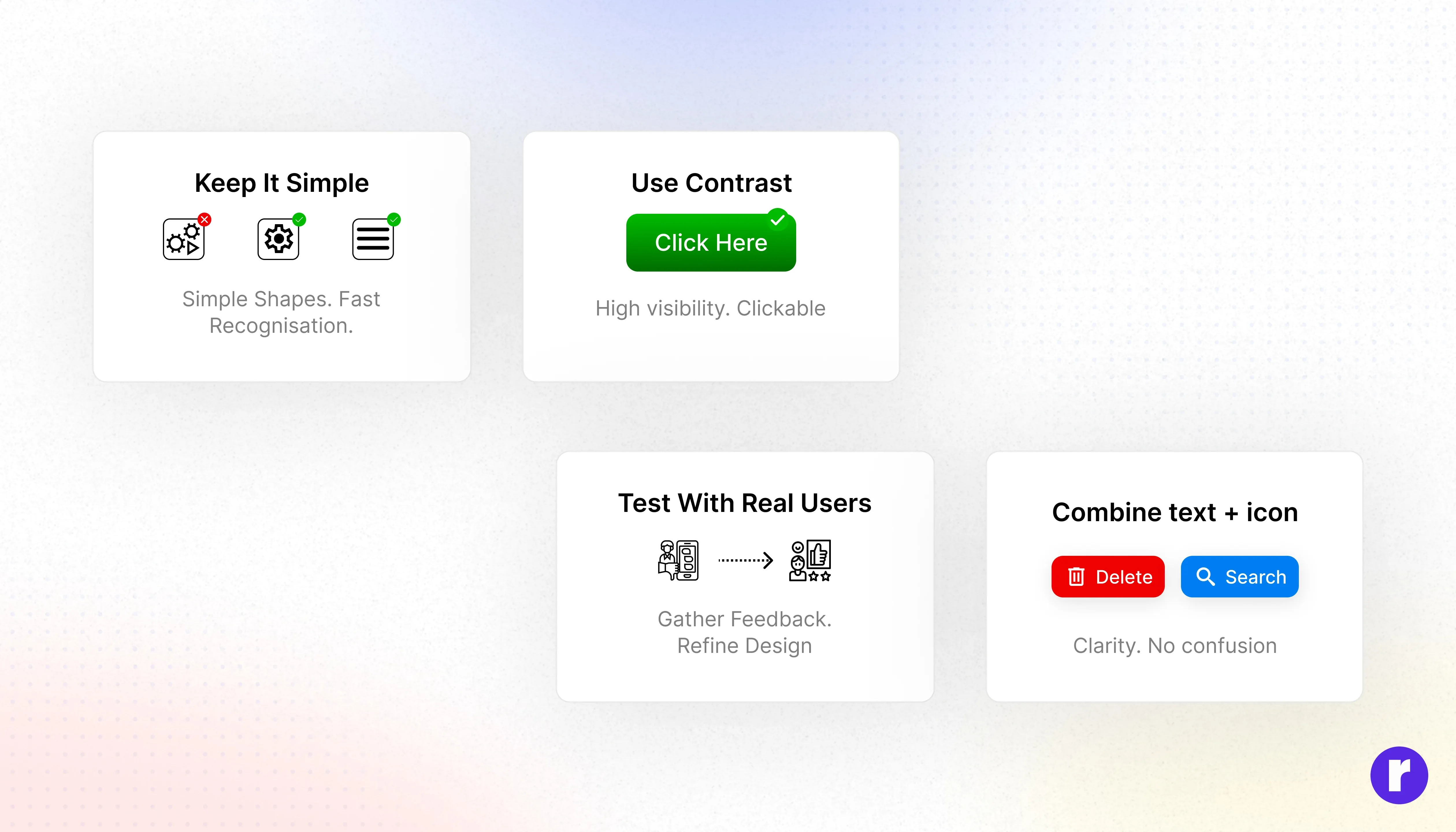
- Keep It Simple: Avoid overly detailed or complex icons. Simple shapes are easier to recognize and faster to process. Users should understand an icon in a split second.
- Use Contrast: Ensure buttons stand out against the background. Colors, shadows, and borders can make buttons more noticeable and visually clickable.
- Test With Real Users: Observe how users interact with your icons and buttons. User testing can reveal confusing elements, unclicked buttons, or misinterpreted icons, helping you refine your design.
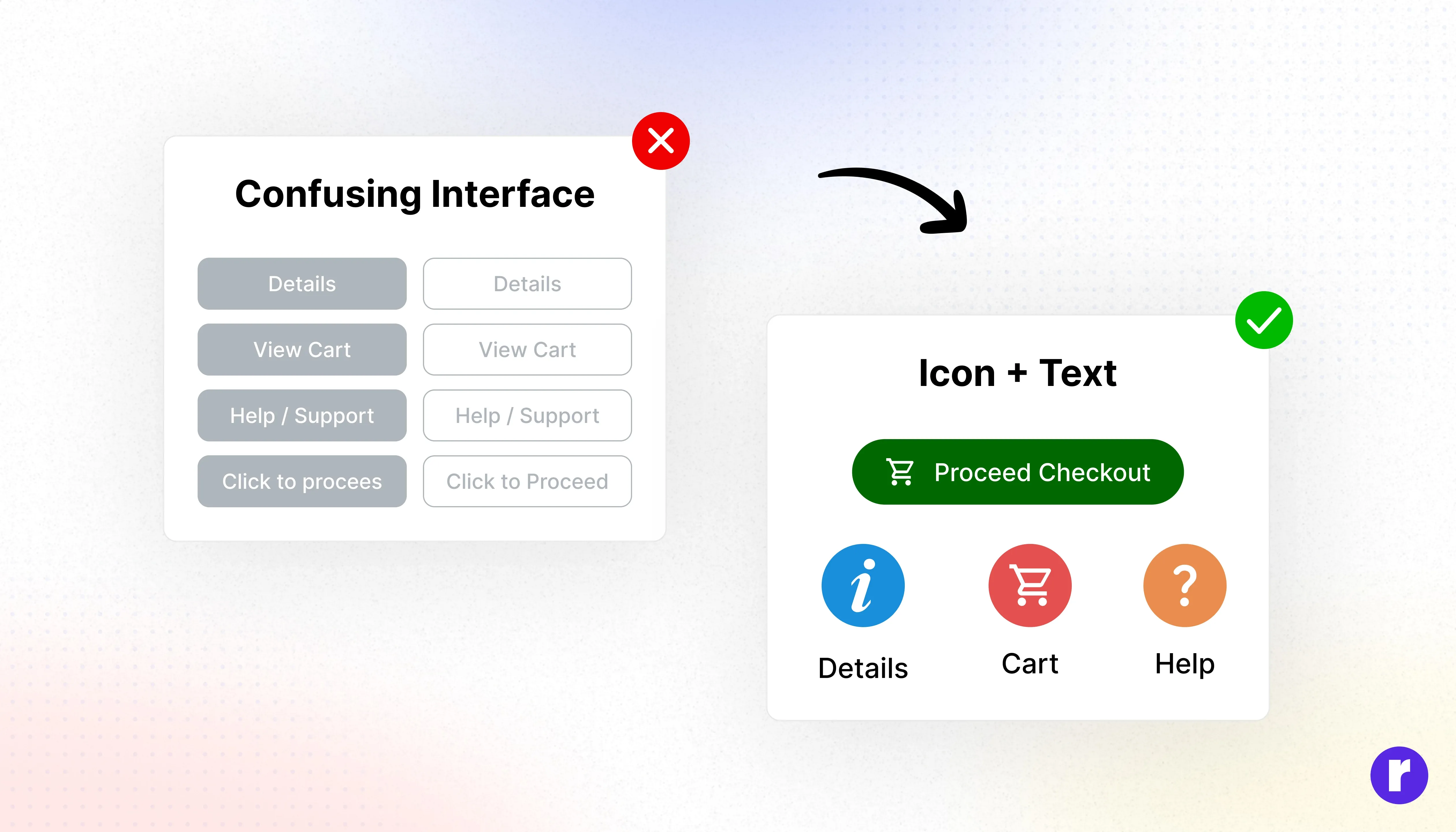
- Combine Icons and Text: Pairing icons with text labels improves clarity, especially for new users. For example, a trash can icon labeled “Delete” ensures there’s no confusion about its action.
Common Mistakes to Avoid
- Using too many icons, which overwhelms users.
- Inconsistent button styles, which reduce trust.
- Hidden icons without labels, which hurt accessibility.
Conclusion
Icons and buttons may look small, but they have a powerful impact on UX. By keeping them simple, clear, and consistent, you help users move smoothly, build trust, and enjoy your product. For more insights on UI/UX design, visit Radial code