How to Pick Colors for Your Website

Written by

Sumit Verma
UI/UX Designer
Table of contents
Build with Radial Code
Share this
When someone visits your website, the first thing they notice is the look and feel. And one of the biggest parts of that is color. The right colors can make your site attractive, easy to read, and even build trust with visitors. The wrong colors can make people leave in seconds.
The right colors can make your website look professional, trustworthy, and welcoming. They help highlight important sections, make your text easy to read, and keep visitors engaged for longer. On the other hand, poor color choices can make your site look messy or unprofessional, and visitors might leave within seconds.
That’s why picking the right colors isn’t just about making your site “pretty”—it’s about creating the right experience for your audience.
Know the steps to pick color for your website ? Radial code
Start with Your Brand

Your brand is the heart of your website. Before you choose any colors, ask yourself: What does my brand represent? What do I want people to feel when they visit my site?
Colors are like a silent language—they communicate your brand’s personality without using words.
- Professional brands (like law firms, banks, or consultancy services) often use neutral and serious colors such as navy blue, black, gray, or white. These colors create a sense of trust, authority, and reliability.
- Fun and playful brands (like toy stores, cafes, or creative startups) usually go for bright and bold colors like yellow, orange, pink, or purple. These colors give off energy, excitement, and friendliness.
- Health, wellness, and eco-friendly brands (like organic products, yoga studios, or nature-related services) commonly use greens, browns, and earthy tones. These shades symbolize freshness, growth, and balance.
The key idea is that Your color choice should tell the story of your brand. If your colors don’t match your brand personality, visitors may get the wrong impression.
Understand Color Meanings (Color Psychology)
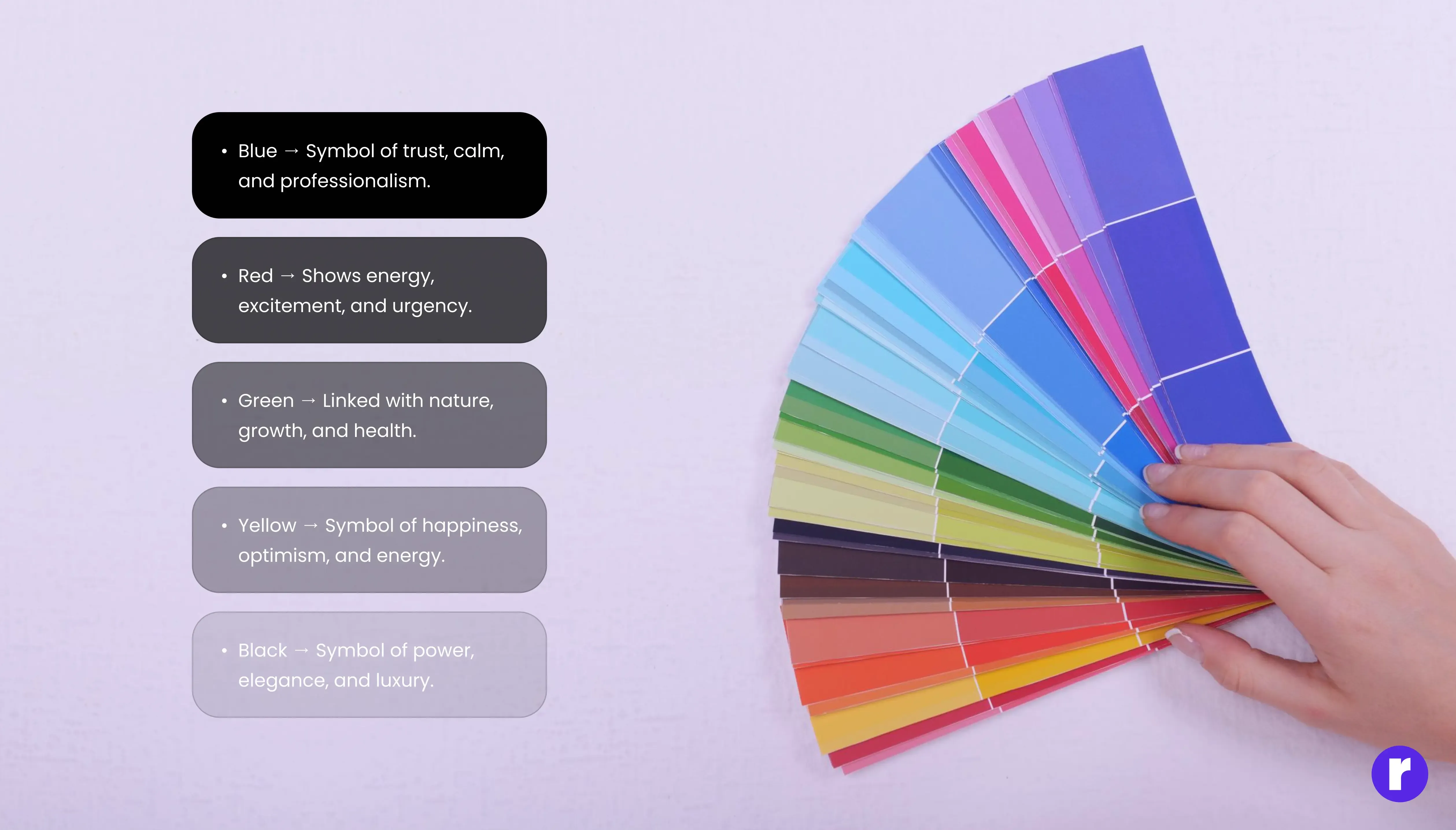
Colors are not just visual—they also influence emotions and decisions. This is called color psychology. When people visit your website, the colors you use can make them feel calm, excited, safe, or even motivated to take action. That’s why it’s important to understand what each color usually represents.
- Blue → Often linked with trust, calmness, and professionalism. That’s why banks, tech companies, and healthcare brands use blue to make people feel safe and confident.
- Red → A strong color that shows energy, excitement, and urgency. Many food brands and e-commerce sites use red to grab attention or encourage quick action (like “Buy Now” buttons).
- Green → Connected with nature, growth, and health. You’ll see it often in wellness, organic products, or environmental websites because it gives a sense of freshness and balance.
- Yellow → Bright and cheerful, symbolizing happiness and optimism. It works well for brands that want to appear friendly, energetic, and approachable.
- Black → A color of power, elegance, and luxury. High-end fashion brands and premium services use black to look classy and exclusive.
The goal is to pick a color that matches your brand’s message. For example, if you want people to trust you, use blue. If you want them to feel excited, red works well. If your brand is all about calmness and balance, green is a good choice.
Learn the meaning of colors for your website ? Radial code blog
Choose One Main Color

Every strong brand has one color that stands out and becomes part of its identity. Think about Facebook, YouTube, or Starbucks—you can probably picture their main color instantly. That’s the power of choosing a primary color. Your main color (also called your brand color) should be the color that represents your business the best. It’s the color people will associate with you, and it should appear the most across your website. This doesn’t mean your whole website has to be filled with that one color, but it should be the dominant tone.
Here’s why having one main color is important:
- Brand Recognition: A single, strong color helps people remember your brand. For example, when you think of Coca-Cola, red comes to mind instantly.
- Consistency: Using the same main color across your website, social media, and marketing materials creates a consistent look. This makes your brand look professional and trustworthy.
- Focus: A main color helps guide the visitor’s attention. It’s easier for people to focus when they see a clear and consistent theme instead of too many mixed shades.
Once you pick your main color, use it in key places like your logo, navigation bar, call-to-action buttons, and headings. This way, visitors will always connect that color with your brand.
Add Secondary and Accent Colors

Once you have your main color, you’ll need a couple of additional colors to make your website visually appealing and easy to navigate. These are called secondary and accent colors. The key is balance—using too many colors can confuse visitors and make your site look cluttered.
A great method to keep things simple is the 60-30-10 rule:
- 60% Main color : This is your primary brand color. Use it the most—for example, in your background, large sections, or main branding elements.
- 30% Secondary color : This color supports your main color. It adds variety without stealing attention. You can use it for sidebars, headers, or section backgrounds.
- 10% Accent color : This is your “attention grabber.” It should stand out and guide users to important actions. Use it for buttons, links, calls-to-action (like Sign Up or Buy Now), or highlights.
This balance ensures your website looks organized, professional, and pleasant. Visitors will know where to look, and important elements (like buttons) will instantly catch their eye.
Learn More about 60 - 30 - 10 Rule ? Radial code
Get Inspiration from Other Websites

If you’re unsure about which colors to pick, one of the best ways to learn is by exploring websites you already enjoy. Look at the brands you admire or the sites that feel easy to use. Pay attention to the color choices and how they affect your emotions.
- Do the colors feel calm and professional, or fun and energetic?
- How do they use contrast to make text stand out?
- Where do they place bright accent colors—on buttons, links, or headings?
You don’t have to copy their exact color scheme. Instead, use these examples as inspiration. Notice patterns: maybe most modern tech websites use blue because it builds trust, or eco-friendly brands lean toward green and earthy tones. By studying successful websites, you can understand what works well and then apply a unique version of it to your own brand. This way, you’ll avoid guesswork and build a design that feels both familiar and original.
Use Free Tools to Help
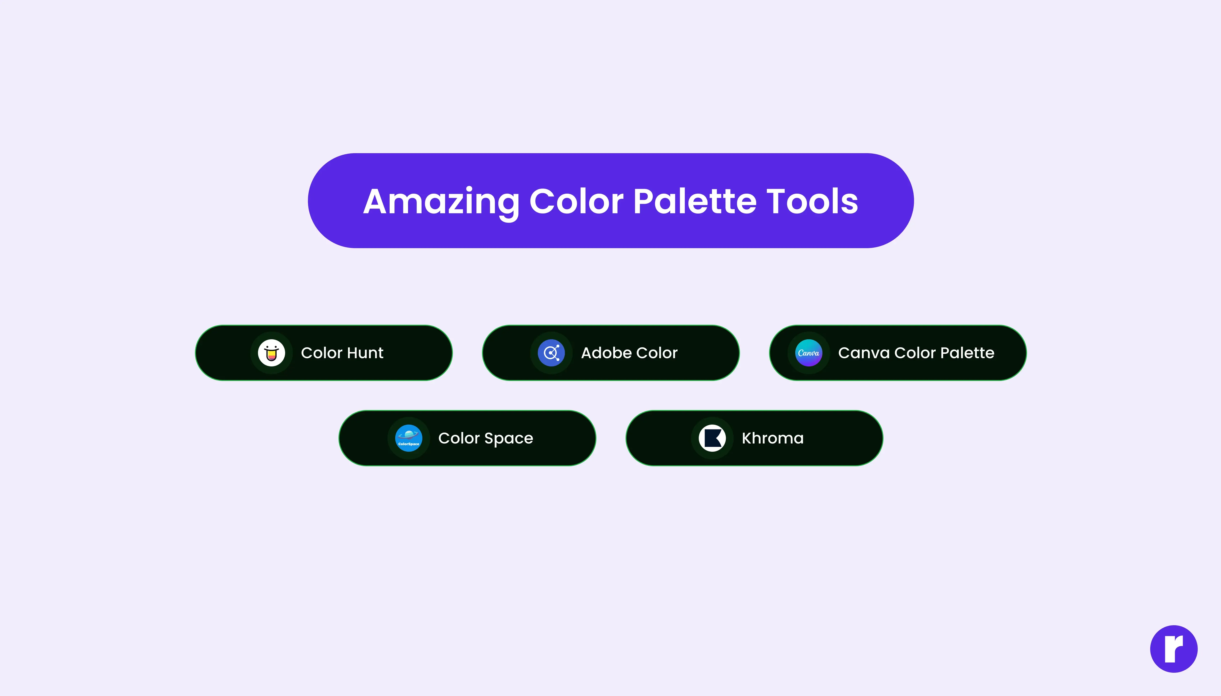
Choosing the right colors can make your design stand out. You can use free color picker tools to find perfect shades and match them easily. Tools like ImageColorPicker.com let you upload an image and pick any color you like, while ColorZilla (a browser extension) helps you grab colors directly from any website. These tools make it simple to find consistent, attractive colors for your project without guessing.
- Coolors.co – Create and explore beautiful color palettes.
- Adobe Color – Pick, adjust, and test color combinations.
- ImageColorPicker.com – Upload an image to find exact color codes.
- ColorZilla – Browser extension to pick colors from any website.
- Color Hunt – Discover ready-made color palettes for inspiration.
- ColorSpace – Generate matching shades from one color.
You don’t have to copy their exact color scheme. Instead, use these examples as inspiration. Notice patterns: maybe most modern tech websites use blue because it builds trust, or eco-friendly brands lean toward green and earthy tones. By studying successful websites, you can understand what works well and then apply a unique version of it to your own brand. This way, you’ll avoid guesswork and build a design that feels both familiar and original.
Final Thoughts
Choosing colors is all about balance, clarity, and brand alignment. Start simple—one main color, one secondary, and one accent—and make sure your design is easy to read and visually appealing. With the right palette, your website will look professional, reflect your brand personality, and leave a lasting impression on visitors.