How to Simplify Complex User Flows

Written by

Sumit Verma
UI/UX Designer
Table of contents
Build with Radial Code
Share this


Users don't abandon products because they're powerful. They abandon them because the path to that power feels like a maze.
Every product starts simple. Then come the edge cases, the extra settings, the compliance step, the "quick" upsell screen, and the one field sales asked for. A year later, a task that used to take three taps takes eleven, and nobody can say exactly when it happened.
Complex user flows are rarely the result of one bad decision. They're the sum of many reasonable ones that nobody looked at together. The good news: you don't need a full redesign to fix them. You need a clear map, a few hard questions, and the discipline to remove things.
What makes a user flow "complex"?
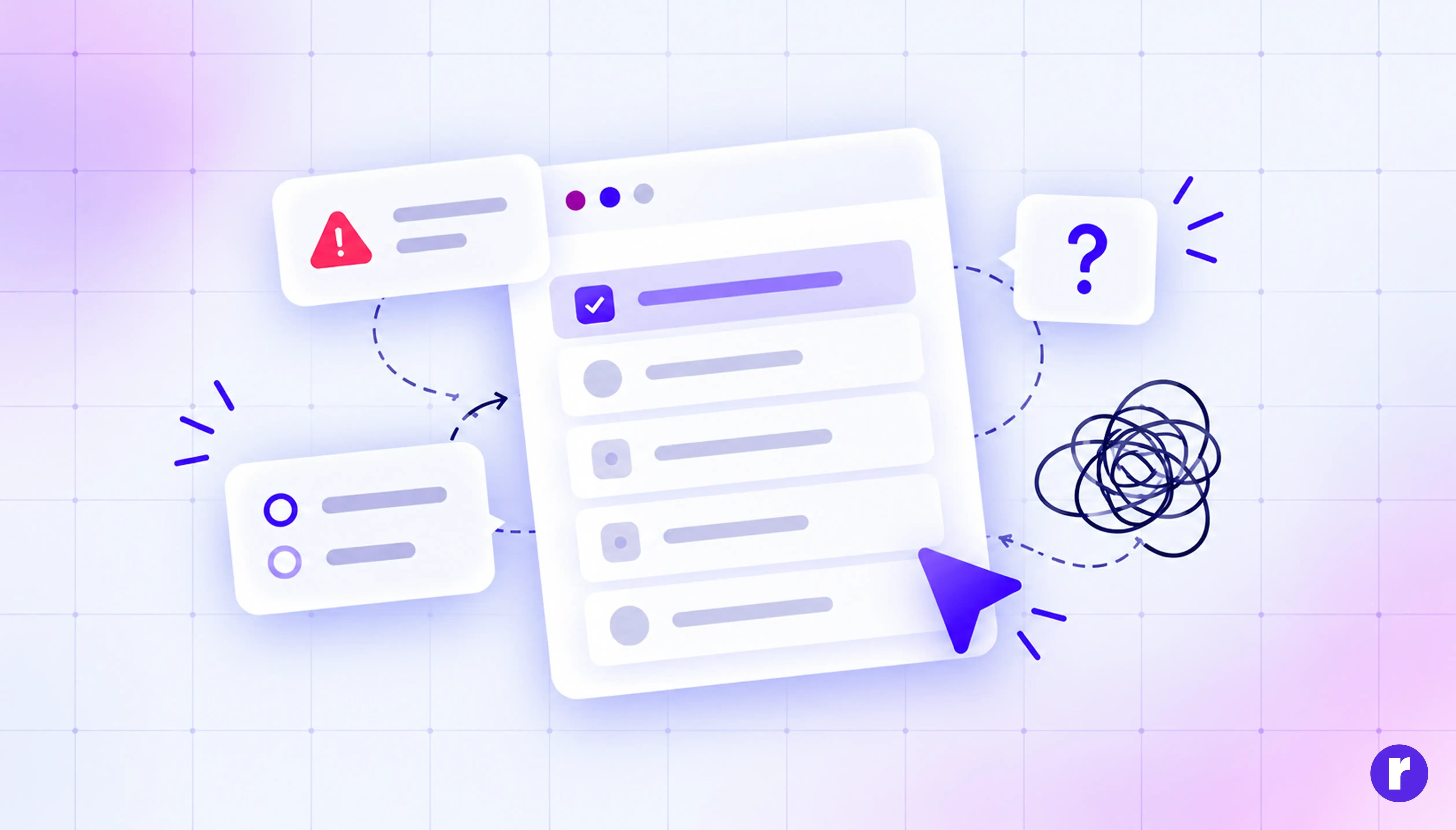
Complexity isn't the same as length. A ten-step checkout can feel effortless if every step is obvious, and a three-step form can feel exhausting if each screen asks the user to think hard.
A flow becomes complex when it creates cognitive load: too many choices at once, unclear next steps, jargon, hidden requirements, or surprises halfway through. The real question isn't "how many screens?" It's "how many moments does the user have to stop and figure something out?"
Common warning signs:
- Users drop off at the same step again and again.
- Support tickets keep asking "where do I find..." or "what does this mean?"
- The flow has branches nobody on the team can fully explain.
- New features were added as extra steps instead of being built into existing ones.
Map the flow before you touch it
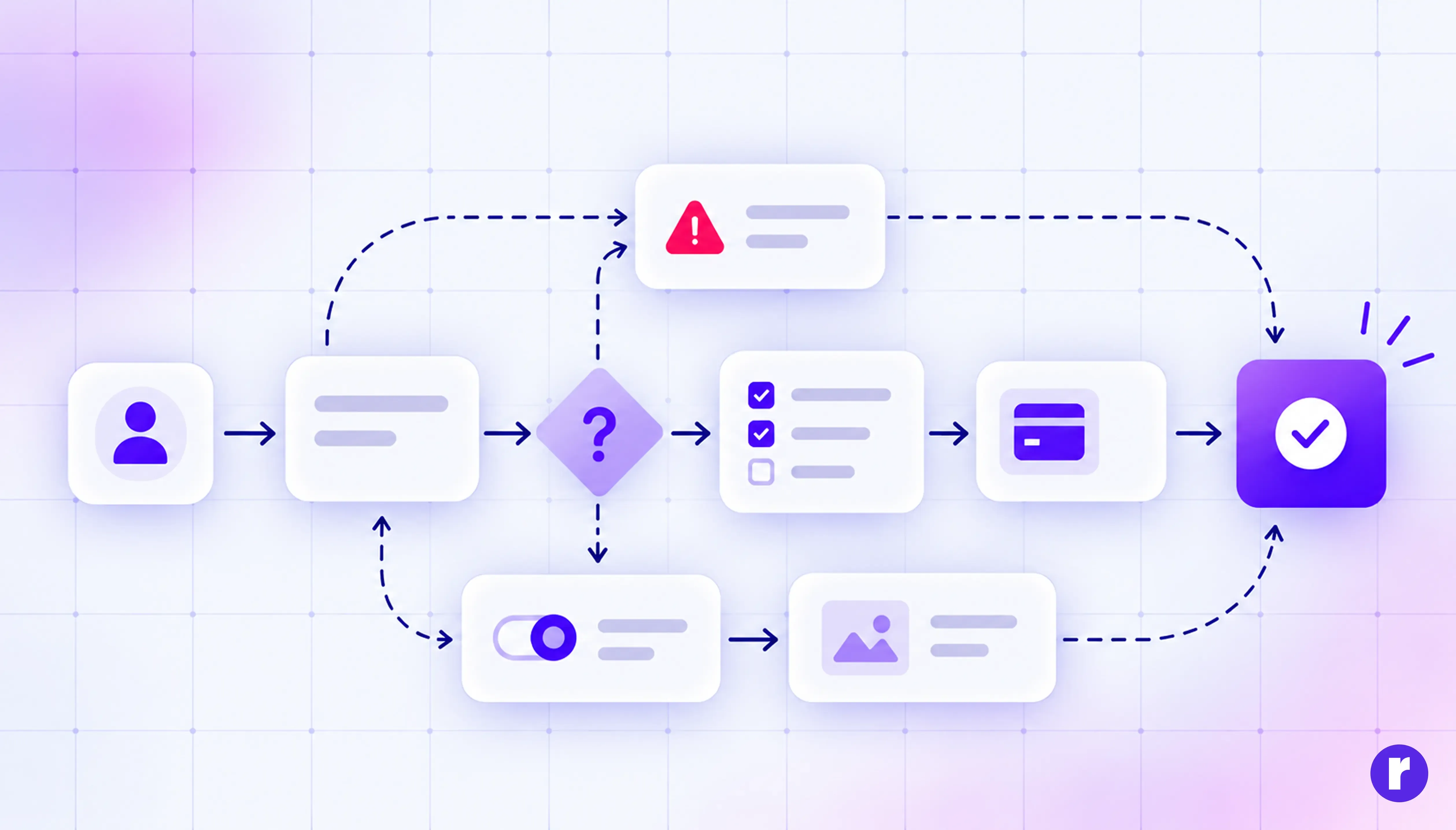
You can't simplify what you can't see. Before redesigning anything, map the current flow exactly as it exists today, including the ugly parts.
Write down every screen, decision point, input field, system message, and email the user receives. Mark where users can go back, where they get stuck, and where they leave. Pull in analytics if you have them; drop-off data turns opinions into facts.
This step almost always surprises teams. Flows that "feel" like five steps turn out to be nine once you count the confirmation modal, the verification email, and the permission prompt. Seeing it laid out is often enough to get everyone to agree that something has to go.
Start from the user's goal, not your feature list
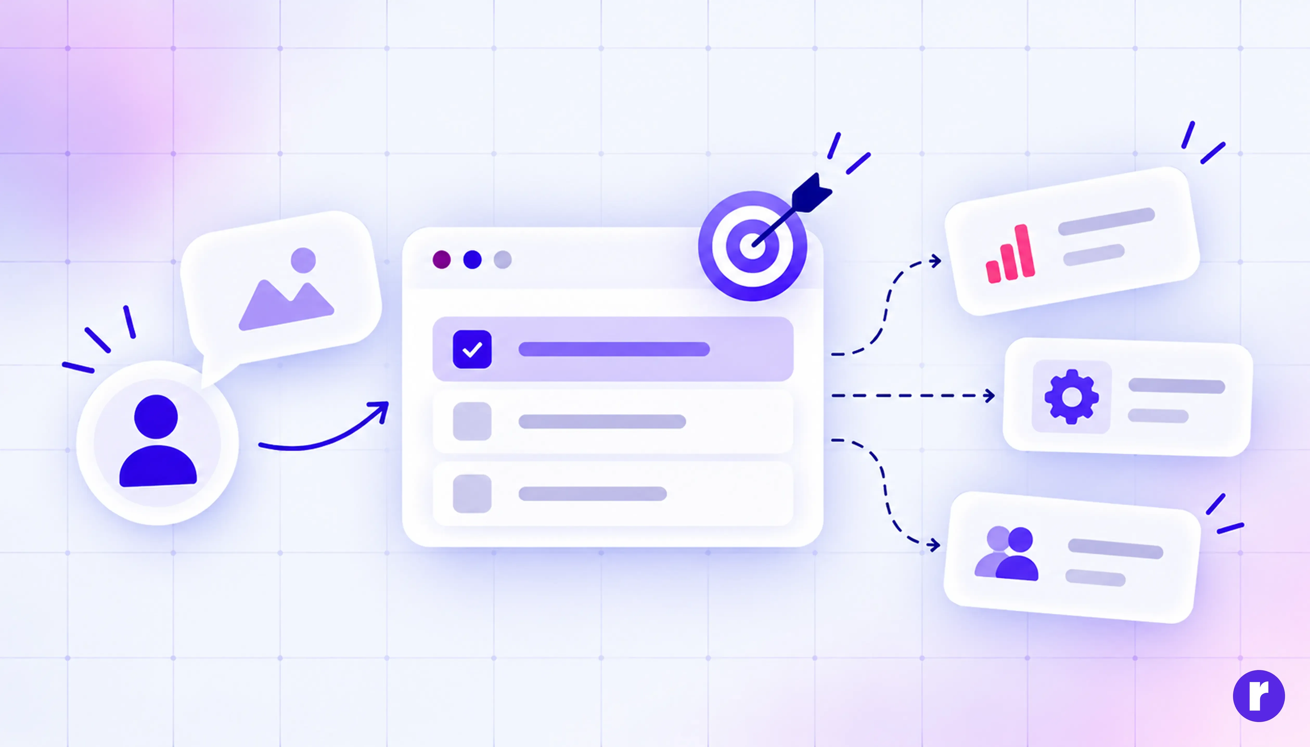
Most bloated flows are organised around the system, not the person using it. The database needs a billing address, so the user fills in a billing address, even if they're on a free plan.
Flip it. Write the user's goal as one plain sentence: "I want to send my first invoice." Then ask, for every step in the flow: does this help them reach that goal right now? If the answer is "no, but we need it eventually," it probably belongs later in the journey, not in the critical path.
A useful rule: the first time through any flow, ask only for what's needed to deliver the first moment of value. Everything else can wait until the user has a reason to care.
Cut steps ruthlessly
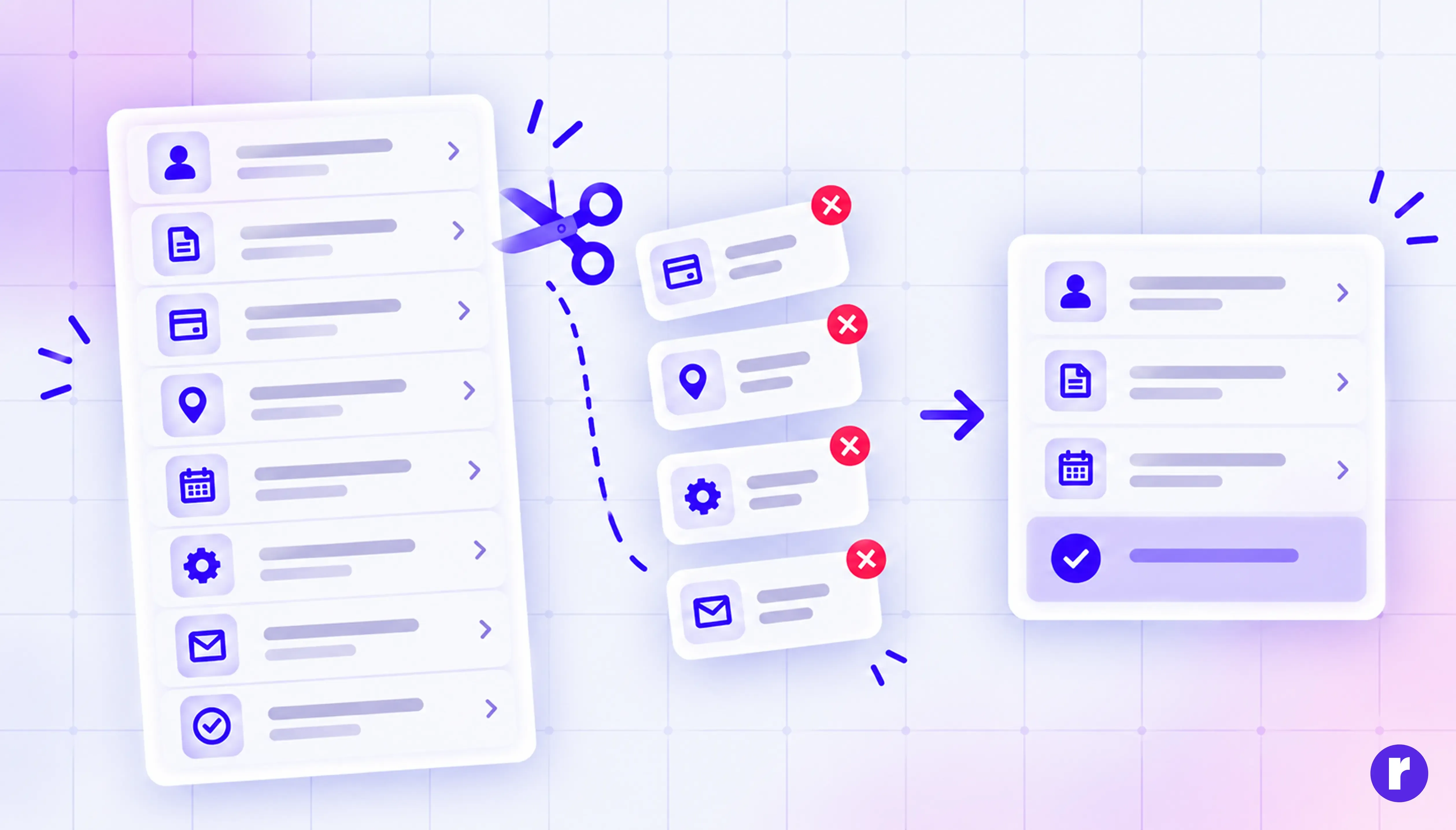
Once you've got your map and your goal, go through every step and put it into one of four buckets:
- Remove: It doesn't serve the goal and nobody would miss it.
- Merge: It can live on the same screen as another step without crowding it.
- Automate: The system can figure it out (location, currency, company name from an email domain).
- Defer: It's needed, but not yet.
Be honest here. "We've always had it" and "legal might want it" aren't reasons. If a step survives, it should be because someone can explain exactly what breaks without it.
Use progressive disclosure
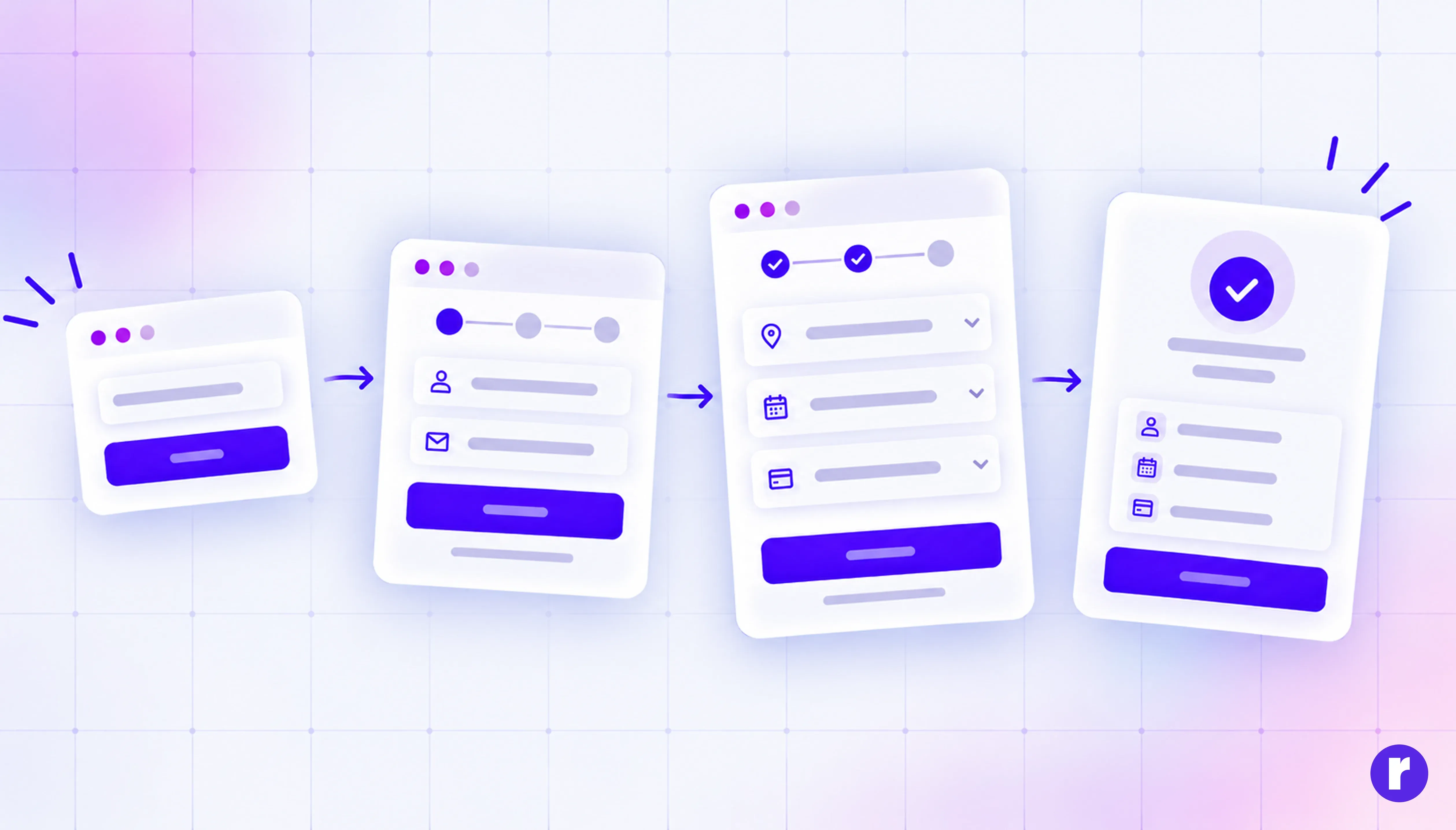
Not every user needs every option. Progressive disclosure means showing the essentials first and revealing advanced choices only when someone asks for them.
Think of an "Advanced settings" toggle, a "More options" link, or a form that only shows the company fields after someone picks "Business account." The power is still there for the people who need it. Everyone else gets a clean path.
The key is choosing the right defaults to show upfront. Use your data: if 90% of users never change a setting, it doesn't belong on the main screen.
Your brand's flow looks complex. Let's fix that. Talk to us
Conclusion
Simplifying a complex user flow isn't about making a product do less. It's about making the path to what it does feel obvious.
Map what exists. Anchor every step to the user's goal. Remove, merge, automate, or defer anything that doesn't earn its place. Reveal complexity only when it's needed, break long journeys into clear stages, let defaults carry the load, and make errors easy to recover from. Then test with real people and let the numbers confirm it.
The best flows don't feel designed at all. Users just get where they were going.