The Psychology Hidden in Every Button

Written by

Sumit Verma
UI/UX Designer
Table of contents
Build with Radial Code
Share this
Websites and apps don’t just guide users—they influence them. Every tap, click, and hover is a decision moment shaped by psychology. Buttons may look simple, but behind their size, color, placement, and wording lies a system designed to reduce hesitation and trigger action. In modern UX, buttons are no longer just interface elements; they’re behavioral cues.
Define the Exact Moment of Action
A button’s job isn’t to look good; it’s to move the user forward with confidence. Visual appeal matters, but intent matters more. Before styling a button, define its role in the user’s mental model.
Ask yourself:
- What decision is the user making at this exact moment?
- Is this action reversible or high-stakes?
- Should the button feel reassuring, urgent, or neutral?
Primary actions need clarity and confidence. Secondary actions should exist—but never compete. When intent leads design, aesthetics naturally fall into place.
Make Every Decision Feel Effortless
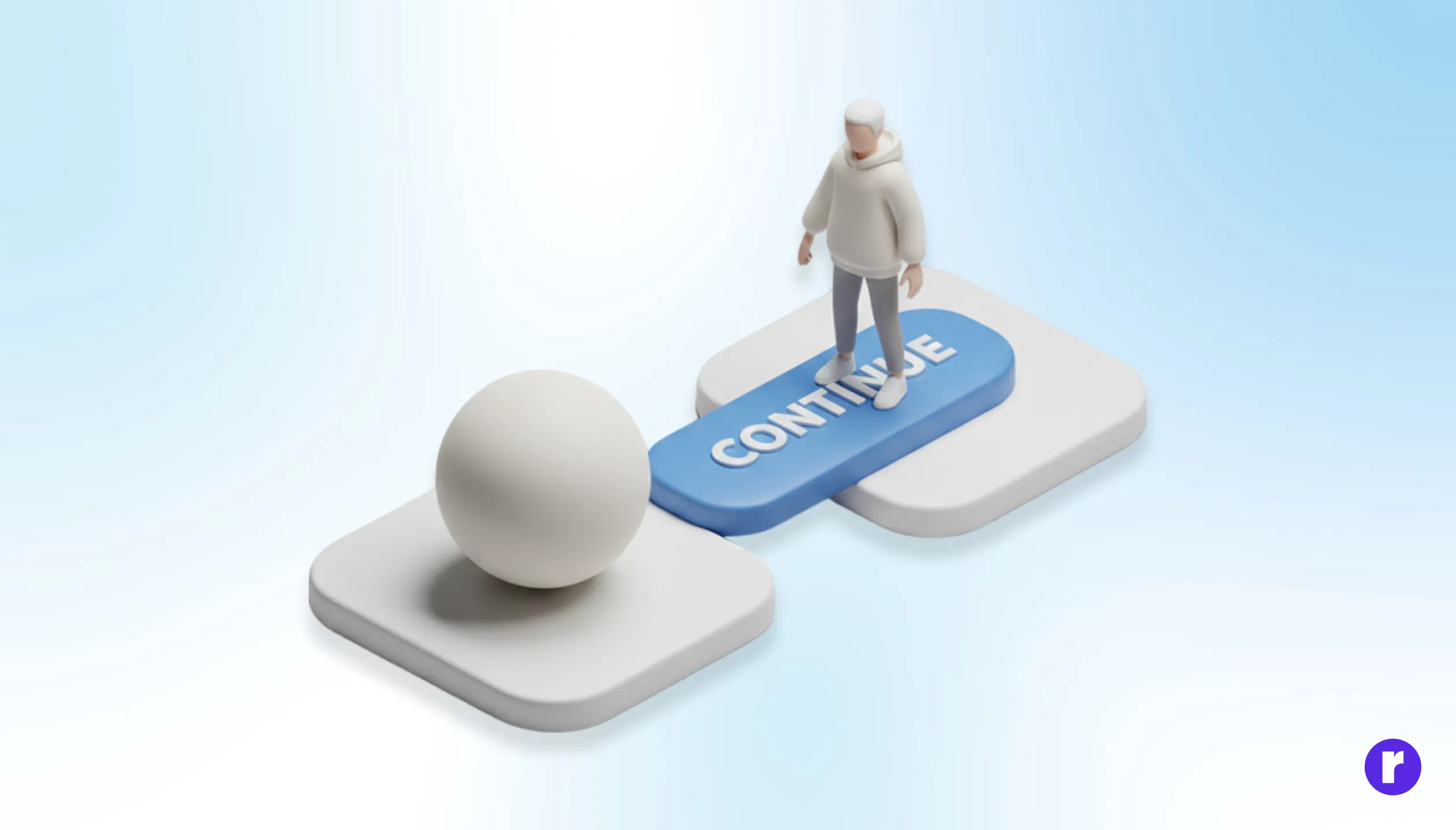
Buttons often appear when users are already processing information. The more effort it takes to understand a button, the more friction you introduce. Effective button design simplifies thinking at the point of action.
Ways to reduce friction:
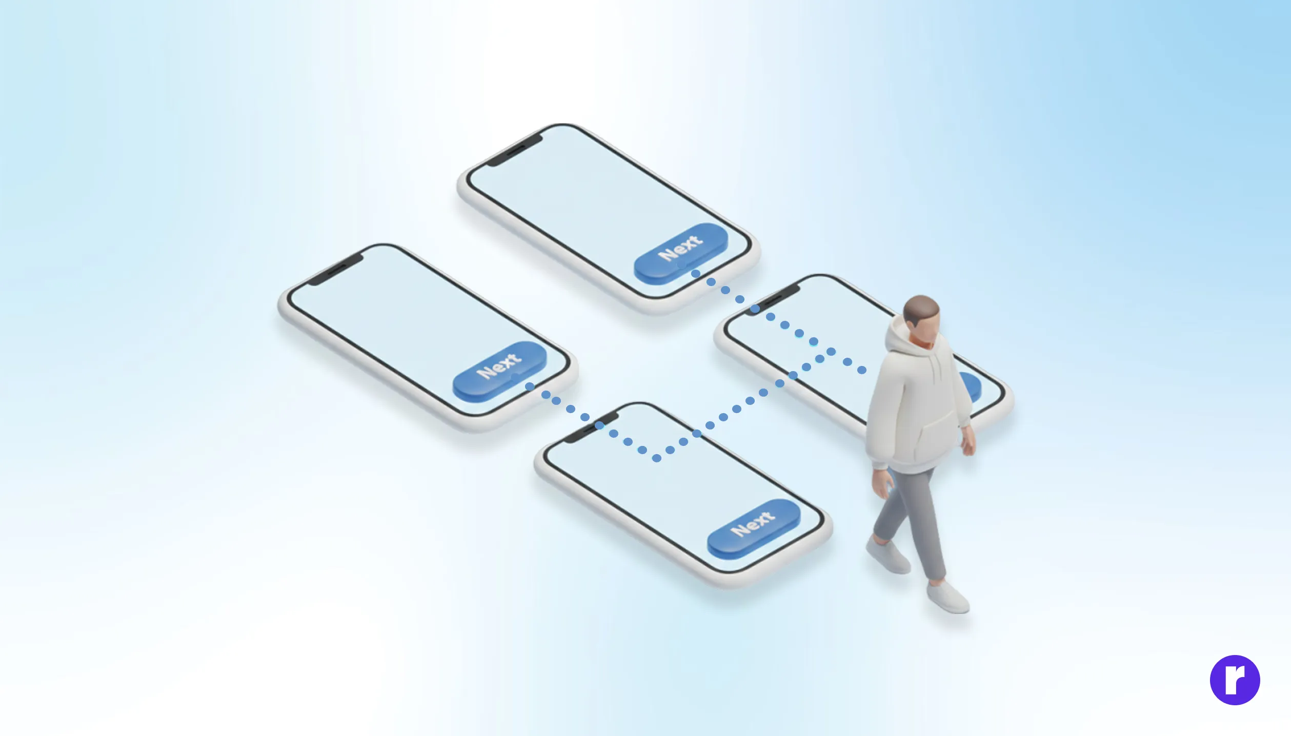
- Use clear, verb-based labels (“Continue”, “Save Changes”, “Get Started”).
- Avoid clever language when clarity is critical.
- Make the primary button visually dominant without being aggressive.
Consistency is key. When similar actions always look and behave the same, users stop thinking—and start acting. The article “The Rise of Minimal UX” explores how reducing visual and cognitive noise helps users focus, decide, and act faster—proving that when interfaces feel lighter, trust and conversions follow naturally.
Design for Emotion Before Interaction
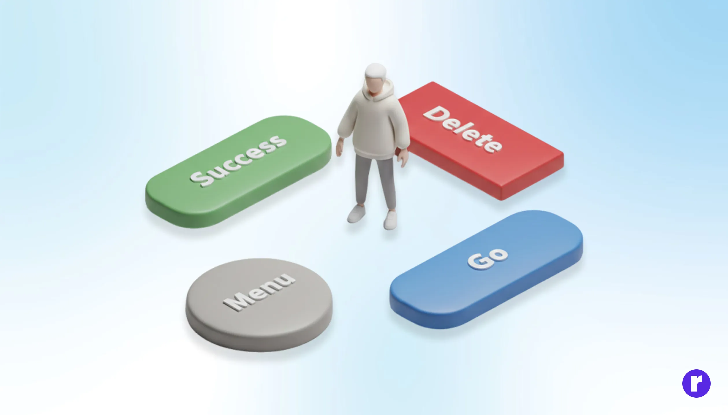
Buttons communicate emotion before they communicate function. Color, shape, and motion subtly answer questions users may not consciously ask: Is this safe? Is this final? Can I trust this?
To make buttons feel right:
- Use color psychology intentionally—green for progress, red for irreversible actions, neutral tones for low-risk steps.
- Rounded corners often feel more approachable; sharp edges feel precise and decisive.
- Micro-interactions (hover states, loading feedback) reassure users that the system is responding.
When buttons acknowledge user intent with immediate feedback, interactions feel collaborative—not mechanical.
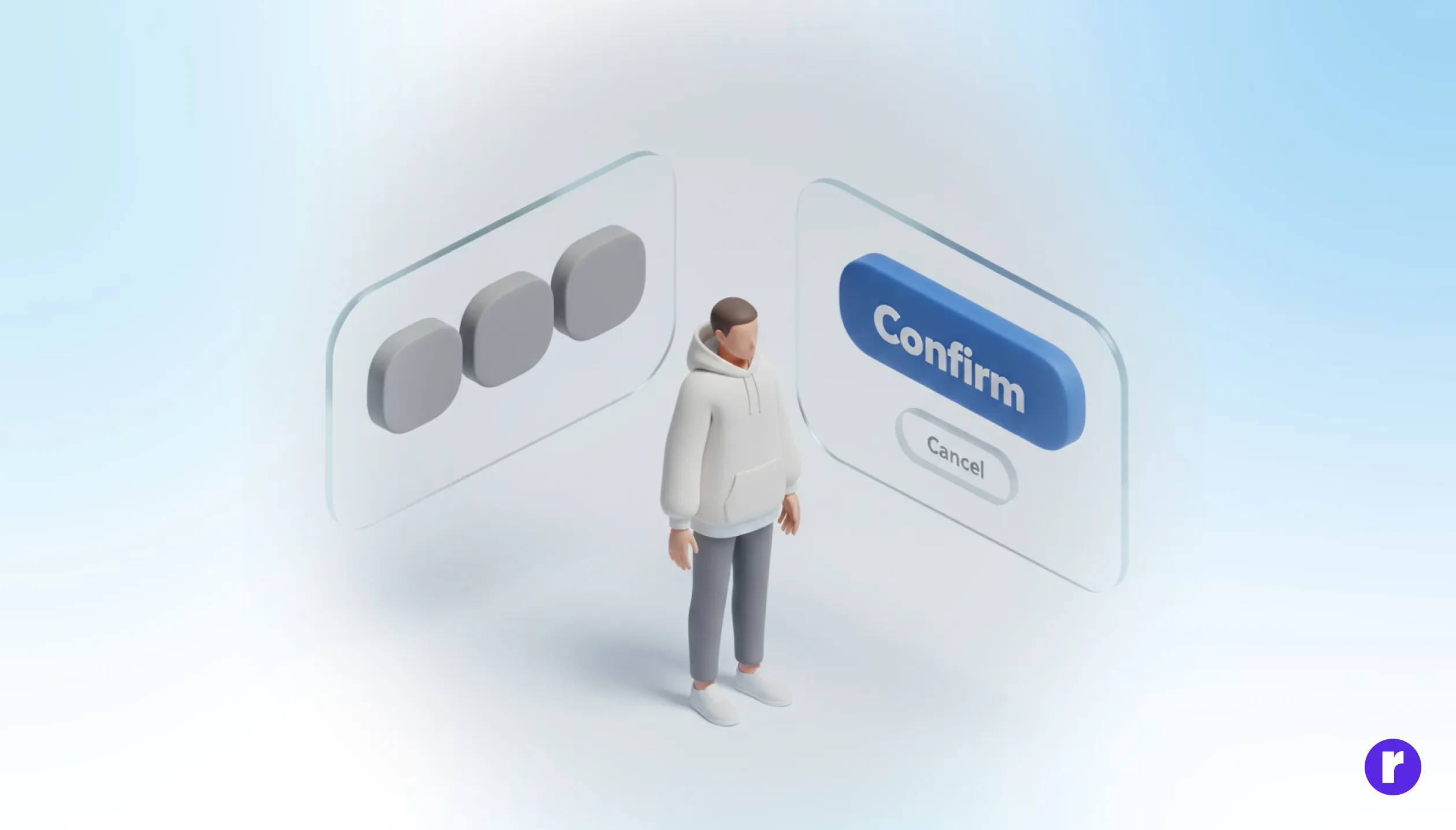
Remove Doubt Before Users Pause
Every button sits at the edge of commitment. Users hesitate when they’re unsure of outcomes. Smart UX reduces that uncertainty before it turns into abandonment.
Design strategies that build confidence:
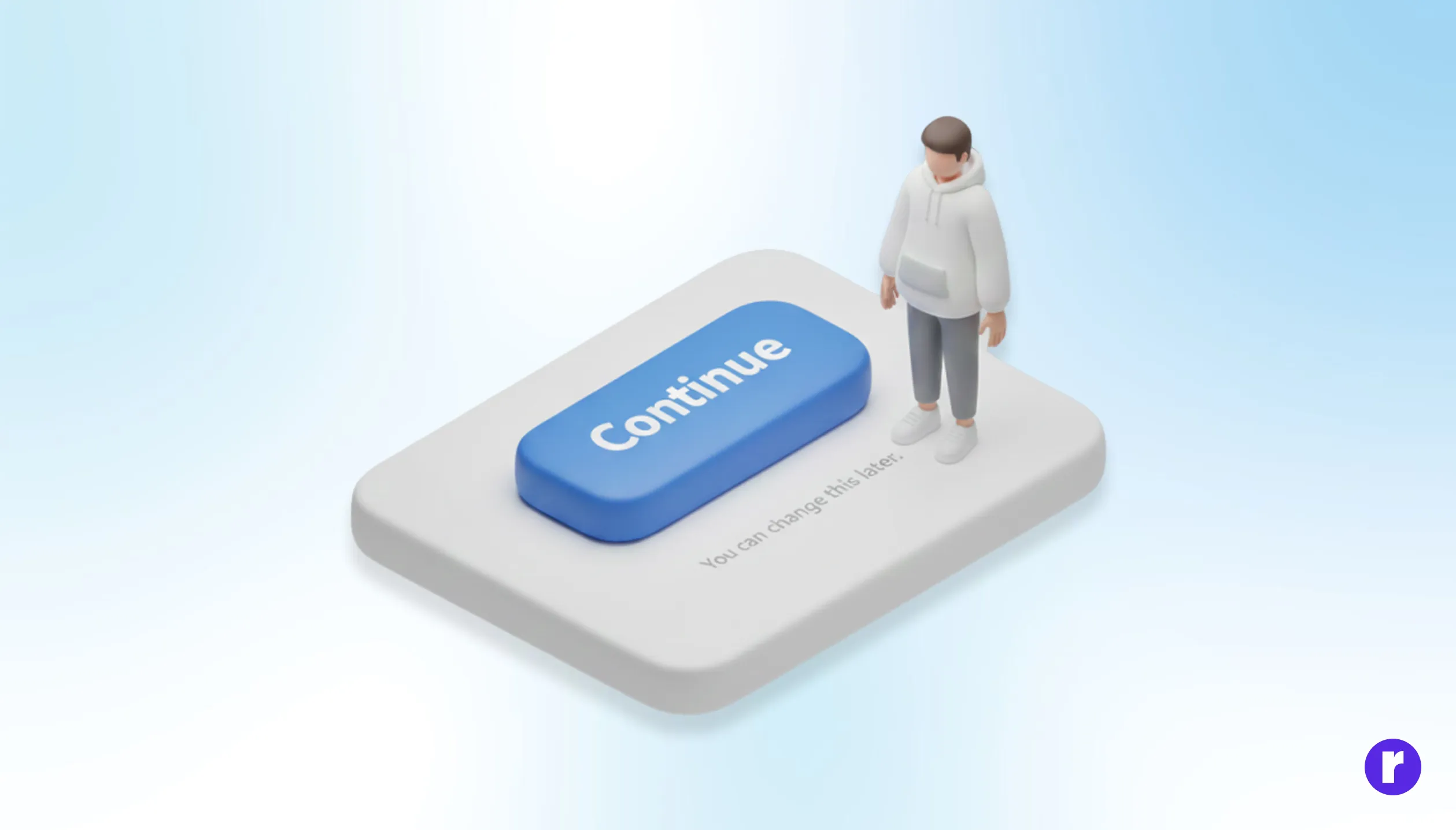
- Pair buttons with subtle context (“No credit card required,” “You can change this later”).
- Use progressive disclosure—don’t ask for everything at once.
- Clearly differentiate destructive actions from safe ones.
"Continue exploring design decisions that shape behavior at Radial code"
Build Confidence Through Consistent Interactions
Buttons play a major role in trust. If they behave unexpectedly, trust erodes instantly. If they’re inaccessible, entire user groups are excluded.
Best practices that scale trust:
- Ensure buttons are accessible via keyboard and screen readers.
- Maintain consistent placement across flows.
- Avoid surprise actions—what the label promises should match the outcome exactly.
Trust isn’t built with bold visuals alone; it’s built when users feel respected and understood at every step.
Conclusion
Buttons are small, but their impact is massive. They sit at the intersection of psychology, design, and decision-making. When designed with intent, clarity, emotional awareness, and trust, buttons stop being interface elements—and start becoming quiet guides. The best UX doesn’t push users. It reassures them. And often, that reassurance lives inside a single, well-designed button.