The Science of Rebranding: UX Behind Simpler, Smarter Designs

Written by

Priyanka Jangra
UI/UX Designer
Table of contents
Build with Radial Code
Share this
Rebranding used to be about changing how a brand looks. Today, it’s about changing how a brand feels to the brain.
The most successful rebrands don’t start in Figma—they start in neuroscience, cognitive psychology, and behavioral UX. When brands simplify, it’s not because minimalism is trendy. It’s because the human brain is overloaded, impatient, and constantly searching for the fastest path to clarity.
Why Some Brands Feel Effortless—and Others Don’t
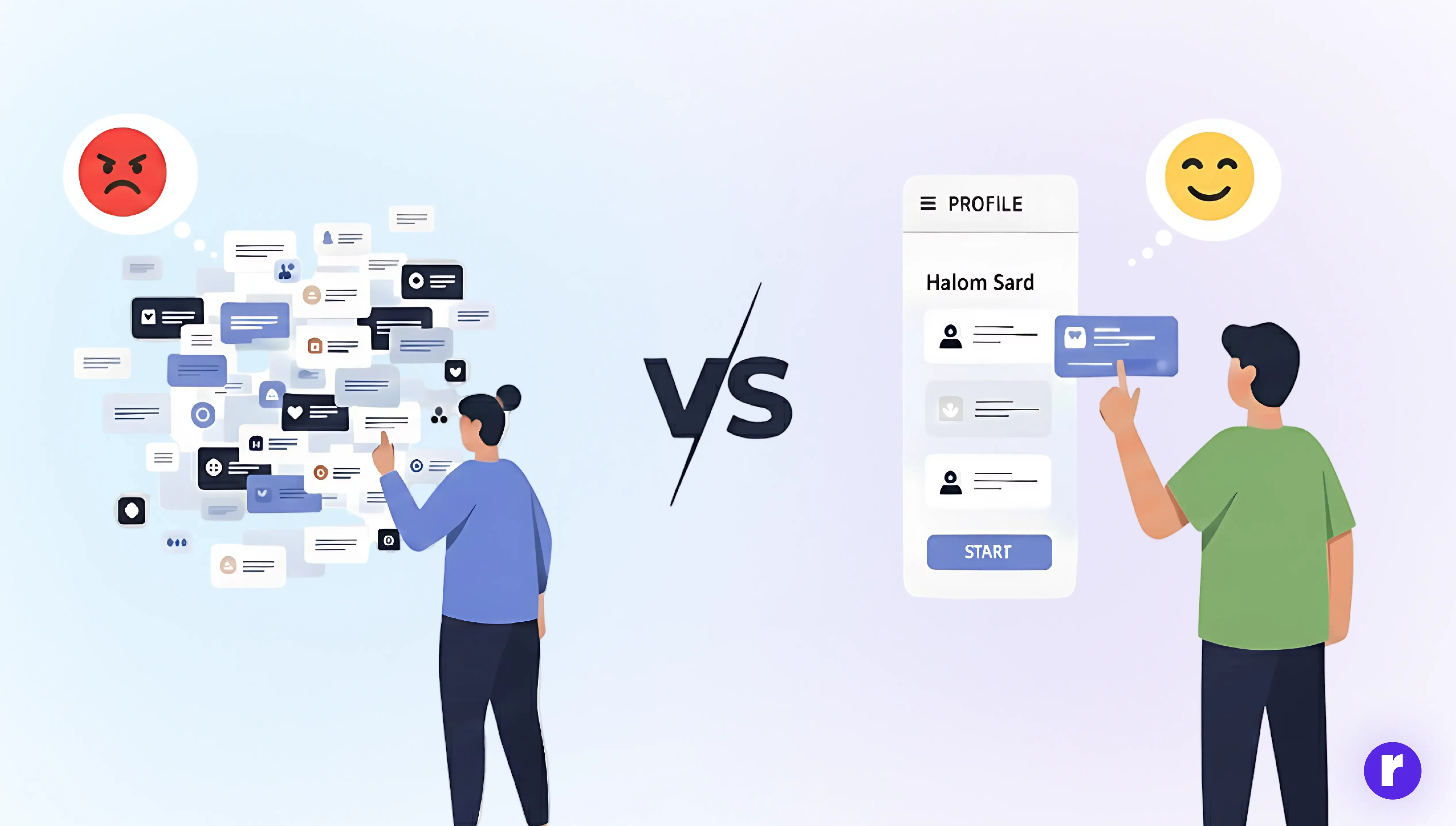
Modern users don’t explore brands. So when a brand feels complex, outdated, or mentally heavy, the brain reacts with friction—and friction kills trust. From a UX science lens, rebranding is about removing that friction. They skim past them.
According to UX research:
- Users form a first impression in under 50 milliseconds
- The brain prefers familiar patterns over novelty
- Too many choices trigger decision paralysis
Why Simplicity isn’t a Style — It’s a Survival Strategy
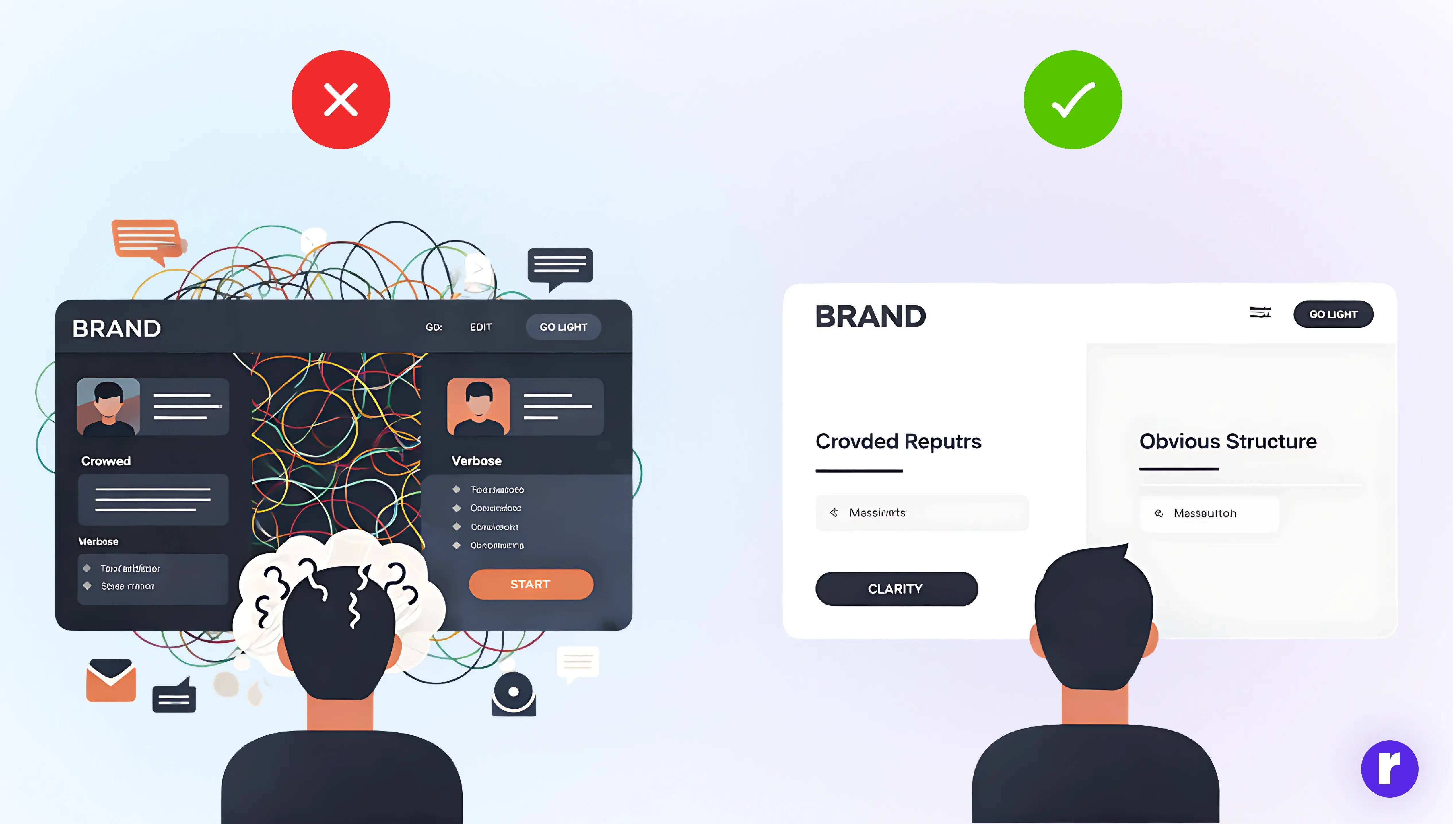
The brain operates on energy efficiency. This is explained by Cognitive Load Theory, which states that our working memory can only process a limited amount of information at once.
When a brand displays too many colors, inconsistent typography, overloaded messaging, or confusing navigation, it forces the brain to work harder, leading users to leave more quickly.
This is why modern rebrands often appear flatter, cleaner, more neutral, and more structured. These designs are not boring—they are intentionally brain-friendly, reducing cognitive load and enhancing user experience.
UX Rebranding is About Recognition, Not Decoration
A common mistake brands make is assuming rebranding requires being radically different. However, UX science reveals the opposite. The brain inherently trusts what it recognizes. This is why successful rebrands often don’t appear entirely new—they feel familiar, yet thoughtfully refined.
Example: Google
Google's transition from a detailed serif logo to a clean sans-serif design was not merely about aesthetic minimalism—it was about functional clarity.
Why it worked:
- Enhanced legibility on small screens
- Quicker recognition across devices
- Visual consistency in micro-interactions (icons, loading states, UI elements)
Google didn't just redesign its logo; it optimized it to align with how users actually experience the brand.
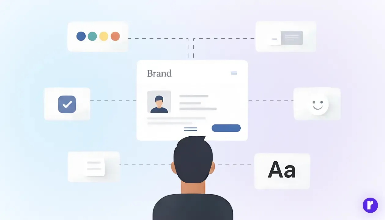
Micro-UX: Where Rebranding Actually Lives
Most assume rebranding is just changing the logo, but it's the micro-moments that define it: button hover states, element spacing, loading animation smoothness, system message tone, and interaction timing. These elements shape a brand's smooth, premium, and trustworthy feel.
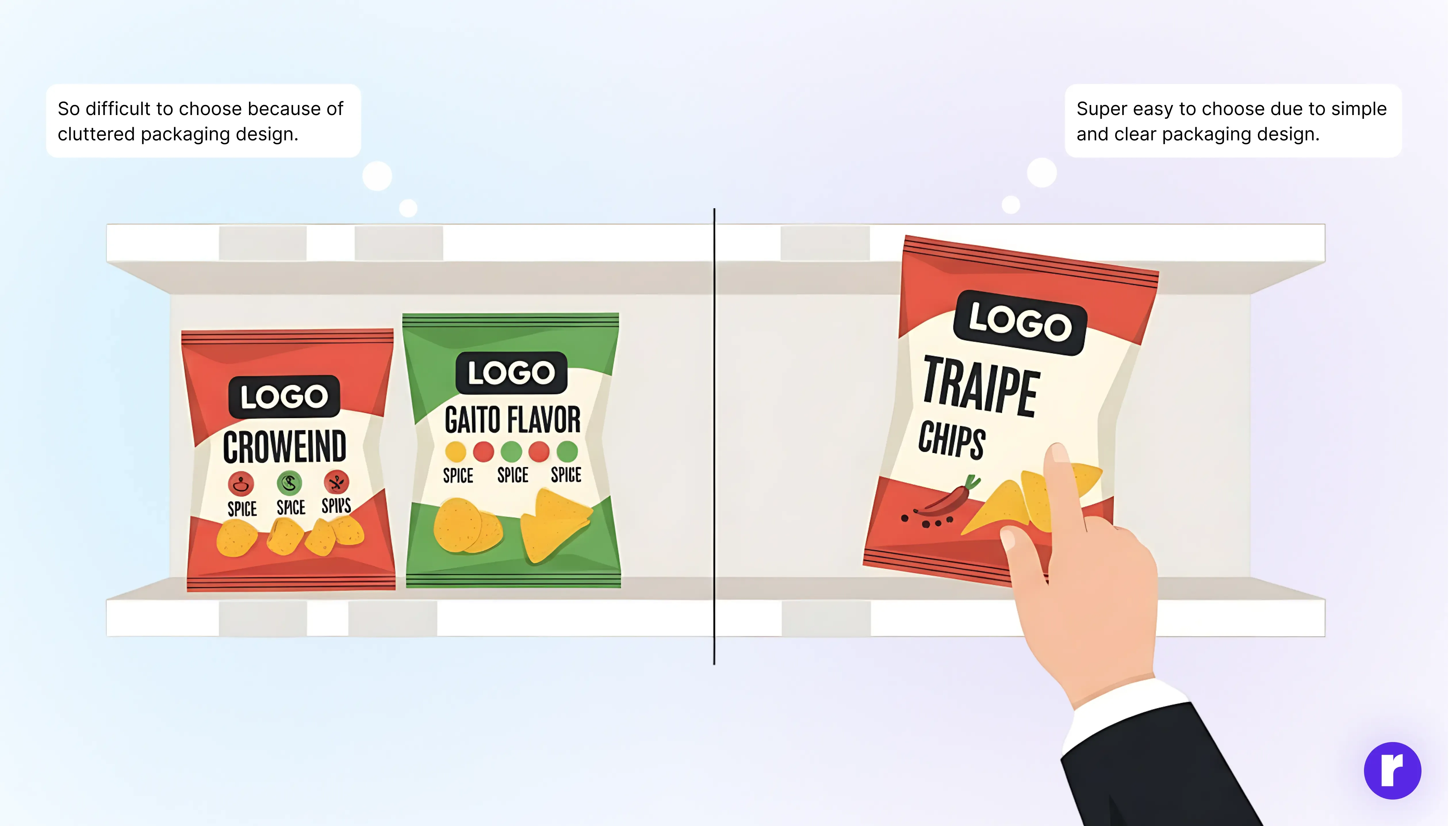
Example: Chips Packets
Modern chip packets didn't evolve to appear trendier; they were redesigned for easier selection. Cleaner layouts, larger flavor names, clear color coding, and simple spice icons minimize confusion at a glance.
While the logo remains familiar, the micro-experience has been enhanced. You don't think, "This brand rebranded." You think, "This is easy to pick."
That's UX-driven rebranding—not about louder design, but about clearer decisions.
“Simplicity is about subtracting the obvious and adding the meaningful.”
Conclusion
The future of rebranding belongs to brands that prioritize simplicity and ease over flashy designs. By aligning with how the brain naturally processes information, they create trust, clarity, and effortless experiences. The most intelligent brands don’t demand attention—they resonate quietly, leaving a lasting impression. To learn more about UI/UX, visit our website here.