The Role of Tooltips in Guiding Users

Written by

Chandani Sahani
UI/UX Designer
Table of contents
Build with Radial Code
Share this
In today’s fast-moving digital world, user experience (UX) is one of the most important parts of product design. Whether it’s a website, a mobile app, or software, the main goal is to make sure users can move around easily and complete their tasks without any Problem.
But sometimes, even the best-designed apps or websites can confuse people. That’s where tooltips help. Tooltips are small pop-up messages that guide users by giving short and clear instructions right when they need them. They work like little helpers that explain things without disturbing the user.
What Are Tooltips?
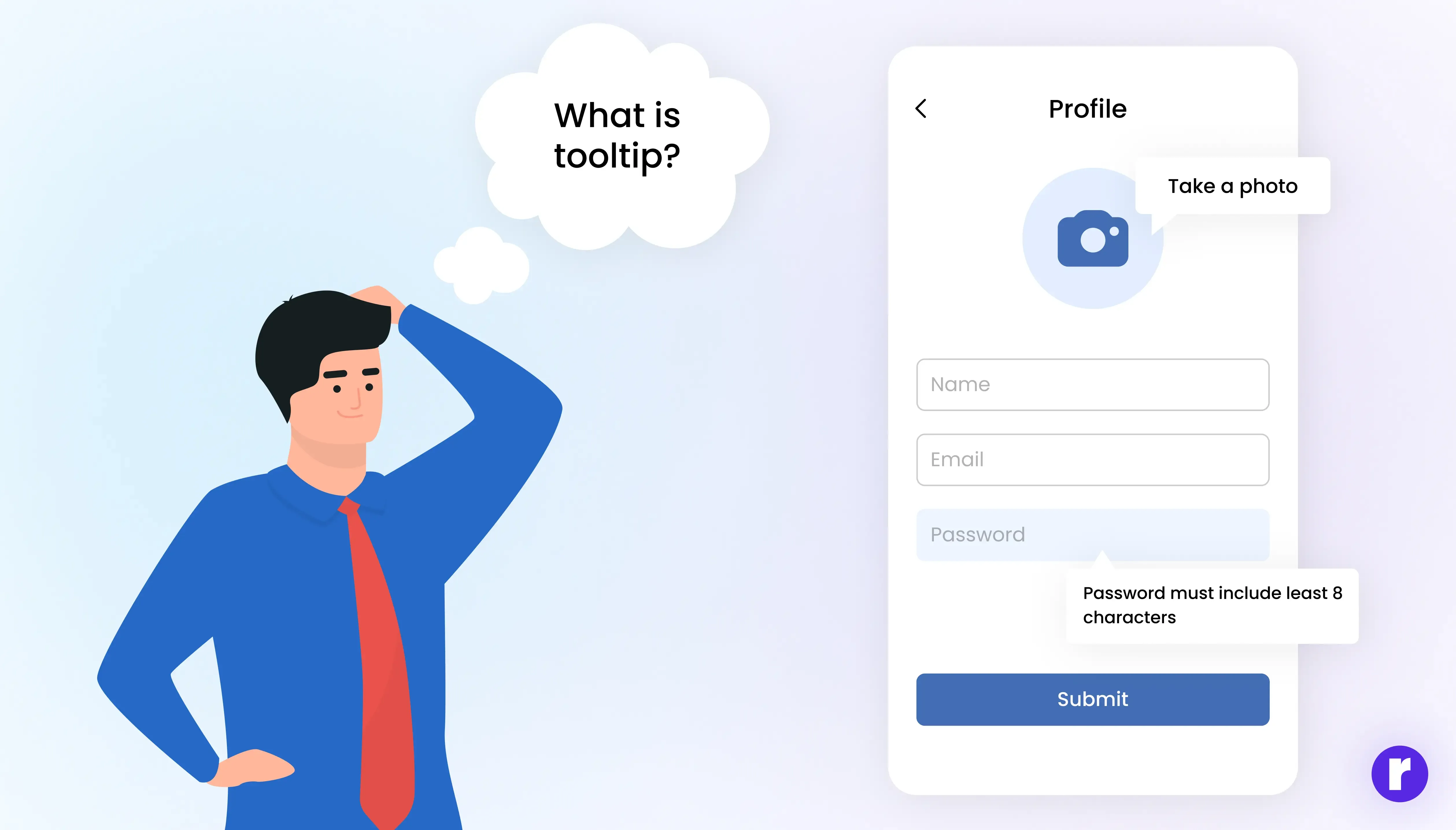
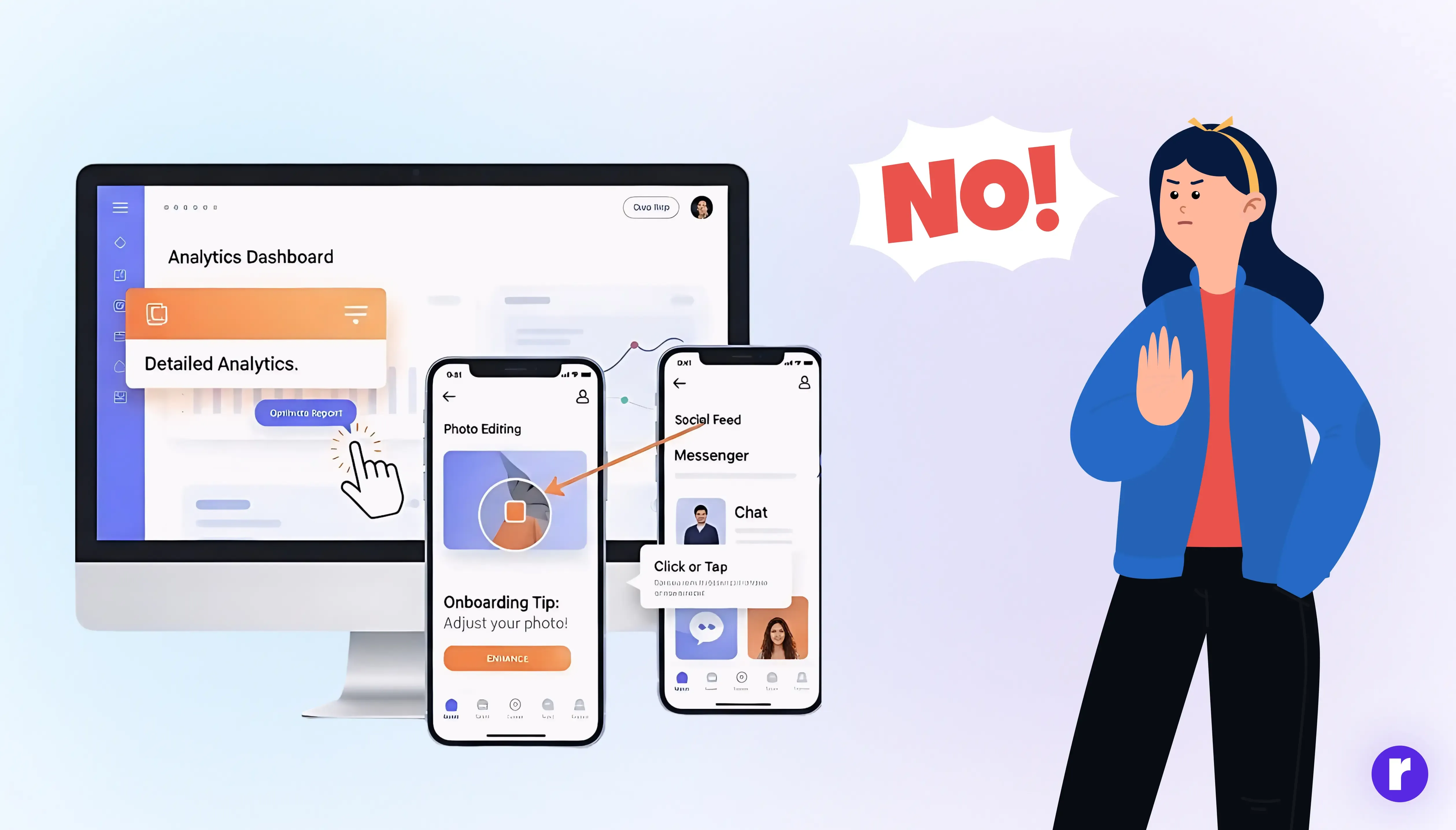
A tooltip is a small, interactive message that appears when a user hovers over, clicks, or taps on an element within an interface. Tooltips are small pop-ups that give extra info or instructions without making the design messy.
- Hovering over a “?” icon may reveal additional guidance.
- A form field tooltip might explain the correct format (e.g., “Password must include at least 8 characters”).
- During onboarding, tooltips may highlight buttons or features to guide first-time users.
Want to Explore other Blogs ? What Are tooltips?
Why Tooltips Matter in User Experience
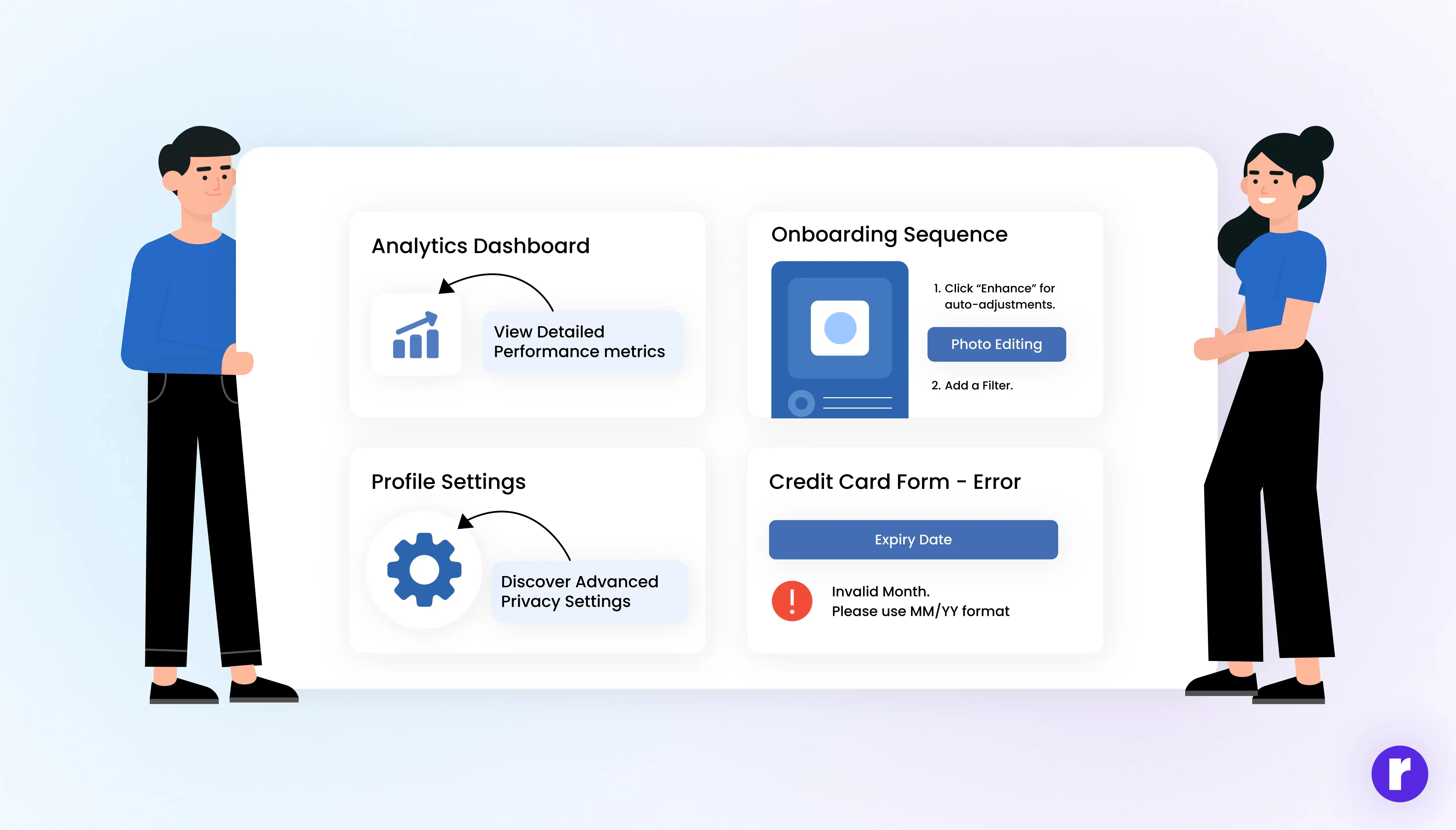
- Make Things Easier to Understand: When users see too much information at once, it can feel confusing. Tooltips solve this by showing extra details only when needed, so the design stays clear and easy to follow.
- Help New Users: Starting with a new app or website can be tricky. Tooltips act like small guides, giving step-by-step help so new users quickly understand how everything works.
- Show Hidden Features: Many people use only the main features and skip the rest. Tooltips highlight hidden or advanced features at the right time, encouraging users to explore more.
- Reduce Mistakes: Without clear guidance, users may click the wrong button or enter the wrong details. Tooltips explain things clearly, reducing errors and preventing frustration.
- Save Space on Screen: Big blocks of text or instructions can make the screen look crowded. Tooltips keep the layout neat by showing help only when users ask for it, keeping the design clean and simple.
Types of Tooltips
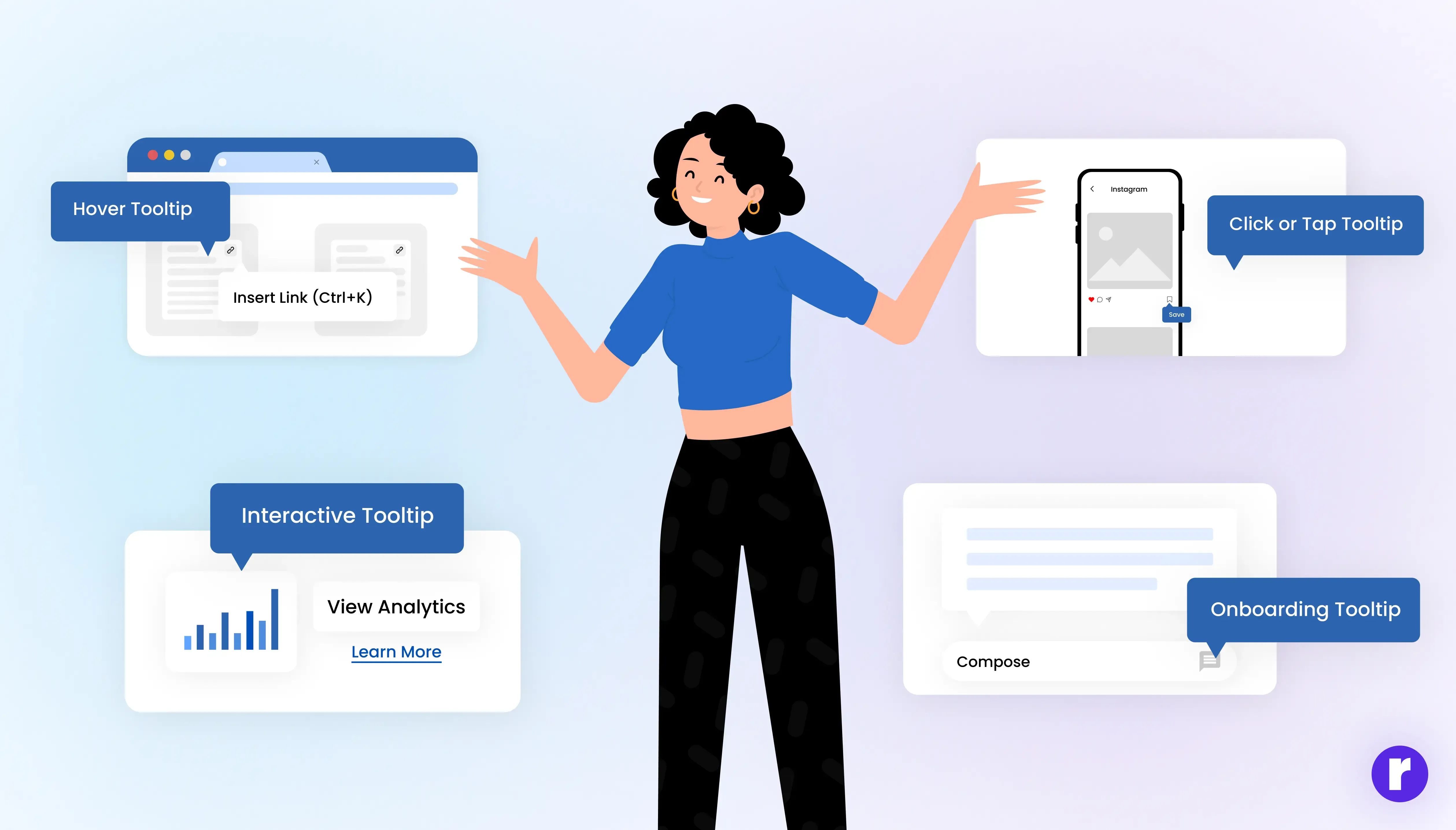
Hover Tooltips
- Appear when users hover over an icon or element.
- Example: Google Docs shows “Insert link (Ctrl+K)” when you hover over the link icon.
Click or Tap Tooltips
- Triggered when users click or tap an element.
- Example: Mobile apps often use this to avoid accidental pop-ups.
Interactive Tooltips
- Contain links, buttons, or actions inside the tooltip itself.
- Example: A tooltip with a “Learn More” link to documentation.
Onboarding Tooltips
- Used in product tours or walkthroughs to guide new users.
- Example: Slack highlights buttons with tips for first-time users.
Want to Explore Radial Code ? Learn About Us
Common Mistakes to Avoid
- Over-explaining: Long, wordy tooltips defeat their purpose.
- Using them as a crutch: Don’t rely on tooltips to fix bad design. The UI itself should be intuitive.
- Bad timing: Tooltips appearing too late or disappearing too fast frustrate users.
- Poor mobile design: Tiny tooltips are hard to tap—make them mobile-friendly.
“A well-designed tooltip is like a quiet guide—appearing only when needed, and vanishing once the user feels confident.”
Real-World Examples of Tooltips in Action
- Google Workspace (Docs, Sheets, Slides): Uses hover tooltips with shortcuts, improving productivity.
- Figma: Shows contextual tooltips that introduce advanced features without overwhelming beginners.
- E-commerce Sites: Many use tooltips to clarify shipping, payment methods, or discount conditions at checkout.
- Duolingo: Employs playful onboarding tooltips that keep users engaged while learning.
The Future of Tooltips

As interfaces evolve, tooltips are also becoming smarter:
- AI-driven Tooltips: Intelligent assistants can provide personalized tips based on user behavior.
- Voice-enabled Tooltips: Future apps may offer audio-based tooltips for hands-free guidance.
- Interactive Learning Tooltips: Instead of static text, they may include short animations or micro-tutorials.
Want to Explore other Blogs ? Why tooltips matters?
Final Thoughts
Tooltips may be small in size, but their value in user experience is undeniable. They provide quick, clear guidance at the exact moment users need it, helping reduce confusion and improving confidence. When designed with care, tooltips act as a subtle guide—supporting users through onboarding and everyday interactions without interrupting their flow. In short, they make products easier to use, more approachable, and far more enjoyable.