Why We Click: The Hidden Psychology Behind Buttons and Link

Written by

Shweta Kumari
UI/UX Designer
Table of contents
Build with Radial Code
Share this
In the vast world of digital interfaces, every tap, click, and swipe represents more than just interaction — it reflects human psychology. The simple act of clicking a button or tapping a link is guided by deep cognitive, emotional, and visual triggers. Designers who understand this psychology can craft interfaces that don’t just look good—they feel right to the user.
Let's know the fascinating science and psychology behind this topic and why we click.
How Our Eyes Know What’s Clickable
Before we click anything, our brain quickly looks for visual clues that show which elements are clickable. This natural ability is called affordance — when the appearance of an object suggests how we can use it.
In UI design, these cues come in the form of:
- Shape and depth: Rounded rectangles, shadows, and gradients subconsciously suggest pressability.
- Color and contrast: A brightly colored button on a neutral background immediately grabs attention.
- Movement: Subtle animations, hover states, or microinteractions signal interactivity and reward curiosity.
This is called perceived affordance — the visual suggestion that something can be clicked. When users can instantly identify what’s clickable, they feel confident and in control.
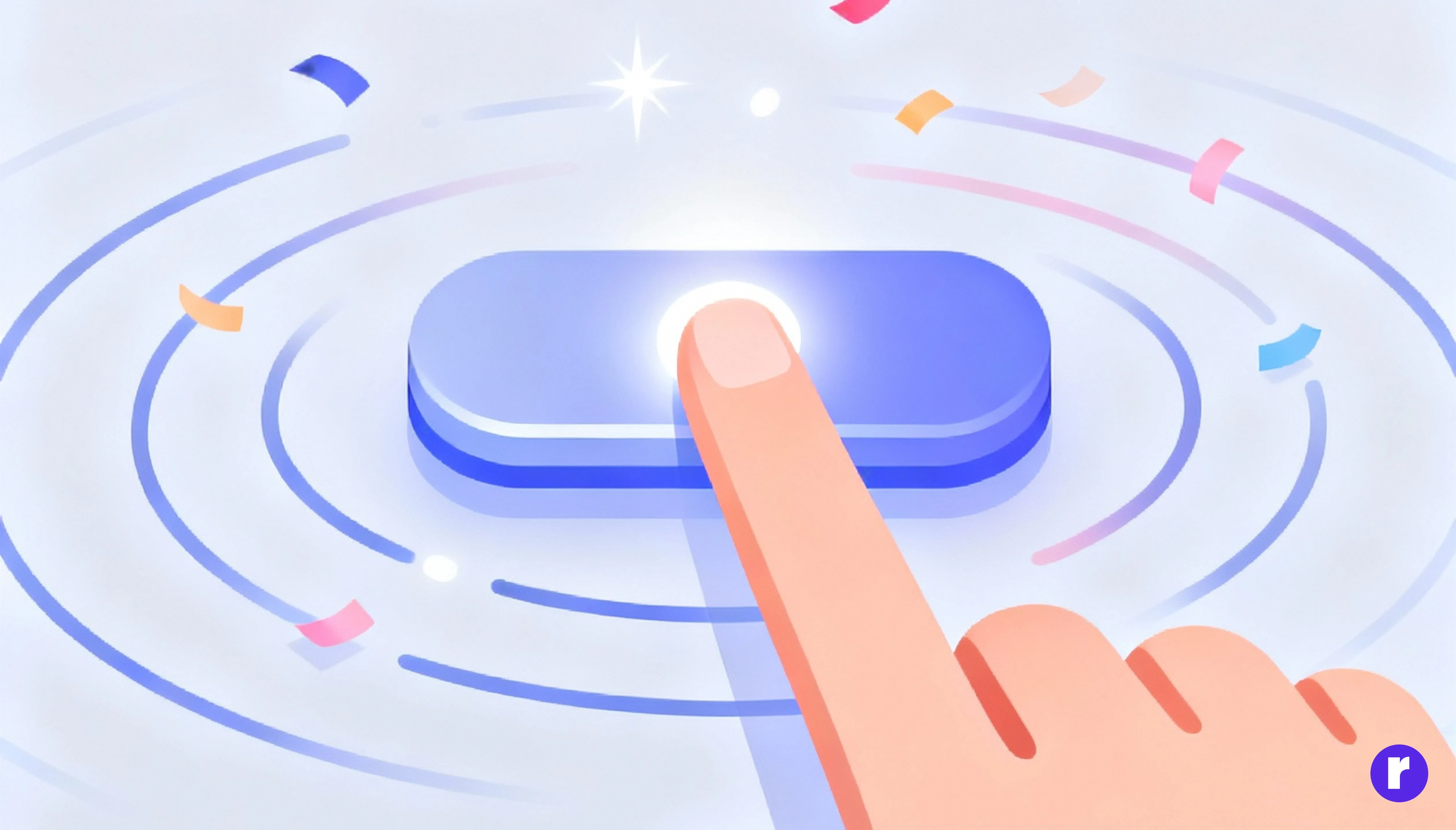
The Dopamine Effect: Anticipation and Reward
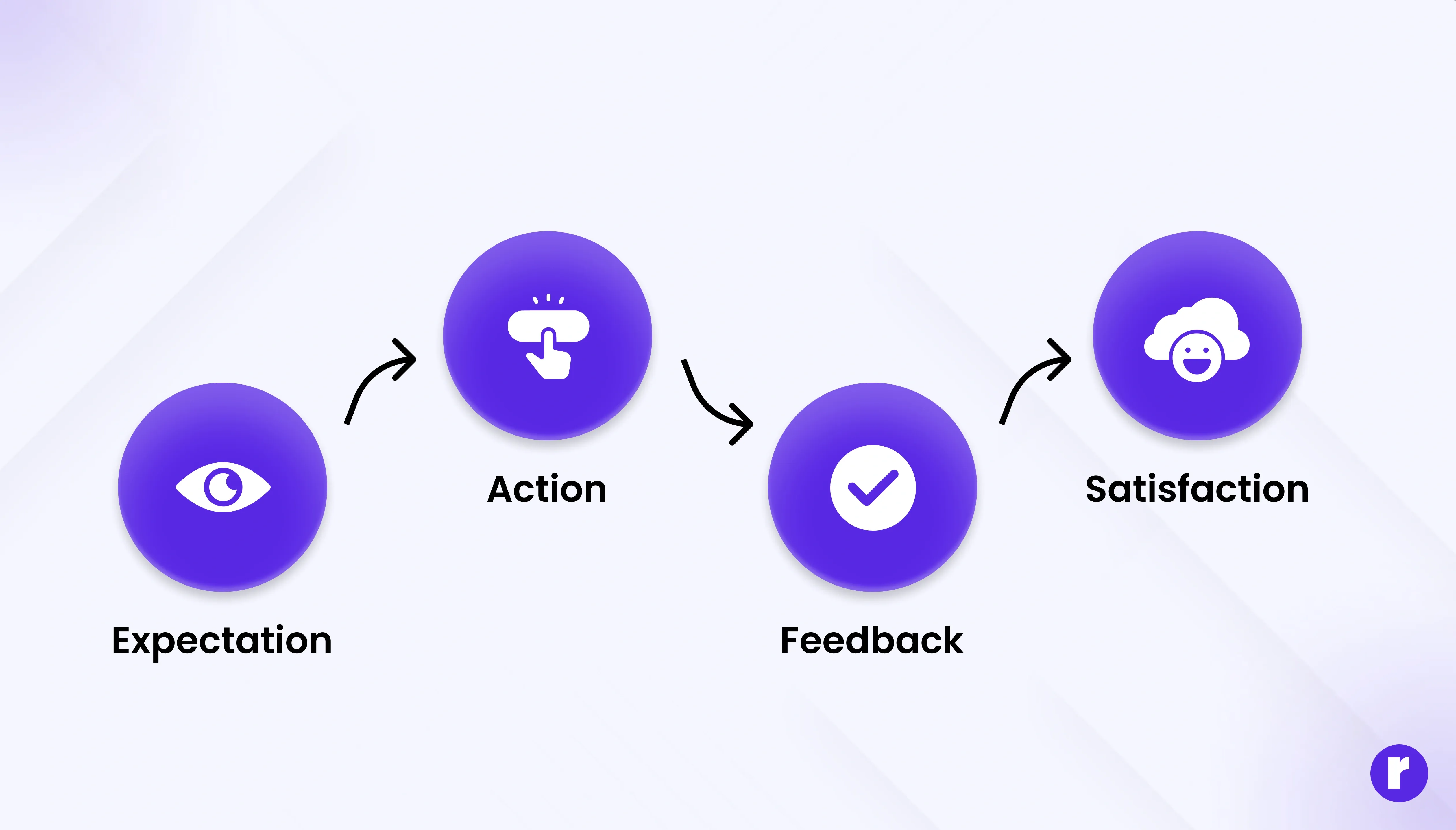
Every click is a small gamble. We click because we expect a reward — a piece of information, a new experience, or a sense of progress. When the interface meets (or exceeds) that expectation, the brain releases dopamine, the “feel-good” neurotransmitter associated with pleasure and learning.
Designers can leverage this opportunity by:
- Using clear labels that set expectations (“Download Now,” “Get Started,” “Watch Video”).
- Providing instant feedback (like button color changes or success messages) to confirm the action worked.
- Offering micro-rewards — small wins such as animations, confetti effects, or satisfying transitions that make the user feel rewarded.
This reward loop — expectation → action → feedback → satisfaction — keeps users engaged and motivated.
The Role of Emotions and Color Psychology
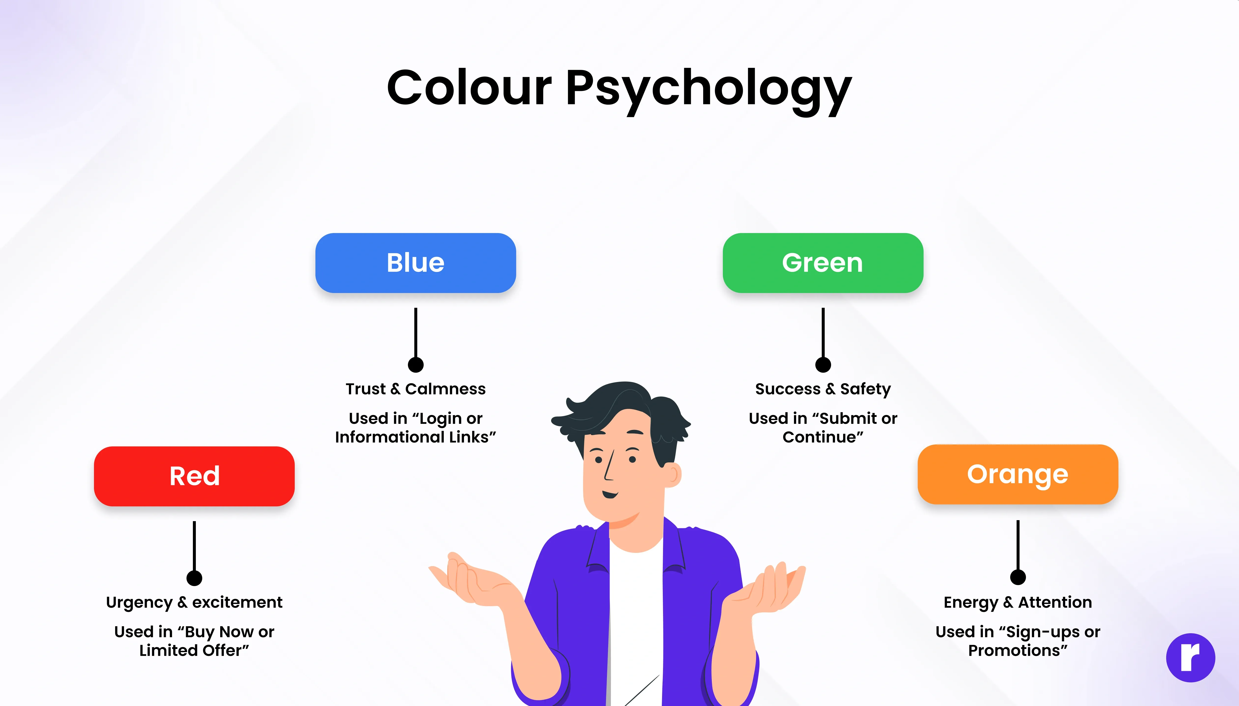
Color is one of the most powerful psychological triggers in design. Different hues evoke different emotions, subtly influencing user behavior.
Color Psychological Effect Common Use in UI:
- Red = urgency, excitement → used in “Buy Now” or “Limited Offer.”
- Blue = trust, calm → used for login or informational links.
- Green = success, safety → used for “Submit” or “Continue.”
- Orange/Yellow = energy, attention → used for sign-ups or promotions.
A distinct color helps a button stand out immediately. By combining emotion-driven colors with thoughtful placement, designers guide users toward actions without needing to tell them directly.
Learn more about color psychology here
The Fear of Missing Out (FOMO) Factor
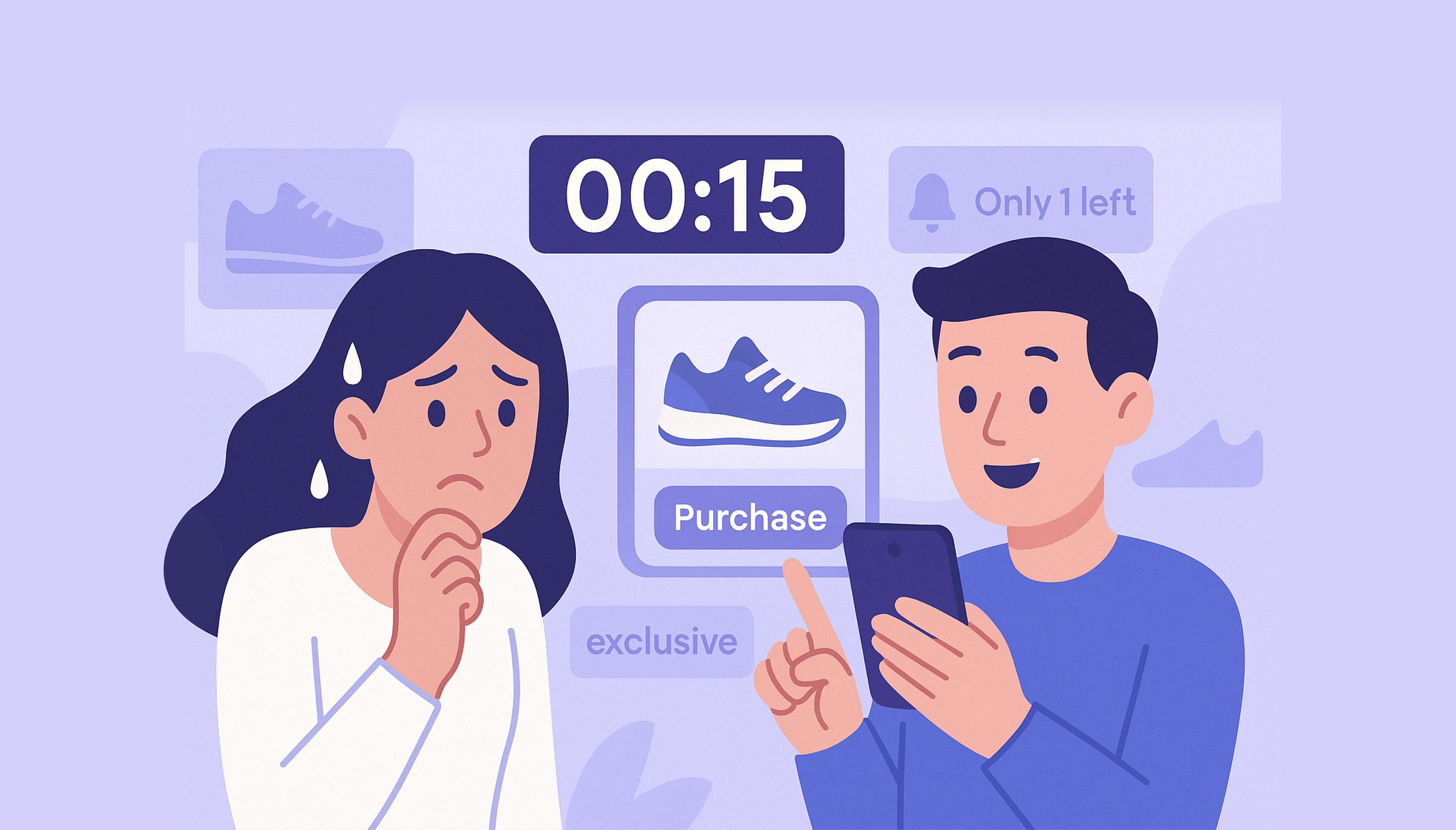
Scarcity and urgency can powerfully influence behavior. When users believe an opportunity is limited, they act faster.
That’s why buttons often include phrases like:
- “Only 3 spots left!”
- “Offer ends in 2 hours.”
- “Limited edition available now.”
- “Only 3 spots left!”
- “Offer ends in 2 hours.”
- “Limited edition available now.”
These phrases play on our brain’s loss aversion bias—the tendency to avoid losing something valuable, even more than we desire gaining it.
The Language of Action: How Words Drive Clicks
The words we put on buttons and links trigger subconscious responses. Good microcopy—the small bits of text that guide users—creates clarity, urgency, and emotional connection.
The Psychology of Good Microcopy:
- Action-Oriented: Use strong verbs (“Start,” “Get,” “Explore,” “Claim”) to inspire movement.
- Emotionally Driven: Tap into desire (“Join the Community,” “Discover Your Match”).
- Clarity Over Cleverness: Users should instantly know what happens after the click.
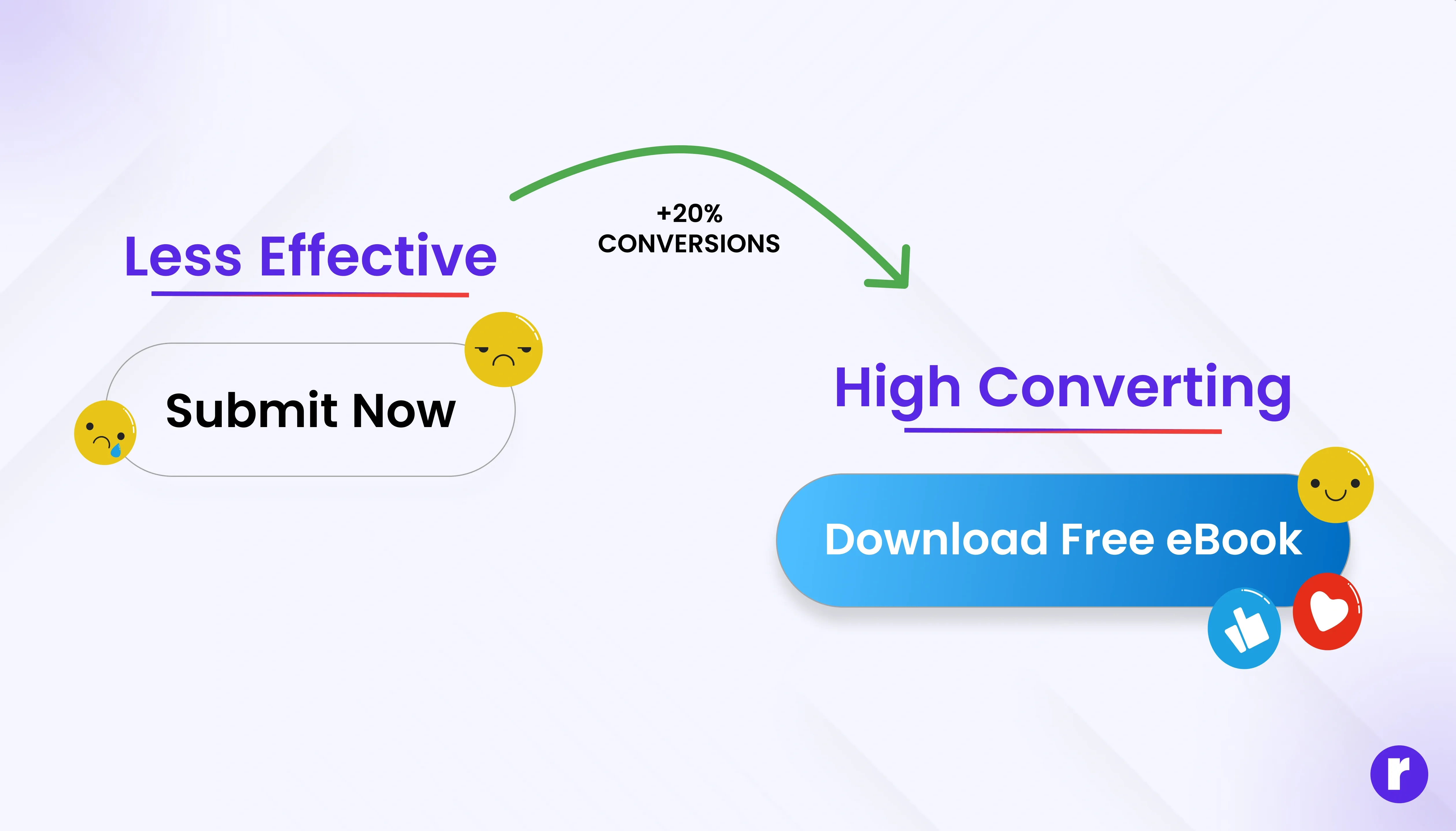
- Urgency and Value: “Download Free eBook” sounds more motivating than “Submit Form.”
Even subtle changes can shift behavior. For instance, “Create My Account” performs better than “Register” because it feels personal and ownership-driven.
💡 Pro Tip: Test multiple button texts using A/B testing—sometimes even a one-word change can boost click-through rates by 20% or more.
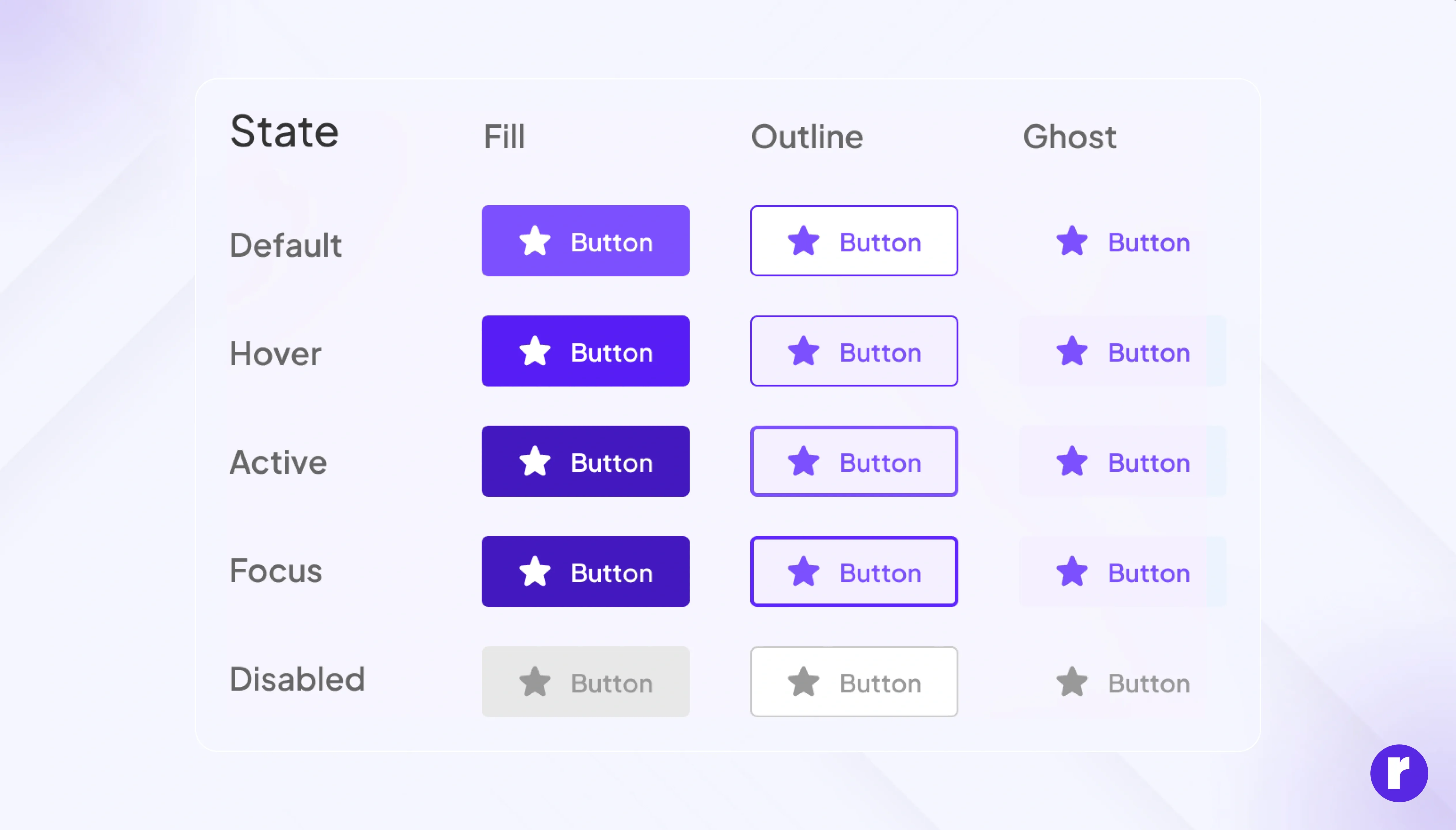
Trust and Consistency: The Invisible Factors
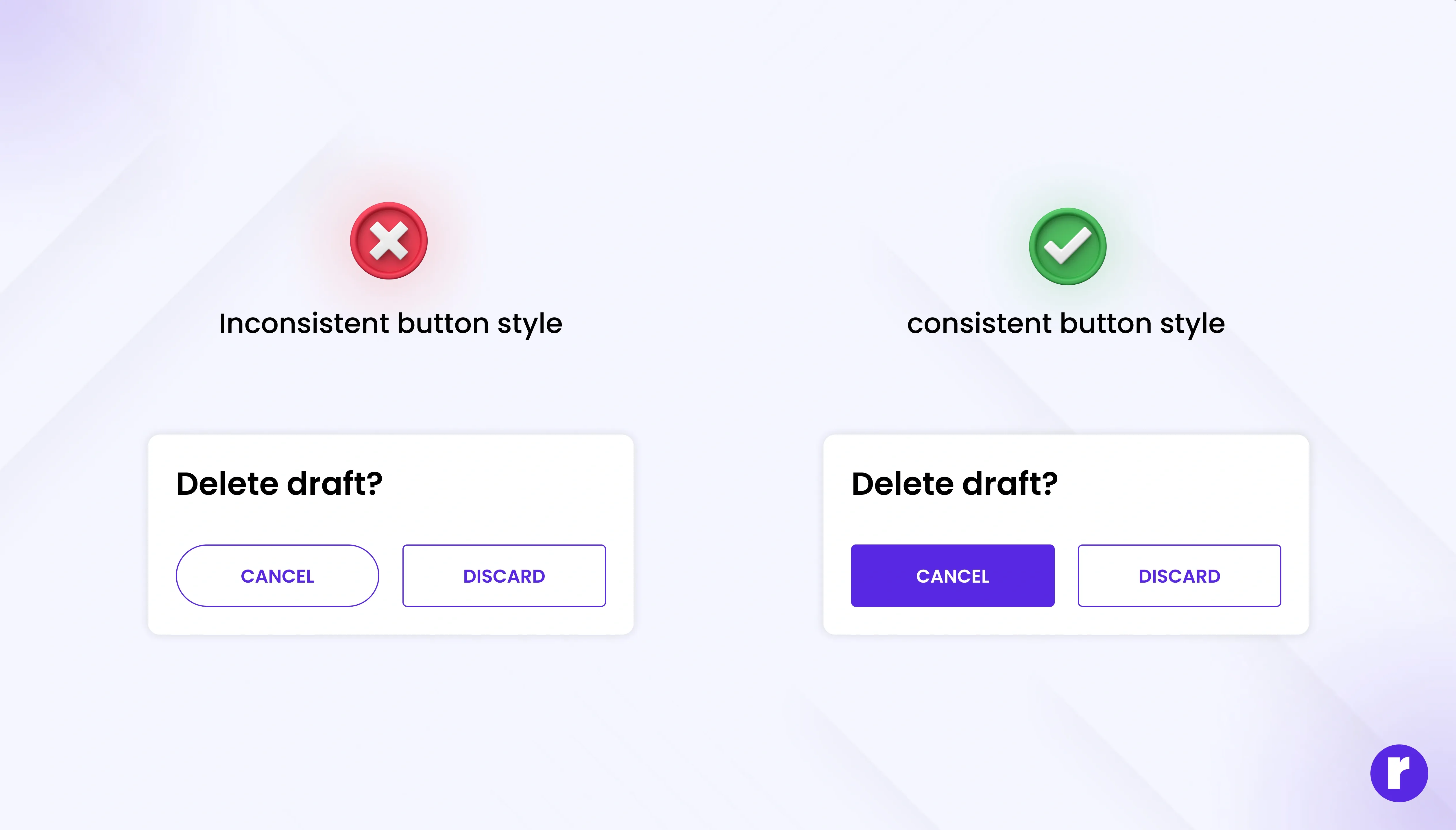
We only act when we trust the environment. If something looks suspicious, inconsistent, or unpredictable, users hesitate — even for milliseconds.
Elements That Build Trust:
- Consistency: Same button shapes, colors, and hover states across pages.
- Predictability: The button does exactly what it promises (no misleading CTAs).
- Security cues: Icons like locks, HTTPS, or phrases like “Safe & Secure Checkout.”
- Clarity: Avoid too many CTAs or unclear navigation paths.
When users feel safe, they stop overthinking — and start clicking instinctively.
The Subtle Art of Timing and Motion
Movement speaks louder than static visuals. Microinteractions — tiny animations that respond to a user’s action — are not just aesthetic; they’re psychological reassurance.
Why Motion Matters:
- Confirms the click worked (reduces anxiety).
- Provides pleasure through responsiveness.
- Mimics real-world physics (a “press” feels like pressing a real button).
But motion should always serve function, not decoration. Overuse can distract or frustrate, breaking the sense of control.
Keep learning with us Visit our website
Case Studies: Buttons That Get Clicked
Amazon’s “Buy Now” Button
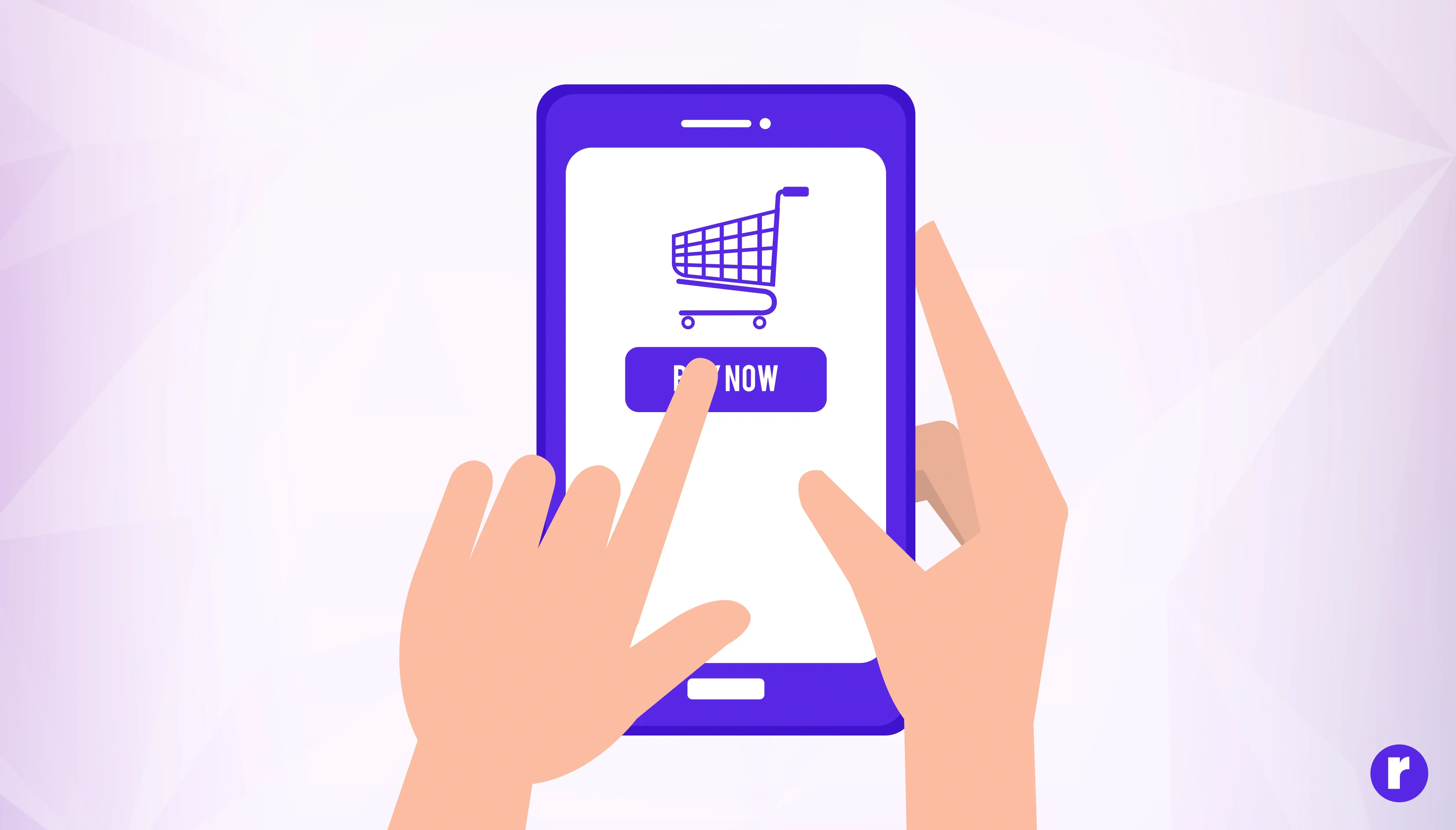
The “Buy Now” button is a classic example of using urgency and simplicity to drive clicks. The button is large, brightly colored (often yellow or orange), and placed prominently on product pages. The phrase “Buy Now” creates a sense of immediacy, encouraging users to act quickly rather than delay their purchase. Amazon also uses social proof by showing how many people have bought the item recently, further increasing trust and the likelihood of a click.
Duolingo’s “Continue” Button
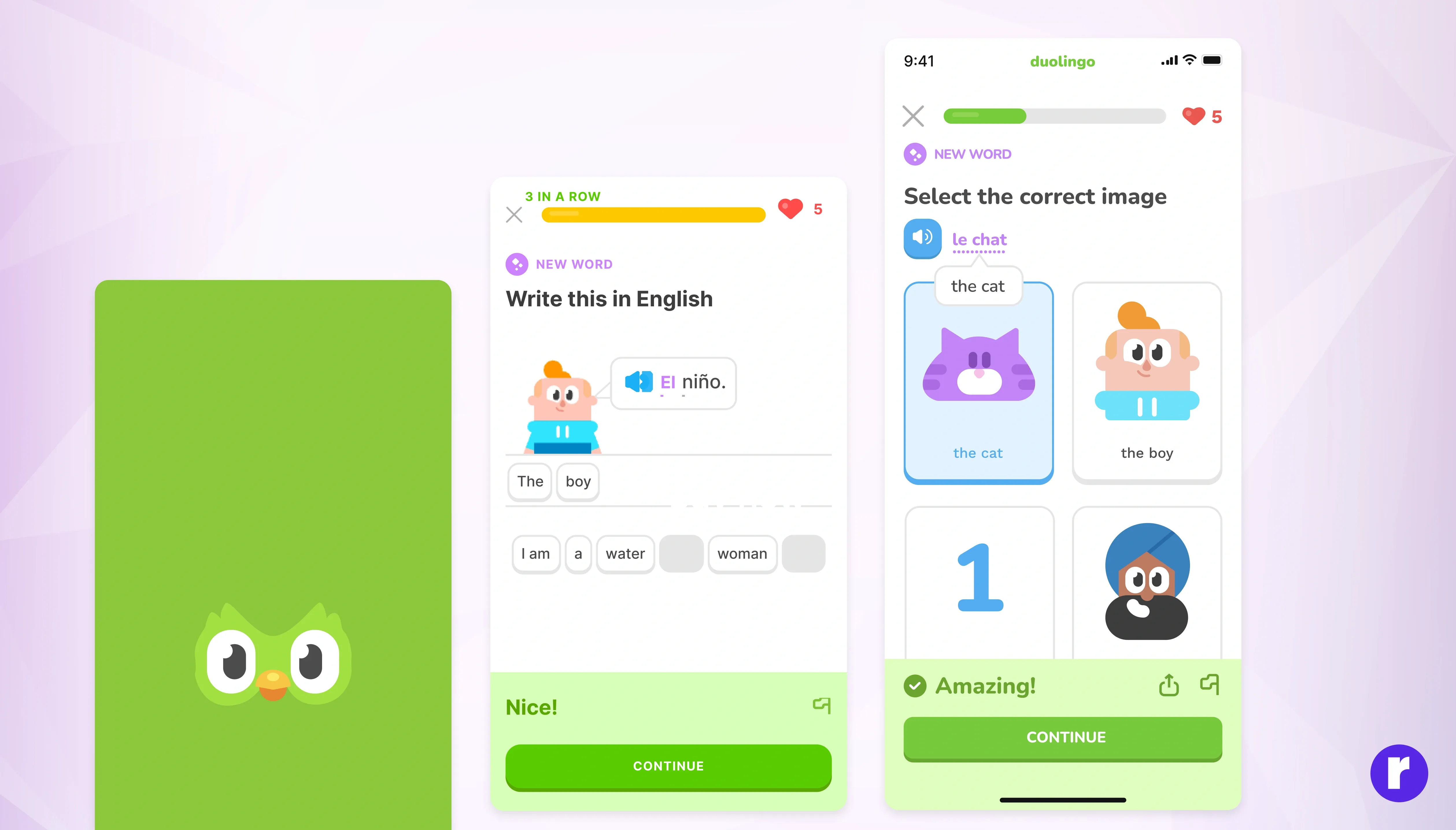
Simple but powerful. After every lesson, the bright “Continue” button keeps the momentum going, rewarding progress with satisfying sounds and animations. It reinforces the habit loop, making learning addictive in a good way.
Conclusion
When we click, we’re not just interacting with technology — we’re engaging in a subtle dance between design, emotion, and cognition.
A button is not just a rectangle with text; it’s a carefully crafted invitation that speaks to our desires, instincts, and expectations.
The best digital designs don’t force users to think, they make them feel — safe, curious, and rewarded.
And that’s the hidden psychology behind every successful click.