Behind Every Great Brand is a Great Logo

Written by

Chandani Sahani
UI/UX Designer
Table of contents
Build with Radial Code
Share this


There is a reason you can close your eyes and still see The Golden Arches. There is a reason you can close your eyes and still see The Apple bitten clean on the back of your laptop. You can still trace the fluid certainty of the Nike Swoosh without ever opening a browser. A logo isn't decoration; it's memory architecture. And the brands that understand this build empires. The ones that don't spend fortunes trying to fix something that should have been right from the start.
A logo can help people remember and distinguish a company, but trust and loyalty are built through much more: the quality of the product or service, customer support, communication, reliability, and the experiences people have over time.
The role of a logo is not to create all of that on its own. Its role is to provide a consistent visual identifier for the brand behind those experiences.
The Marks That Built Empires
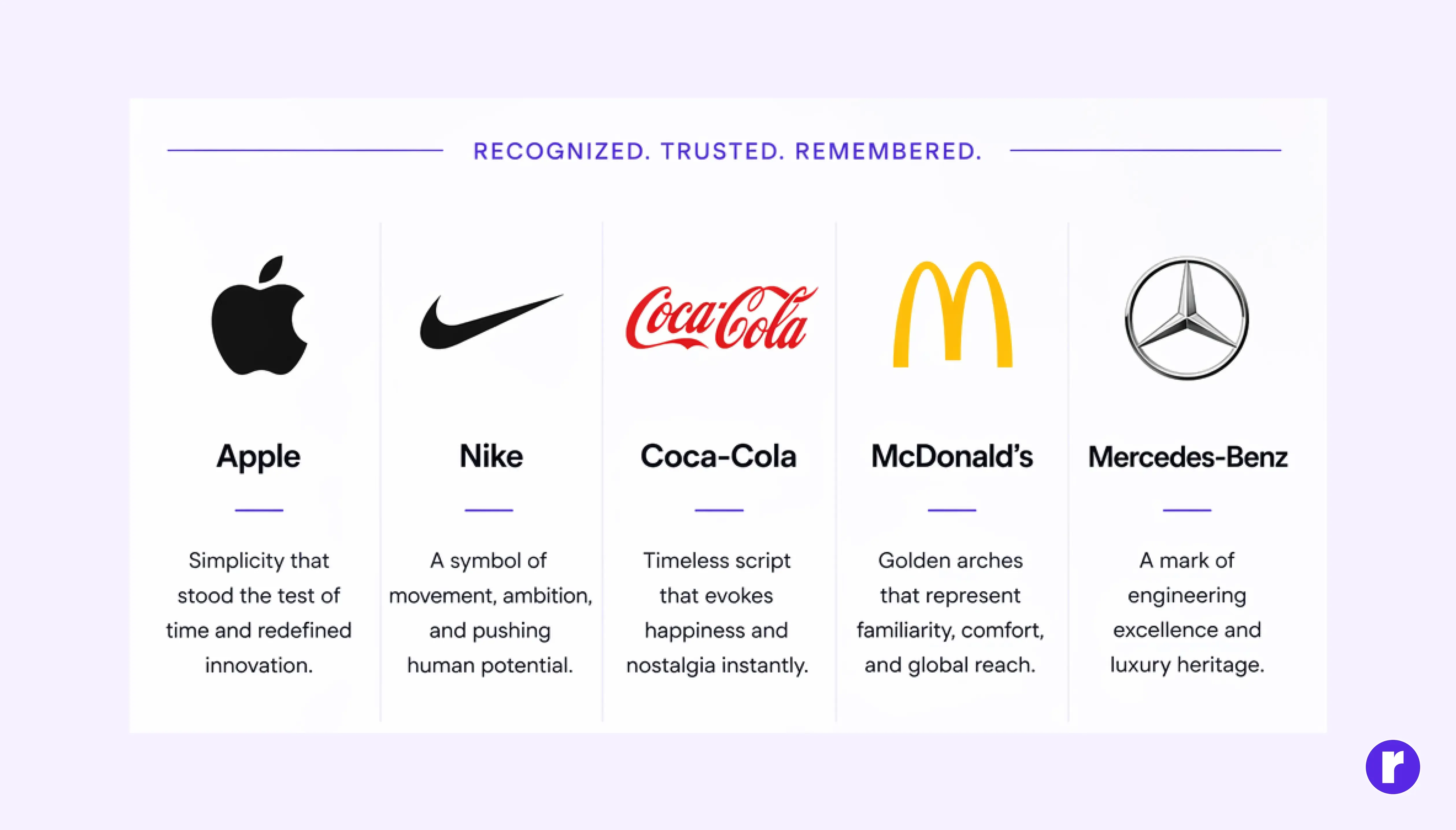
Some logos have become so familiar that recognition arrives almost immediately. They appear on products, websites, packaging, advertisements, storefronts, and many other brand touchpoints.
Over time, repeated exposure can strengthen the connection between a visual mark and the experiences people associate with the company.
The important distinction is that the logo becomes associated with the brand's reputation; it does not create that reputation by itself.
A recognizable mark can remind customers of what they already know about a company. The product, service, communication, and customer experience give that mark meaning. “Top Logo Design Tools and Software”
The 10-Second Rule: You Only Get One First Impression
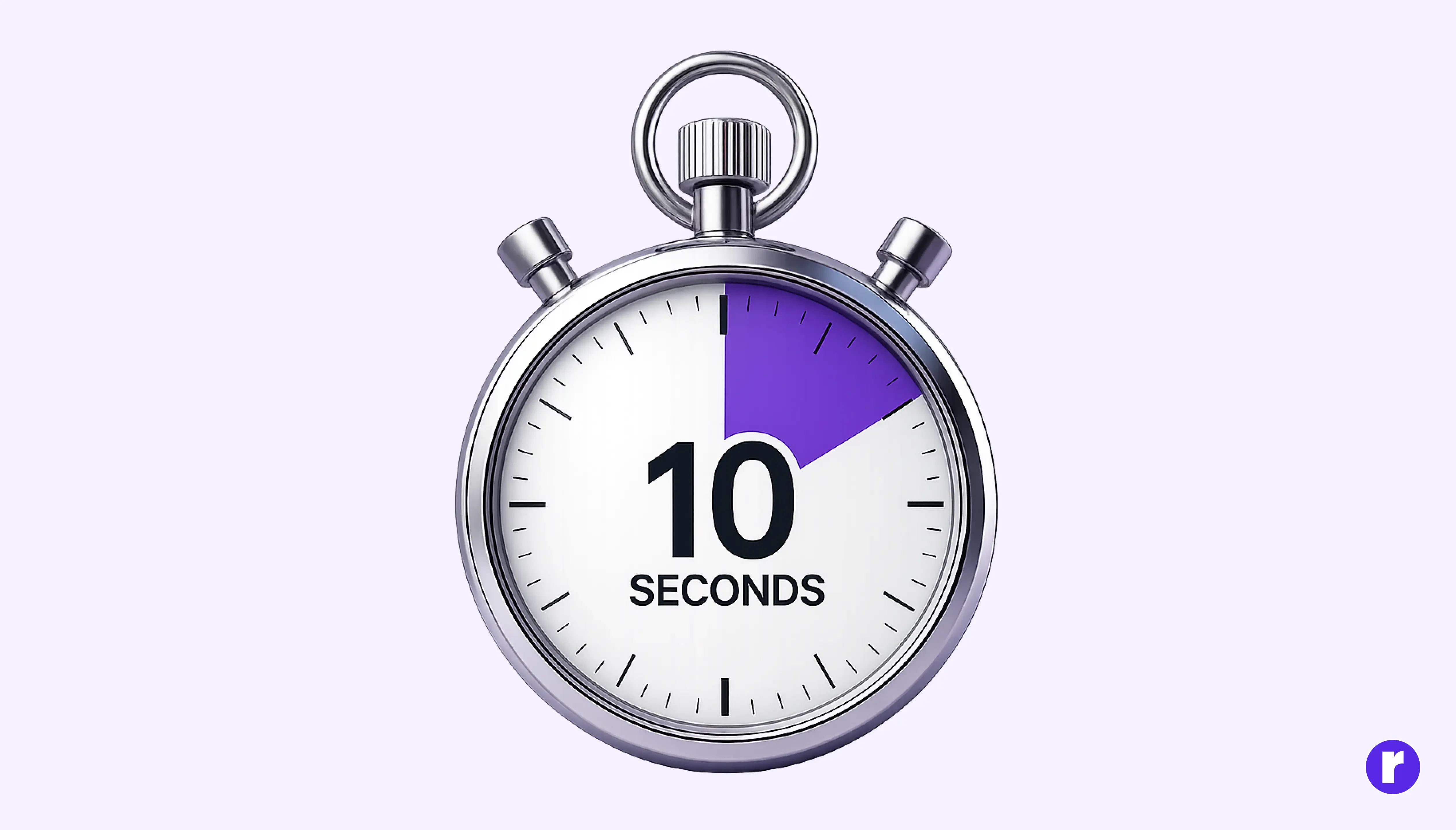
Consumers are ruthless timekeepers. Research consistently shows that it takes just 10 seconds for someone to form an opinion of your logo and by extension, your brand. But here's the uncomfortable truth that 10 seconds doesn't guarantee retention. It takes between 5 and 7 exposures before a logo is reliably lodged in memory.
That means every touchpoint your website header, packaging, business card, social profile, invoice is an opportunity to compound that impression or dilute it. Consistency is not a design preference. It is a competitive strategy.
Brand visibility is 3.5 times higher for companies with a consistently presented brand identity compared to those without one. Consistency in logos, colors, and visual language isn't just aesthetically pleasing — it directly multiplies how often and how easily consumers notice you.
Think about what happens when a brand gets this wrong. When Gap attempted a logo refresh in 2010, the internet responded with such swift and collective outrage that the company reverted to its original design within six days. The episode cost them millions in agency fees, production costs, and brand trust all to end up exactly where they started.
Recognition is Revenue
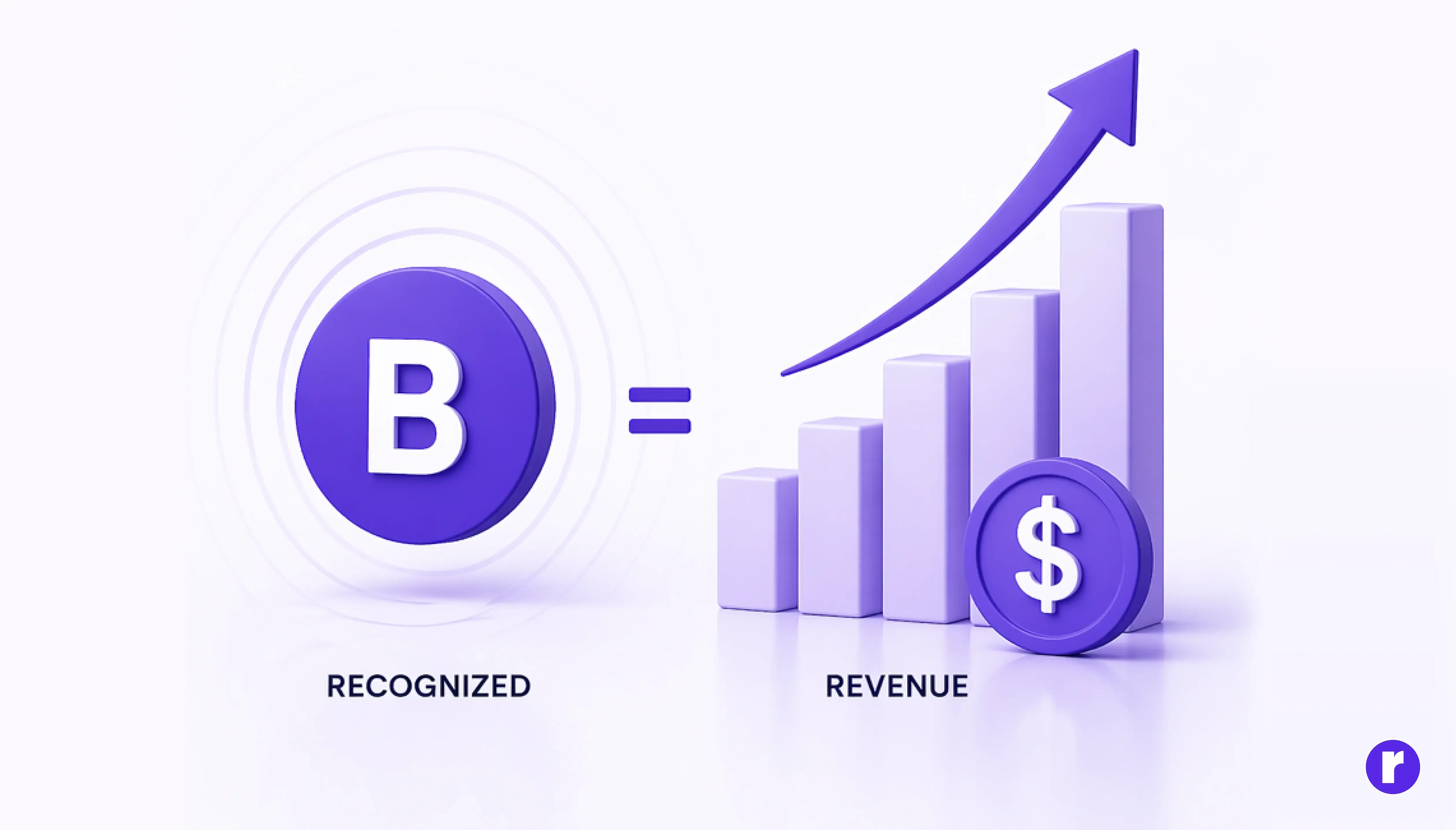
This is not soft branding theory. The connection between logo recognition and purchasing behavior is direct and measurable.
- According to Digital Silk's research, 34% of U.S. adults have purchased a product solely because they liked the company's logo.
- Half of consumers (50%) are more likely to purchase from a brand with a recognizable logo.
- A striking 60% of consumers say they would actively avoid buying from a company if they disliked its logo.
- According to Capital One Shopping, shoppers subconsciously judge a product within 90 seconds of viewing it, with 62–90% of that assessment based solely on color.
The Psychology of Color: Your Logo's Silent Language
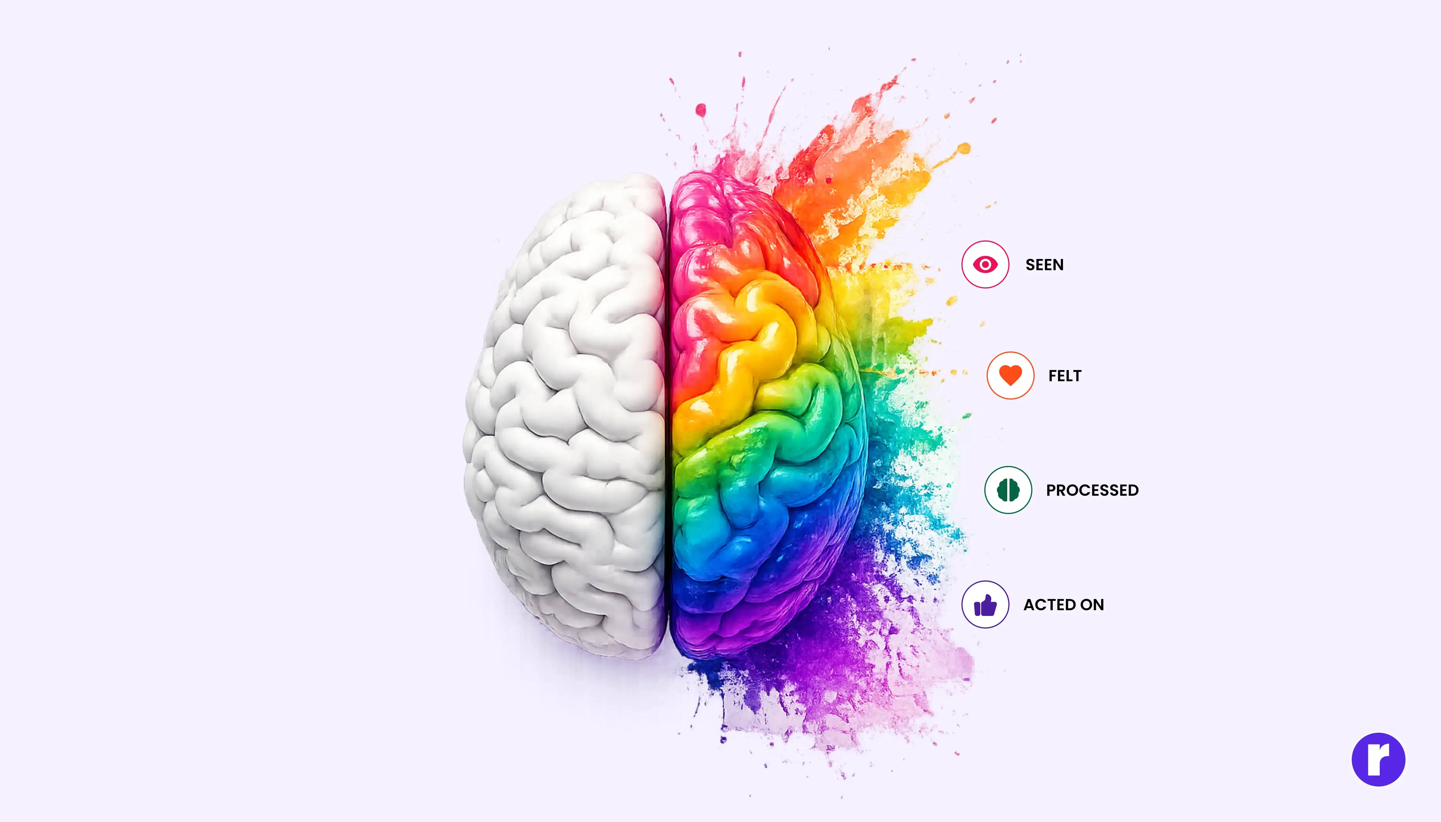
If shape is the skeleton of a logo, color is its nervous system. Color is processed before words, shapes, and often before conscious thought. Brands that deploy it deliberately don't just look better they think more clearly about what they're communicating.
The numbers behind color are hard to ignore:
- A consistent color palette can boost brand recognition by up to 80% a finding cited consistently across multiple branding research sources.
- 35.2% of the world's most valuable brand logos use blue as their dominant color, making it the most used logo color globally.
- 76% of top brands use only one or two colors in their logo. Restraint is a strategy.
- 43% of Fortune 500 companies use two colors in their logo, while just 5% use four or more.
- About 95% of the world's top 100 brands use a palette of just two colors.
Consider Tiffany's robin-egg blue, a color so owned by one brand that it was trademarked as Pantone 1837 or Coca-Cola's red, which has become so psychologically embedded that research suggests people associate that exact shade with energy and joy independent of any text. The color IS the brand.
What Makes a Logo Actually Great
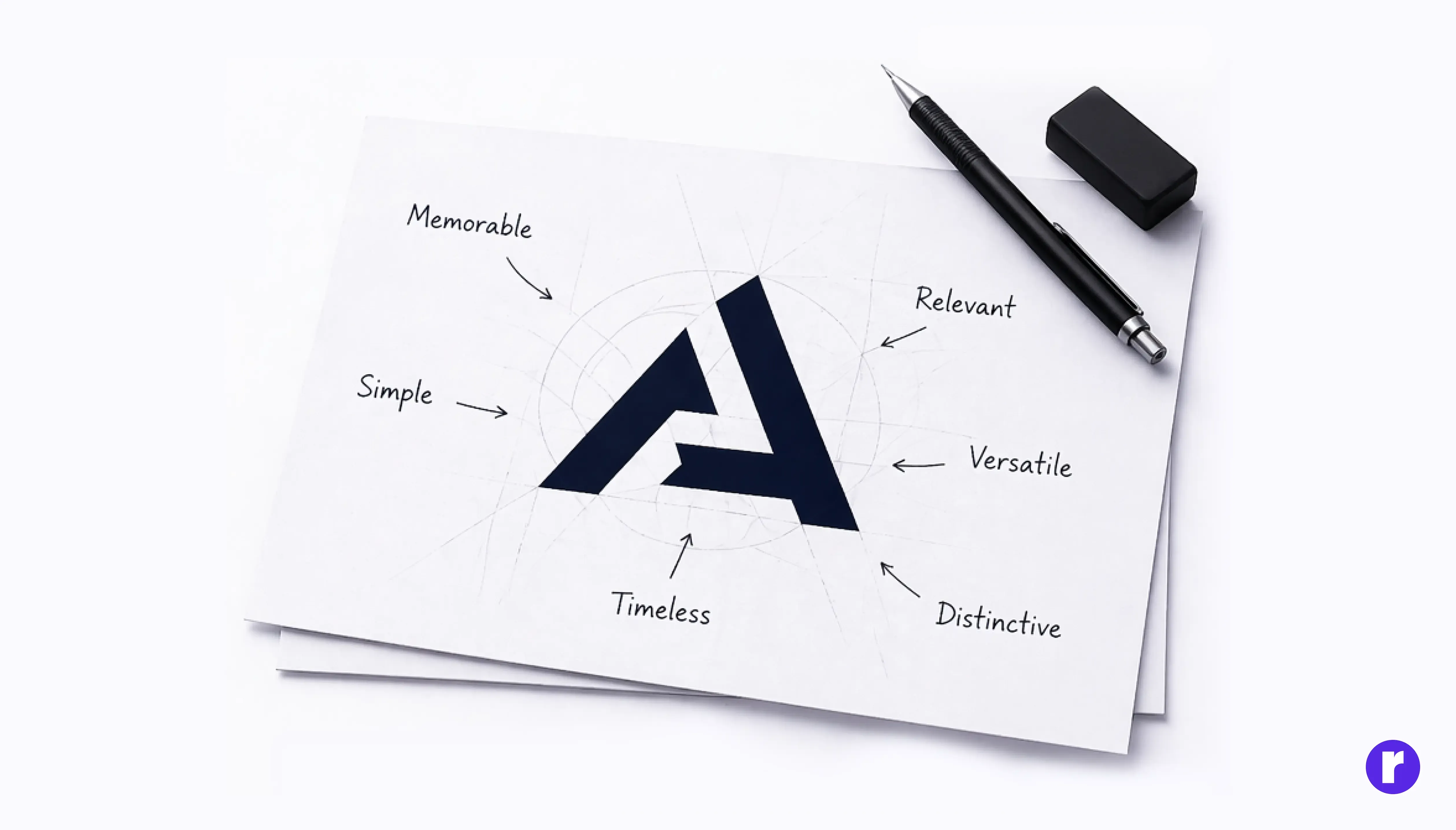
Great logos are not accidents, and they're rarely the product of a single flash of inspiration. They emerge from a disciplined process of understanding the brand, the audience, the competitive landscape, and the psychology of perception. Here is what the data and the decades tell us:
- Simplicity: The discipline to remove everything non-essential. A child should be able to sketch it from memory.
- Memorability: Singular enough to own a corner of memory. It plants itself on first contact and never fully leaves.
- Timelessness: Design for the decade, not the quarter. Fashion moves in seasons; great logos move in generations.
- Versatility: From a 16px favicon to a billboard, it must hold integrity everywhere it travels.
- Distinctive: Unique and instantly recognizable it stands apart from competitors and leaves a lasting impression in the viewer’s mind.
- Relevant: It visually communicates the brand’s purpose, making it feel appropriate and meaningful within its industry.
Your brand deserves a perfect logo, visit Radial Code
The Investment Case for Great Logo Design
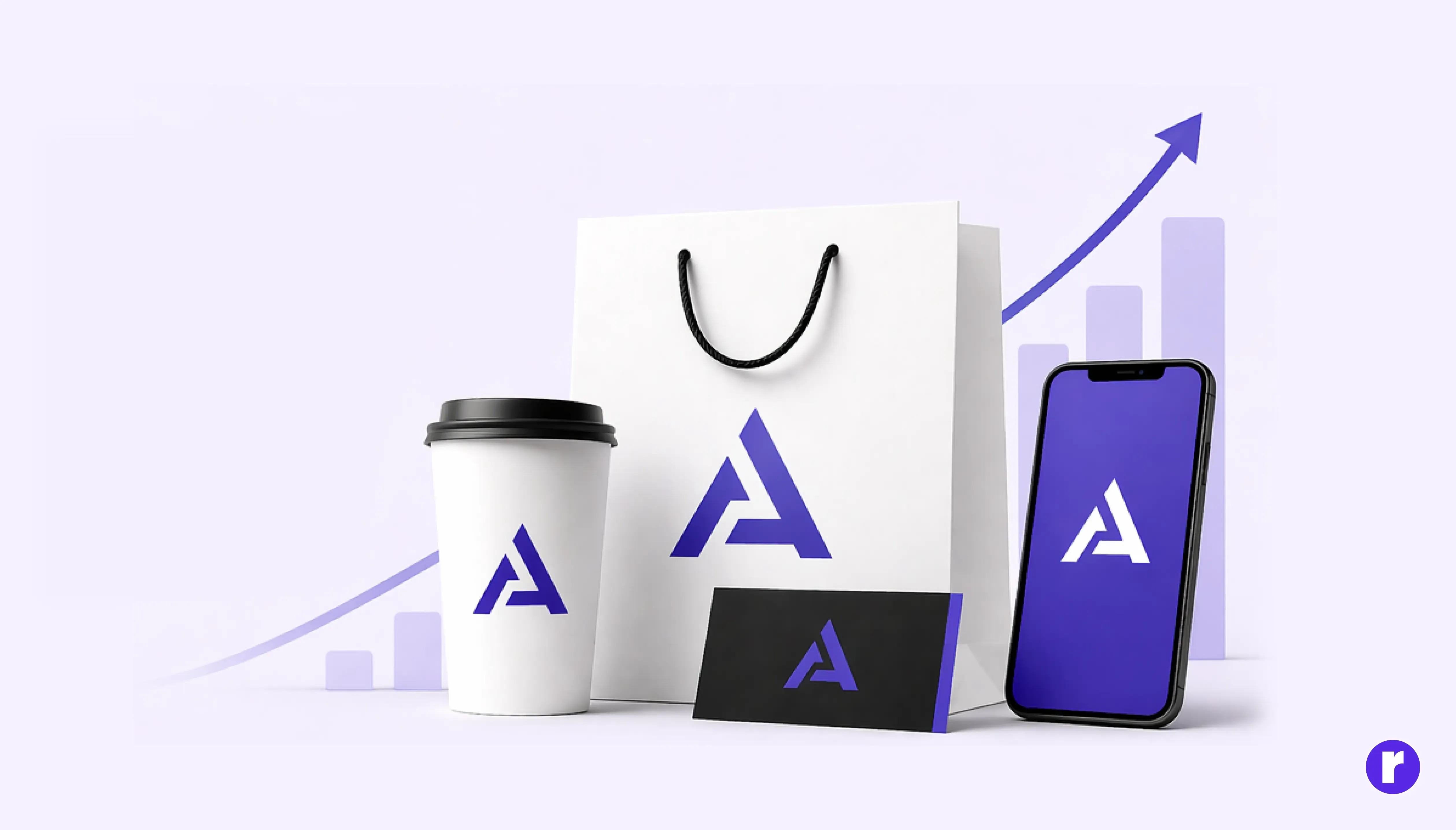
Here is the business argument, stripped of sentiment your logo is the most frequently seen piece of marketing collateral your brand will ever produce. Every email, every product, every vehicle, every building, every piece of packaging the logo is there. It works 24 hours a day, 365 days a year, without a salary, without a media buy, without a campaign brief.
- Consistent brand presentation anchored by a well-designed logo can increase revenue by 10–20%, according to Lucidpress's State of Brand Consistency report.
- Brand visibility is 3.5× higher for consistently presented brands.
- 82% of investors say name and brand recognition is essential in guiding their investment decisions.
- 50% of consumers are more likely to buy from brands they recognize and recognition starts with the logo.
- Companies that invest in strong visual branding from the start avoid the compounding cost of correction redesign fees, reprinting costs, consumer confusion, and lost brand equity.
Apple's brand value the most valuable brand in the world is inseparable from the logo that represents it. A bitten apple, drawn in 1977. The lesson invest early, design with intention, and protect what you build.
The Real Cost of Getting It Wrong
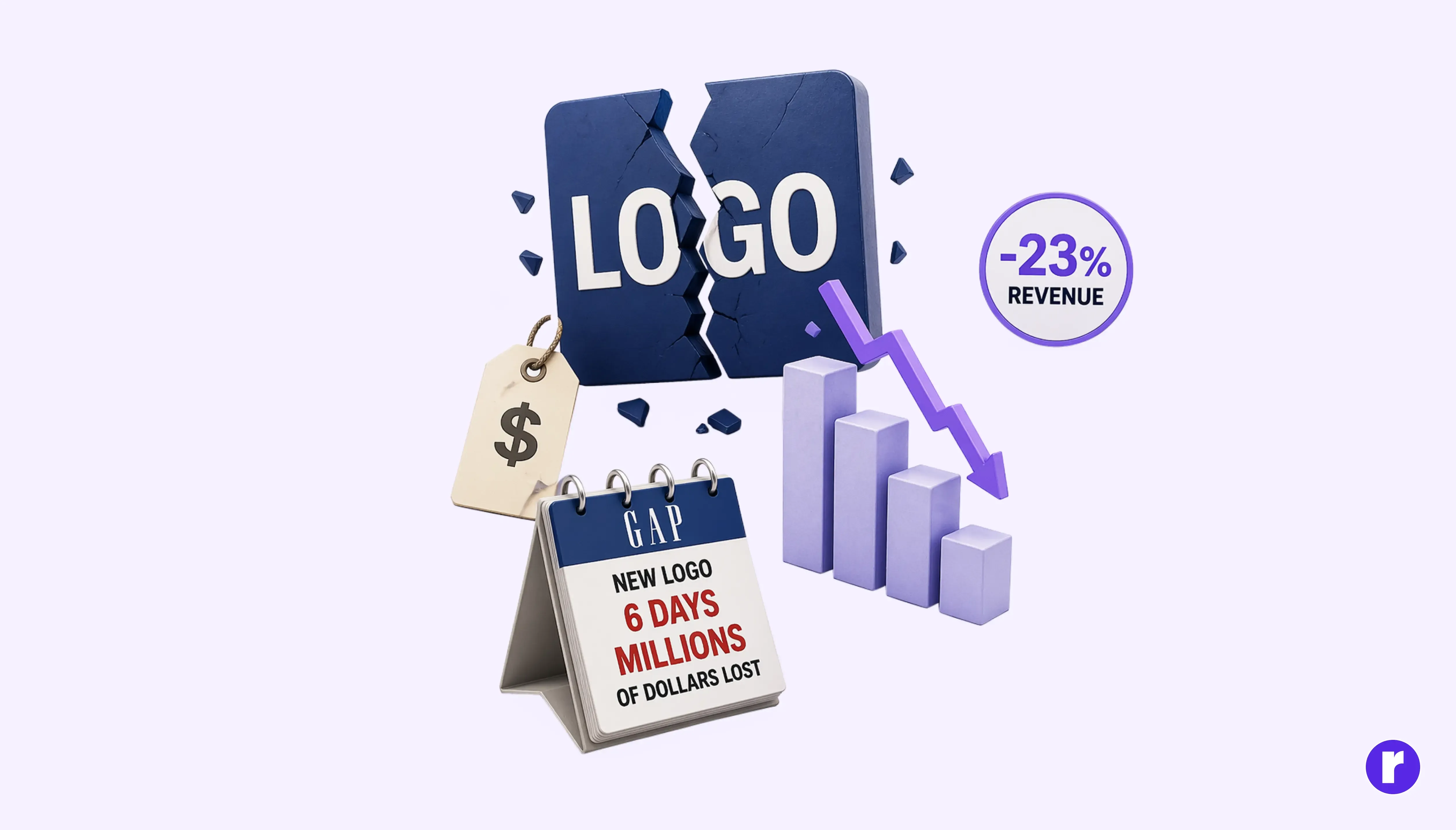
Weak branding undermines trust, limits premium pricing, and can significantly impact revenue growth.
- Audiences subconsciously equate visual quality with product quality a weak logo signals a weak brand, regardless of what you deliver.
- You cannot charge premium prices behind a budget-looking identity.
- Gap's 2010 logo redesign was reversed after about six days, with the company restoring its original logo. The example highlights the importance of considering existing brand recognition before making major identity changes.
- Inconsistent or forgettable branding can reduce revenue by up to 23% compared to brands with strong visual identities.
"The most expensive logo isn't the one that costs the most to create — it's the one you get wrong and have to redo. Twice."
Conclusion
At the end of the day, building a brand is an act of sustained intention. Your logo is where that intention becomes visible to the world. It doesn't need to be elaborate; it needs to be honest, consistent, and unmistakably yours. Tend to it with the same care you give your product, your people, and your promise. Because long after your campaigns fade and your copy changes, that small mark will remain quietly carrying everything your brand has earned.
To learn more about logo and branding, visit our website here Radial Code Learn