The Psychology Behind Great Logo Design

Written by

Chandani Sahani
UI/UX Designer
Table of contents
Build with Radial Code
Share this


Think about your daily routine for a moment. You wake up, grab your phone, scroll through apps, maybe order coffee, or check social media. Without realizing it, you interact with dozens of logos before your day even properly begins. That familiar green speech bubble with a white phone icon instantly tells you it's WhatsApp. The bitten apple needs no explanation. You don't read these logos; you feel them.
That's not an accident. That's psychology at work.
Great logo design goes far beyond aesthetics. It taps into how our brains perceive, process, and emotionally connect with visual information. Let's unpack what really makes a logo not just "good-looking," but memorable, meaningful, and powerful.
First Impressions Happen in Milliseconds
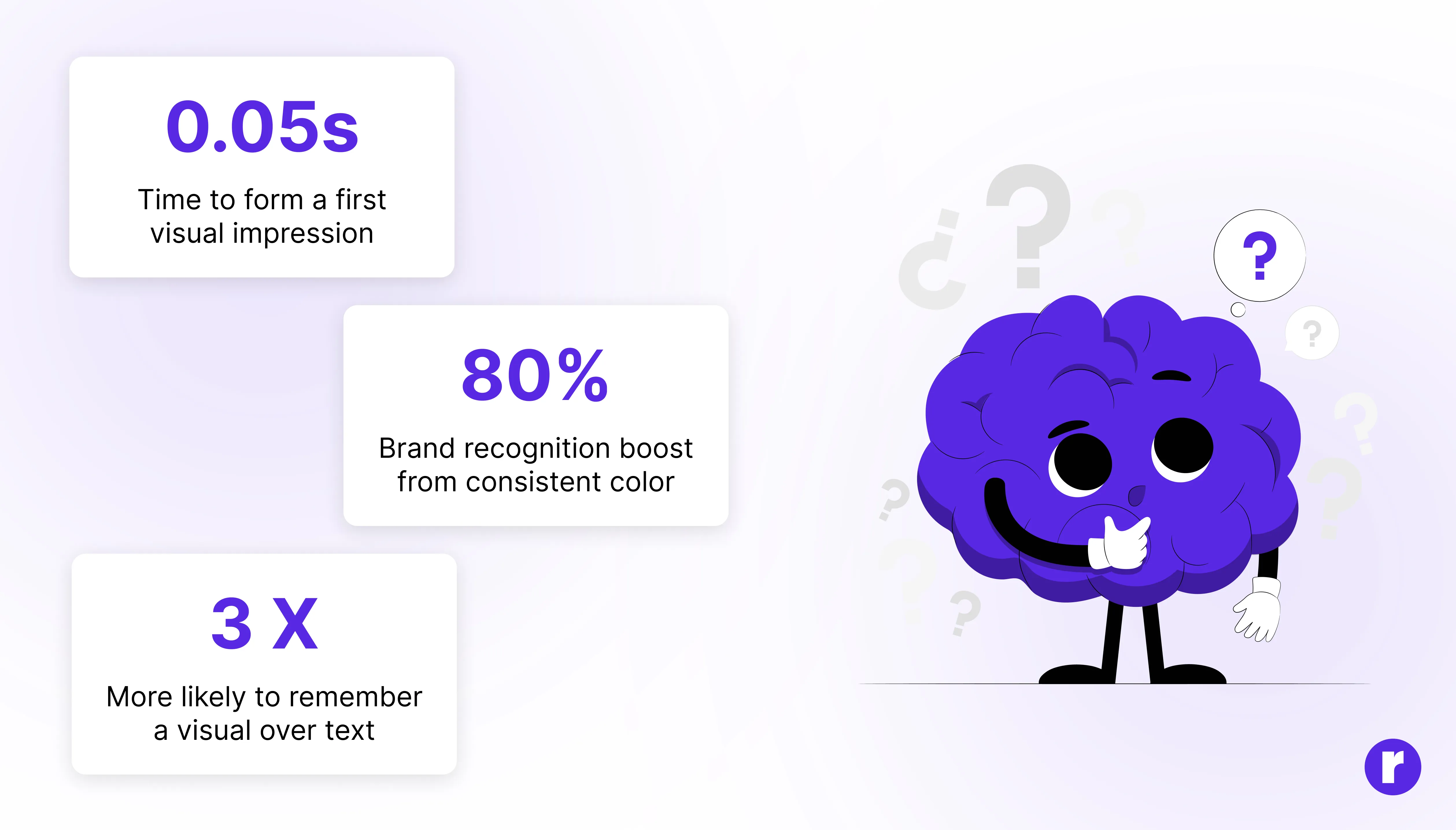
Humans are wired for quick judgment. Research from Lindgaard et al. (2006) found that people can form initial impressions of visual designs in as little as 50 milliseconds. Although the study focused on web pages, it demonstrates how quickly visual impressions can form. A logo is often the first handshake between a brand and its audience. If it feels confusing, outdated, or cluttered, people may subconsciously associate those traits with the brand itself. Radial Code Learn focuses on practical, real-world design thinking over outdated theory.
The Color Psychology Cheat Sheet
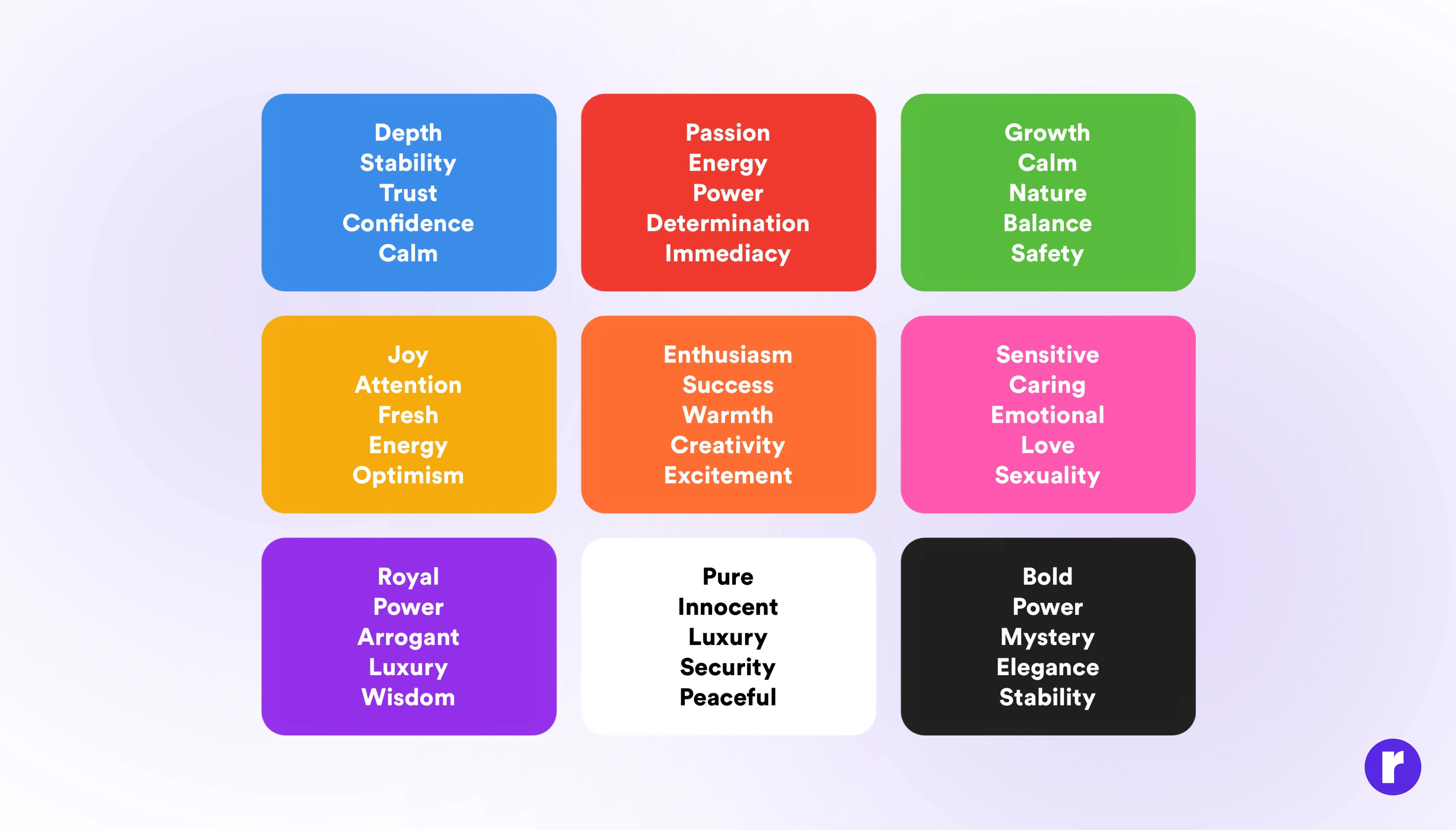
Colors don't just decorate; they communicate. Color is one of the loudest signals in any logo. Color may account for 62% to 90% of an initial assessment of a person or product (Singh, 2006).
Color choices are rarely random in great brand identities. Notice how many financial institutions use blue: it's often associated with stability and dependability in Western markets. Meanwhile, fast food chains frequently lean toward red and yellow, creating a bold and attention-grabbing visual presence.
Key takeaway: There's no universal "color = emotion" formula. The most effective color choices are the ones that feel appropriate for the specific brand, audience, and category.
Shape Psychology: What Every Curve Is Saying
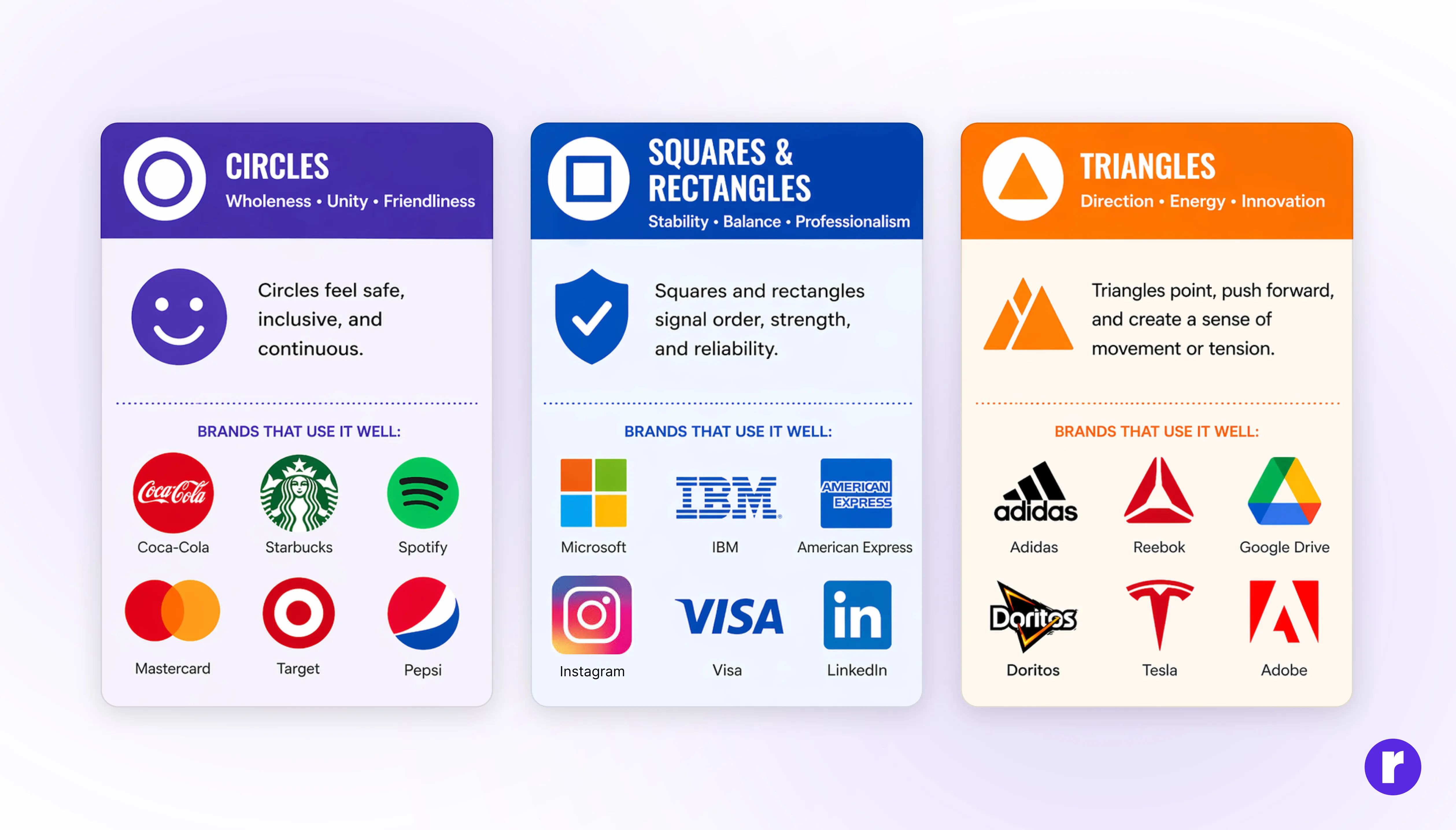
Long before language evolved, humans read shapes to survive: sharp edges could signal danger, soft curves could indicate safety. Even subtle curves or sharp edges can shift perception. Our brains still carry some of that wiring, though the relationship between shape and meaning isn't fixed.
- Circles often feel friendly, inclusive, and continuous
- Squares and rectangles tend to signal stability and professionalism
For example, a rounded logo generally feels more approachable, while sharp angles can feel dynamic or aggressive. However, context matters enormously: the same shape can communicate differently depending on the brand, audience, and surrounding design elements (Jiang et al., 2016).
"A great logo is not designed; it is distilled. Every element that can be removed without losing meaning, must be."
The Power of Simplicity (and Why It's So Hard)
Here's the paradox of logo design: the simpler it looks, the harder it is to make. Apple's logo is a bitten apple. Nike's is a swoosh. FedEx's is just two words, except it hides an arrow between the E and the X, visible only when you know where to look.
Simple logos tend to work because of how recognition memory functions. A complex logo demands more cognitive effort; a simple one is processed more fluently and tends to stick. This may be why logos that pass the "napkin test" (can you sketch it from memory?) often enjoy stronger brand recognition, though simplicity alone doesn't guarantee longevity.
Typography Speaks Before You Read It
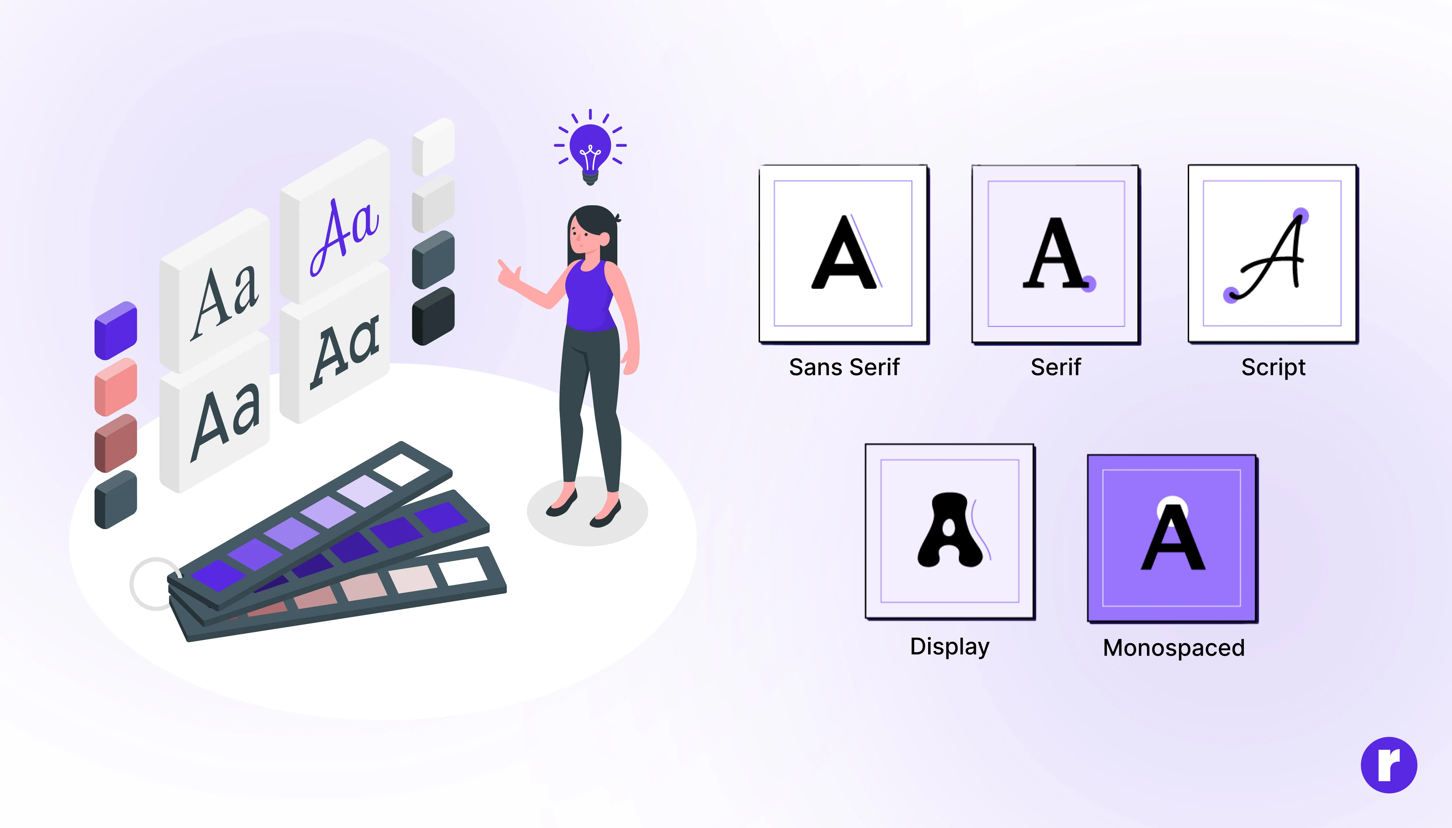
Even before you decode what a word says, you've already registered how the font makes you feel. Research on font perception (Doyle & Bottomley, 2006) shows that typeface characteristics influence brand personality perceptions, though the effect is moderated by product category.
- Serif fonts, with their traditional detailing, often evoke authority, heritage, and trust. Think law firms, newspapers, luxury fashion.
- Sans-serif fonts tend to feel modern, clean, and accessible. That's part of why tech companies from Google to Airbnb made the switch.
- Script fonts can feel personal and warm.
- All-caps can feel dominant and commanding.
- Even letter spacing sends signals: luxury brands often use generous tracking to feel unhurried, while discount brands may squeeze things together to suggest abundance.
The best logos achieve something rare: their font and mark are so perfectly matched that you couldn't imagine one without the other.
Familiarity, Trust, and the Mere Exposure Effect
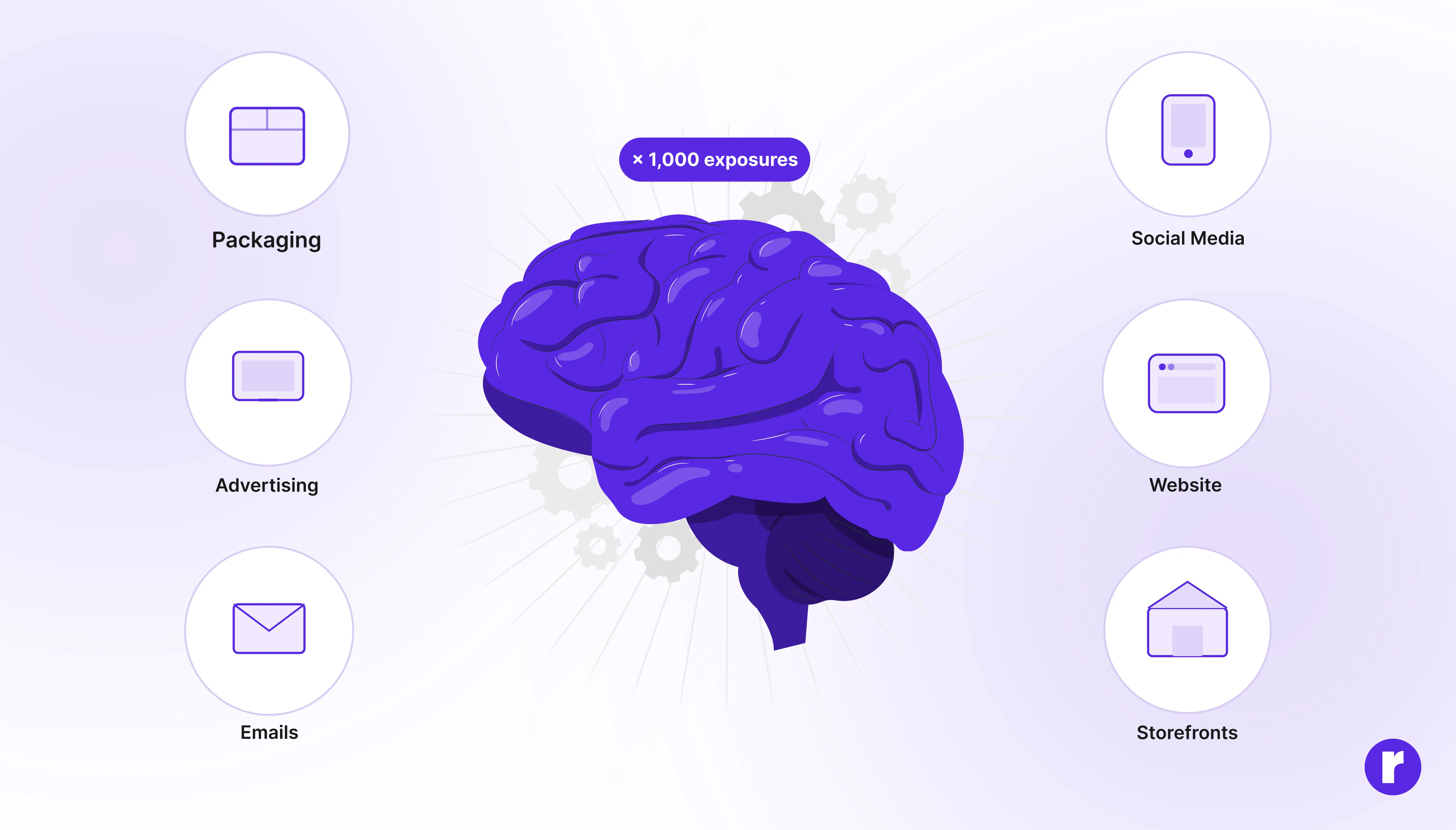
Here's a psychological phenomenon that every brand strategist should know: the more you see something, the more you tend to like it. This is the mere exposure effect, first documented by Robert Zajonc (1968). It's one reason why consistent brand identity across every touchpoint (packaging, ads, social media, storefronts) compounds over time.
A logo you've seen a thousand times feels trustworthy, not necessarily because it's objectively better, but because the brain processes familiarity with greater fluency, which can be misattributed as preference or safety. That comfort when you spot a Starbucks in an unfamiliar city? Mere exposure likely plays a role.
This is also why logo redesigns are emotionally fraught. Changing a familiar logo isn't just an aesthetic update; it disrupts the processing fluency that audiences have built over years of repeated exposure.
This perspective aligns with modern logo design principles where psychological impact and emotional resonance matter just as much as visual simplicity.
Hidden Meaning: The Iceberg Theory of Logo Design
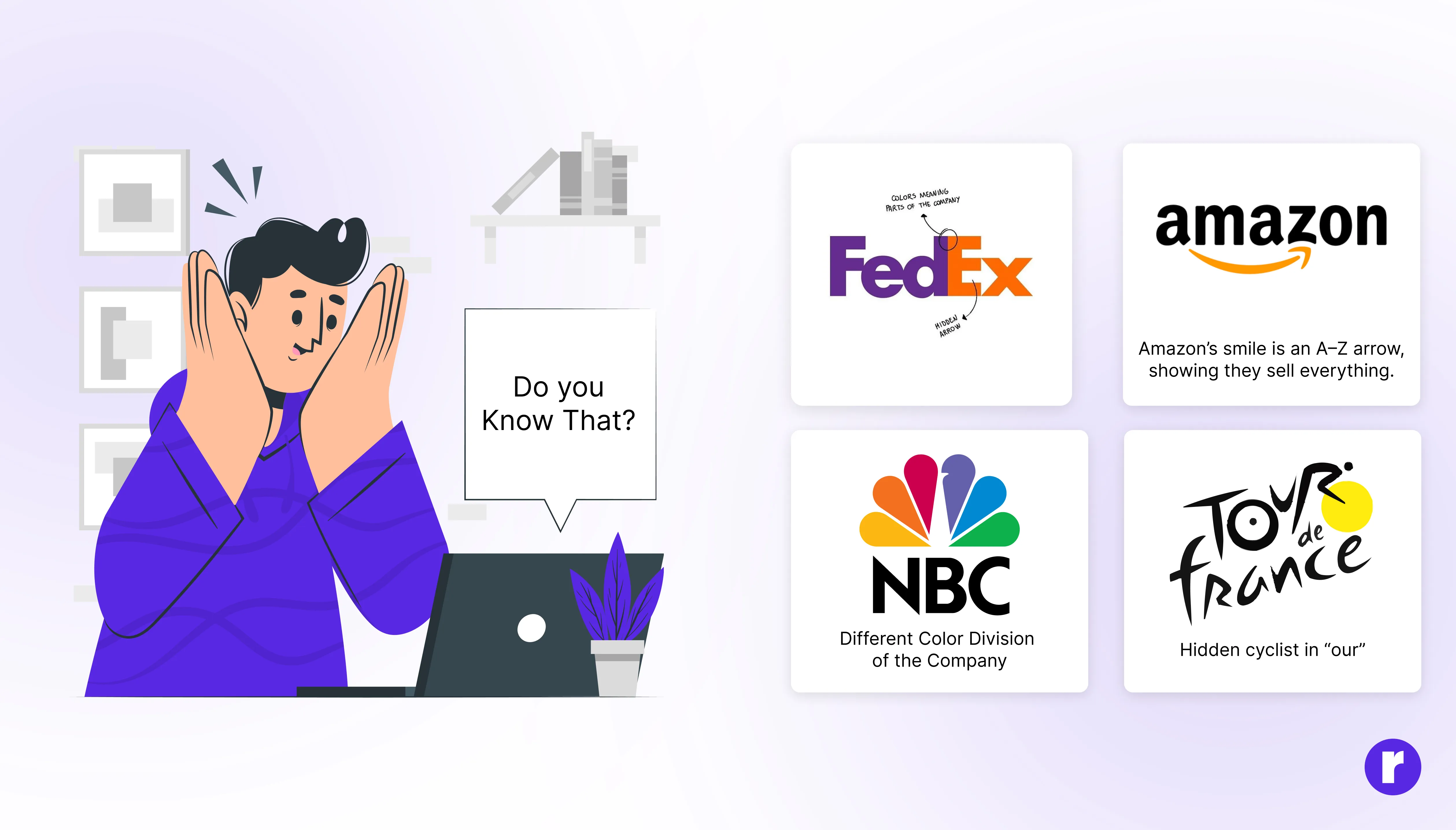
The greatest logos reward attention. On the surface, they work fast and clean. But buried inside are layers of meaning that reveal themselves over time, and when you spot them, there's a small sense of satisfaction.
The FedEx arrow between E and X suggests speed and forward motion. The Amazon smile doubles as an arrow from A to Z, signaling they sell everything. The Tour de France logo hides a cyclist made from the letters "our." NBC’s peacock logo uses six feathers in the primary and secondary colors of television.
These hidden details can make a logo more engaging because discovering an unexpected visual element creates a small moment of satisfaction. Whether that translates into deeper brand attachment depends on the individual and the context, but at minimum, it makes the logo more interesting, memorable, and talkable.
Conclusion
A logo is never just a visual mark; it's a psychological shortcut. It compresses identity, emotion, and meaning into something the brain can recognize in an instant and remember for years. From color and shape to typography and hidden symbolism, every element works quietly beneath the surface, shaping perception before conscious thought even begins.
The most powerful logos succeed because they respect how humans think and feel. They are simple enough to remember, strategic enough to communicate, and familiar enough to build trust over time. When all these elements align, a logo stops being just a design and becomes an experience.
In a world overflowing with visual noise, the brands that stand out are the ones that understand this: people don't connect with complexity; they connect with clarity, consistency, and meaning.