What Makes a Logo Truly Memorable?

Written by

Sumit Verma
UI/UX Designer
Table of contents
Build with Radial Code
Share this


Logos have always been about recognition — shape, colour, and the silent impression they leave behind. But in today's saturated visual world, logo design is evolving faster than ever. Memorability isn't just an aesthetic goal; it's reshaping how brands communicate, connect with audiences, and build lasting identity over time.
Dive into the art of selecting perfect fonts for logos with “The Importance of Typography in Logo Design and How to Select the Right Fonts?”
Start With Meaning, Not Just Form
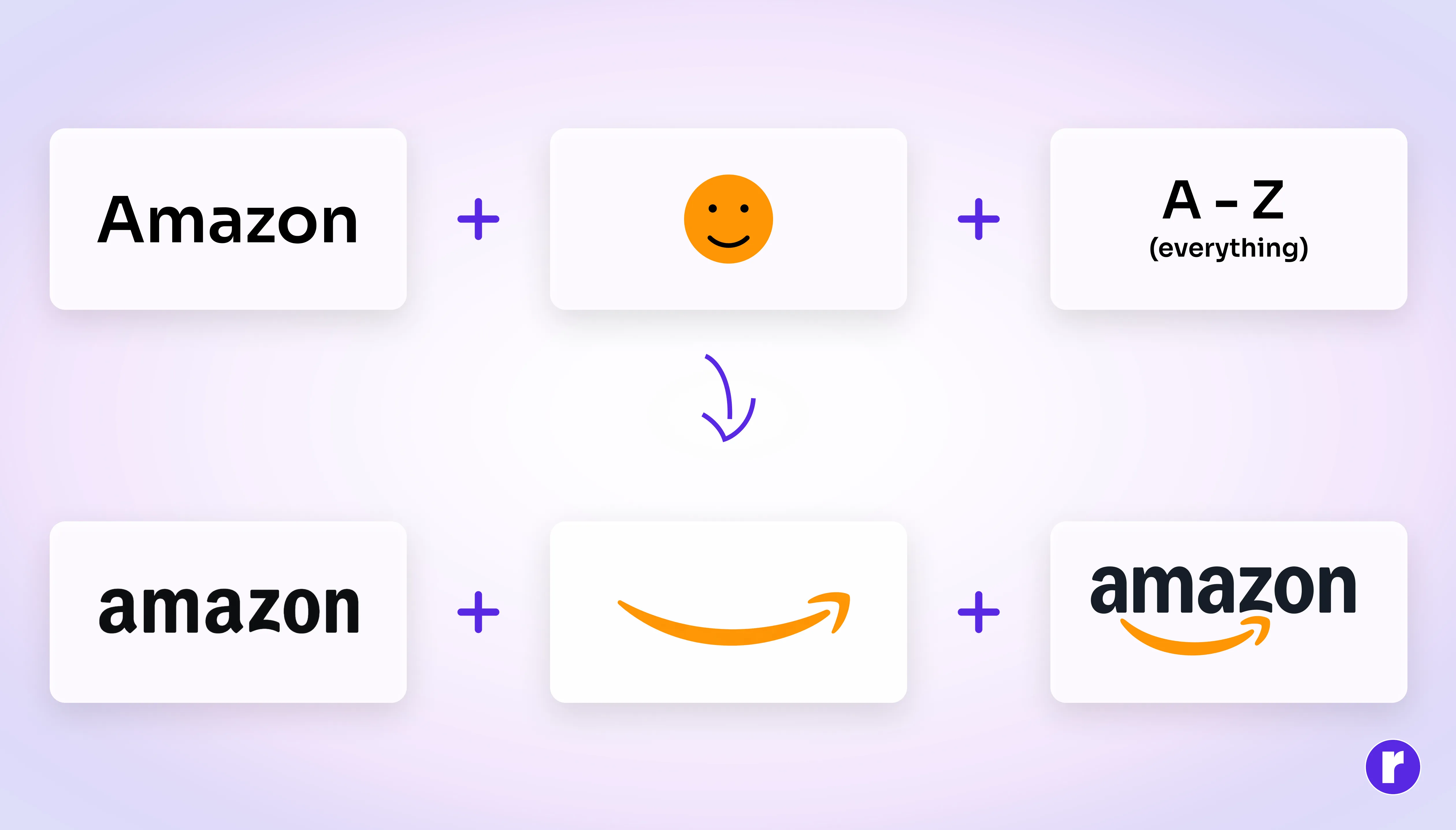
The first step to creating a memorable logo isn't sketching shapes — it's understanding what the brand fundamentally stands for. Every visual decision should be rooted in purpose. A logo without a concept behind it is decoration, not identity.
To learn about the proper logo-design process, visit Logo designing process
Ask yourself:
- What core emotion or promise should this mark communicate at a glance?
- Which visual elements carry meaning versus which are purely decorative?
- Does every colour, shape, and typeface choice serve the brand's character?
Bold typography or clever negative space can be powerful — but only when they emerge from concept, not trend-chasing.
Keep the Design Simple, But Never Empty
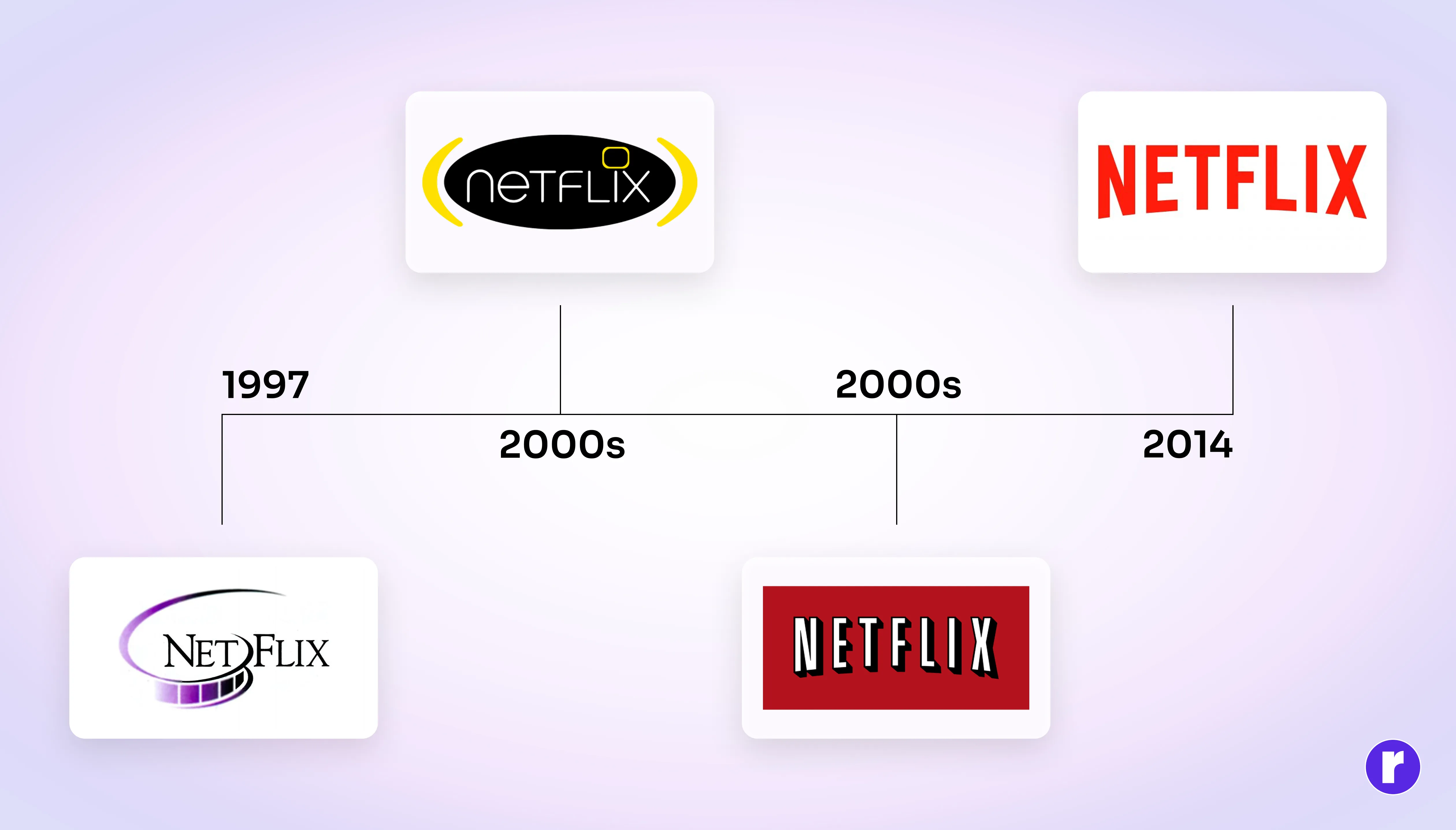
Simplicity is the most misunderstood principle in logo design. True simplicity isn't minimalism for its own sake — it's the removal of everything that doesn't earn its place. A well-crafted logo uses only the elements needed to make its identity clear and distinctive. To learn more about simple and minimalist logos, visit Key features of minimal logo
Practical ways to achieve meaningful simplicity:
- Reduce the design to its most essential form — but ensure what remains carries weight.
- Test the logo at small sizes; if it loses legibility, it needs further refinement.
- Strip away colour and check whether the mark still holds its identity in black and white.
- Check that the logo is visually distinct from competitors in the same category.
- Ensure the design can be cleared for trademark use and doesn't conflict with existing marks.
- Test the logo with the target audience to see whether it is recognisable and memorable.
The goal is not a logo that is simple to look at — it's a logo that is impossible to forget because it distills a brand into a single, clear visual truth.
Pro Tip: A great simplicity test — squint at your logo until it blurs. If the core shape still reads clearly, you have achieved the kind of visual strength that survives any context or size.
Embed a Hidden Layer of Meaning
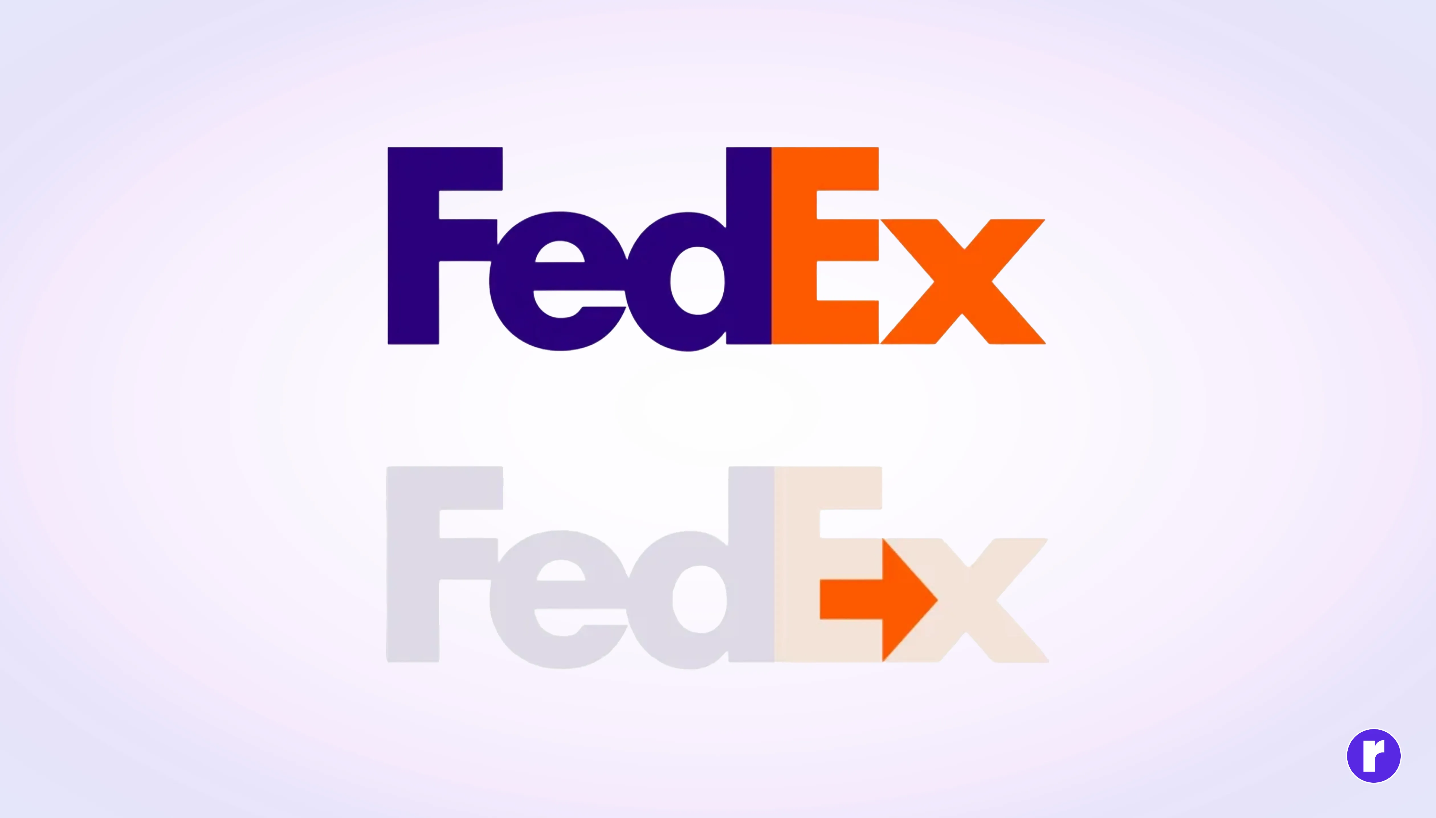
Some of the most celebrated logos carry a second story beneath the surface — a concealed arrow, a face in negative space, a shape within a shape. When a viewer discovers this hidden layer, it can make the logo more engaging. That moment of discovery can make the logo more engaging and memorable.
The most effective approach is to look for natural visual opportunities within the brand name's letterforms or initials. Negative space should be used deliberately — the space around the mark is as important as the mark itself. And crucially, any hidden meaning should support the brand's character rather than exist merely as a visual trick.
A deeper look into visual storytelling in brand identity, such as the work explored in design-focused publications on logo semiotics, reveals how layered meaning dramatically increases long-term recall.
Learn the skills behind great design and digital branding with Radial Code
Choose Colour With Intention, Not Instinct
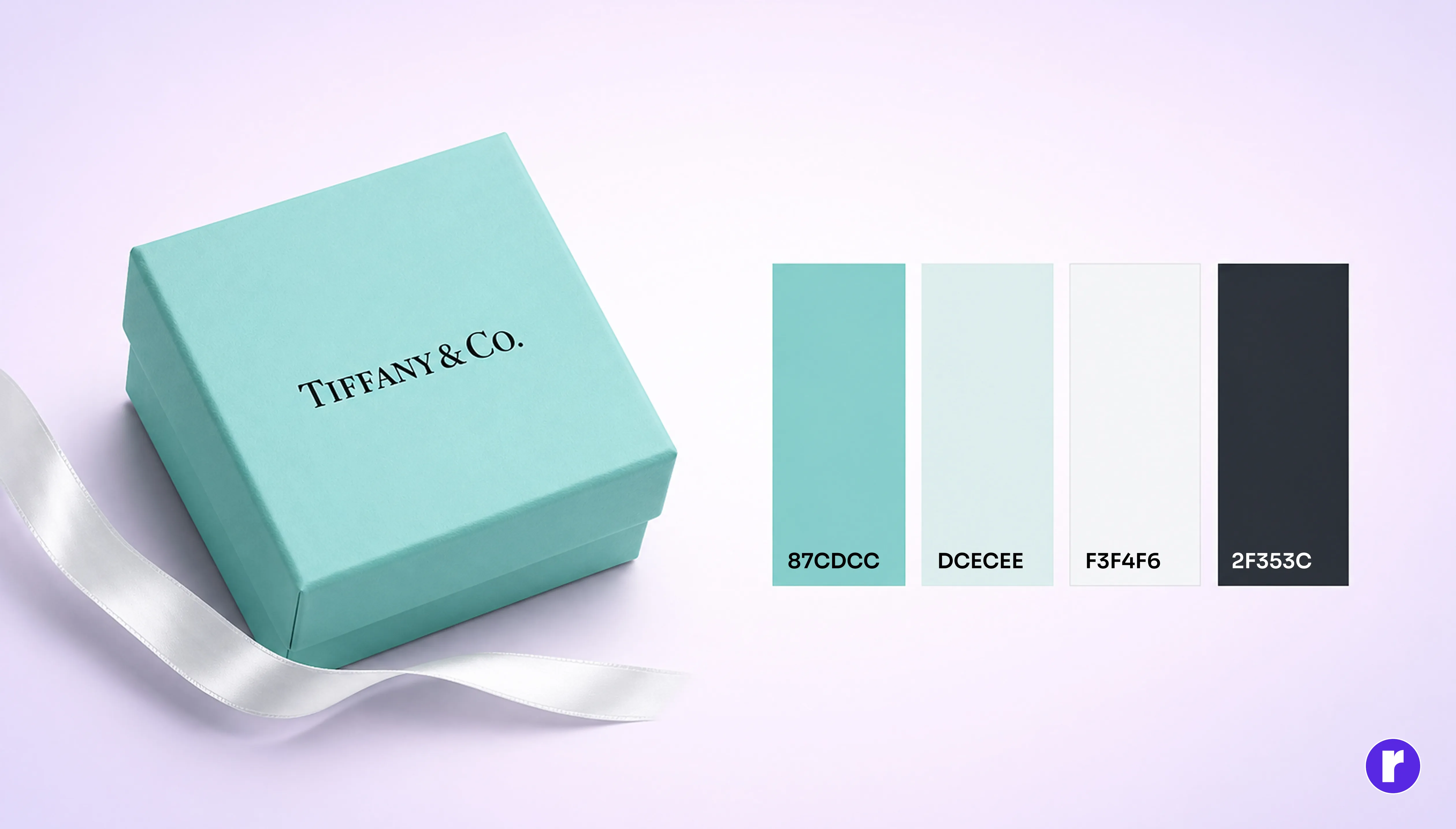
Before the brain reads shape or text, it registers colour. This makes chromatic choice one of the most powerful — and most underestimated — elements of any logo. The right colour palette encodes personality, builds trust, and triggers emotion.
Smart brands approach colour this way:
- Select a dominant colour that reflects the brand's emotional core, not just the industry convention.
- Choose a colour palette that reflects the brand and works effectively across different audiences, categories, and contexts.
- Verify the logo holds its meaning in greyscale before committing to any colour choices.
Transparency in colour rationale also helps internal teams apply the brand consistently — and consistency is where recognition is built over time.
Look at what colour your biggest competitors use — then deliberately consider what colour they are not using. Owning a distinctive colour in a crowded category is one of the fastest routes to instant recognition.
Design for Decades, Not the Current Trend Cycle
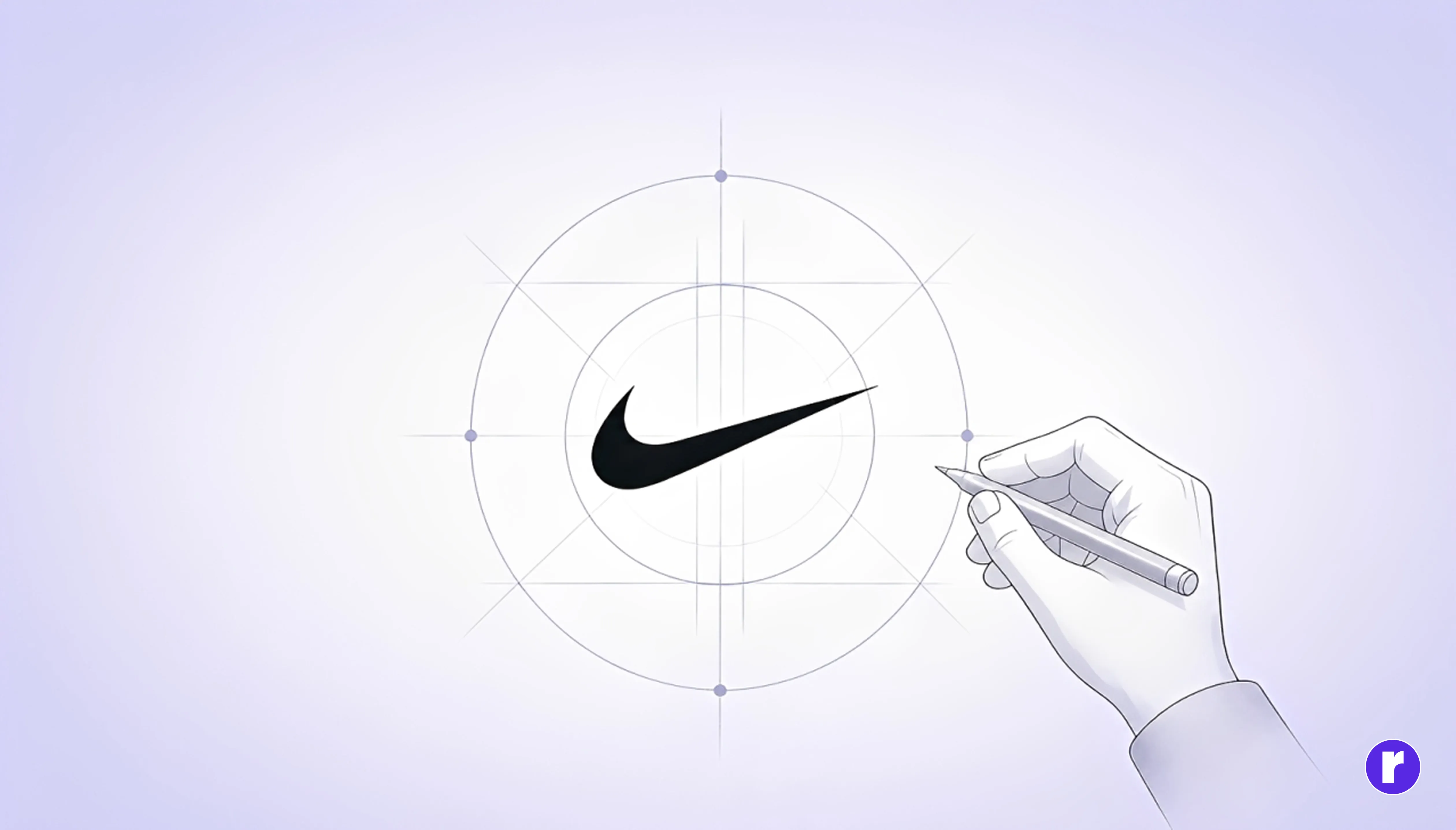
Every design era has its fashions — drop shadows, gradients, flat design waves, outlined letterforms. Logos that chase these trends look fresh for a season and dated for the next thirty years. Enduring logos are built on principles, not on the trending aesthetics of the moment. Learn more about how designers can ensure that a logo is both timeless and adaptable to future brand evolution through Timelessness and adaptable logo
That means:
- Avoid visual elements that are recognisably tied to a specific moment in design history.
- Choose geometry and proportion based on brand character, not what is currently trending on design platforms.
- Consider whether the design relies too heavily on trends that may quickly become dated.
Logos designed around strong fundamentals have a better chance of staying relevant as visual trends change.
Conclusion
A memorable logo is never an accident. It is the product of deliberate restraint, layered thinking, emotional intelligence, and the courage to resist whatever is fashionable. When designed with purpose, a logo becomes more than a mark — it becomes a cultural shorthand for everything a brand represents.
Remember: A great logo is a conversation between a brand and its audience. The best ones leave people feeling something — and that feeling is what keeps them coming back. For insights on design, branding, and digital creativity, visit Radial Code Learn