Best Logo Design Tips for Beginners

Written by

Vishal Baloda
UI/UX Designer
Table of contents
Build with Radial Code
Share this


Designing a logo might seem simple at first, just a small icon with some text, right? But in reality, a logo is a key part of a brand's visual identity. It supports recognition, reinforces personality, and helps set the tone for how people perceive a business over time.
That said, a logo is not automatically the first thing people notice about a brand, nor is it the complete face of a business on its own. It works alongside messaging, experience, and consistency to build trust. If you're just starting out in logo design, the key is not to chase complexity but to focus on clarity, meaning, and usability.
Here are practical, beginner-friendly tips to help you design better logos with clarity and purpose.
Keep It Simple
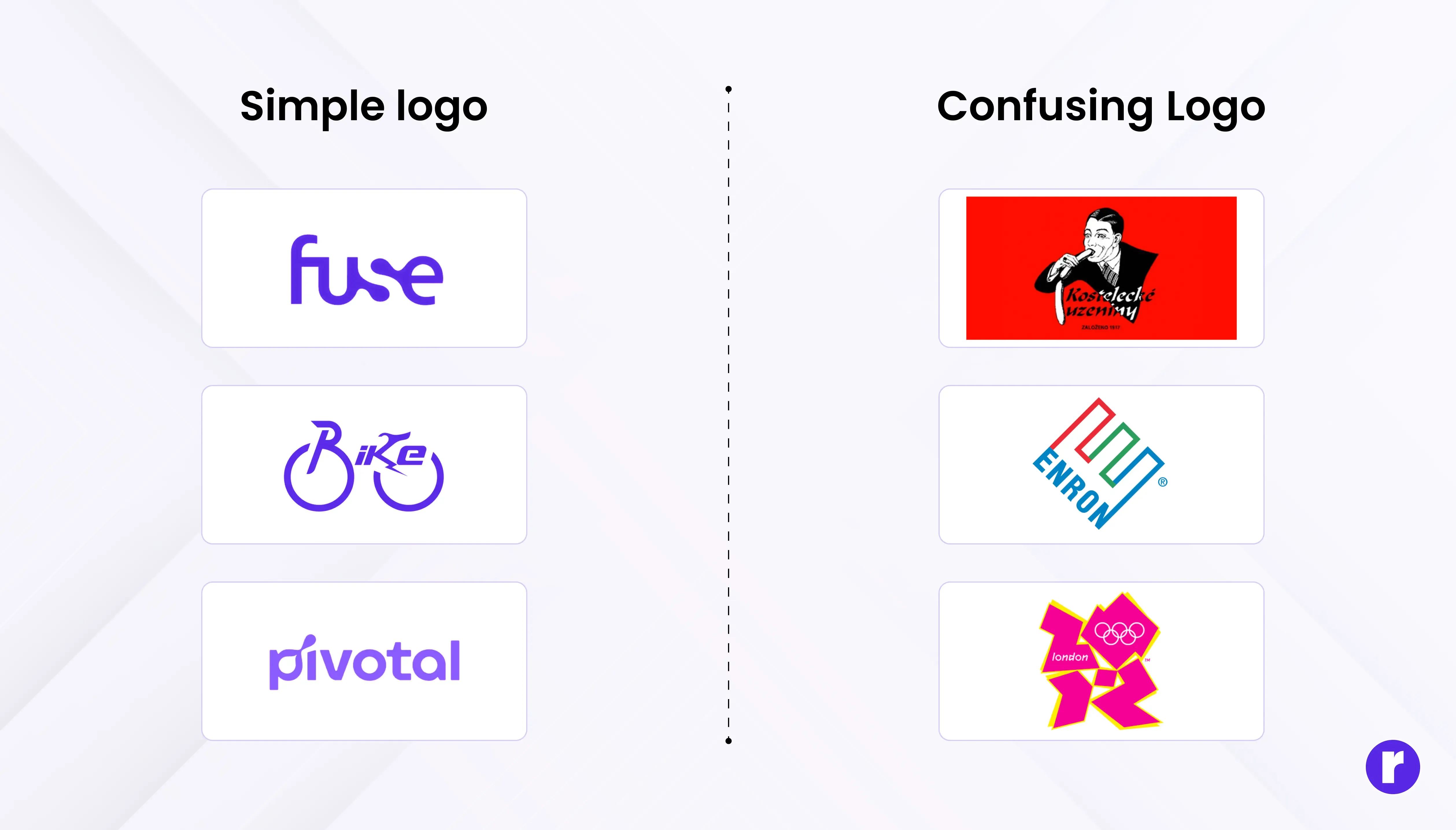
Great logos are often instantly recognizable because they're clear and focused. Look at leading brands: many of their marks rely on minimal elements, strong shapes, and zero unnecessary detail.
Simple logos can improve clarity at small sizes and make a mark easier to recall. However, complex logos can also work depending on context, category, and exposure. Luxury brands, craft industries, and heritage companies sometimes use detailed crests or illustrations effectively.
A simple logo:
- Is generally easier to remember
- Works across multiple platforms
- Scales well (from favicon to billboard)
The goal isn't simplicity for its own sake; it's ensuring every element earns its place. If you can remove something without losing meaning, remove it. But don't strip away personality just to follow a rule.
Focus on Concept First
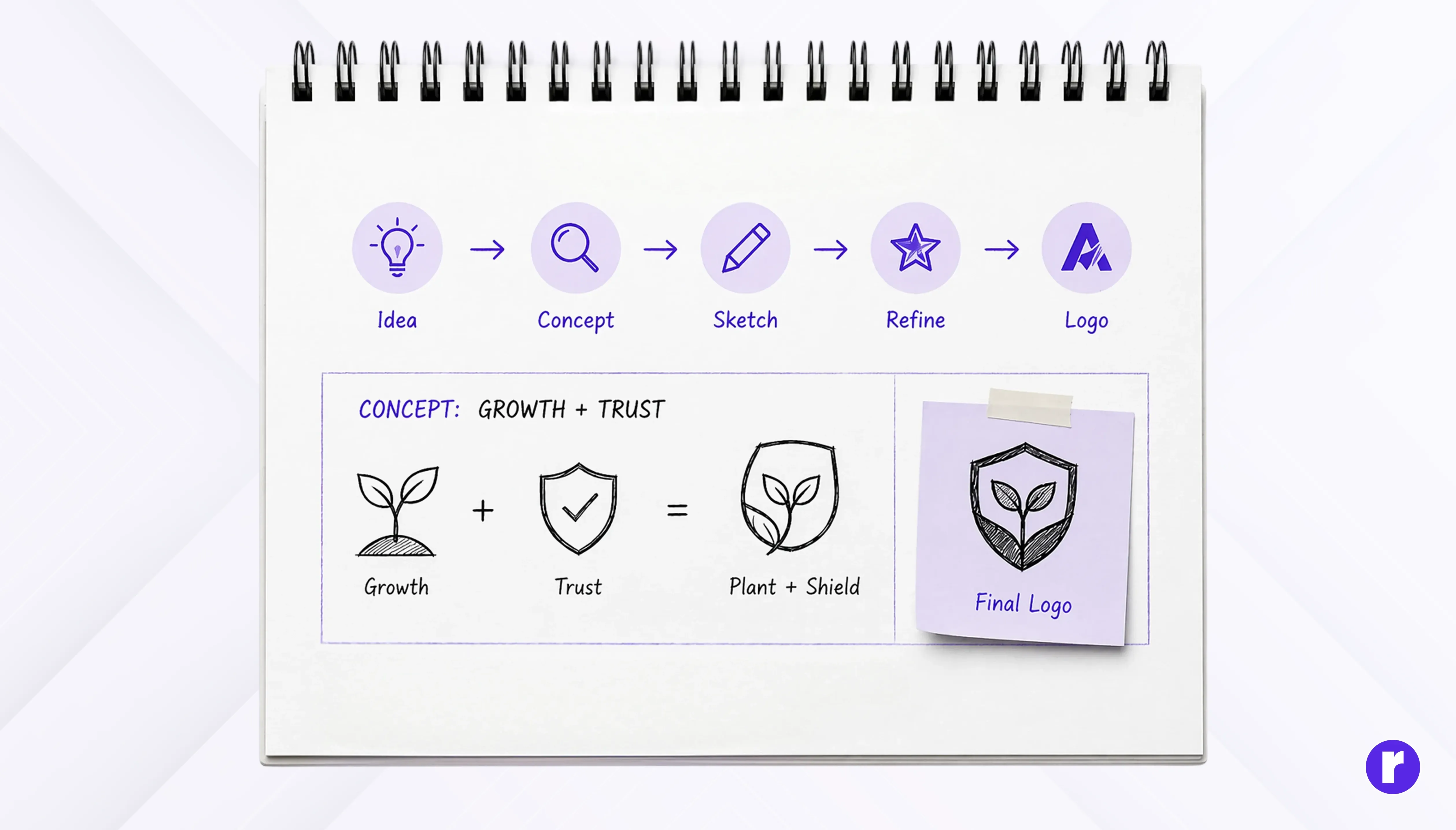
Before opening any design tool, start with an idea. A strong logo is built on a strong concept, not just visuals.
A clear concept gives direction to your design and makes it meaningful rather than decorative. It ensures every element in the logo serves a purpose.
Ask yourself:
- What does the brand stand for?
- What emotion or personality should it convey?
- Who is the target audience?
Sketch ideas on paper first. Great logos are often rooted in smart thinking rather than complex execution.
Important: A logo should reflect a brand's identity, personality, or values. It does not need to explain exactly what the business does. Many iconic logos (Apple, Nike, Starbucks) don't literally describe their products, yet they're unmistakable.
Choose Colors Wisely
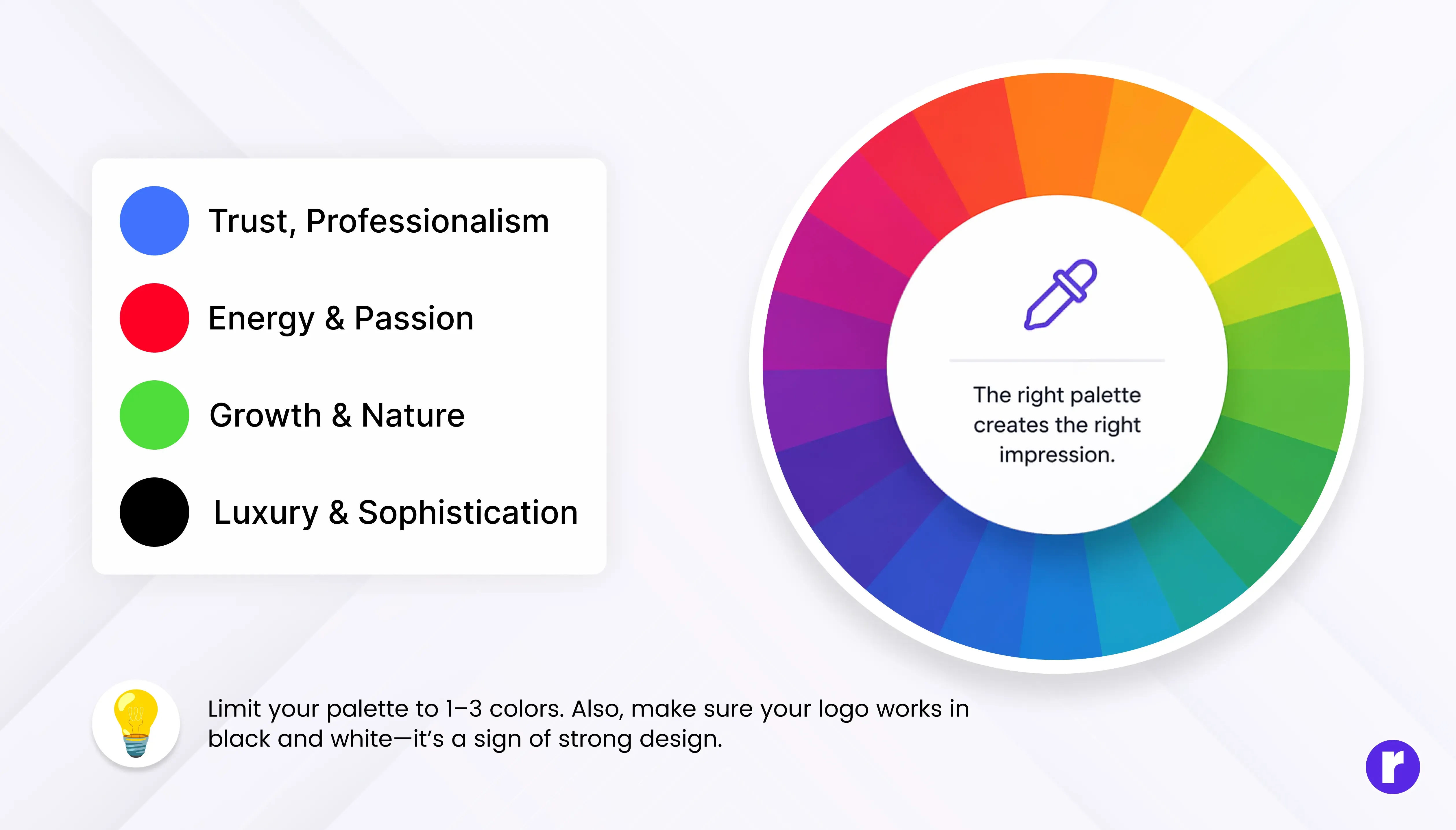
Color plays a powerful role in how a logo feels, but color meaning is not universal. Associations like "blue equals trust" or "red equals energy" are common generalizations, but they shift significantly by culture, audience, product category, and context.
Instead of relying on fixed color psychology charts, consider:
- Your specific audience: What colors resonate with them in their cultural and industry context?
- Competitor landscape: What colors dominate your space, and do you want to align or stand apart?
- Accessibility: Ensure sufficient color contrast so the logo remains distinguishable for users with color vision deficiencies, especially in digital applications.
- Versatility: Your colors should work in both print and digital formats.
Many effective logos use one to three colors, but the right choice depends on the brand and its applications. Test your palette in different contexts before committing.
💡 Color perception varies across cultures and industries. Always research your specific audience rather than relying on generic color-meaning lists.
Use Typography Carefully
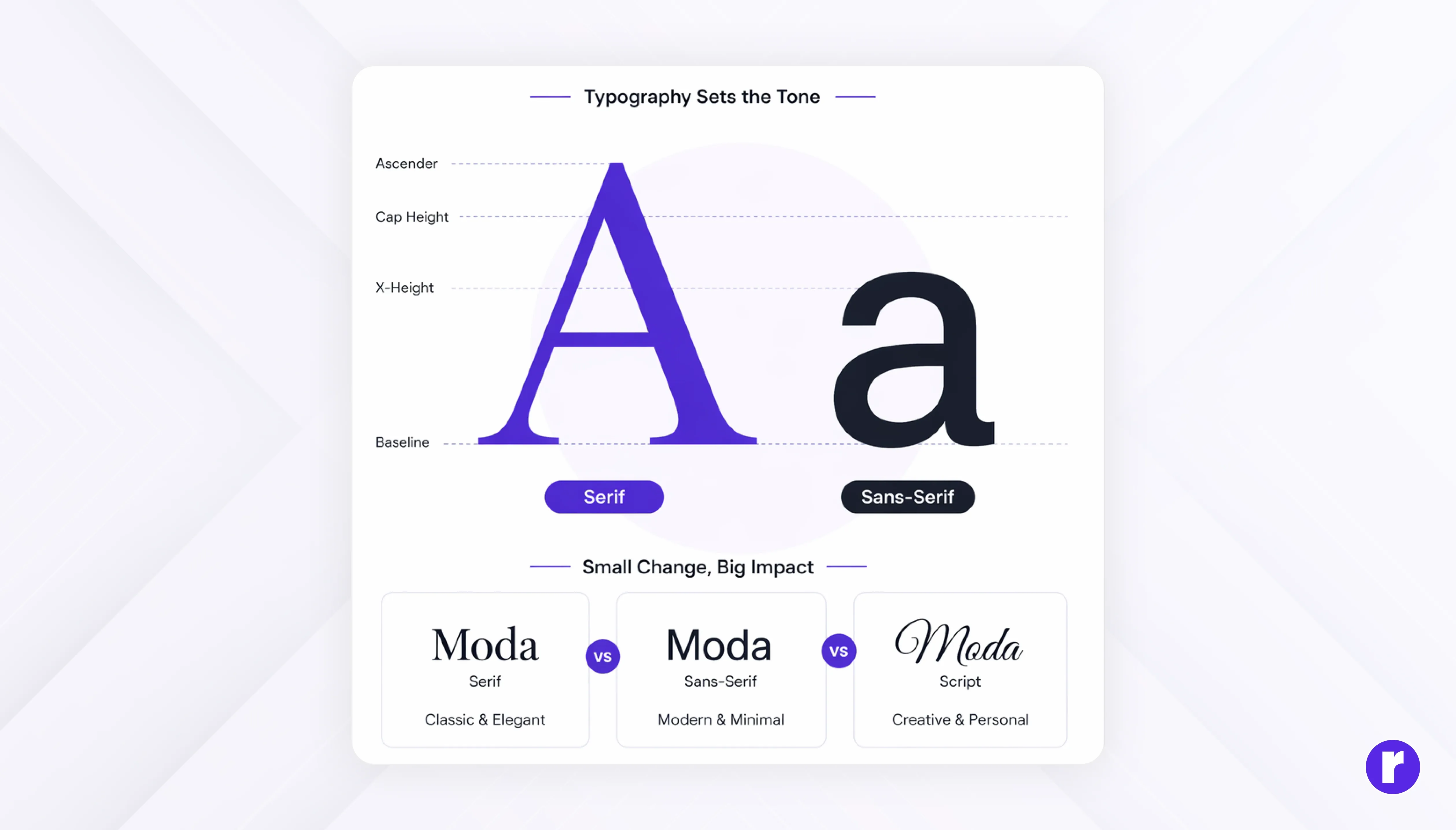
Typography is not just about choosing a font; it's about personality.
The right typography enhances readability and reflects the brand's tone. Even small changes in letter forms can completely change how a logo feels.
- Serif fonts → traditional, reliable
- Sans-serif → modern, clean
- Script → elegant, creative
Limit your logo to one or two typefaces to maintain clarity and cohesion. Thoughtful tweaks to letterforms can add distinctiveness without compromising readability.
Ensure Versatility
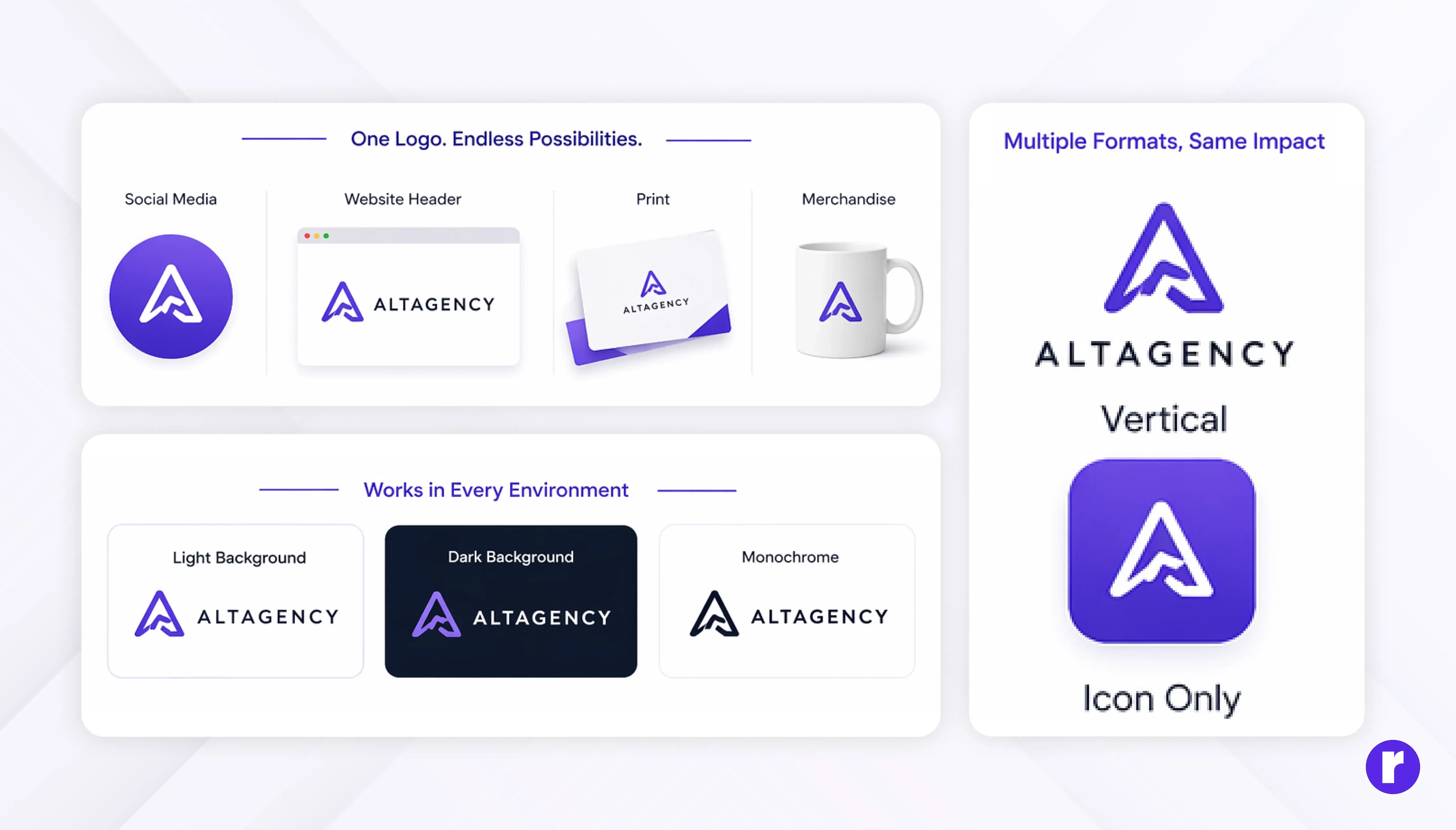
A good logo should look clear and professional at any size—from a small app icon or business card to a large banner or billboard.
A versatile logo adapts easily to different backgrounds and formats. This flexibility makes your brand look consistent across all channels.
Pro Tip: Test your logo at a very small size (like a favicon) and at a very large size (like a banner). If it looks good in both, your logo is scalable.
Make sure it:
- Works on light and dark backgrounds
- Maintains readability at different sizes
- Looks good in monochrome
Create Your Logo in Vector Format
Always create the master version of your logo in a vector format such as SVG, AI, or EPS. Vector files use mathematical paths rather than pixels, which means your logo will scale cleanly to any size, from a tiny app icon to a massive billboard, without losing quality.
Why this matters for beginners:
- Pixel-based formats (PNG, JPG) become blurry when enlarged
- Vector files can be exported to any raster format at any resolution
- Print shops, sign makers, and developers will all request vector files
Tools like Adobe Illustrator, Affinity Designer, or even free options like Inkscape are built for vector work. Start there, not in Photoshop or Canva.
Run a Trademark Check
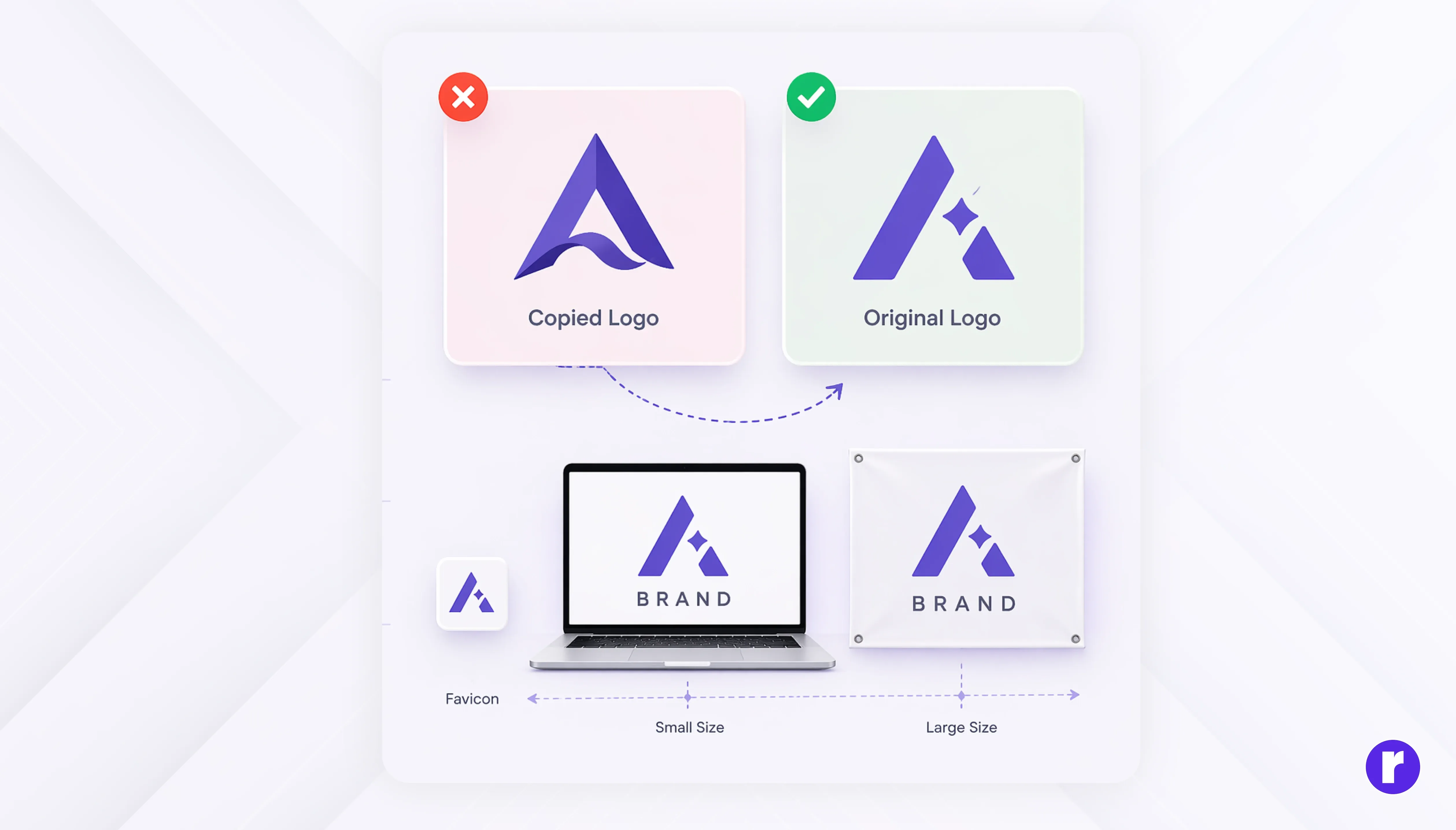
Before finalizing your logo, search for similar existing marks. This step is often skipped by beginners but can save you from legal trouble and brand confusion down the line.
What to do:
- Search trademark databases (like the USPTO Trademark Search system or your country's equivalent)
- Do a Google Image search for similar shapes and concepts
- Check your industry for marks that could be confused with yours
A logo that's too similar to an existing registered mark can lead to cease-and-desist letters, forced rebrands, or even lawsuits. Spending 30 minutes on research now can save months of headache later.
Design in Black & White First
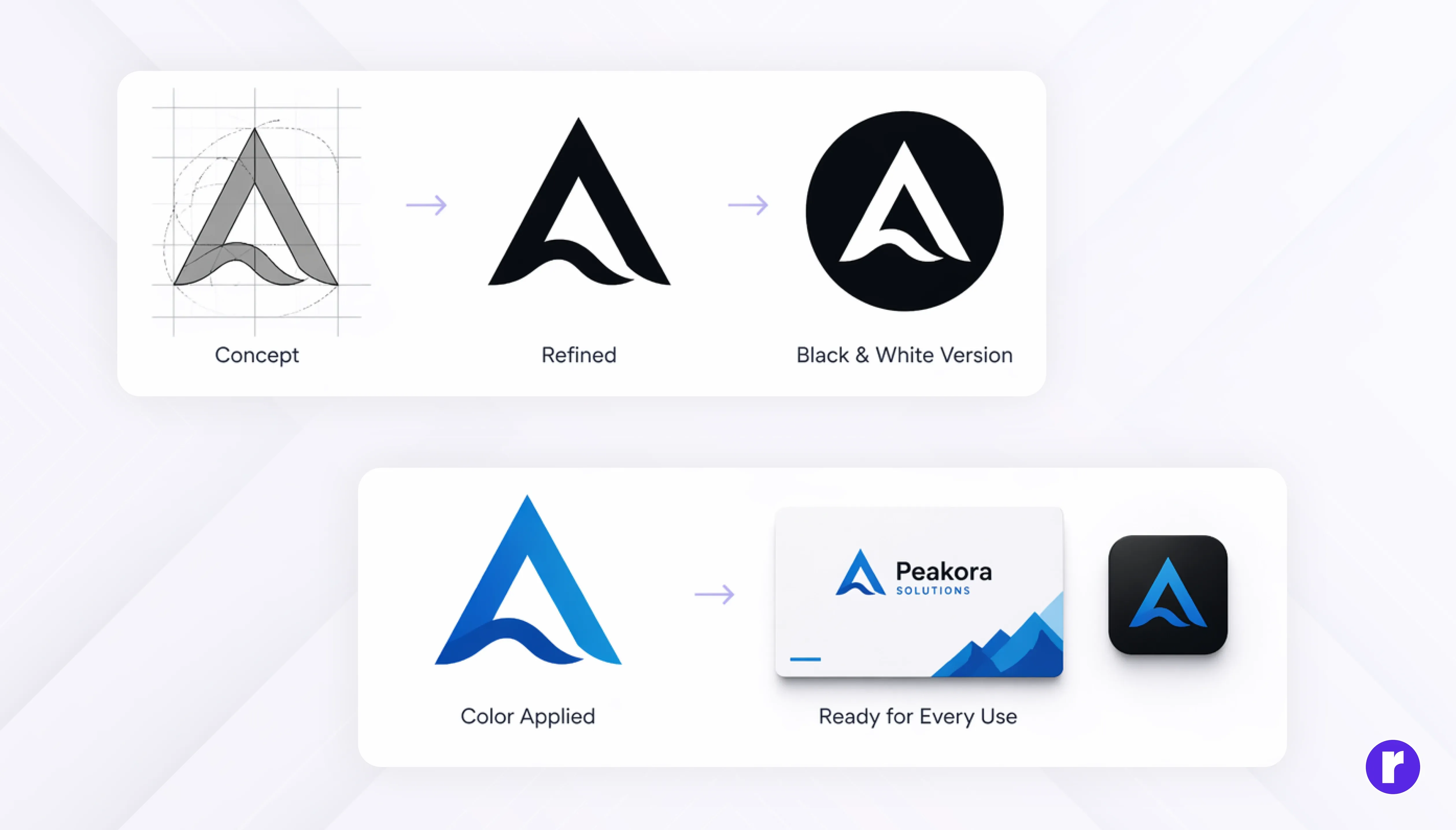
Many designers find it helpful to start in black and white before introducing color. This helps you focus on the core design, such as shape, structure, and concept without relying on colors to make it look good.
If your logo looks strong and clear in black and white, it means the design itself is effective. Colors can enhance a logo, but they should not be the only reason it looks appealing.
Designing in black and white also ensures your logo works well in different situations like printing, photocopying, or low-color displays. Once you are confident with the black and white version, you can add colors to make it more attractive and aligned with your brand.
Get started with us at Radial Code
Learn from Great Logos
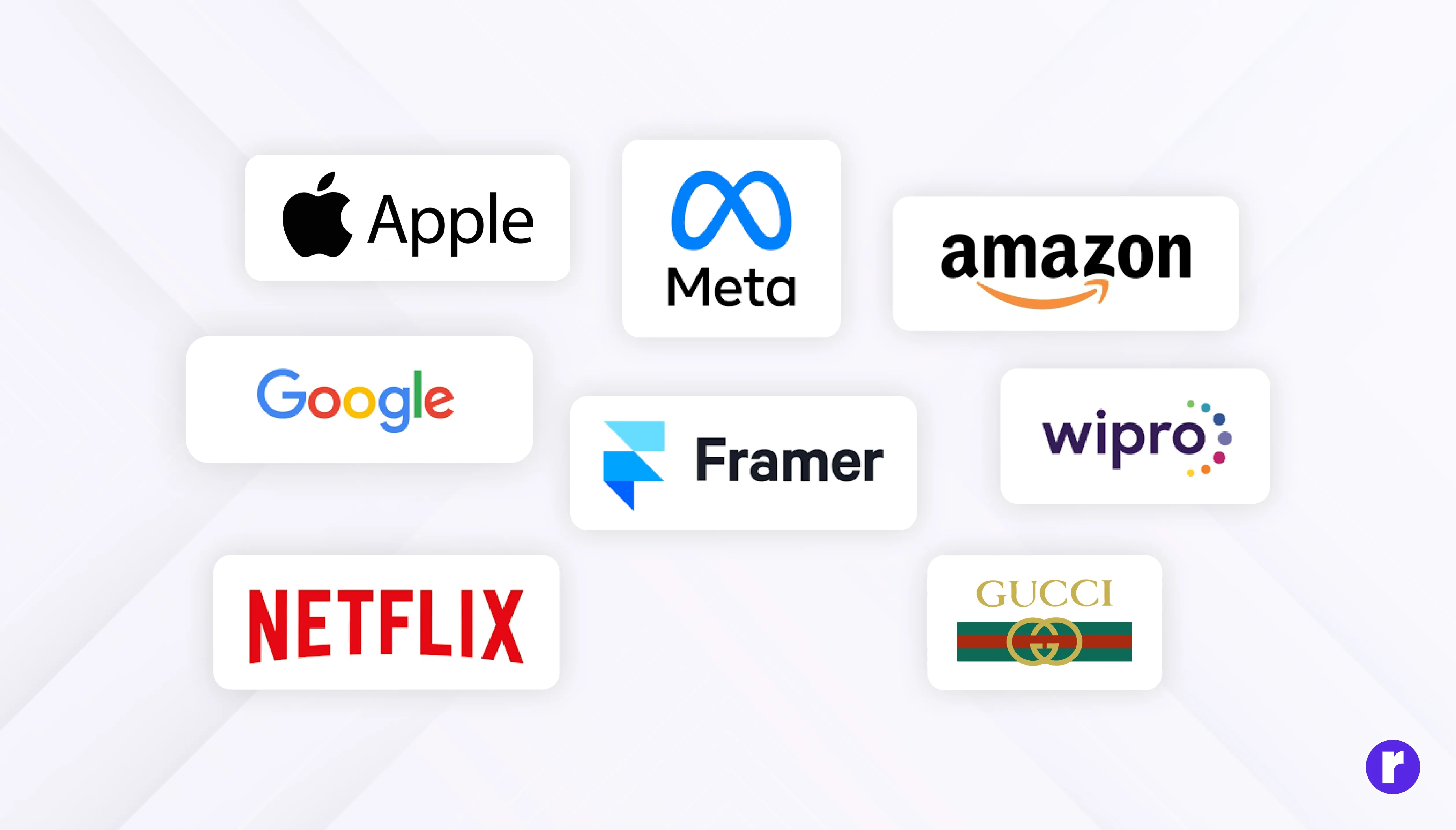
Analyze successful logos and understand why they work. Studying great logos helps you develop design intuition and builds your visual thinking over time.
Look at:
- How they use space
- Their simplicity
- Their color choices
- Their adaptability
Case study: The FedEx logo is a masterclass in simple, concept-driven design. It uses clean sans-serif type with an arrow hidden in the negative space between the "E" and "X," subtly reinforcing speed and precision. It works at any size, in any color variation, and across every medium. That's the power of strong thinking behind a simple execution.
But remember—learn, don’t copy.
Explore other blogs for more design insights and creative guidance.
Conclusion
Logo design isn't just about aesthetics. It's about communicating a brand's identity in the clearest and most efficient way possible. A strong logo helps people recognize and connect with a brand over time.
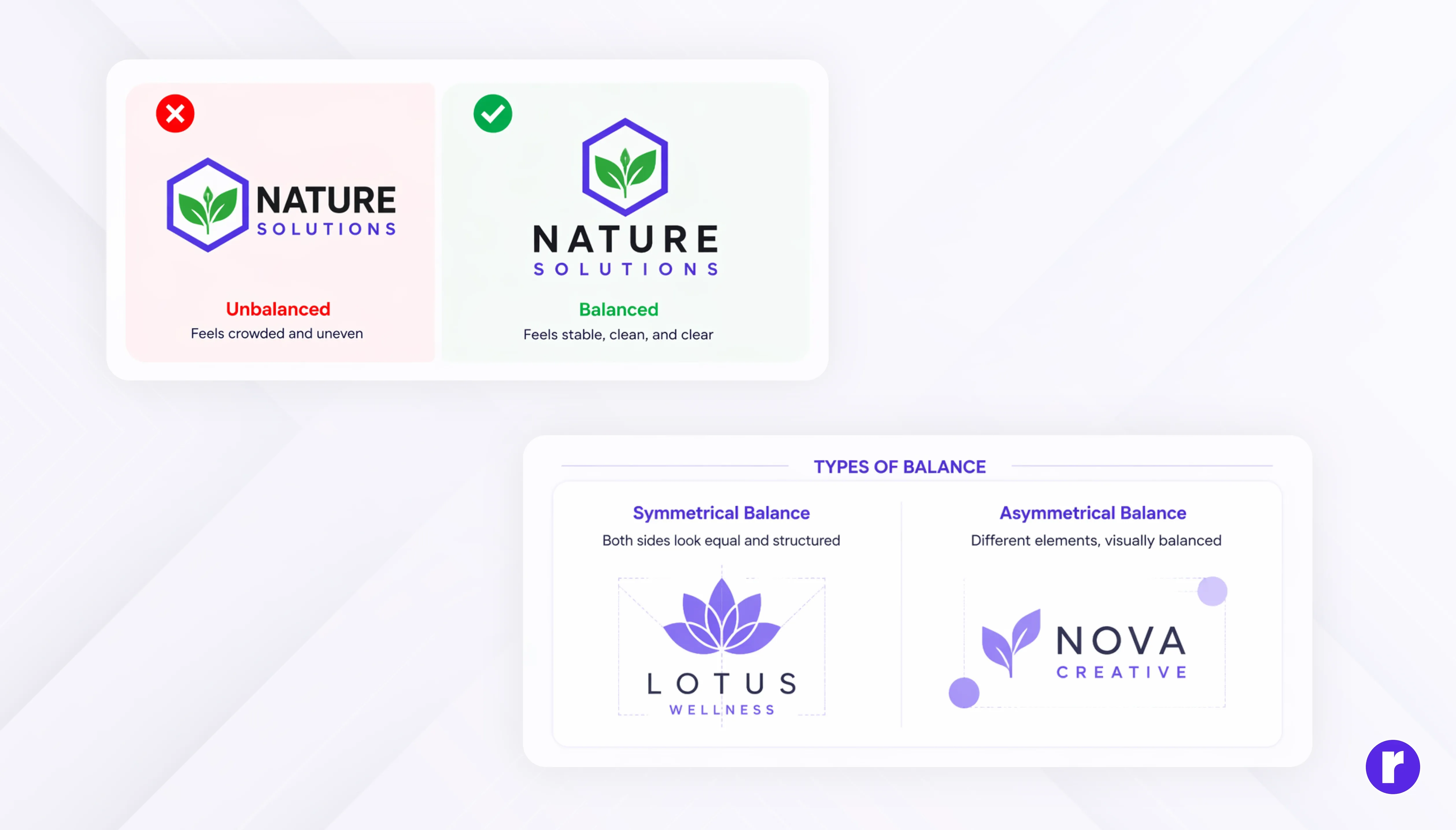
As a beginner, focus on creating something thoughtful and purposeful rather than flashy but keep focus on fundamentals like clarity, balance, meaning, and scalability in mind. Start small, stay consistent, and keep refining your work. Over time, you’ll not only design better logos but also develop a designer’s mindset.