How to choose the perfect logo for your business

Written by

Shweta Kumari
UI/UX Designer
Table of contents
Build with Radial Code
Share this


Your logo is a key part of your brand identity, shaping how your business is recognized and the first impression your audience forms. It's the visual they carry with them long after they've moved on. A thoughtful logo supports recognition, reinforces your brand's values, and helps you stand out in a competitive landscape. But it's just one piece of the puzzle: your full brand is built through messaging, experience, and reputation working together.
Choosing the right logo isn't just about making something that looks good; it's about choosing a style that fits your business goals, audience, and long-term vision.
Define your brand identity first

Here's where most people get it wrong. They jump straight to designing the logo without laying the groundwork. Don't do that. Before you sketch a single line, you need to understand your brand inside and out.
Ask yourself these critical questions:
- What does my business do, and what problem does it solve?
- Who is my ideal customer?
- What are my brand's core values?
- What personality do I want to convey? (Professional? Playful? Trustworthy? Innovative?)
- What kind of feeling or connection should my brand create in the minds of my customers?
Want to turn your vision into an intuitive, high-converting design? Visit here
Design for your audience, not yourself
A logo isn’t just about what you like; it’s about what your audience connects with. The right design speaks directly to the people you want to attract, making your brand feel relevant, familiar, and trustworthy from the very first glance.
Think about who you’re designing for:
- Are they young and trend-driven, or mature and professional?
- Do they expect something bold and energetic, or minimal and refined?
- What visuals, colors, and styles naturally appeal to them?
Your logo should reflect their expectations while still standing out in your space. When your audience sees it, they should feel like “this brand is for me.”
Choose the right logo type
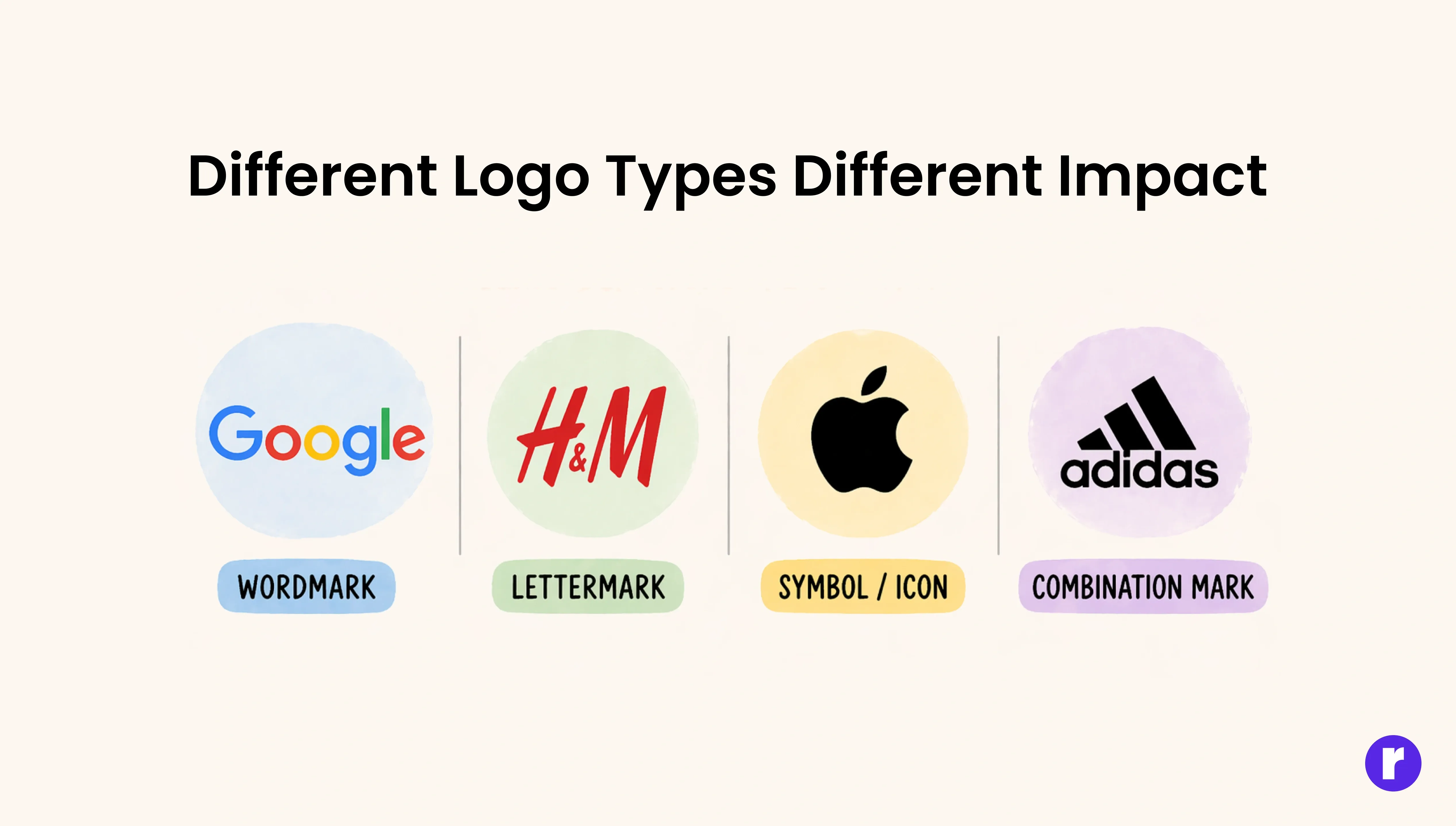
Each logo type serves a different purpose, and choosing the right one depends on your brand name, industry, and future goals.
For example:
- Wordmark: Ideal if your brand name is unique and easy to remember. It keeps things clean and focuses entirely on typography.
- Lettermark: A great option for businesses with long or complex names, making them easier to recognize and use.
- Symbol / Icon: A strong option when visual recognition is the priority. Its suitability depends on your recognition needs, how the logo will be used, and whether text accompanies it. Many brands start with a symbol alongside their name and let the icon stand alone as familiarity grows.
- Combination mark: A mix of text and symbol, offering flexibility across different platforms and use cases.
A good logo structure should be adaptable, easy to scale, and work well in different formats.
💡 Pro Tip: If you're unsure, go with a combination mark that gives customers both visual and textual recognition.
Psychology of colors
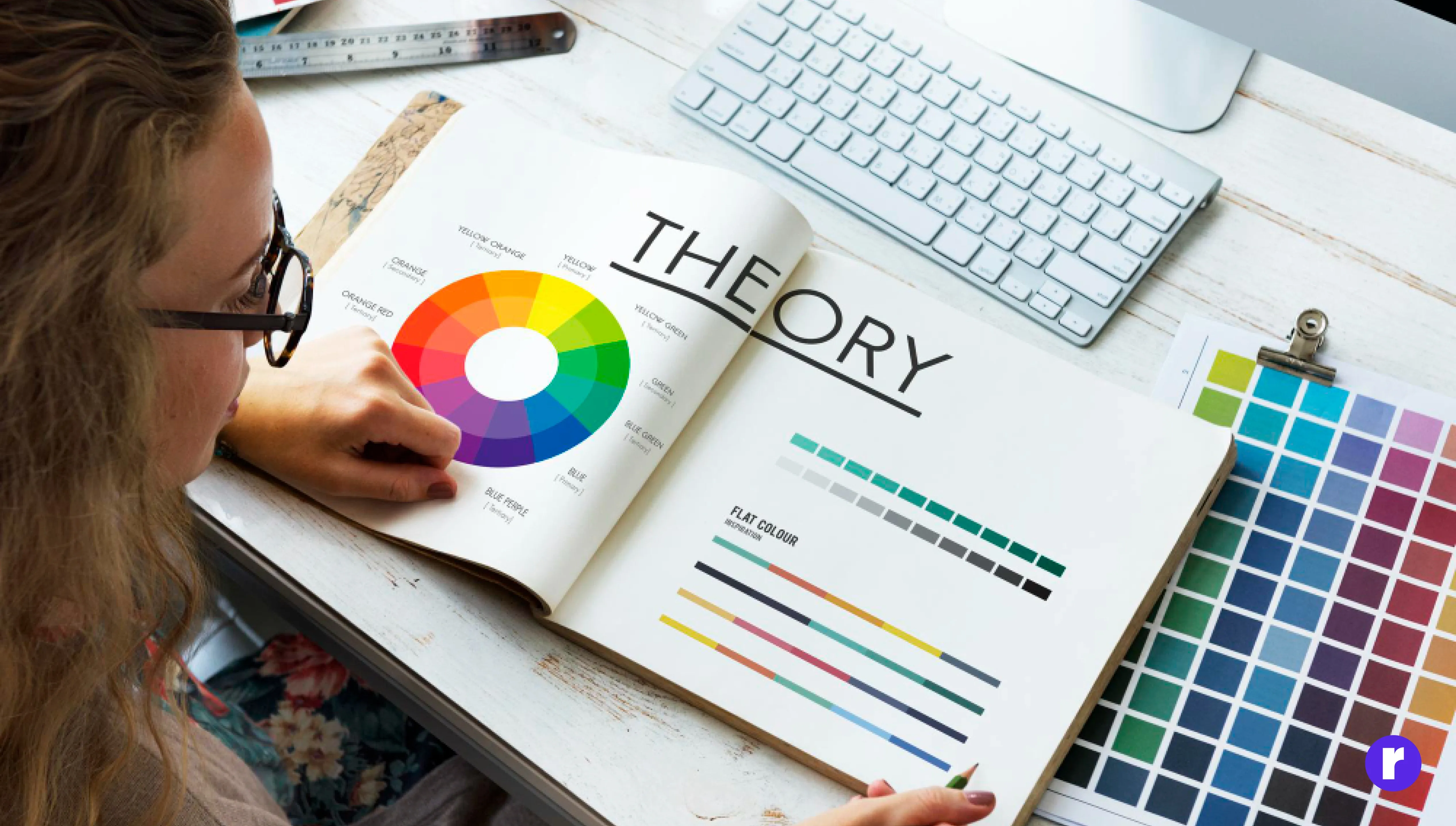
Colors are not decorative; they are psychological triggers. The colors in your logo influence how customers perceive your brand. This is called Color Psychology, and the world's biggest brands use it strategically.
Keep in mind that color associations are not universal. They shift based on culture, audience, industry, and context. The examples below reflect common Western associations, not fixed rules:
- Blue is often associated with trust and stability (Facebook, LinkedIn)
- Red is commonly linked to energy and excitement (Coca-Cola, Netflix)
- Green tends to suggest growth and health (Starbucks, Whole Foods)
- Yellow frequently conveys optimism and warmth (McDonald's, IKEA)
- Black often signals sophistication and power (Chanel, Apple)
Rather than picking a color based on a fixed meaning, consider how your specific audience and industry will interpret it. Test your choices in context before committing.
Choose typography that speaks for you
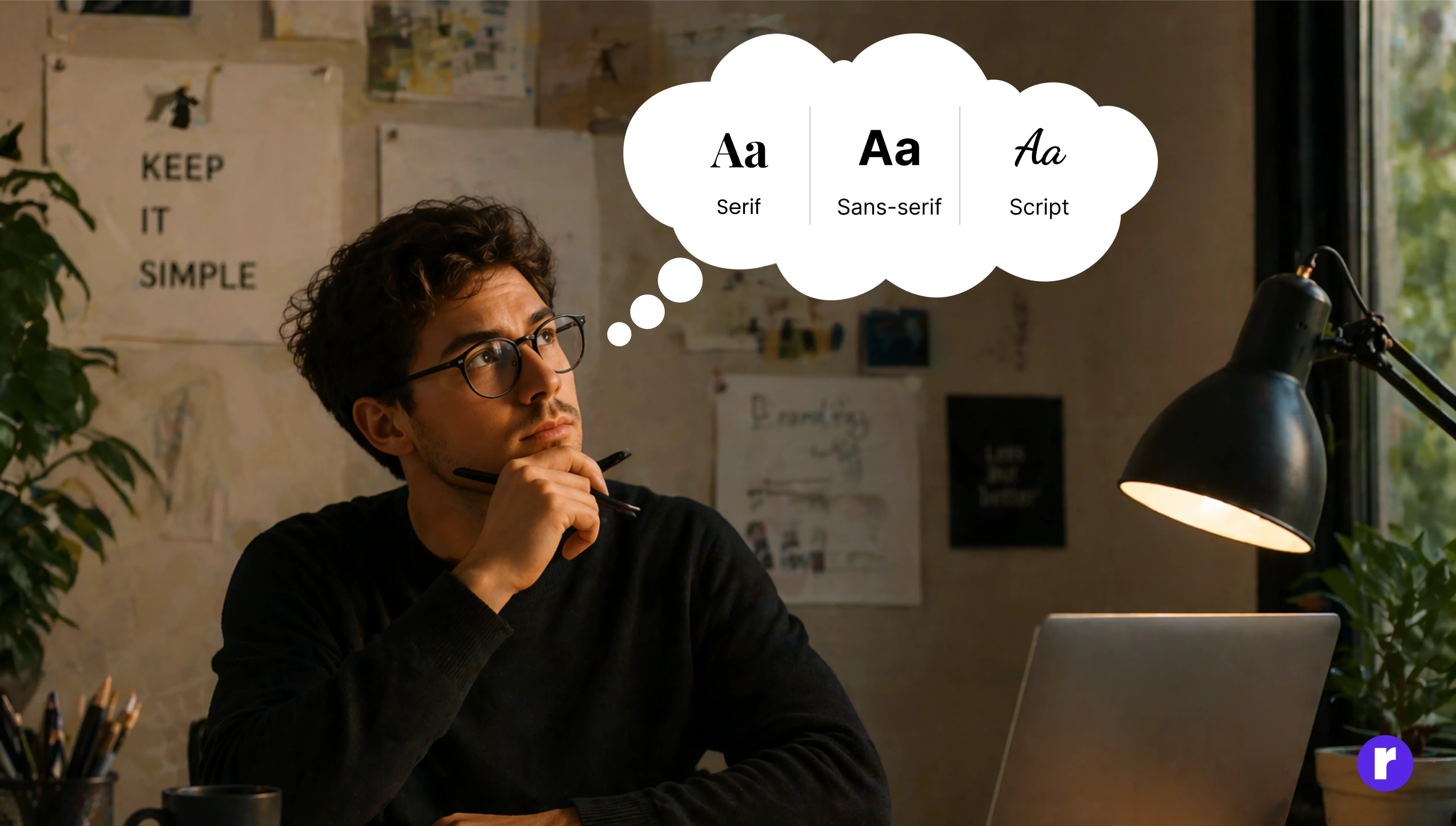
Typography is one of the most underrated elements of logo design and one of the most powerful. Your choice of typography expresses your brand’s character instantly long before any message is read.
- Serif fonts: Traditional, reliable
- Sans-serif fonts: Modern, clean
- Script fonts: Elegant, creative
Avoid overly decorative fonts unless they truly match your brand.
To learn more about typography. Click here
Make it versatile across all mediums
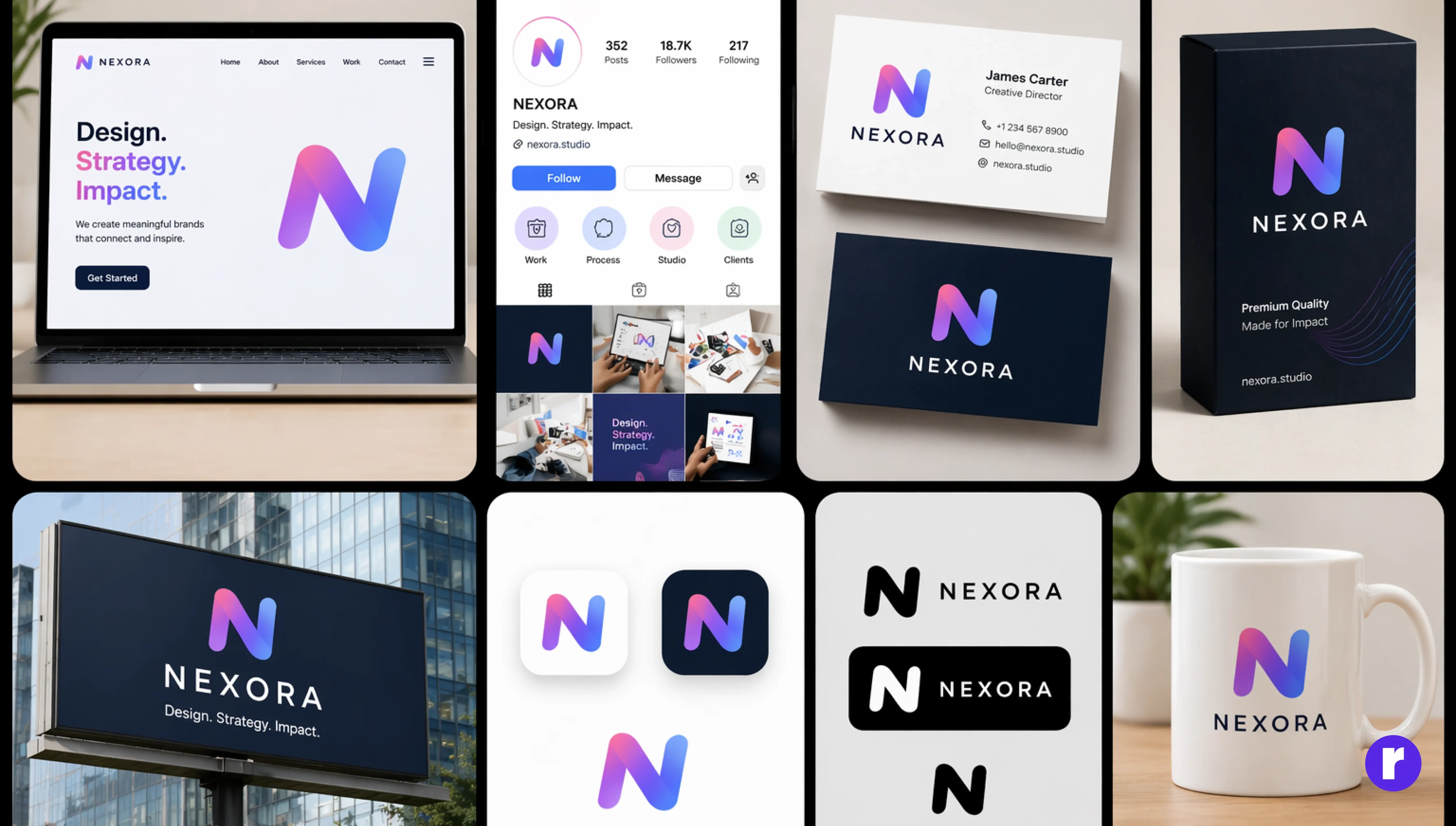
A great logo isn't designed for just one screen, it's built to perform everywhere your brand shows up. Whether it's a website header, Instagram profile, business card, packaging, or a large billboard, your logo should remain clear, balanced, and instantly recognizable.
To achieve this, your logo should be:
- Scalable: Sharp and legible at both small and large sizes.
- Flexible: Effective in full color, black & white, and different backgrounds.
- Adaptable: Available in multiple versions like full logo, icon, or simplified mark.
If it fails any test, redesign it.
Focus on simplicity & memorability
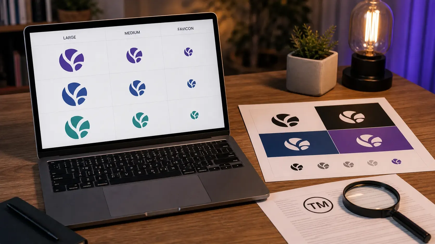
Before committing to your final logo, put it through real-world testing. Skipping this step is one of the most common mistakes, and it can cost you a redesign later.
Here's what to check:
- Audience feedback: Share your top 2 or 3 options with a sample of your target audience. Their gut reaction matters more than your own preference.
- Small size test: Does it stay legible as a favicon, app icon, or social media avatar?
- Black and white: Does it hold up without color? A strong logo works in monochrome too.
- Different backgrounds: Test it on light, dark, and busy backgrounds to make sure it doesn't disappear or clash.
- Accessibility: Ensure sufficient contrast so the logo is clear for people with visual impairments.
- Trademark check: Search existing trademarks and registered logos to make sure your design (and name) doesn't conflict with another brand. This step can save you from legal trouble down the line.
Focus on simplicity & memorability
Simplicity is an important quality of a successful logo. A clean design is generally easier to recognize, remember, and reproduce across different platforms.
Brands like Apple and Nike have minimal logos that are instantly recognizable worldwide, but that recognition also comes from decades of consistent use and massive exposure. Simplicity made their logos easier to recall, but it wasn't the only factor.
A cluttered logo with too many elements can confuse users and weaken your brand identity. The goal is to communicate your idea as clearly as possible, while understanding that long-term recognition is built over time.
Ready to build a logo that truly represents your brand? Visit Radial code
Conclusion
Choosing the right logo is about more than just design; it's about representing your brand in the best way possible. Each logo type has its own purpose, so the key is to pick one that aligns with your business, audience, and long-term goals.
Your logo is the starting point, not the finish line. It won't build your brand on its own, but the right one makes everything else easier: recognition, trust, and recall all compound over time. Choose a style that fits your audience, test it in the real world, and protect it with a trademark check before you go live. Then show up consistently, because the best logos aren't the ones that looked perfect on day one; they're the ones people saw a thousand times and never forgot.